Cards
Style packs define the visual configuration of a card grid. They control the amount of columns, type of cards, separators, and overall visual rhythm, ensuring consistency across screens and use cases. While card variants define waht is shown, style packs define how they are presented.
They provide scalable, system-driven way to standardize grid layouts, reduce design and implementation ambiguity, and make the building of a card grid more efficient for the authors.
Configuration and Naming
Style packs are build in Contentstack based on the following aspects:
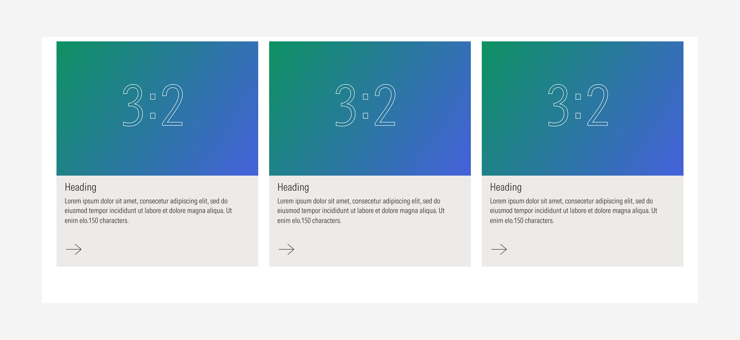
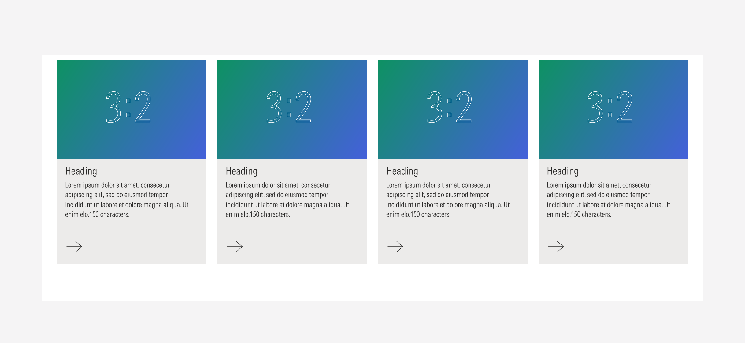
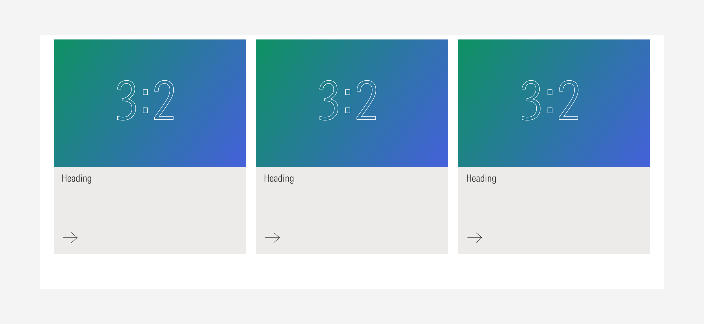
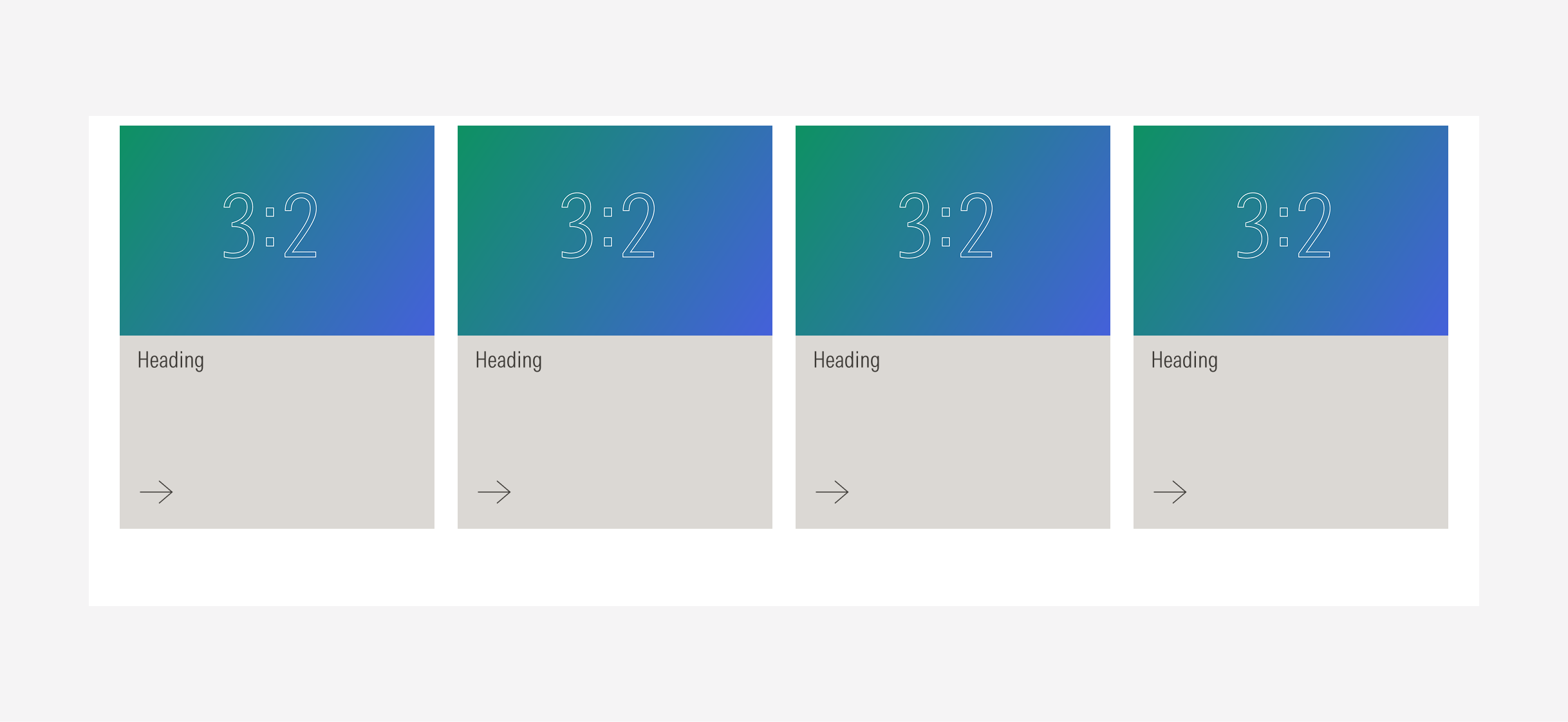
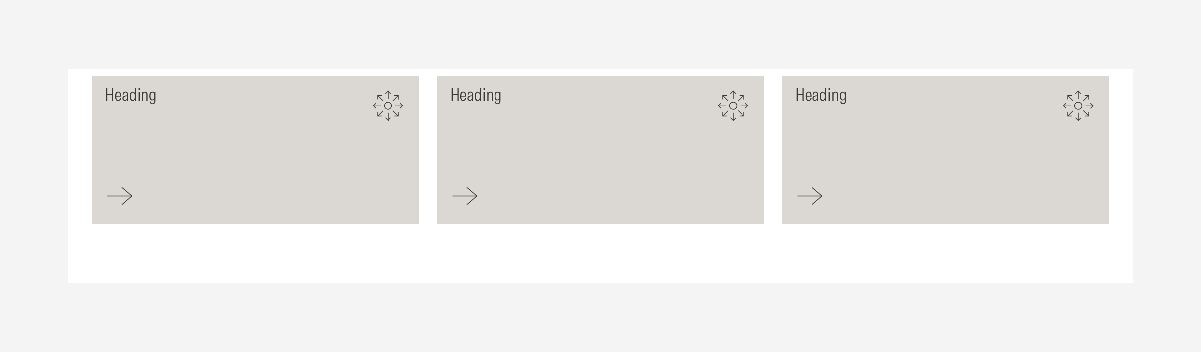
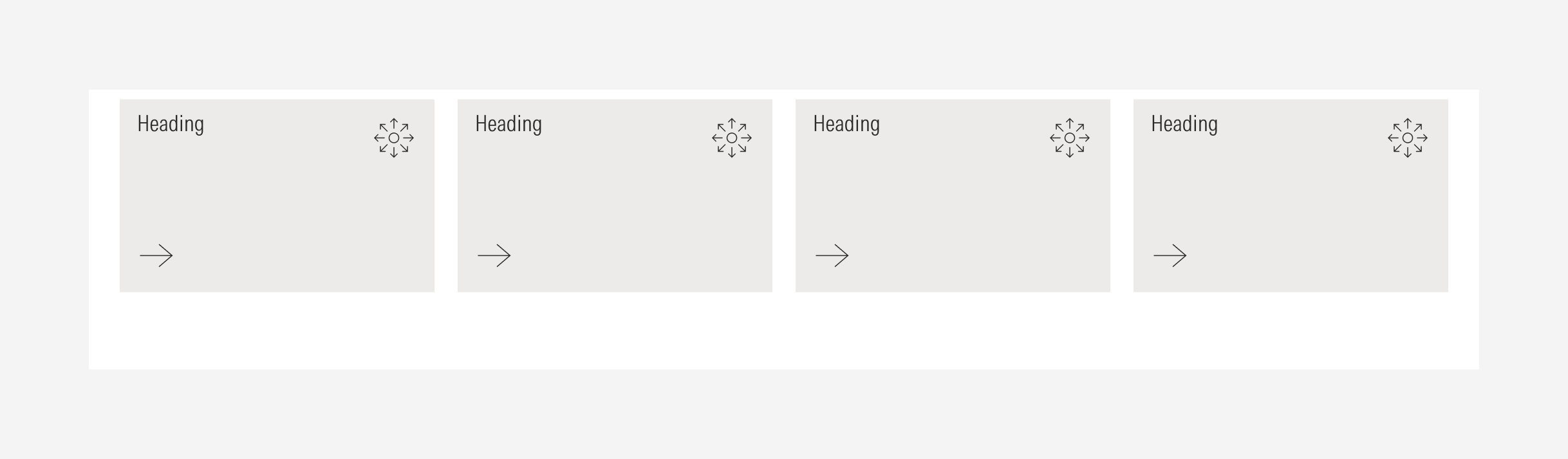
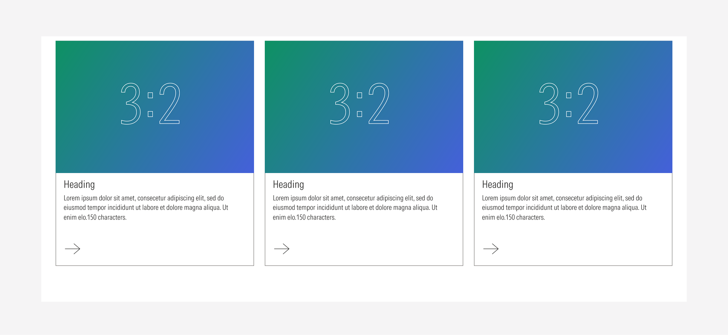
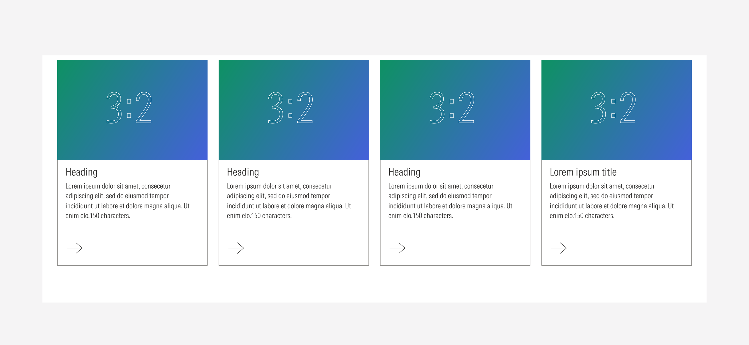
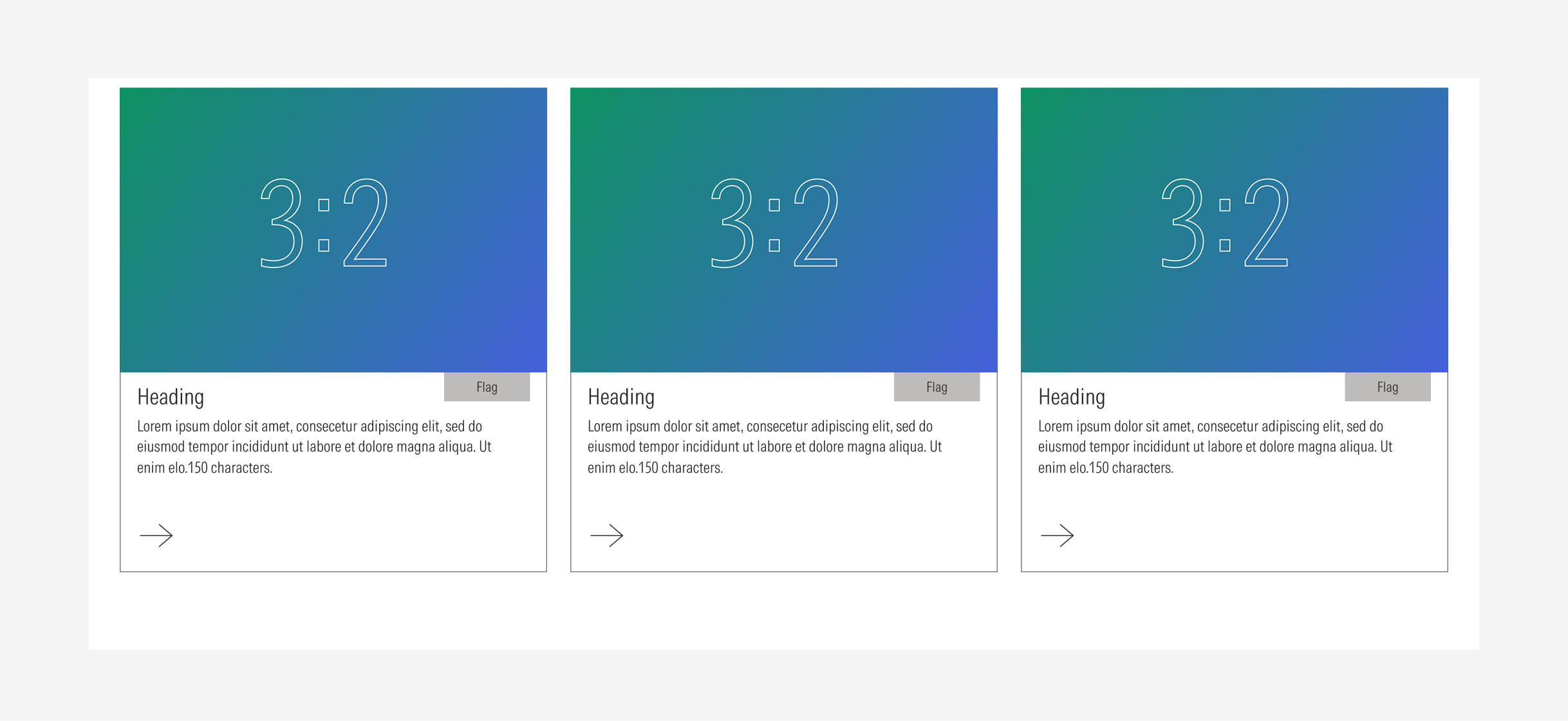
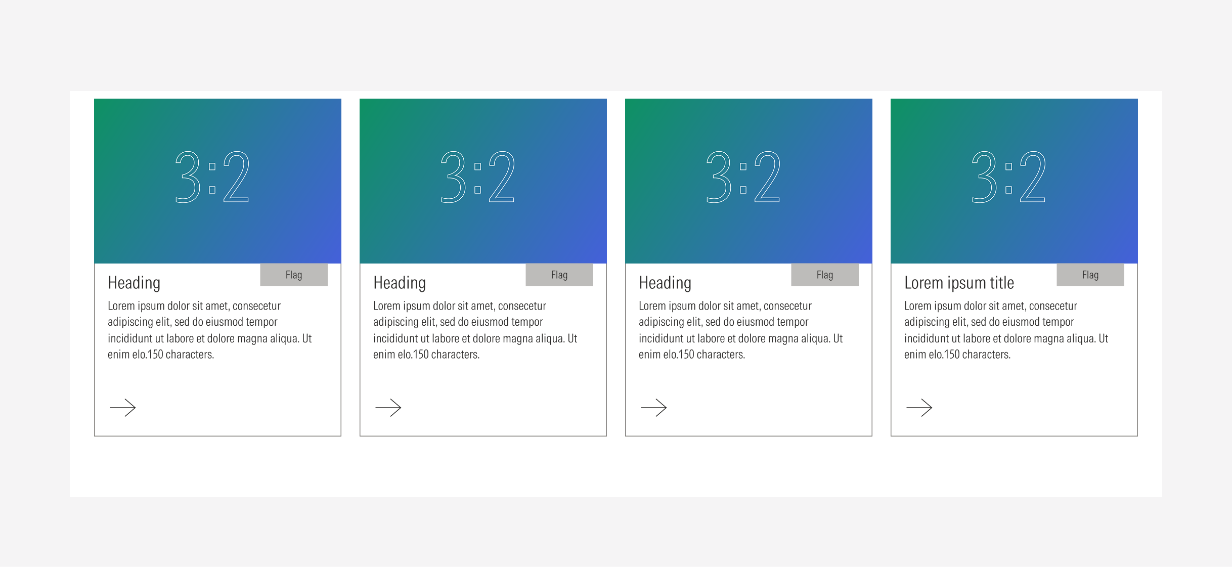
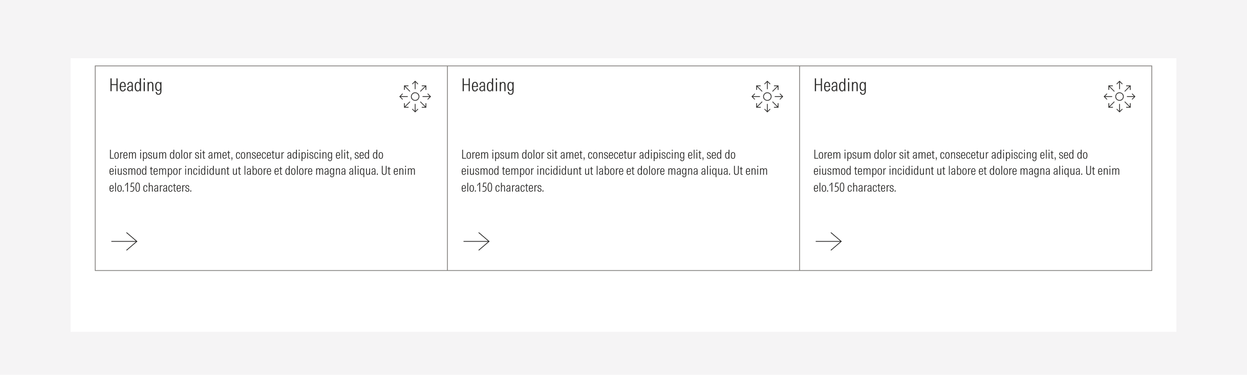
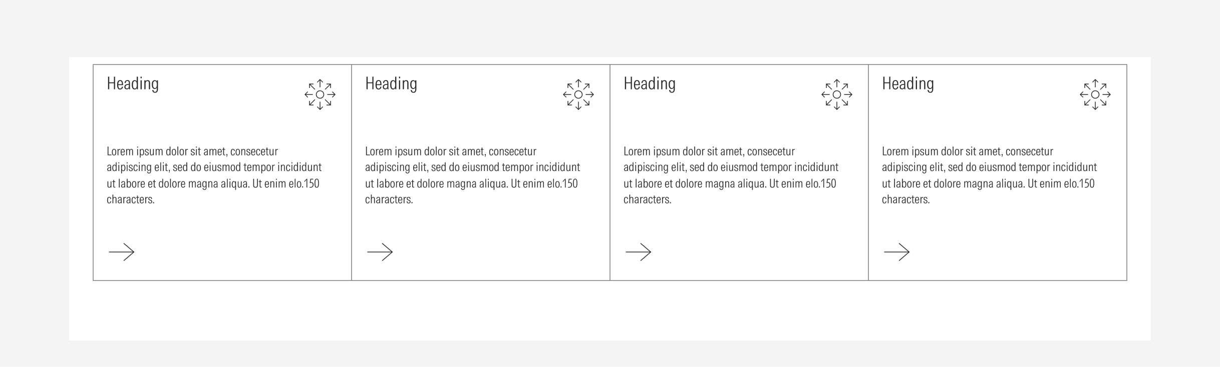
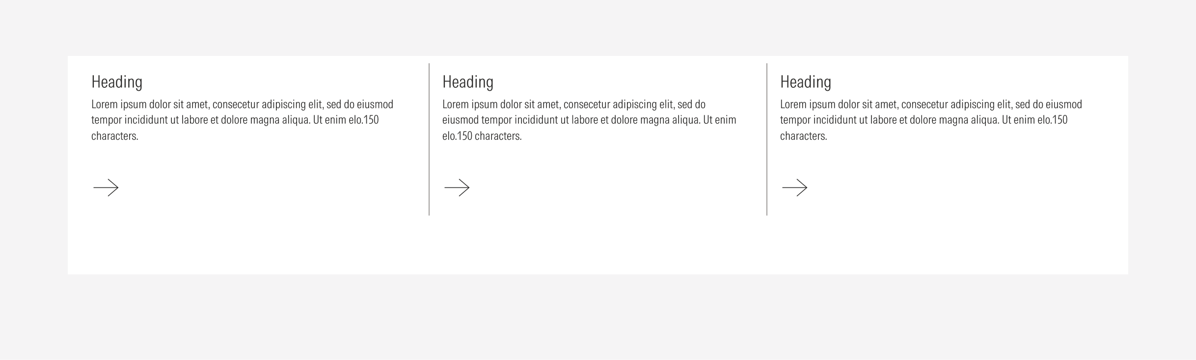
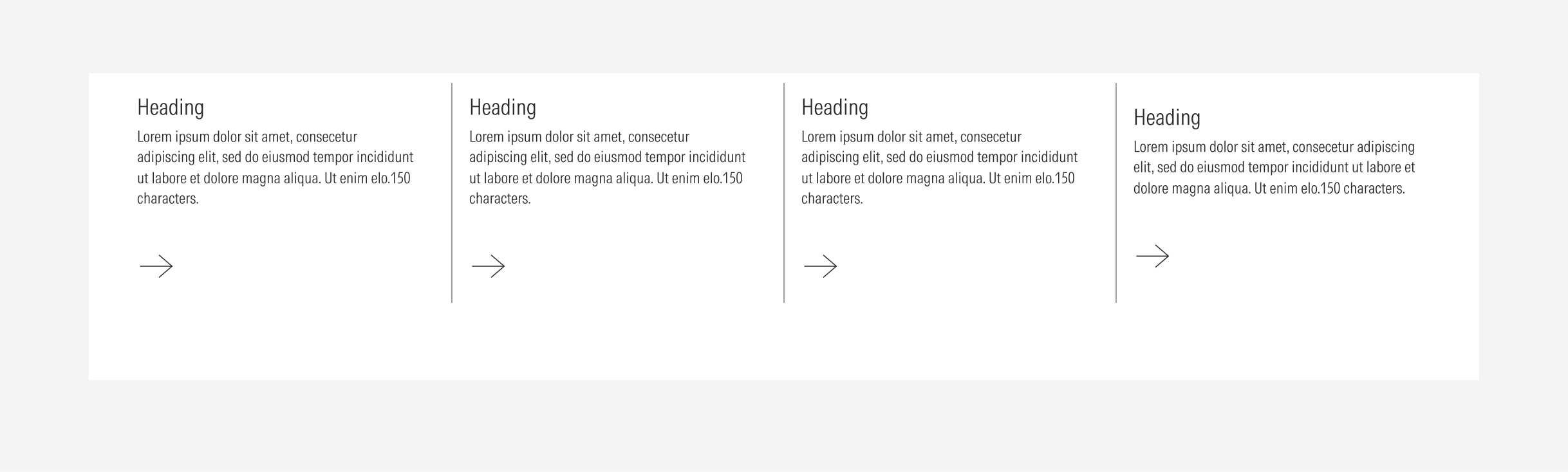
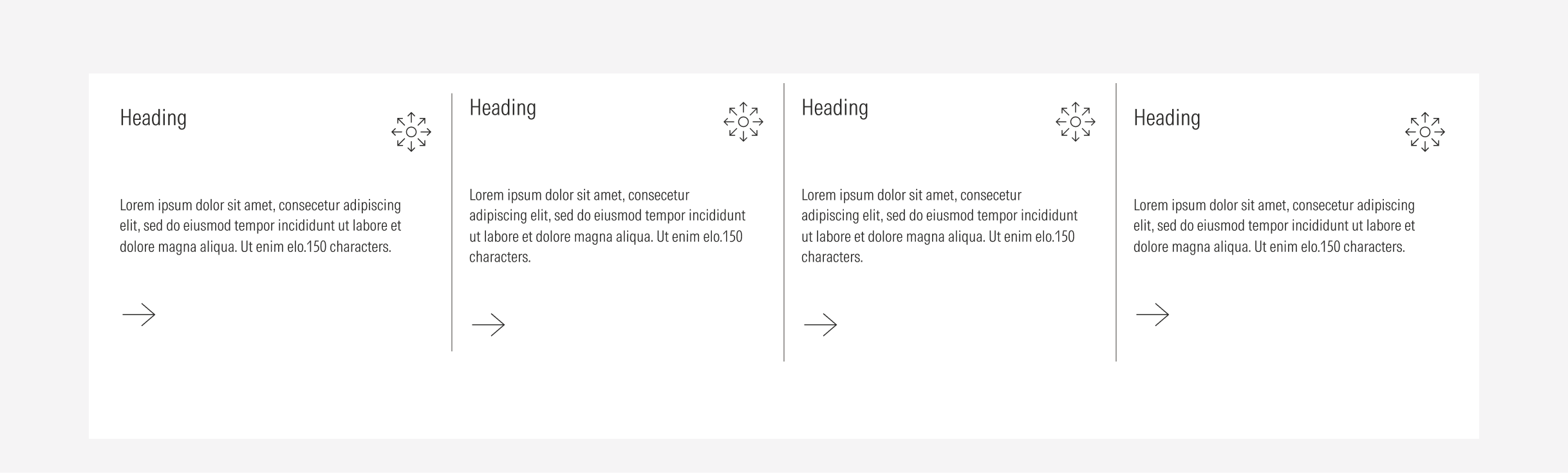
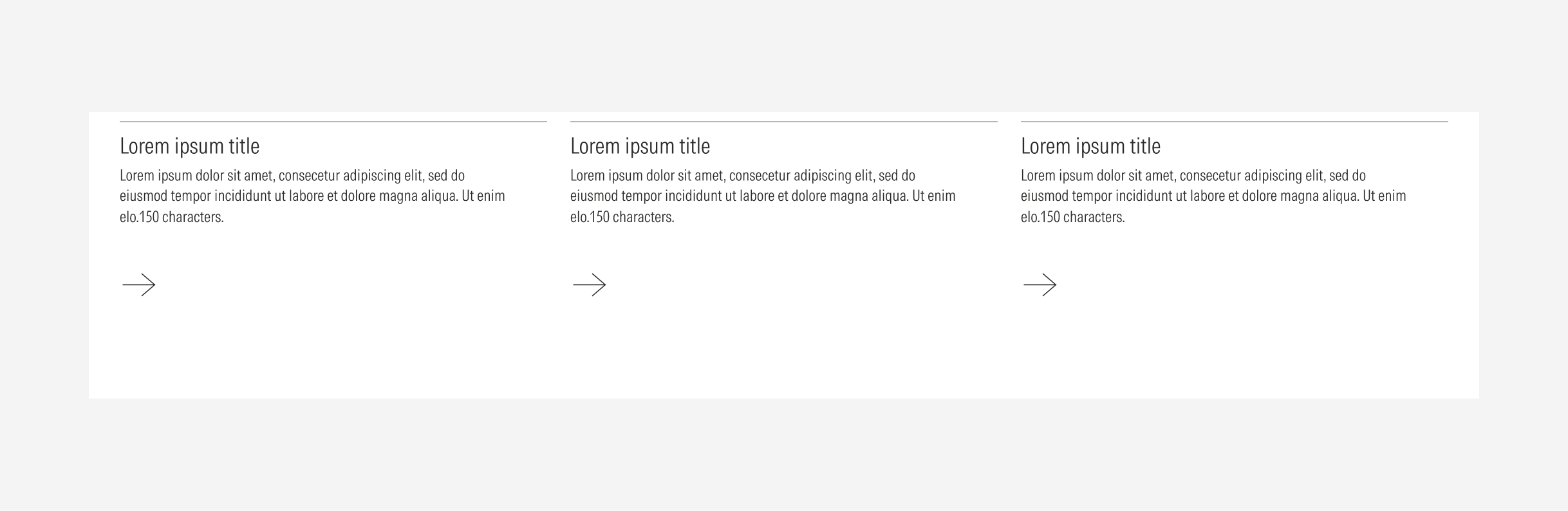
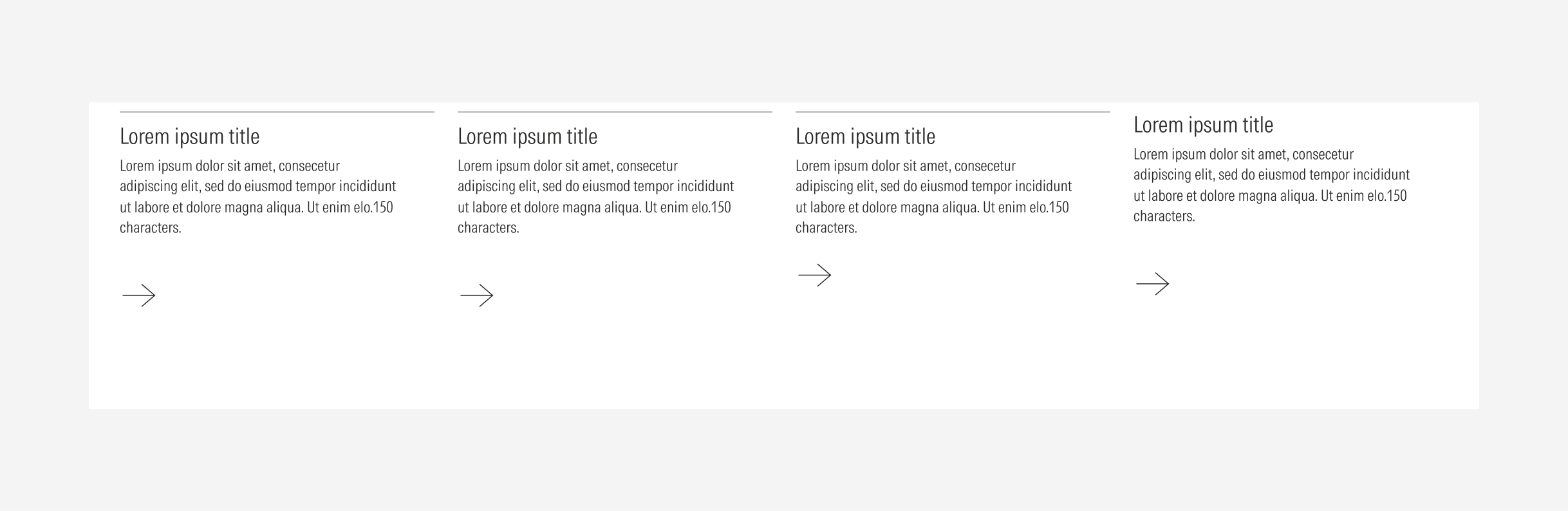
- Column configuration: 3 columns or 4 columns.
- Card spacing: gutter, tight, touching, divider.
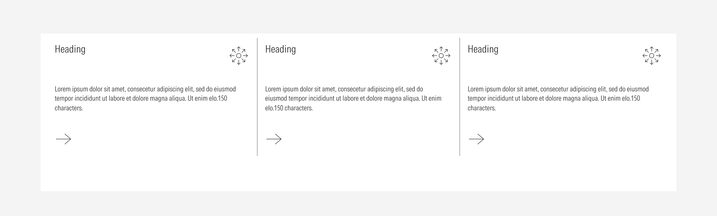
- Card type: general, animated, stat, blurb, list.
- Additional options: may include a description, and image and an icon/timer/flag.
These aspects are reflected directly in the style pack name to make each configuration easy to identify. The order follows how the fields appear in Contentstack, using the format:
- (#col) Spacing / Type / Style / Description / Image
- (#col) Spacing / Type / Style / / CTA Size / Height Size / Description / Image
Examples:
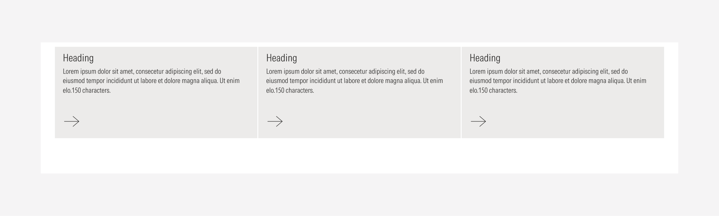
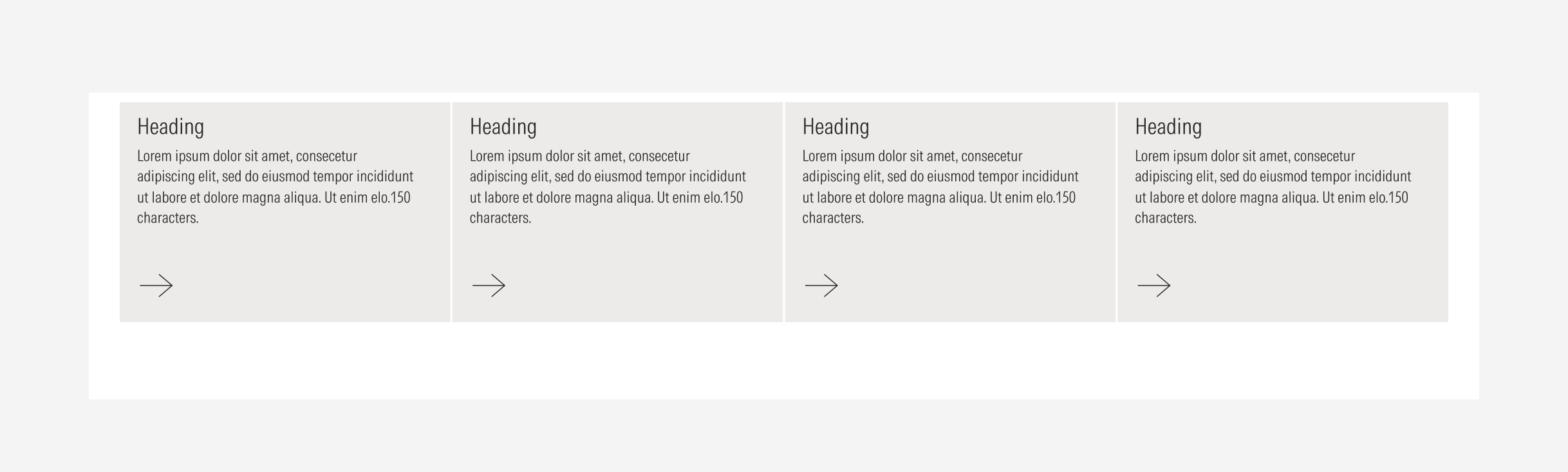
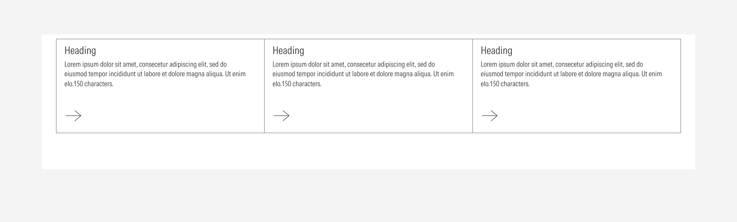
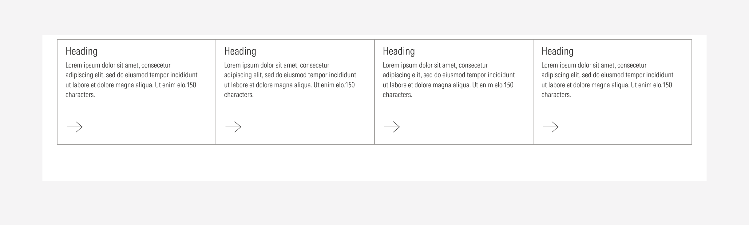
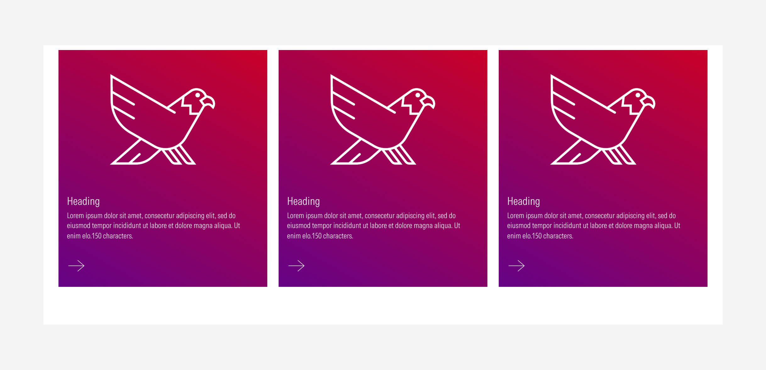
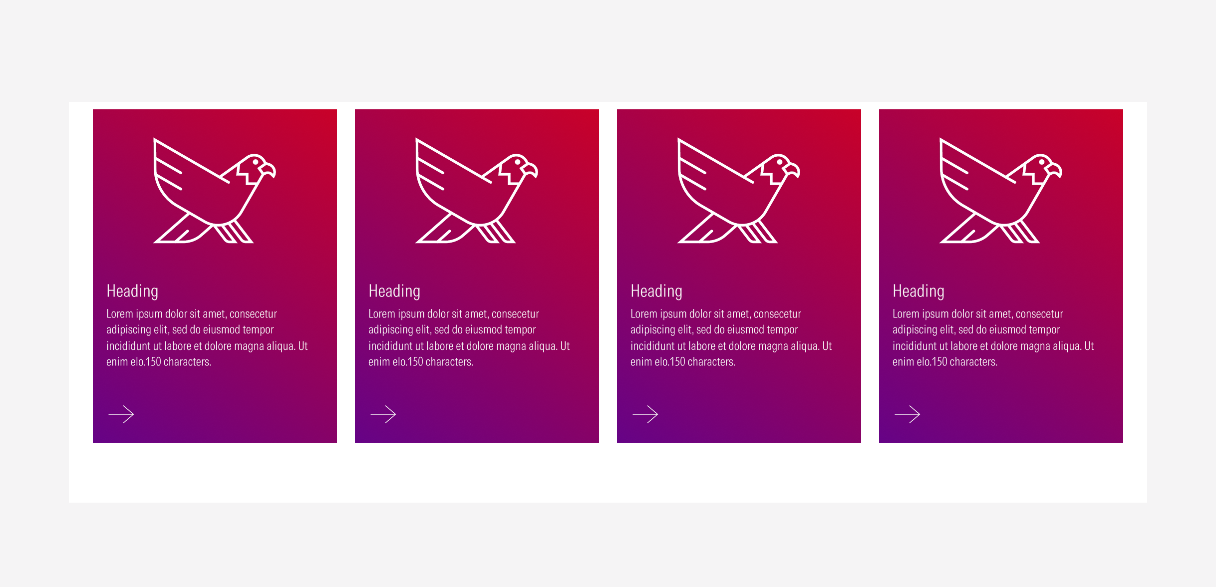
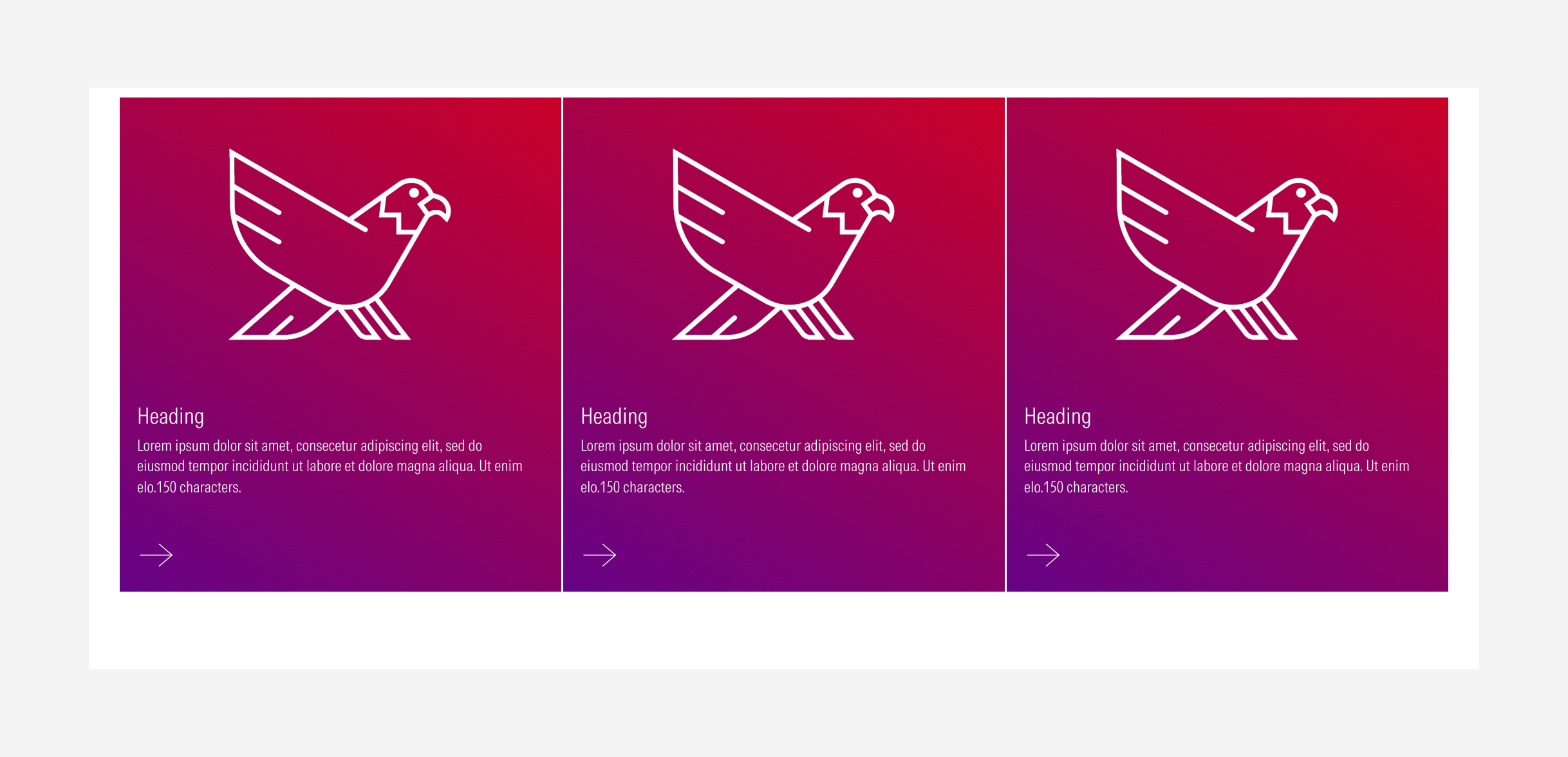
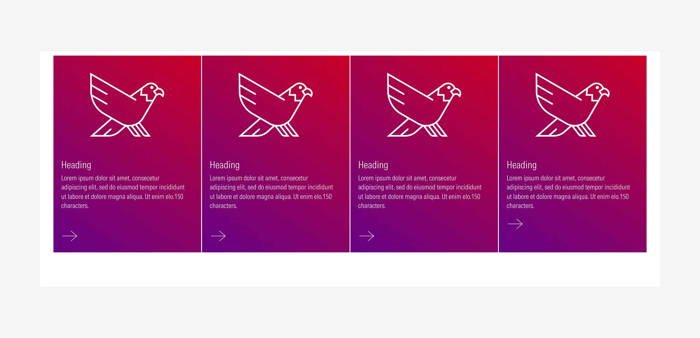
- (4col) Gutter / Fill
- (3col) Gutter / Outline / Description / Icon
- (3col) Tight / Stat / Fill / Description
- (3col) Gutter / List / Fill / MD CTA / MD Height / Description
Naming rules:
- General is the default card type and is not included in the name. Other types (stat, list, blurb, animated) must explicitly specified.
- Optional attributes such as image, description, icon, flag, or timer are included in the name only when present.
- Attributes that are not used should be omitted from the name.
- In the specific case of the list cards, the CTA size and the height size of the spacing between each, will appear on the name as well.
Styles
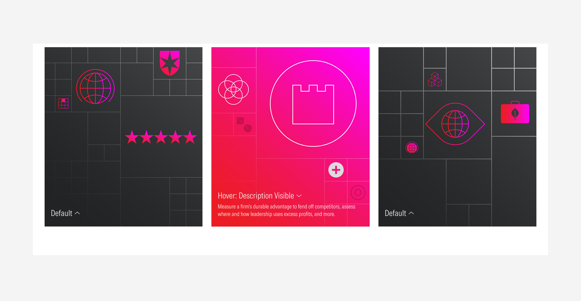
The following style packs are currently available in Contentstack, including their corresponding names and visual representations.
If you are uploading the content and you are still . not sure which style pack to use, you can use one of this 2 as default:
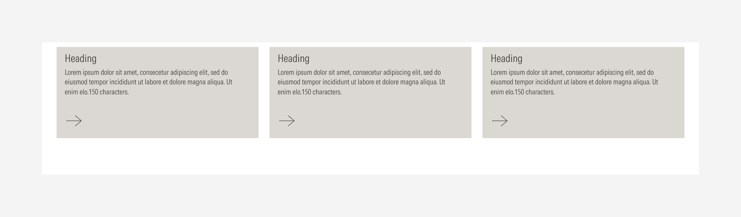
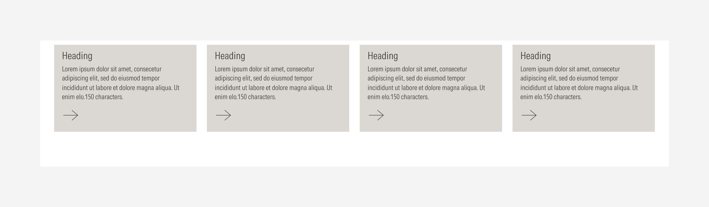
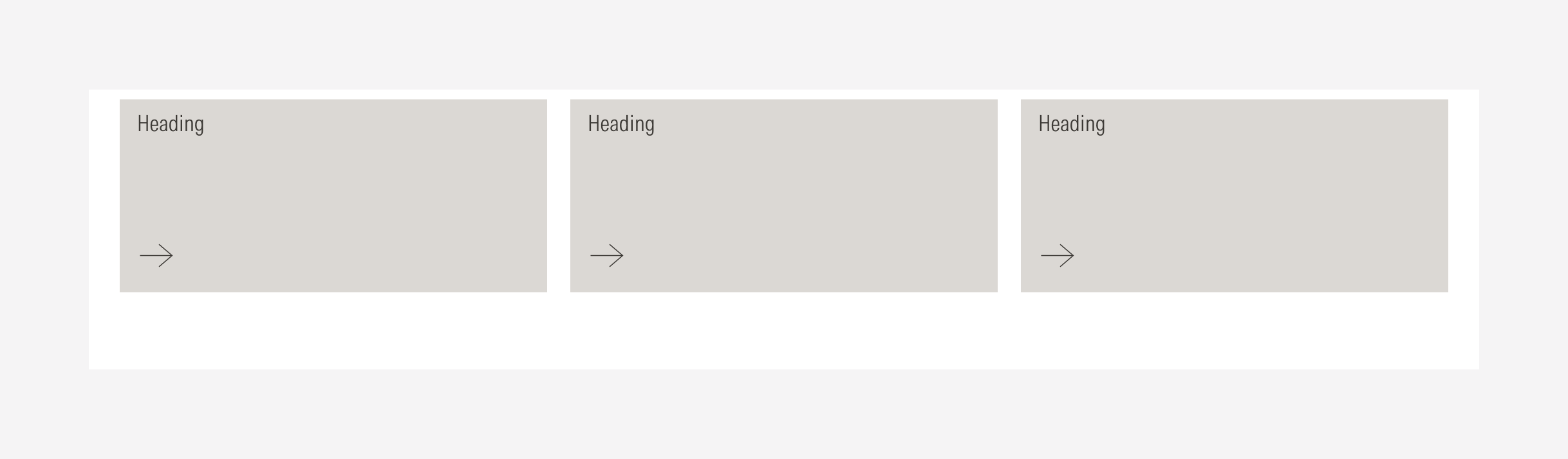
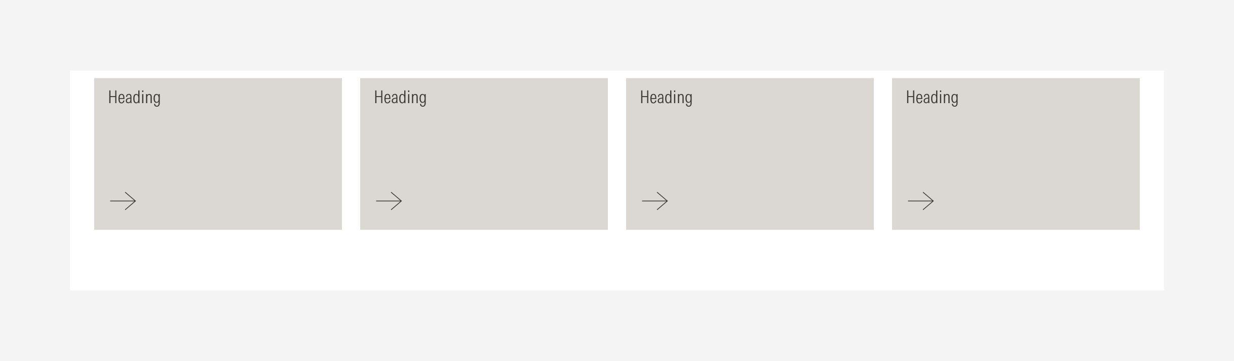
- (4col) Gutter / Fill / Description / Image
- (4col) Gutter / Fill / Description
Style Packs for General Cards
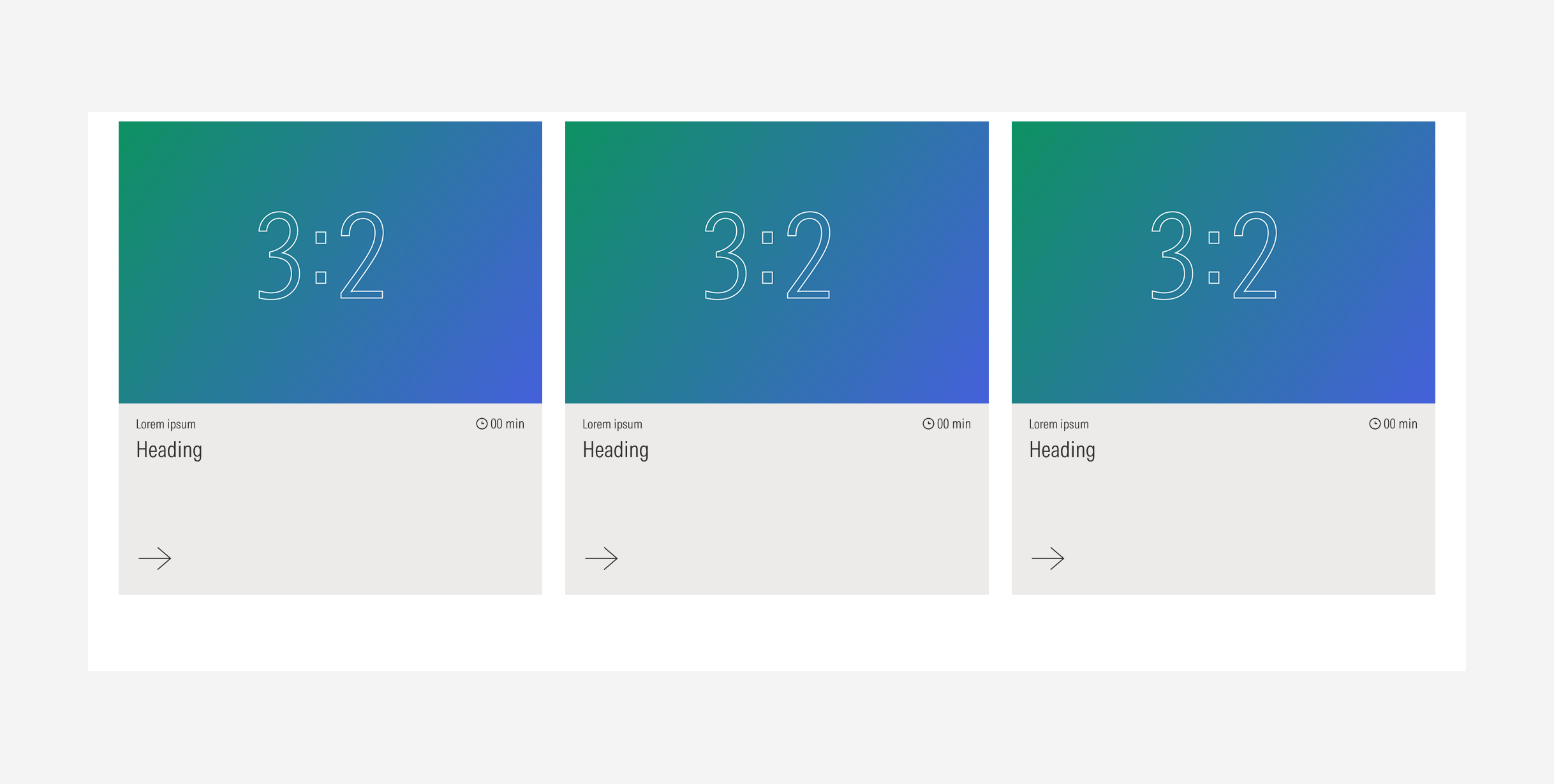
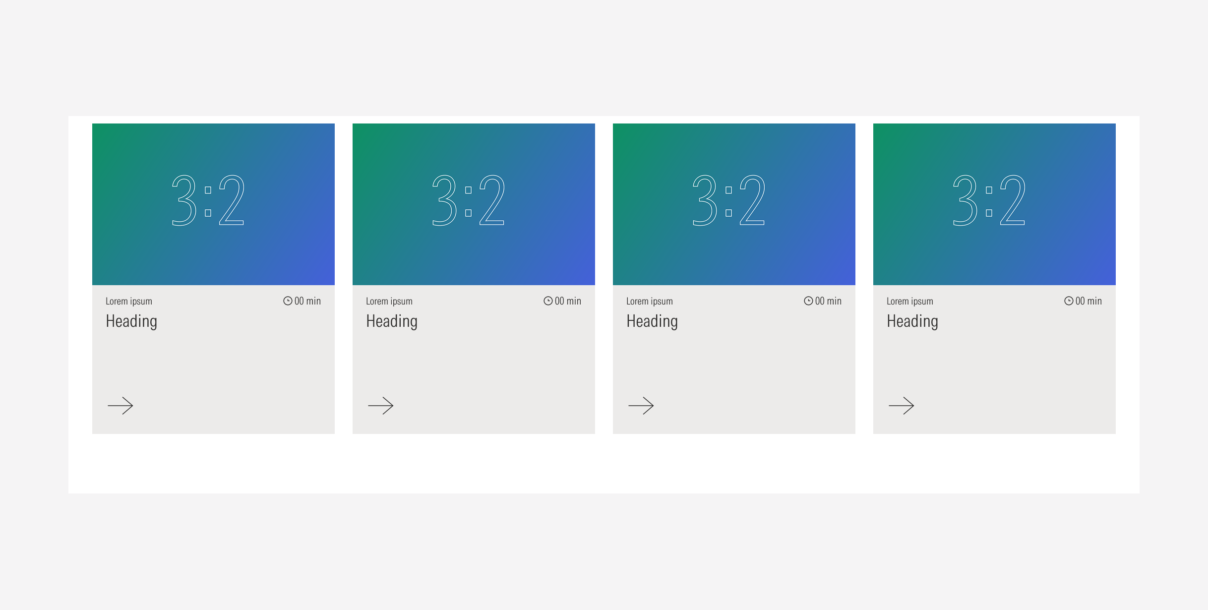
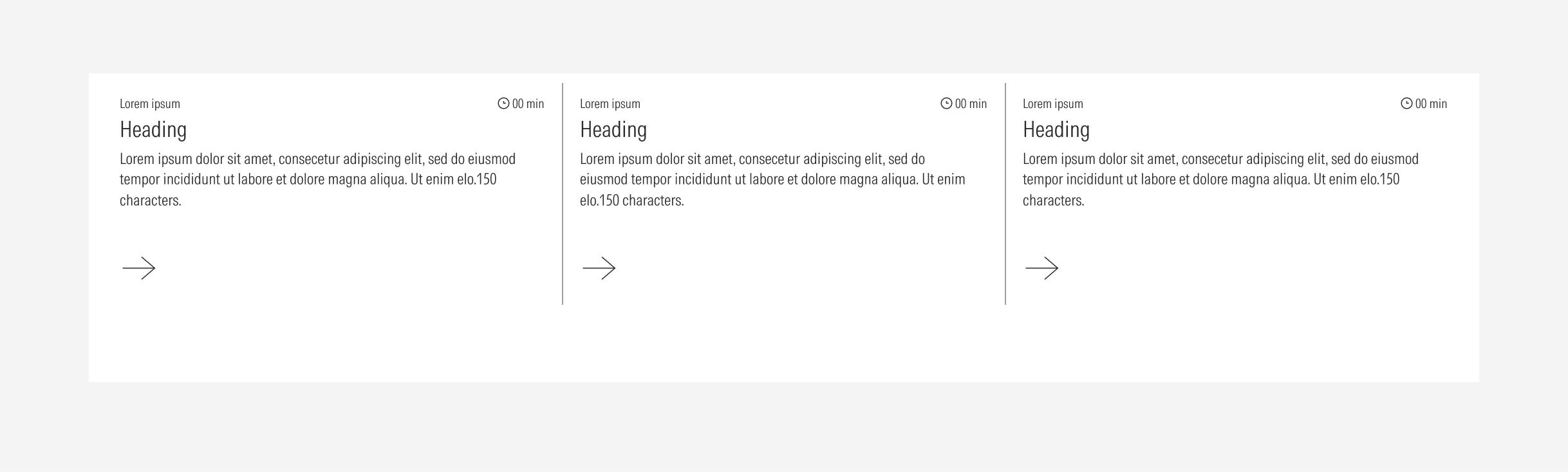
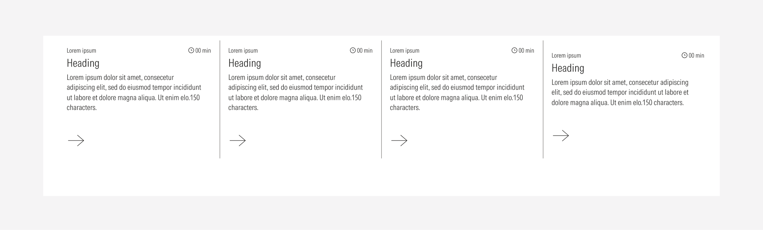
Style Packs for Stat Cards
Style Packs for Blurbs
Style Packs for Animated Cards
Style Packs for List Cards
In case you need an specific style pack that is not on this list, please contact Design to request it.