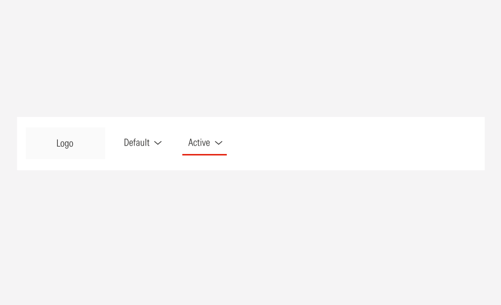
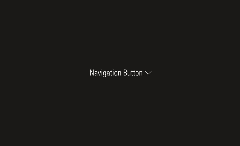
Buttons
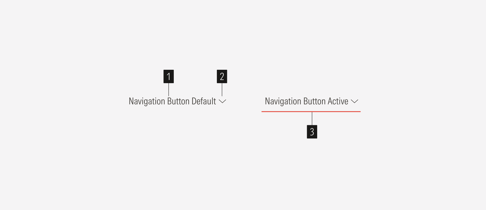
- Label sets the label of the button.
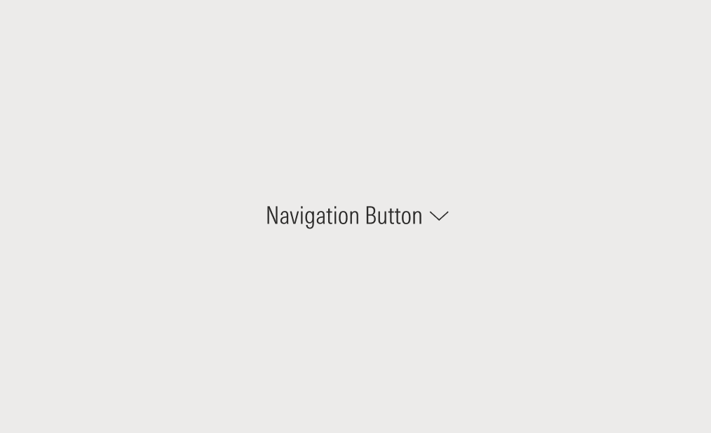
- Caret down/up icon shows that there are options. Show the icon only when the parent section has one or more children.
- Underline represents the active section on the page. It is present in the active and hover state.

Variation | Purpose | Icon | Sizes | Colors |
|---|---|---|---|---|
Navigation | Use for menu options in the top hat, site nav, page nav, and nested nav. | With icon (parent and child options), no icon (only parent option) | XL, LG, MD, SM | Neutral, white |
With Icon
Add a caret-down icon when the parent option has children.

No Icon
No icon should appear when the parent option has no children.

Default
The default state shows the button as it appears on the interface with no user interaction, serving as the neutral baseline for all other states.

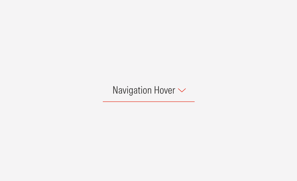
Hover
The hover state communicates interactivity and signals that the button can be clicked. It should provide clear change from the default state without creating confusion with other states.
Pressed
The pressed state represents the exact moment when a user clicks or taps the button. It communicates that the interaction is being registered.

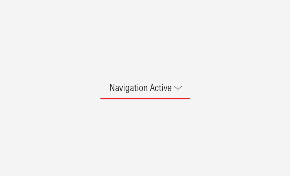
Active
The active state indicates the user’s current page and remains visible for the duration of their time on that page, unlike the momentary pressed state.
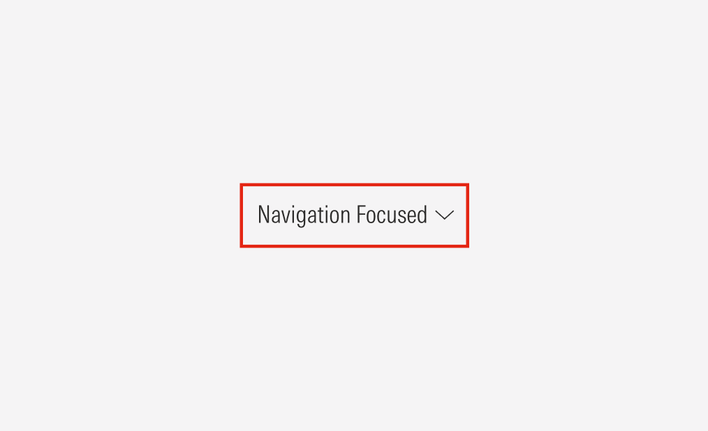
Focused
The focused state indicates the button is the current target for keyboard or assistive technology interaction, helping non-mouse users identify the active element.
Disabled
The disabled state communicates that a button is visible but unavailable for interaction. It should look clearly inactive while still being legible enough to inform users of its purpose.


Alignment
The alignment of the navigation buttons in their container should follow a right-justified pattern. The navigation component and its alignment change for the SM and Default view-ports.
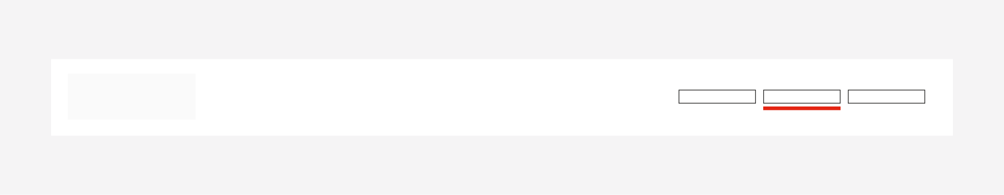
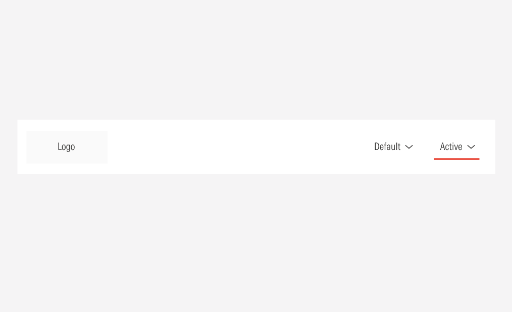
Do place the navigation buttons at the right of the navigation bar.
Don’t place the navigation buttons following the logo, left-aligned.


