Cards
The animated card component has a similar base structure as the full-bleed background image general card. The major characteristic of the animated card, is that (as its name points out) it has an animation.
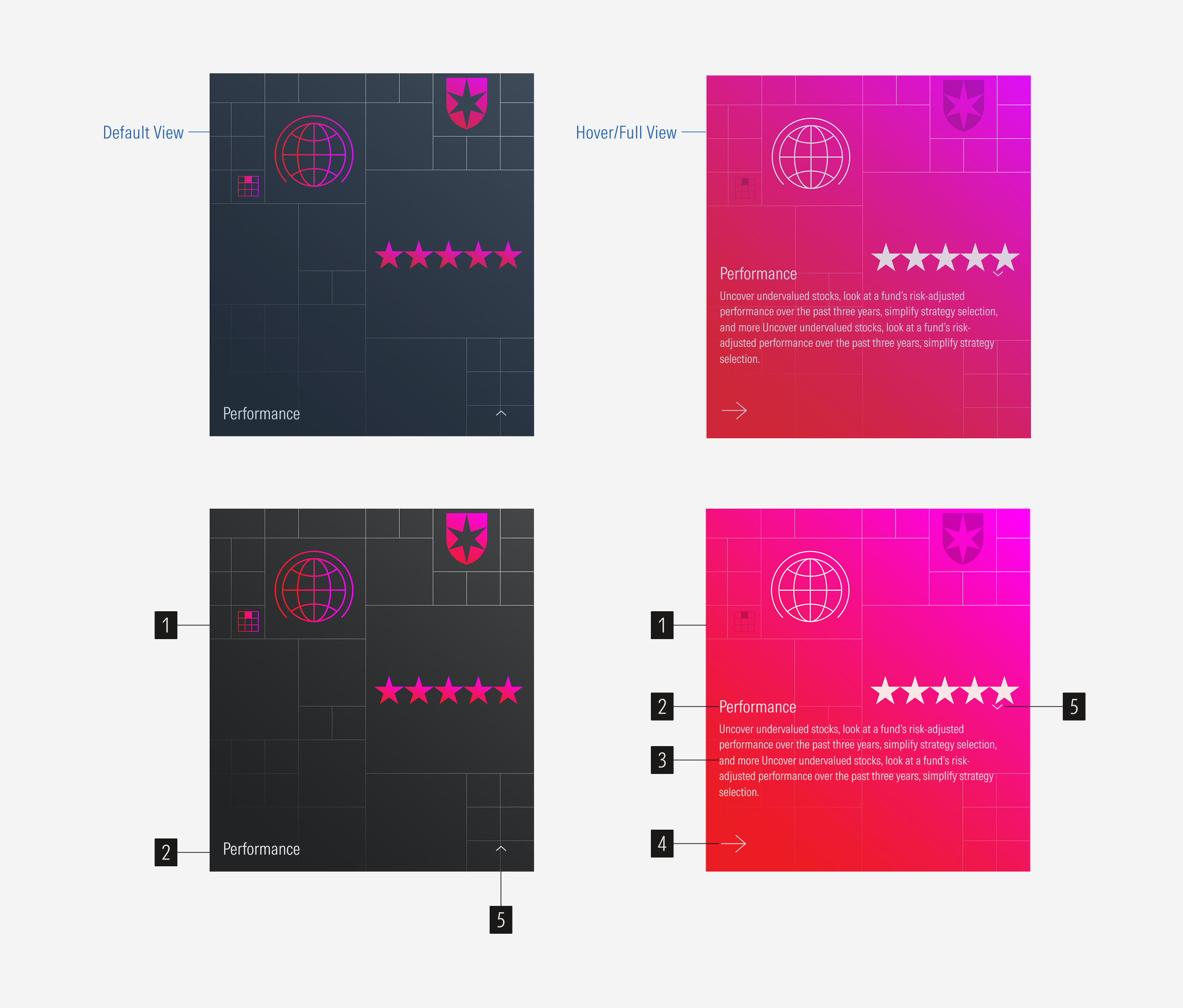
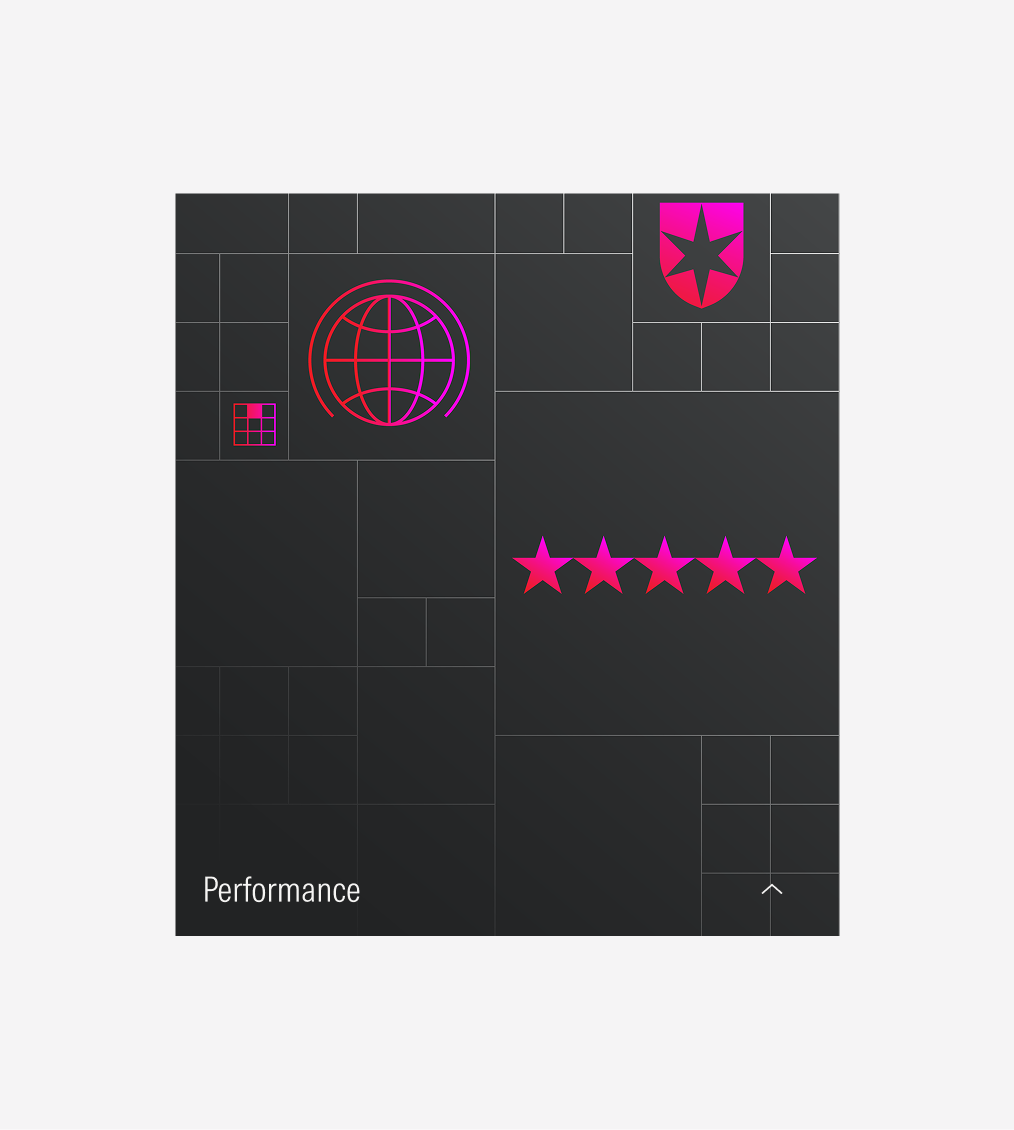
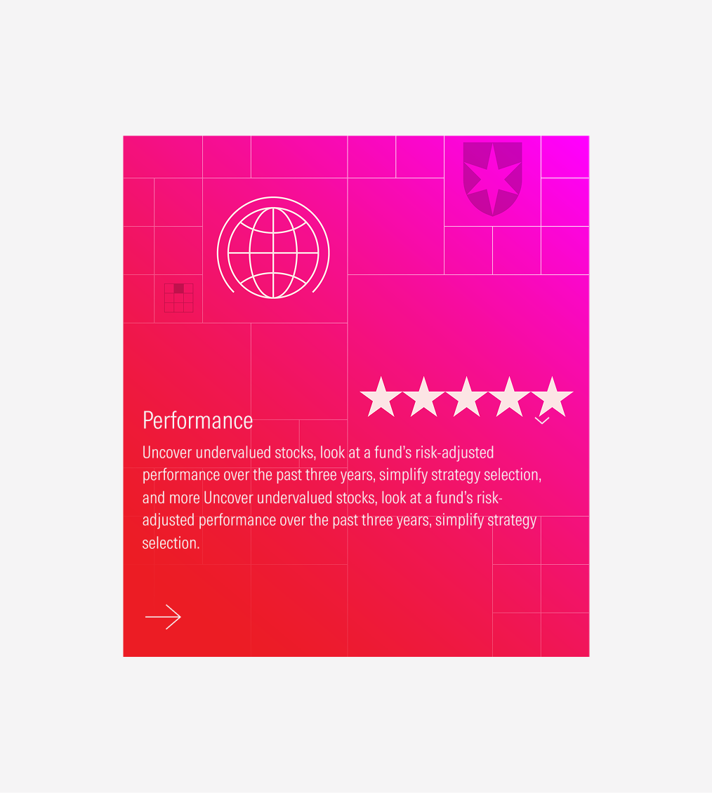
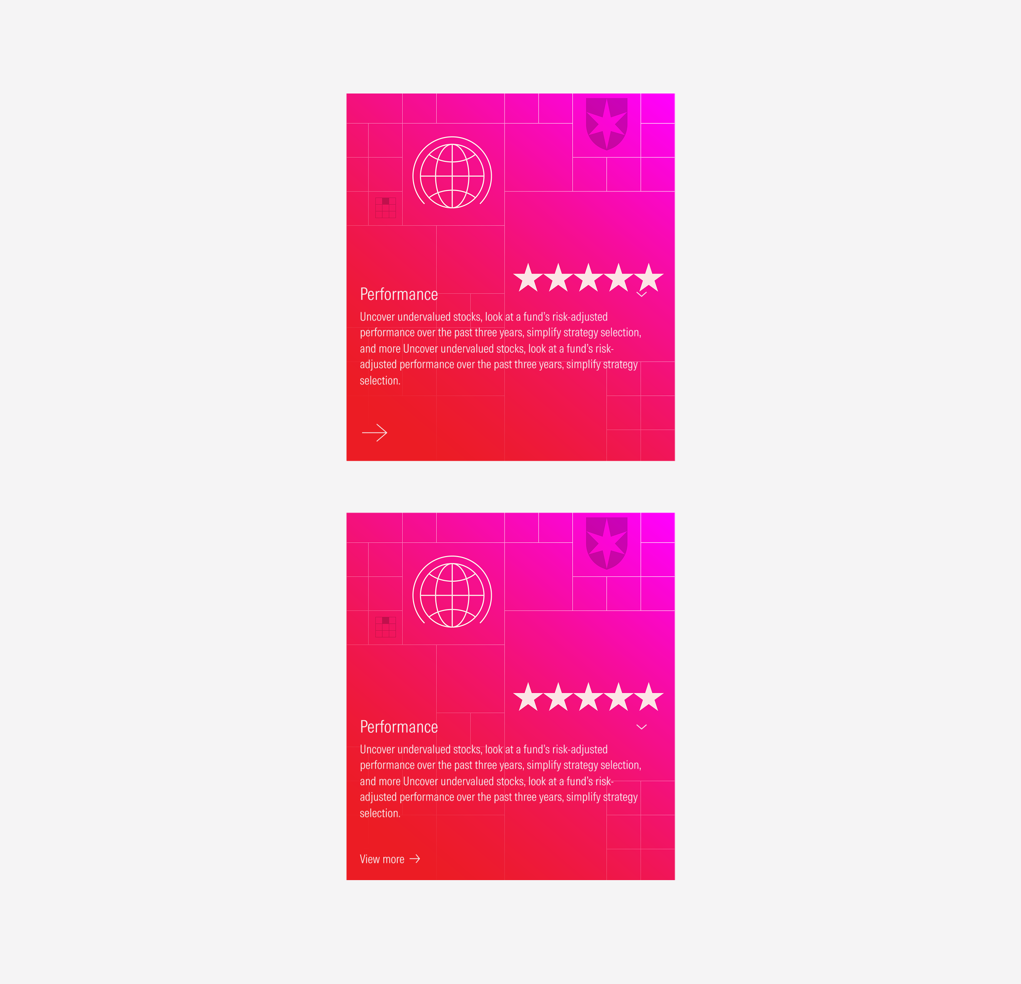
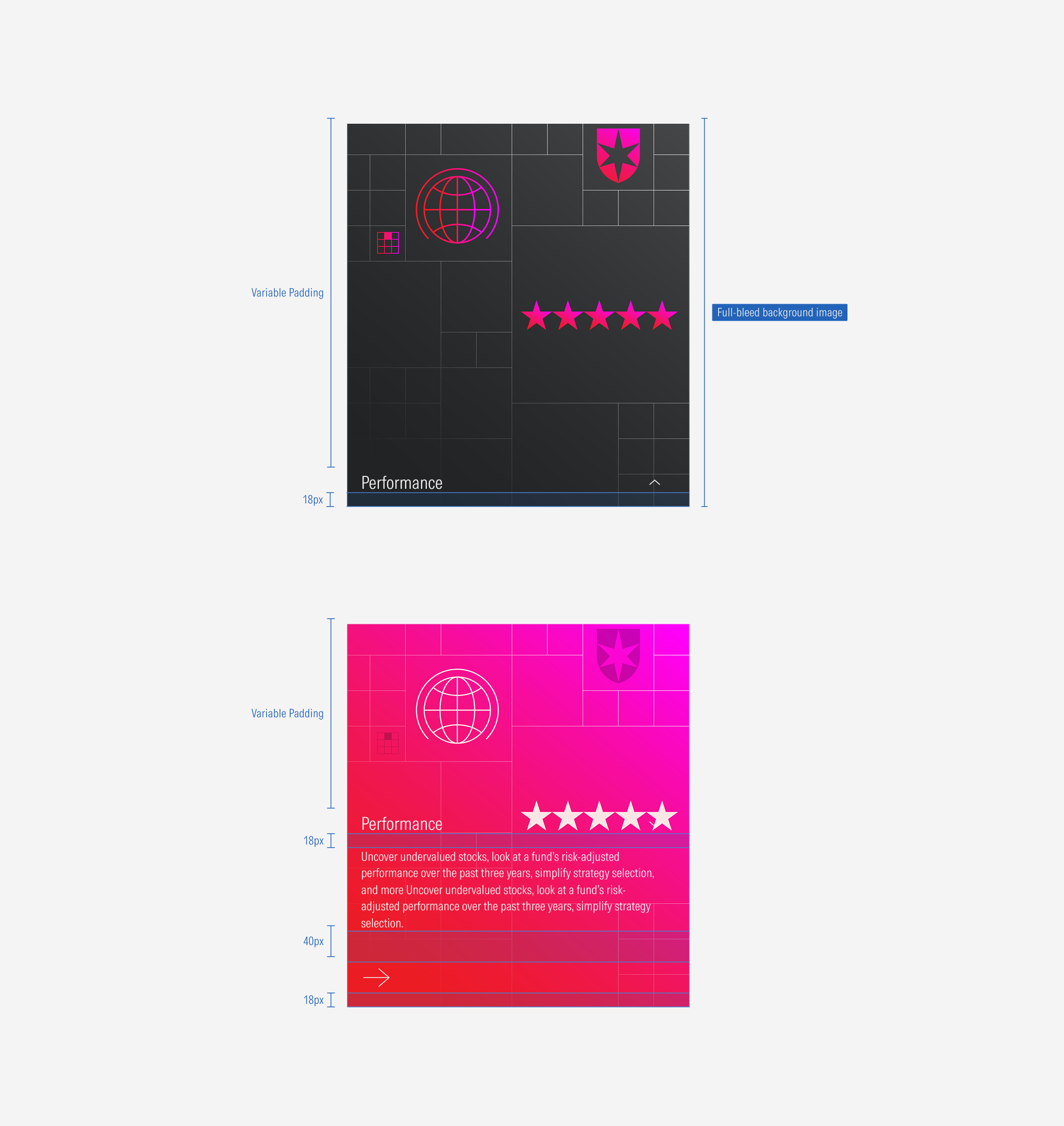
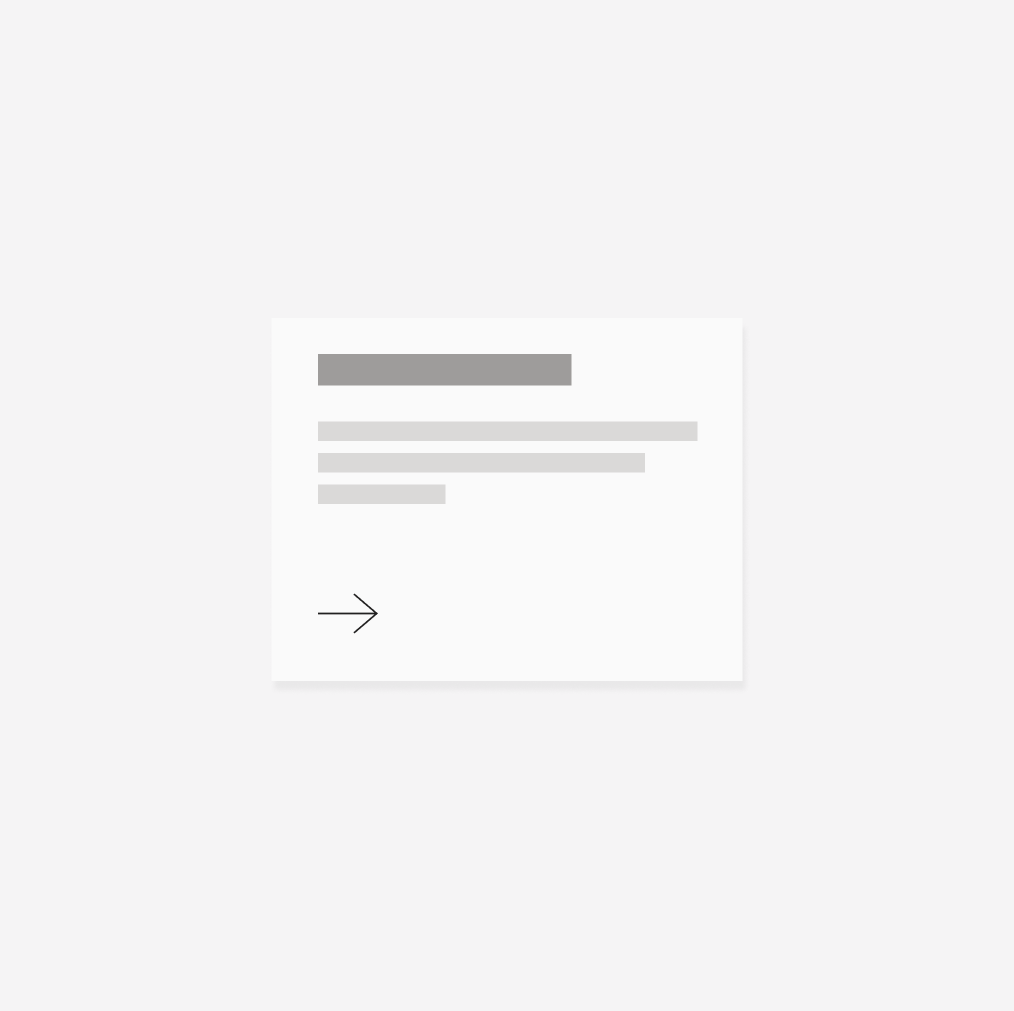
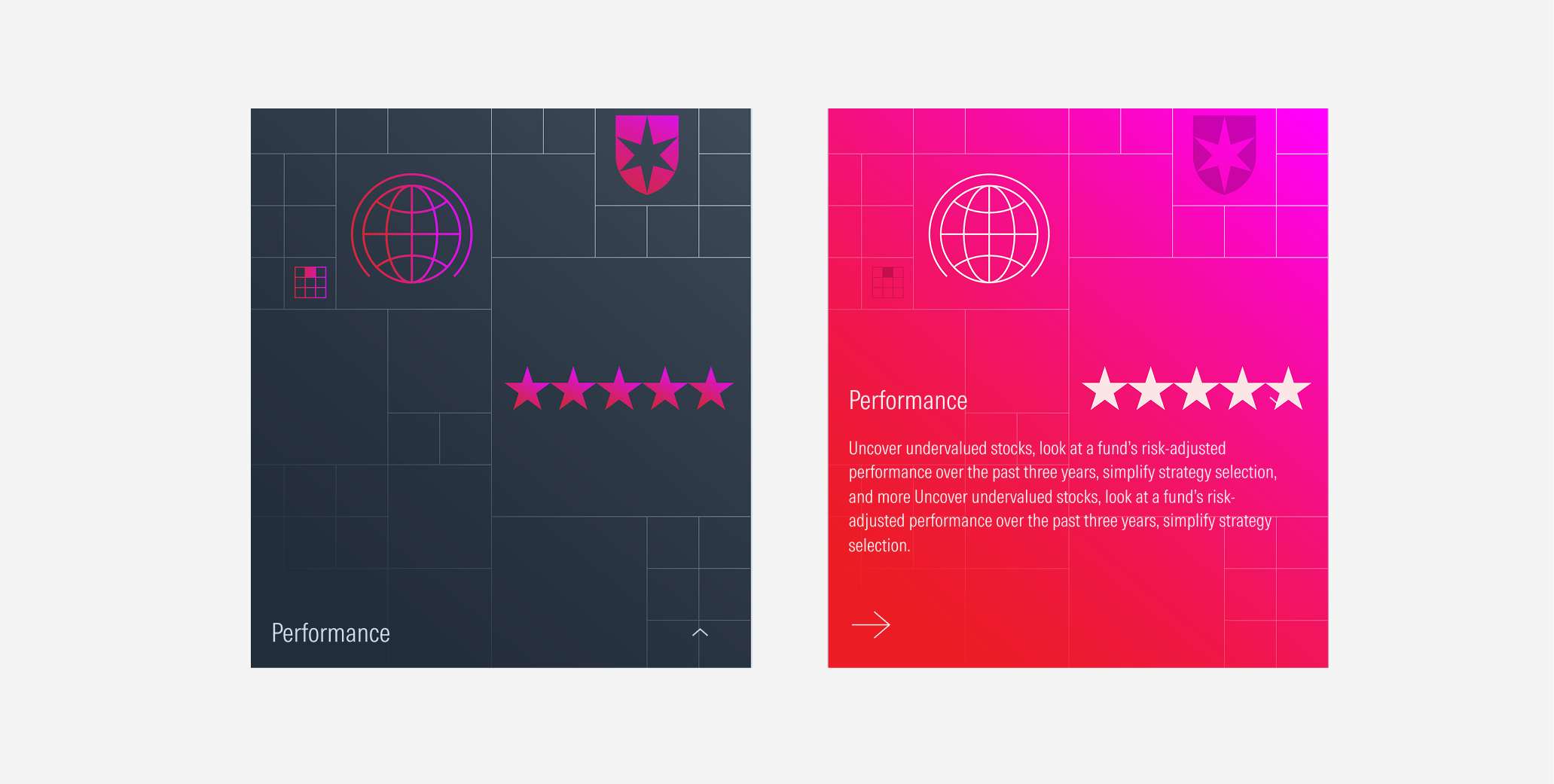
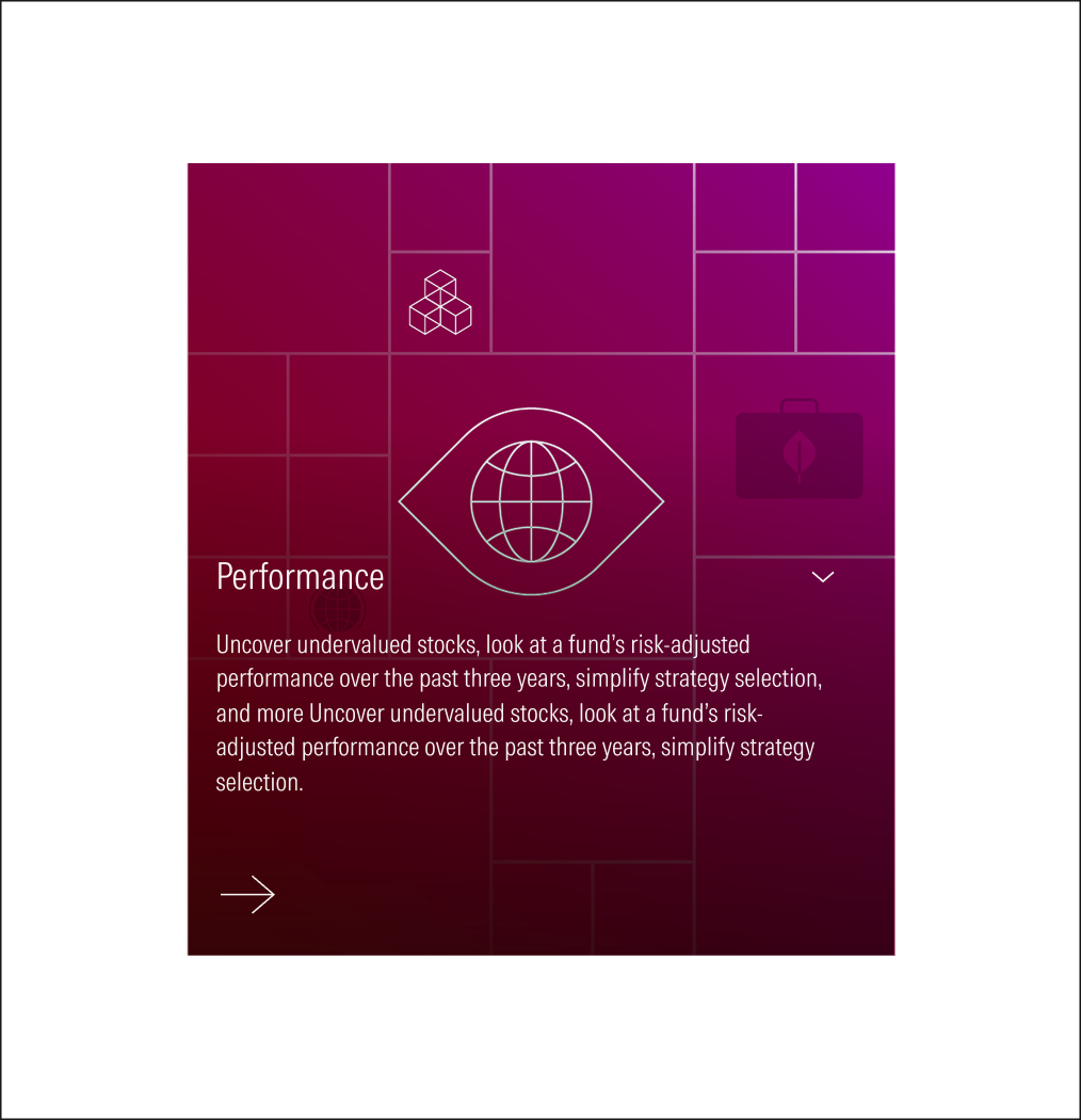
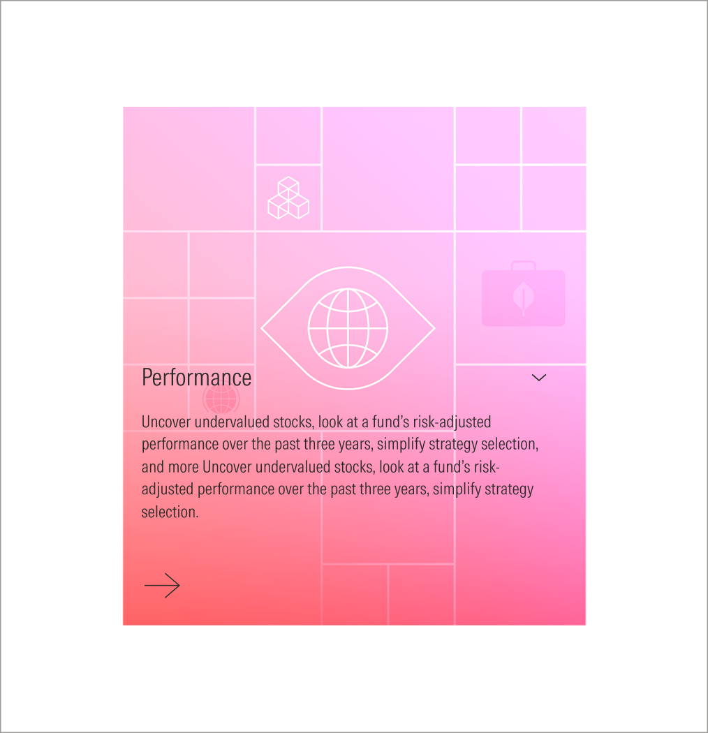
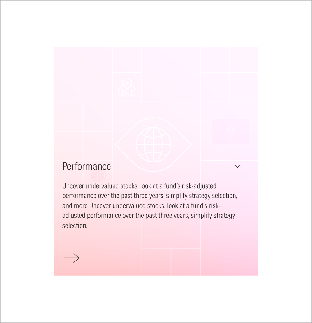
- Background Image enforces the content of the card. It is a full-bleed image, takes the height and width of the card.
- Title sets the topic for the card. Has a limit of 75 characters.
- Body gives more context. It is optional. Has a limit of 100 characters. It appears at the hover view on the expanded size.
- CTA enforces the user to take an action and see more about the content. It can be a tertiary icon-only button (large right arrow) or a tertiary button (label and right-arrow icon).
- Caret Icon guides the user to interact with it. The caret-down displays the info below the title, and the caret-up icon hides it.
Usage
When to use
Use animated cards to represent more general content such as sections, categories, features or strategies. They will work as an anchor to get the user’s attention and give an idea of the content at the same time.
When not to use
Don’t use animated cards when the content is more specific and detailed, when you need to have a longer copy, or when you need to present a list of links. Use general cards or capability cards instead.
Variation | Purpose | Image | Text | CTA |
|---|---|---|---|---|
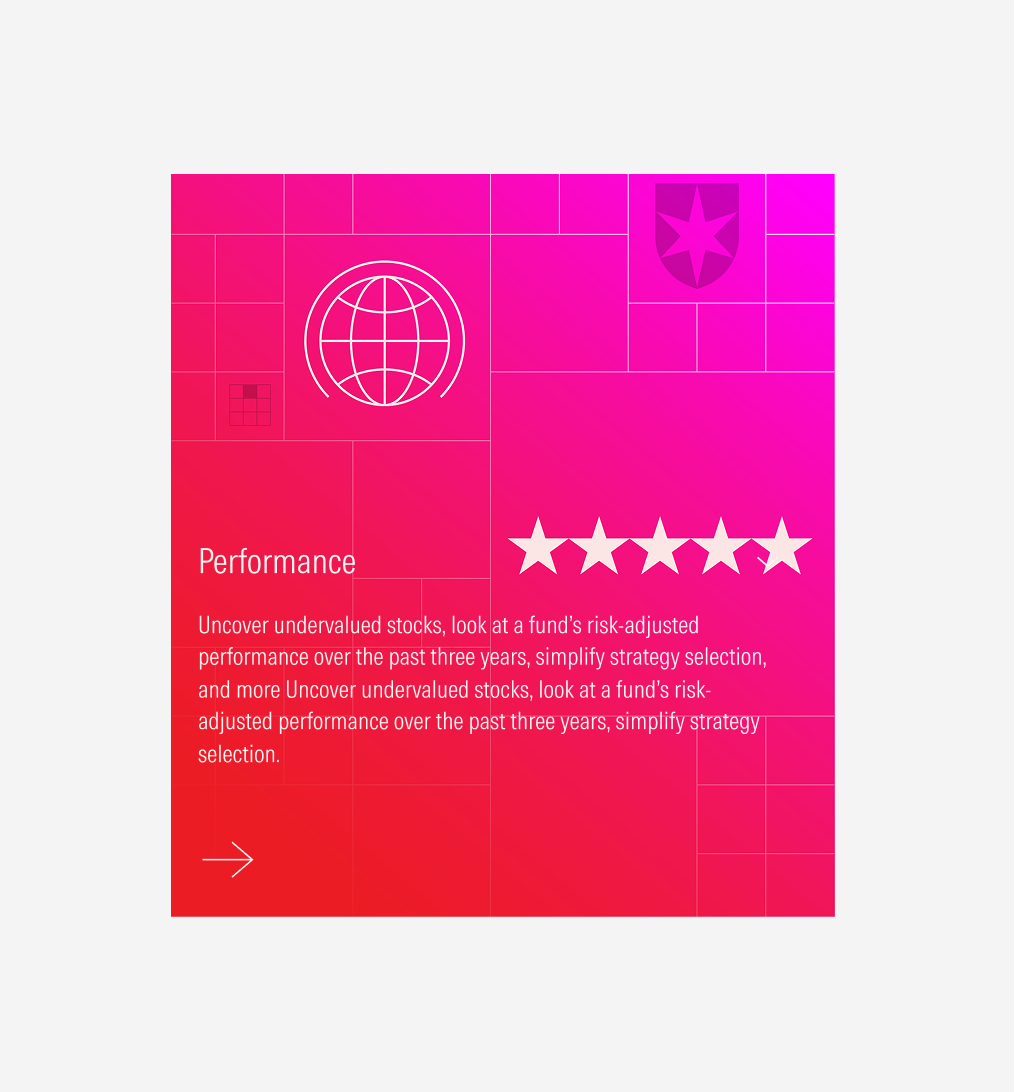
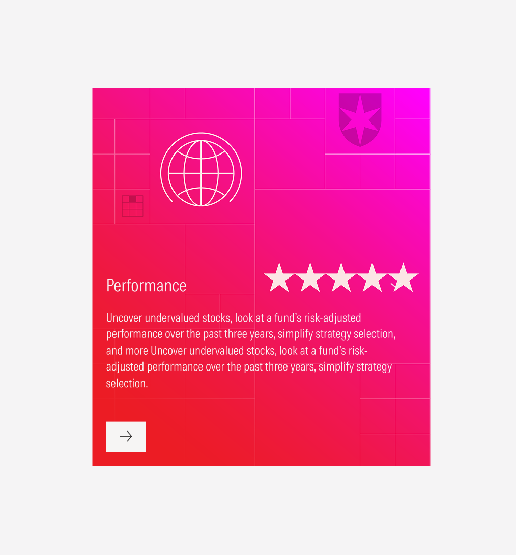
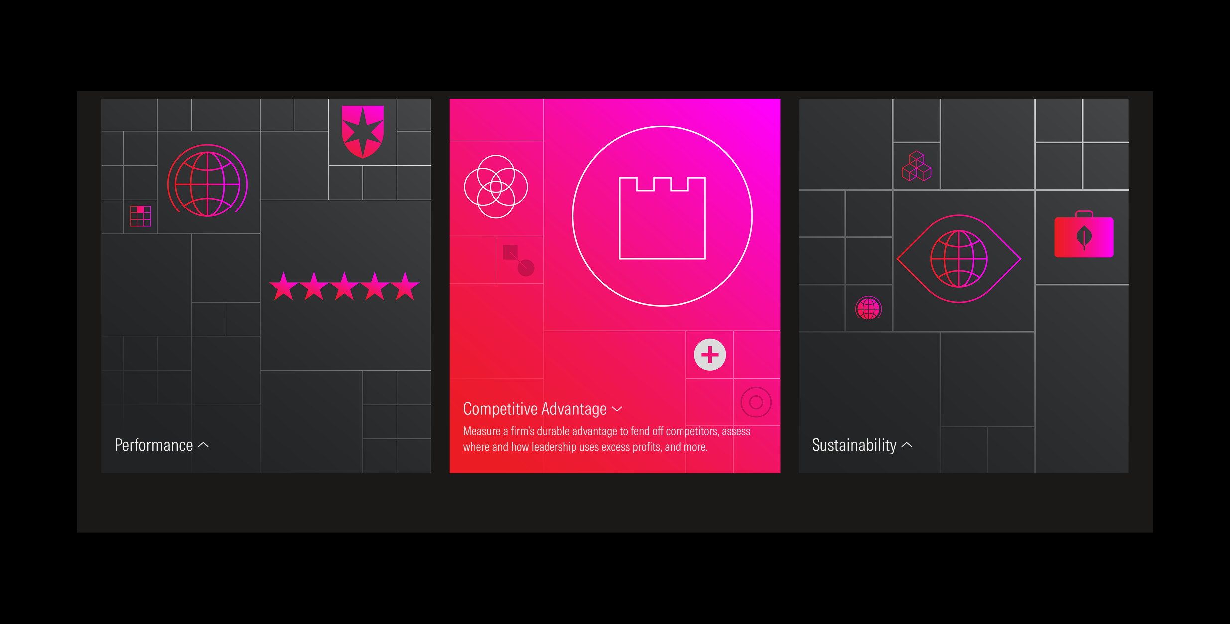
Default view | Use on extended view-ports as the default view. | Background image 1 | With title, hidden body | Hidden CTA |
Hover/full view | Use on extended view-ports as the hover view, and on compact view-ports as the full (only) view. | Background image 2 | With title, with body | With CTA (tertiary button: icon-only; label and icon) |
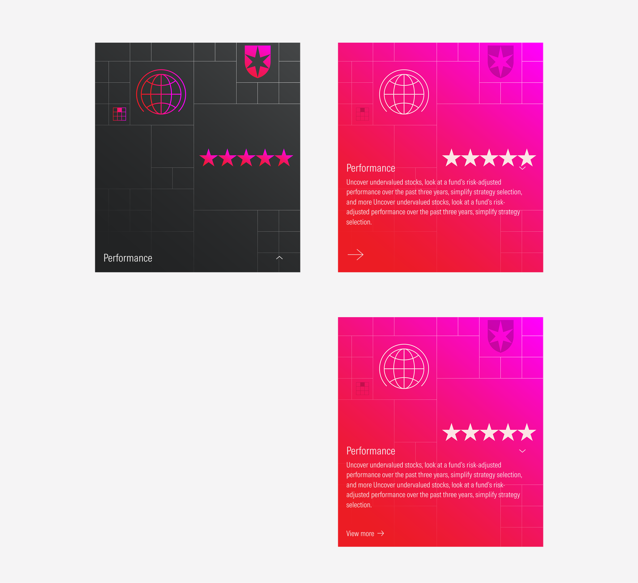
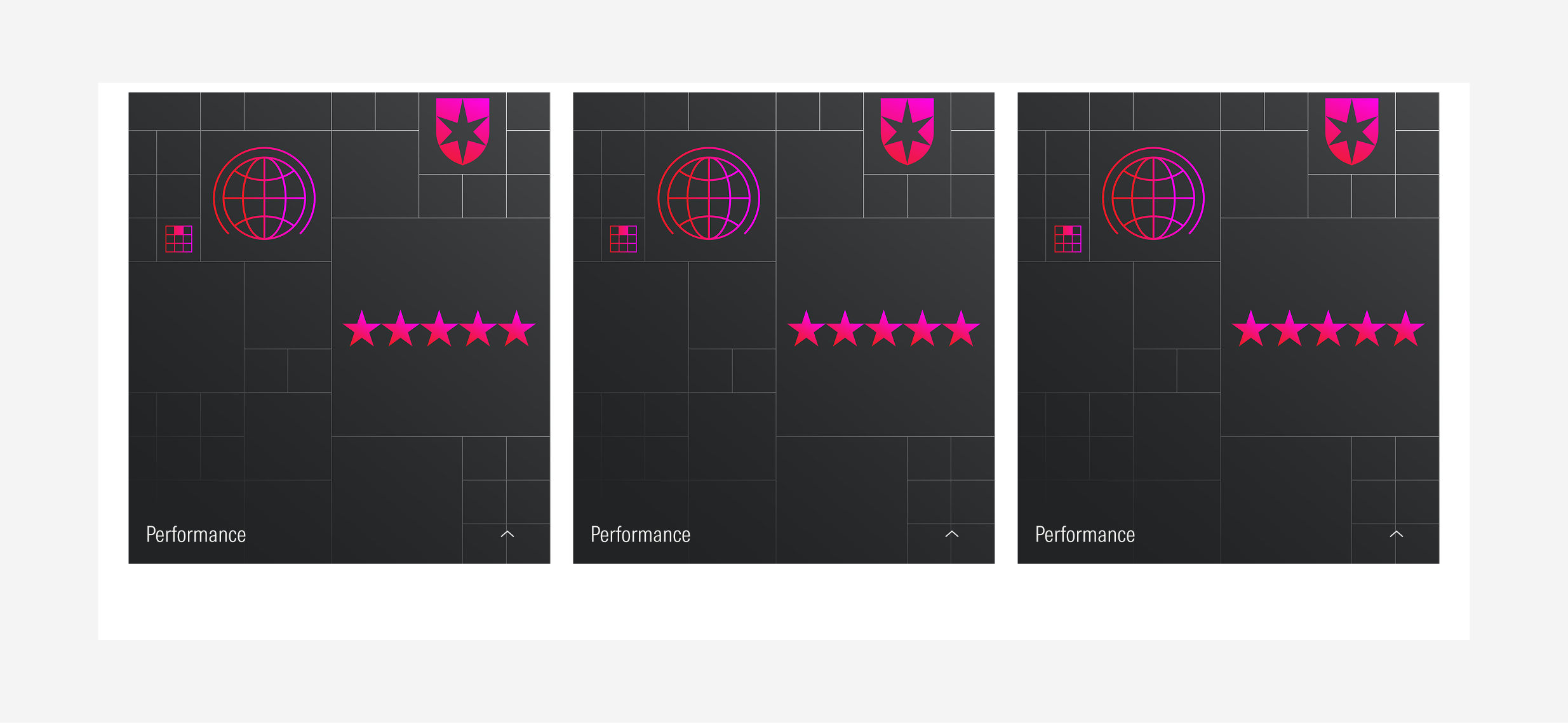
Compact
For the compact view-ports, the animated card won’t have an animation and will only display the hover/full view. The hover/full view can have an icon-only tertiary button with the right arrow or a tertiary button with the label and the right arrow icon.
Card Container
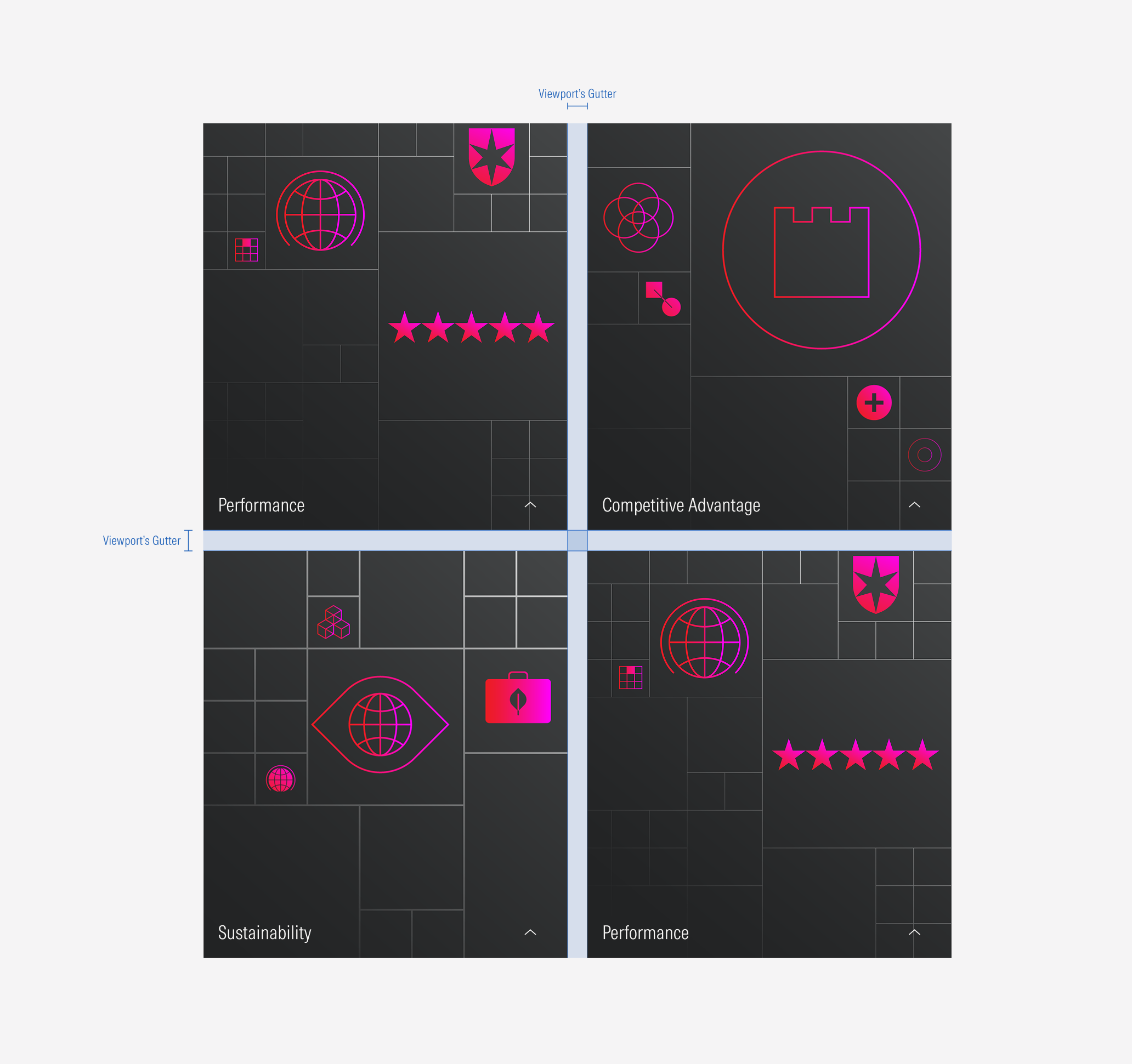
To have a consistent behavior, a standard spacing and sizing between a group of cards, a card container can be used. Take a look at the Card Container guidelines here.
Spacing
Ensure that proper space is given between each card item. The distance between each item will depend on the card variation.
Ensure that proper space is given between each card. The vertical and the horizontal space between cards, should be the same as the gutter of the view-port. (More details about card grouping at the card container guidelines).
Hierarchy
A proper hierarchy must be ensured for the elements that compose the animated card. The title, with the highest level of importance, needs to give a clear and short idea of the topic of the card content, inviting the user to know more. The title will be visible in both views (default and hover/full). The CTA of the card will be at the bottom and it should be a tertiary button (with label or icon only). Images should have two color variations (for its two views) and placed as the card background, filling the card space.
Alignment
The texts and CTA are left-aligned. The image is centered and full-bleed as the card background.
Do use a tertiary button as the CTA for the card. It can be with a label or icon-only.
Don’t use a primary or secondary button as CTA for the card.
Behavior
Clickable Cards
Cards are components that by definition need to have an interaction. In case of animated cards, actions can be exposed by hovering the card (this displays the body text and the CTA), and by clicking the CTA.
The animated card on expanded views has two actions: hovering the card the text block (title, body and CTA) are pulled up with a smooth motion, and by clicking the CTA the action is triggered.
On the other hand, for compact views, the animated card has only one action: by clicking the CTA on the card, the action is triggered.
Hovering Transition
The motion behavior only exists for extended view-ports. This transition from the default view to the hover/full view-port has a change on the background image when hovering the card at its default view. While hovering, the body and the CTA from the text block are revealed.
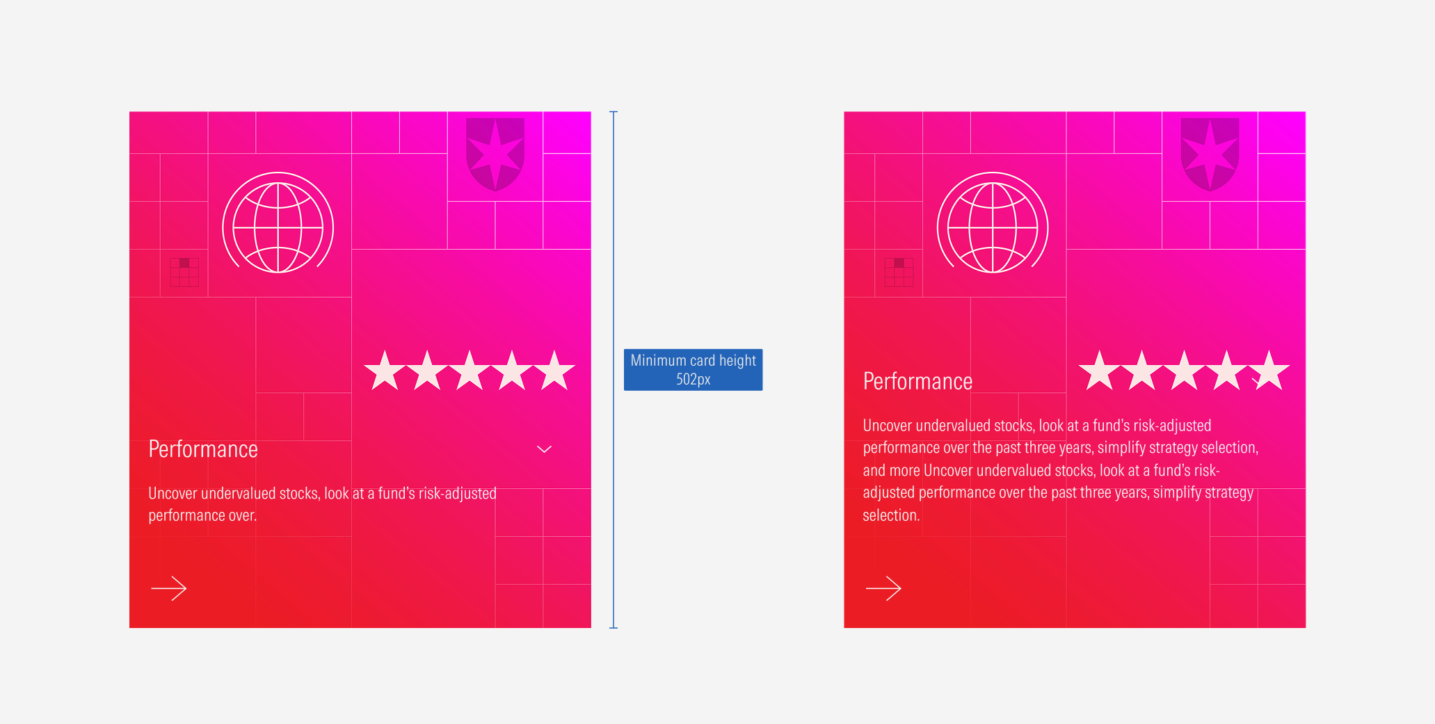
Flexible Height
As same as the other card types, the animated cards will also match sizes across rows to the tallest card. Keep in mind that the card can become taller, but the height can’t be less than 502px.
Group of Cards