Cards
Cards group related information in a flexible-size container. Cards are widely used across the Morningstar B2B web experience to contain and present specific information.
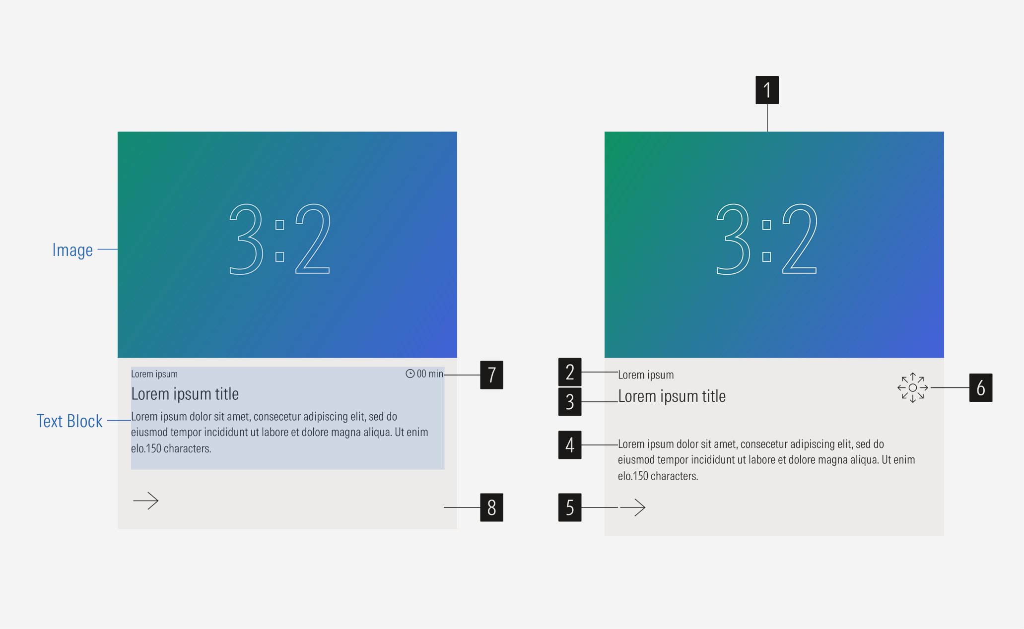
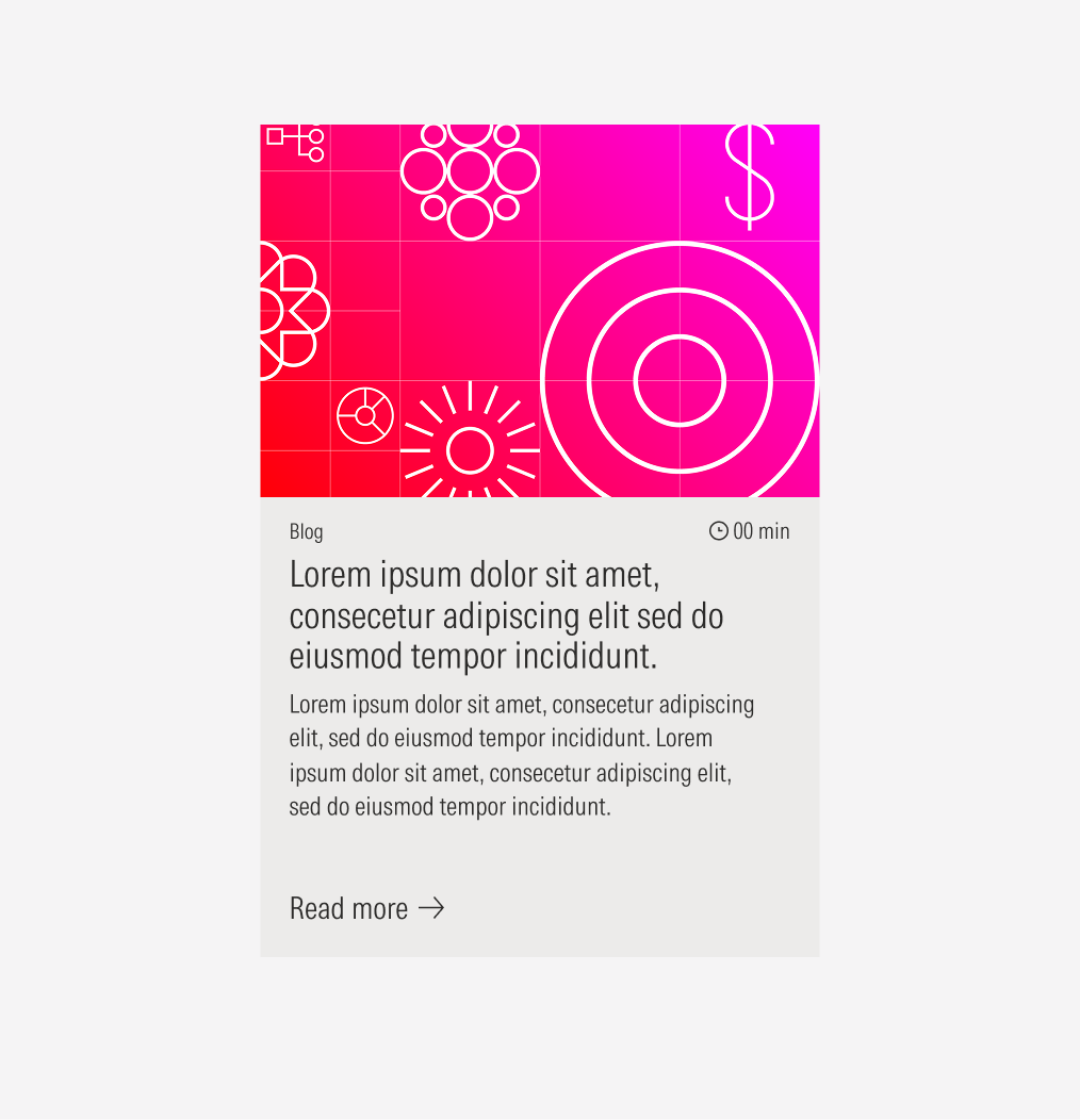
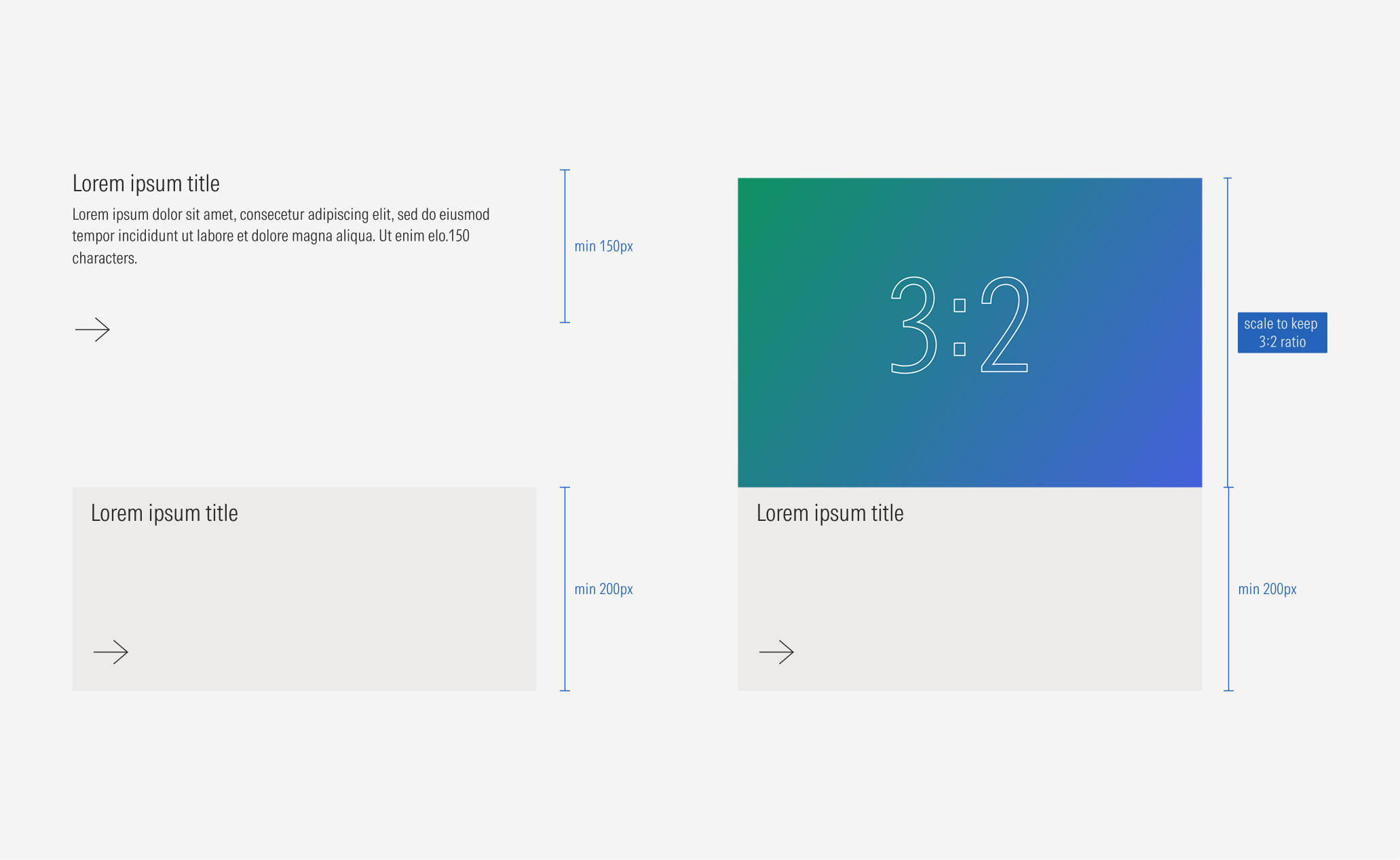
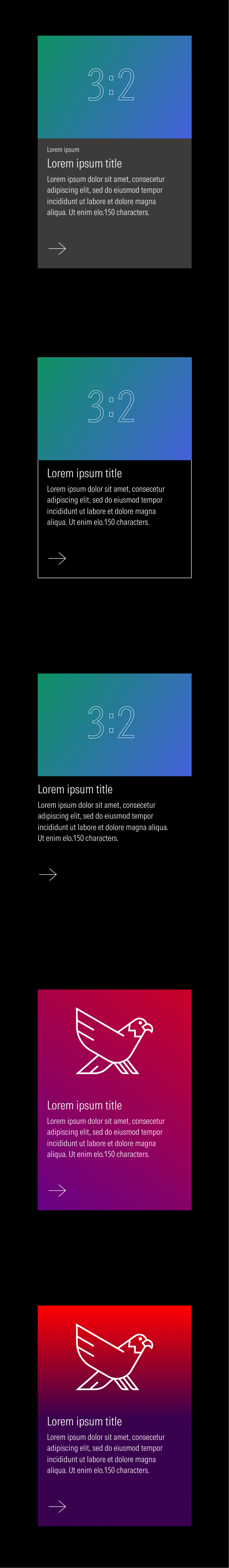
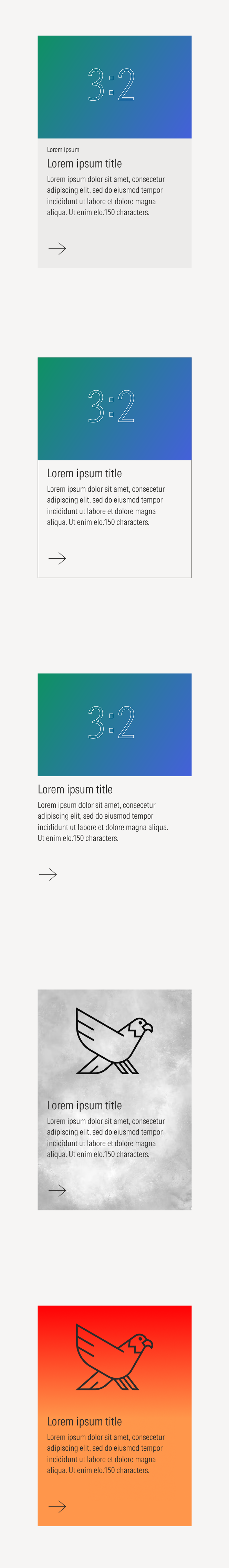
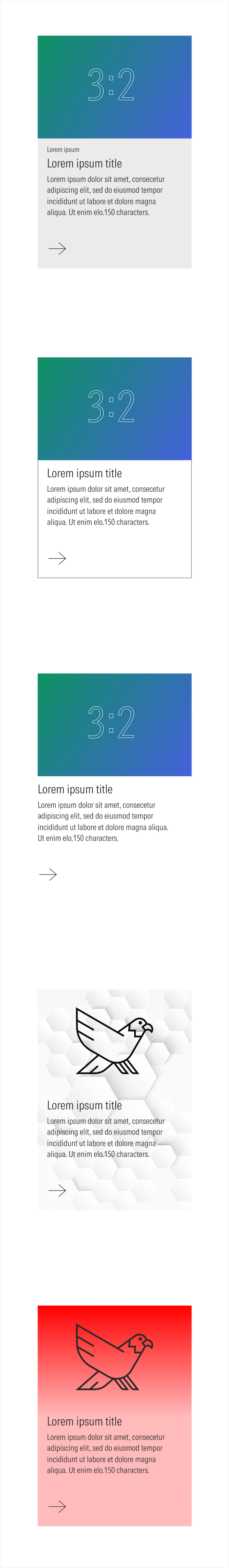
- Image enforces the content of the card. It is optional. Use a 3:2 or full-bleed background image.
- Eyebrow sets the category that the content of the card belongs to. It is optional. Has a character limit.
- Title sets the topic for the card. Has a character limit.
- Body gives more context. It is optional. Has a character limit.
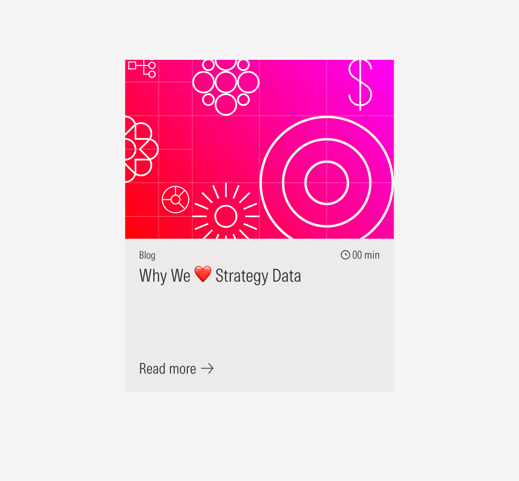
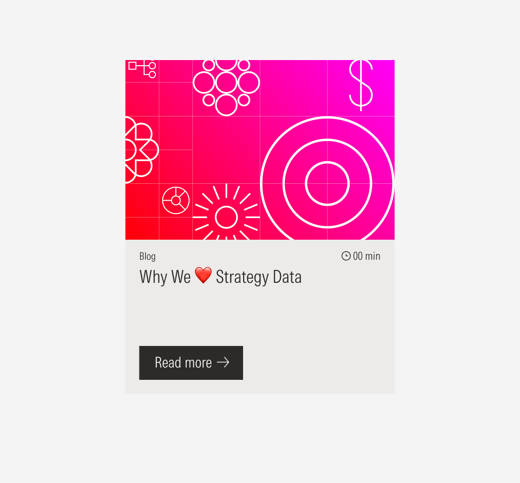
- CTA enforces the desired user action. Users can click to see more about the content presented. It can be a tertiary icon only button (large right-arrow), tertiary button (label and right-arrow icon) or list of links.
- Icon supports the category the content belongs to. It is optional. Icons should be from Brand Icon Library.
- Reading time sets the reading time of the content that the card redirects to. It is optional.
- Background defines the space of the text block. It can be a solid color, transparent with or without an outline, or a color gradient.
Usage
When to Use
Use cards to display different types of general content on a page in an organized and visual way. Also use when users don’t need to see all the card entries at the same time.
When Not Use
Don’t use cards when the user needs to quickly scan every entry and a visual hook is not relevant, or when you need to display more than one link. Also don’t use cards when you need to condense information or when the user needs to see most of the entries at once, including on mobile devices. Use a list or a capability card instead.
Variation | Purpose | Image | Icon | Text | Background |
|---|---|---|---|---|---|
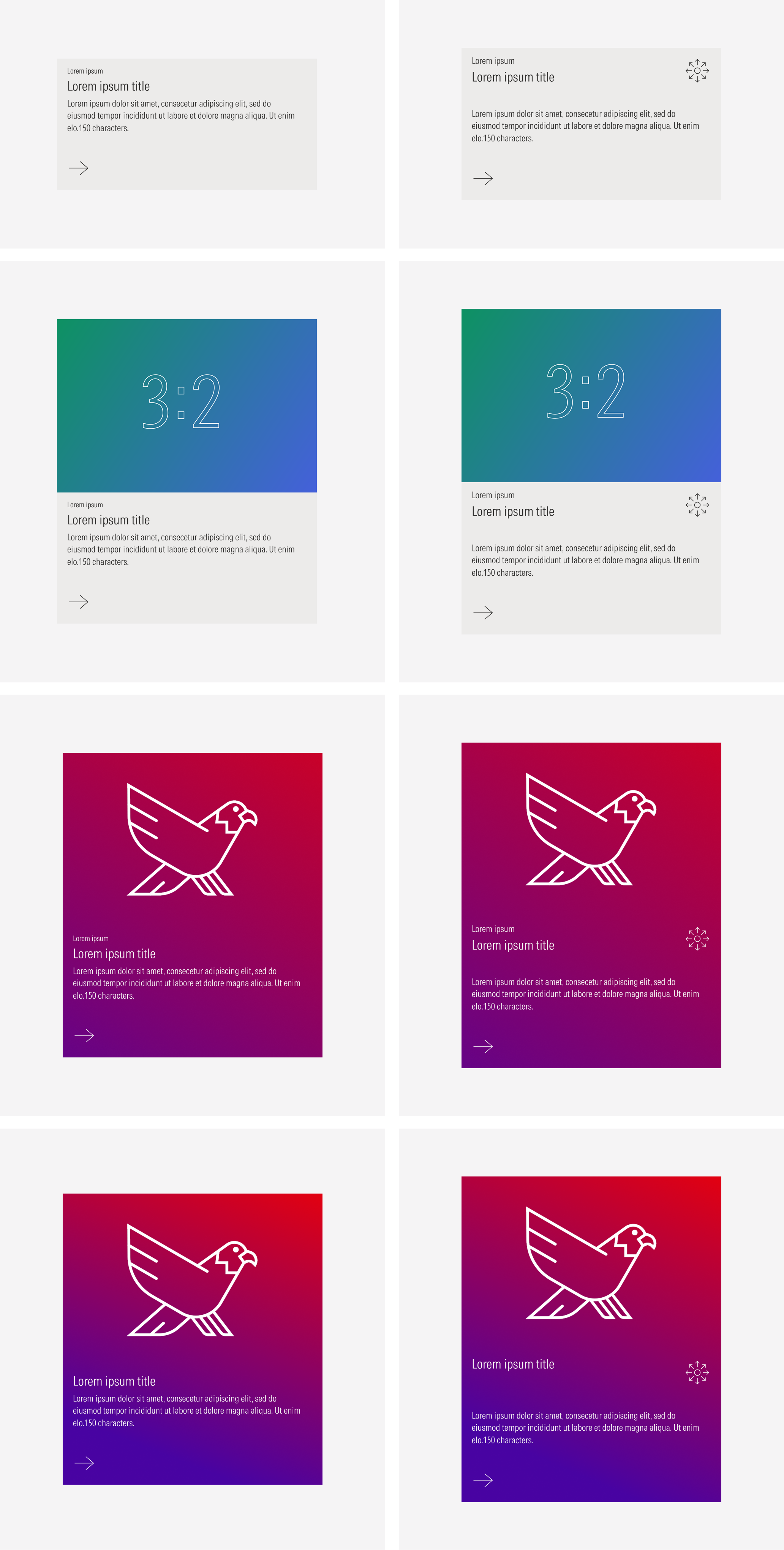
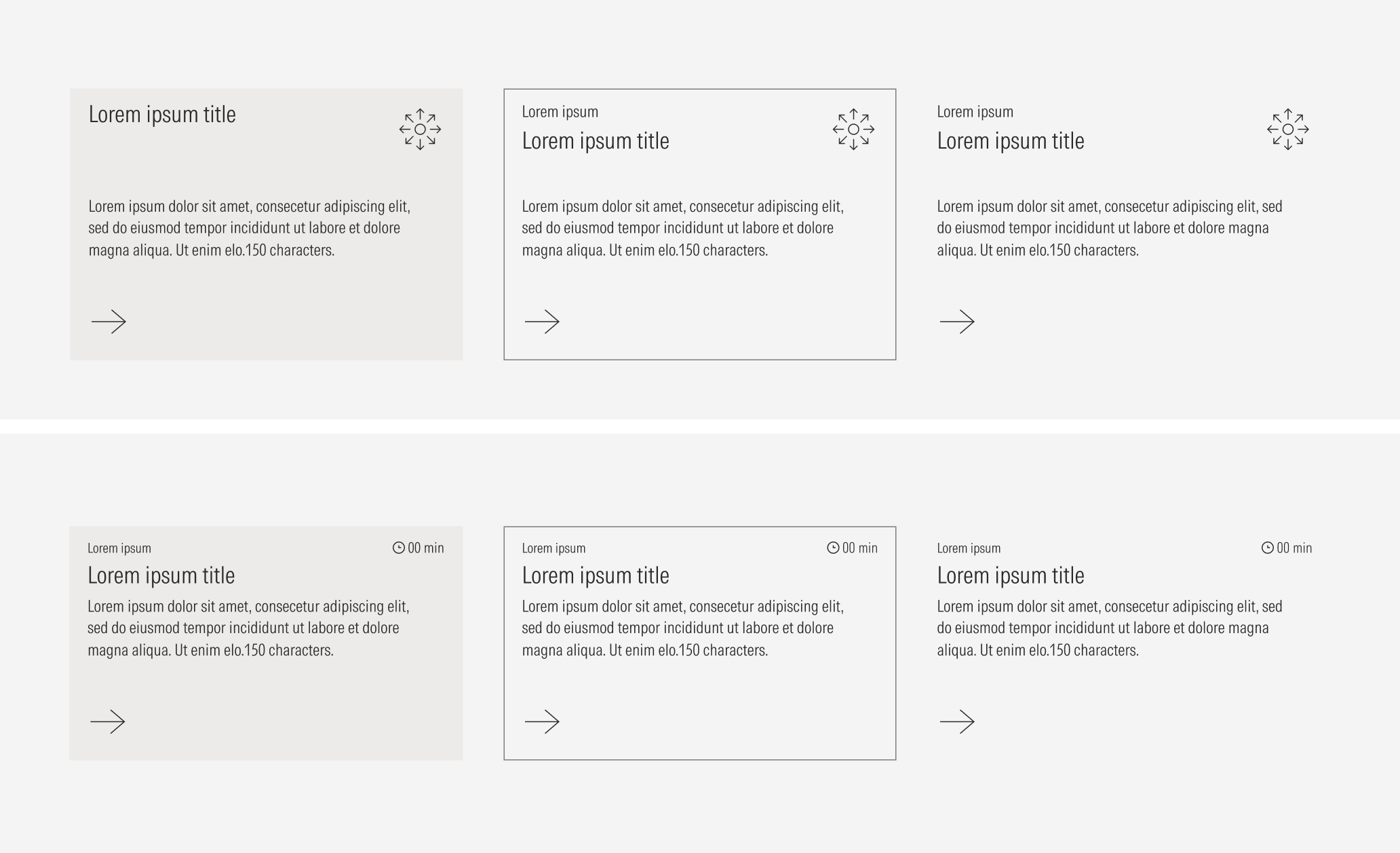
Text block only | Use for simple content that doesn’t need extra context or an image hook. | No image | No icon, no read time | With eyebrow, with body, no eyebrow, no body | Float |
Text block with icon | Use for content that needs to be identified with a specific category, or content with a specified reading time. | No image | With icon, with read time | With eyebrow, with body, no eyebrow, no body | Fill, outline, float |
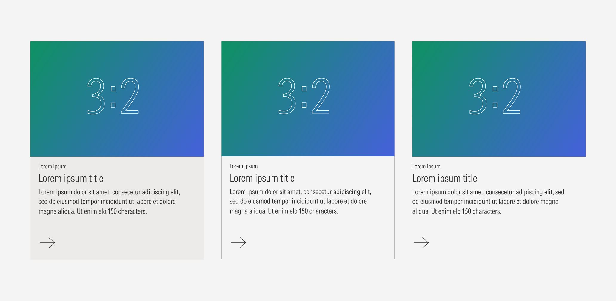
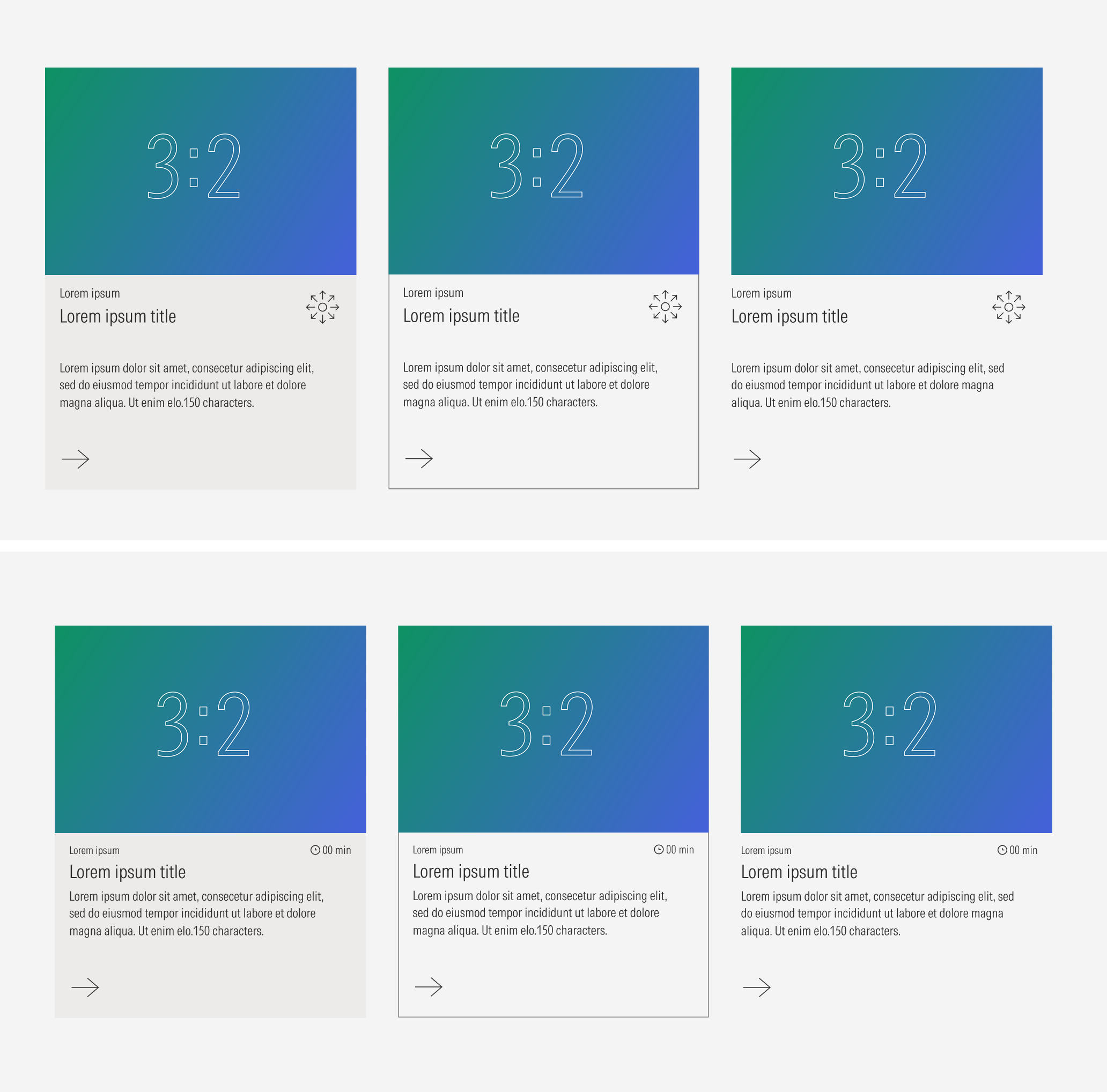
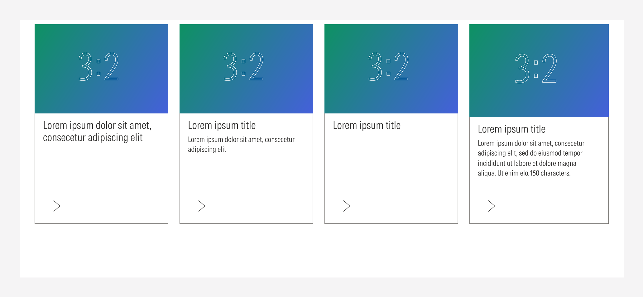
Text block and boxed image | Use for content that needs extra context, an image hook, or to present new content. | With image (boxed) | No icon, no read time | With eyebrow, with body, no eyebrow, no body | Fill, outline, float |
Text block with icon and boxed image | Use for content that needs extra context, an image hook, or needs to be identified with a specific category or reading time. | With image (boxed) | With icon, with read time | With eyebrow, with body, no eyebrow, no body | Fill, outline, float |
Text block and background image | Use for content that needs extra context, an image hook, or to present new content. | With image (full-bleed background) | No icon, no read time | With eyebrow, with body, no eyebrow, no body | Full-bleed image |
Text block with icon and background image | Use for content that needs extra context an image hook, to present new content, or needs to be identified with an specific category or reading time. | With image (full-bleed background) | With icon, with read time | With eyebrow, with body, no eyebrow, no body | Full-bleed image |
Text block and gradient background | Use for content that needs a color gradient hook, or to present new content. | No image | No icon, no read time | With eyebrow, with body, no eyebrow, no body | Color gradient |
Text block with icon and gradient background | Use for content that needs a color gradient hook, to present new content, or needs to be identified with an specific category or reading time. | No image | With icon, with read time | With eyebrow, with body, no eyebrow, no body | Color gradient |
Text Block Only
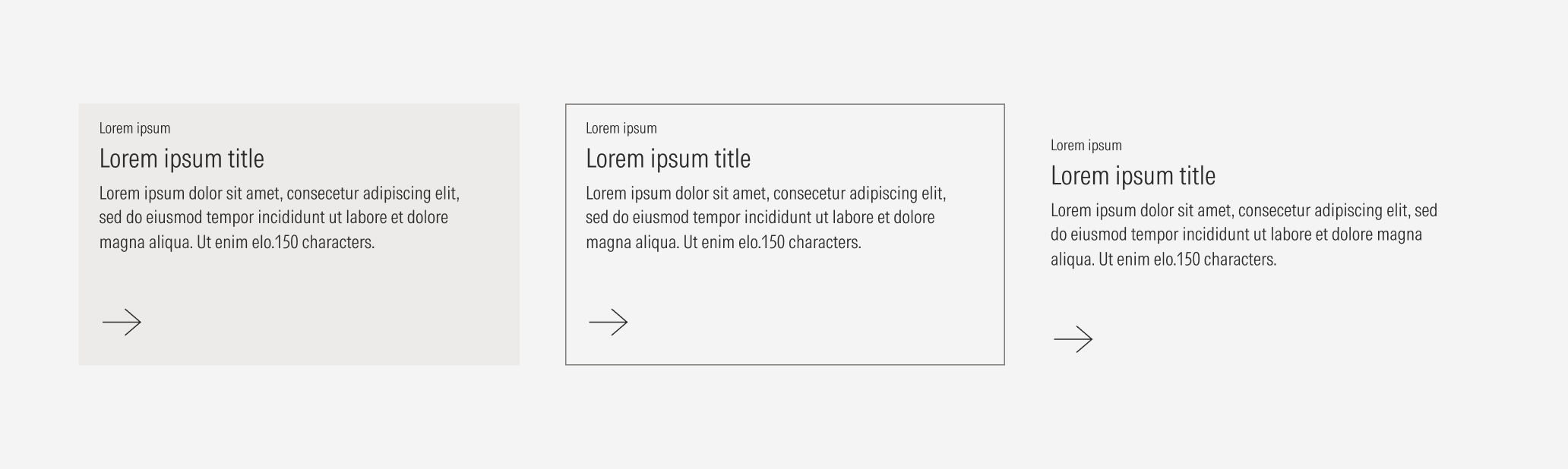
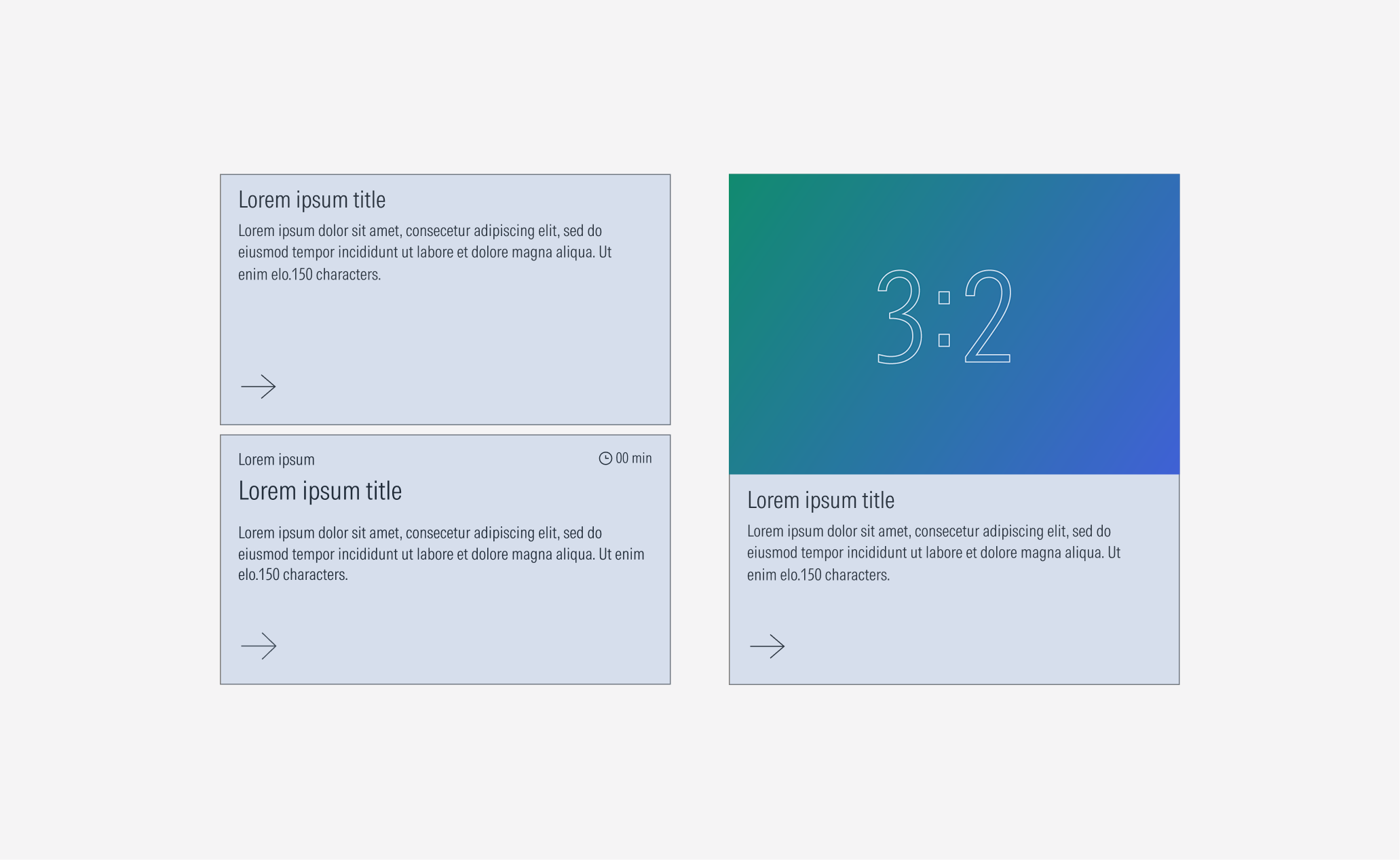
Use the text block with a solid background, a transparent background and an outline, or a transparent background only.
Text Block With Icon
Use the text block with an icon or read time on a solid background, a transparent background and an outline, or a transparent background only.
Text Block and Image
Use the text block with an image on a solid background, a transparent background and an outline, or a transparent background only.
Text Block With Icon and Image
Use the text block with an icon or read time and an image on a solid background, a transparent background and an outline, or a transparent background only.
Container
Use a card container for standard spacing and sizing between a group of cards and a consistent behavior. Take a look at the layout section guidelines here.
Spacing
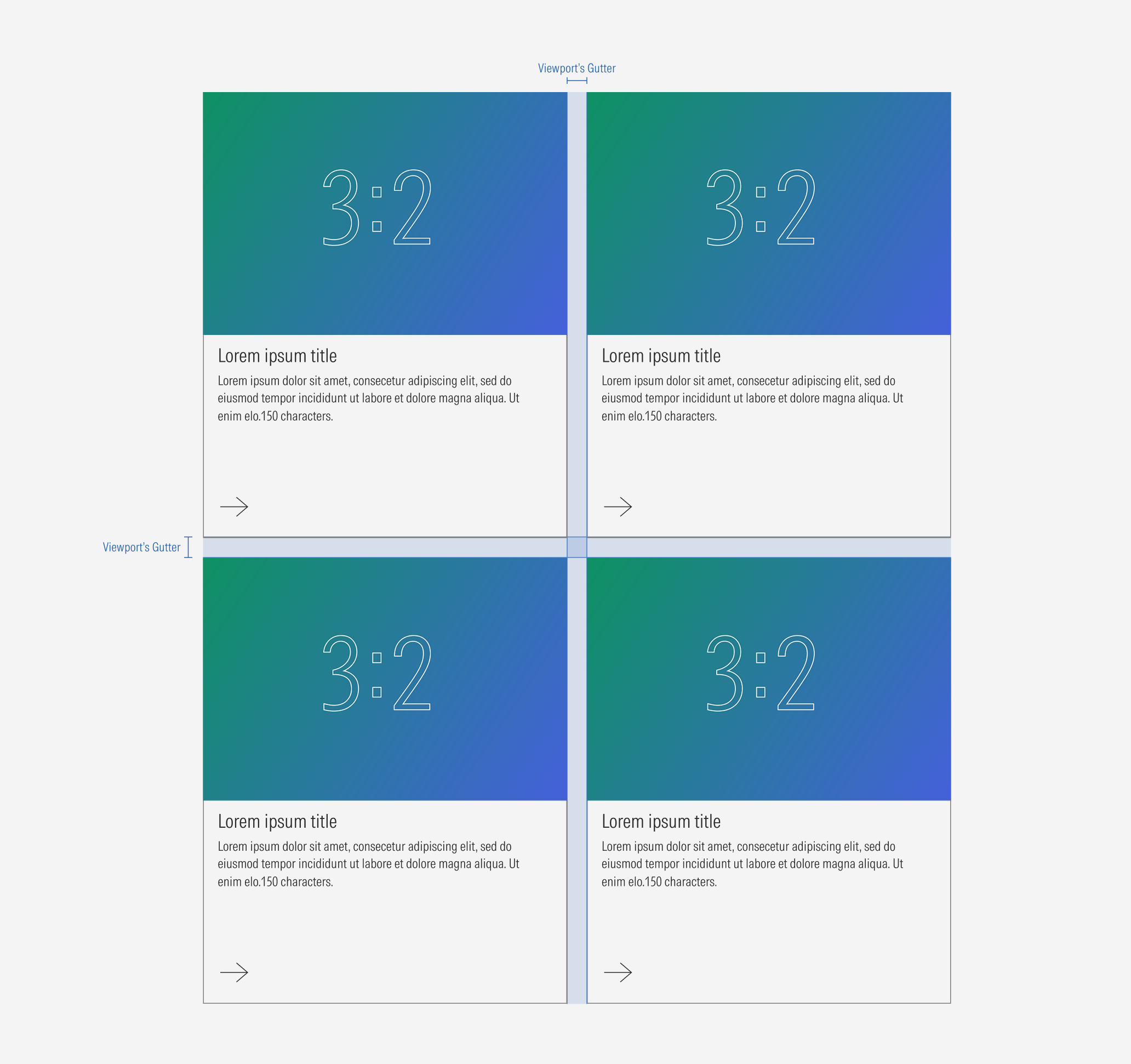
Ensure that proper space is given between each card item.
Ensure that proper space is given between each card. Both the vertical and the horizontal space between cards should be the same as the gutter of the displayed layout being displayed.
Hierarchy
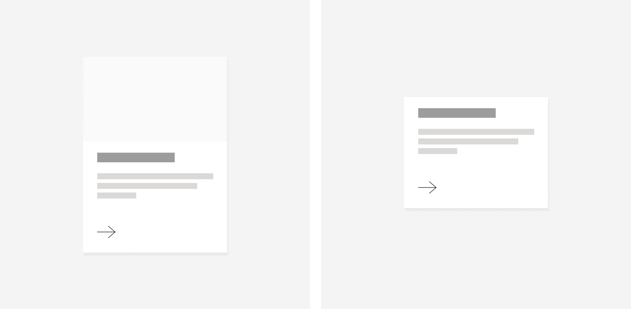
A proper hierarchy must be ensured for the elements that compose the card. The CTA should be a tertiary button (with a label or only an icon) at the bottom. Images should be placed on top to support or give more context to the textual content. The title, with the highest level of importance, needs to give a clear and short idea of the topic of the card content. If that content is part of a series or a category, the card should include an eyebrow in a smaller size above the title.
Alignment
The alignment of the components within the card depends on the type of component. The texts and CTA are left-aligned, the image is centered and full-bleed, and the icon and read time are right-aligned.
Do use a tertiary button as the CTA for the card. It can be with a label or icon only.
Don’t use a primary or secondary button as the CTA for the card.
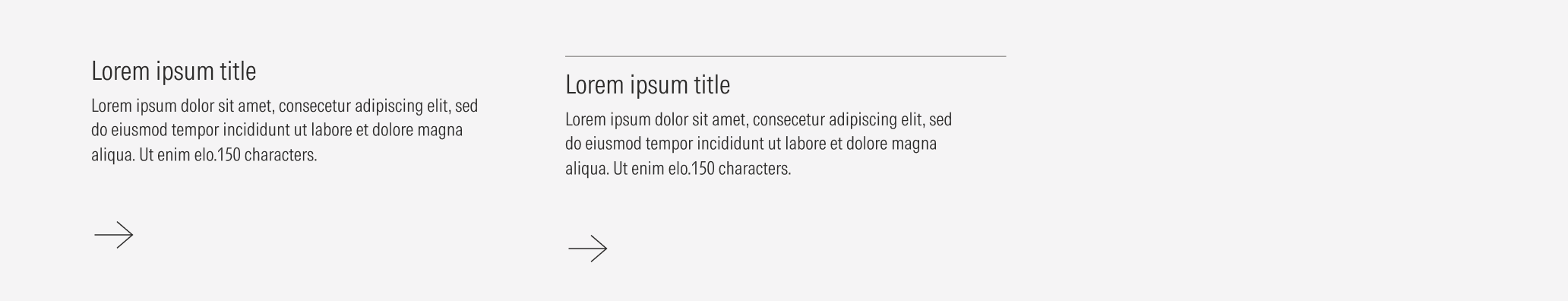
Do summarize the title and make it three lines max. If more context is needed, use a body text for that brief description.

Don’t use a paragraph as a title. Avoid having a title of more than three lines.
Behavior
Clickable Cards
Cards are components that by definition need to have an interaction. Actions can be exposed and shown more clearly with CTAs inside the card or triggered by clicking anywhere on the card.
The general card has only one action. Clicking anywhere on the card should trigger the same action as clicking the CTA inside it.
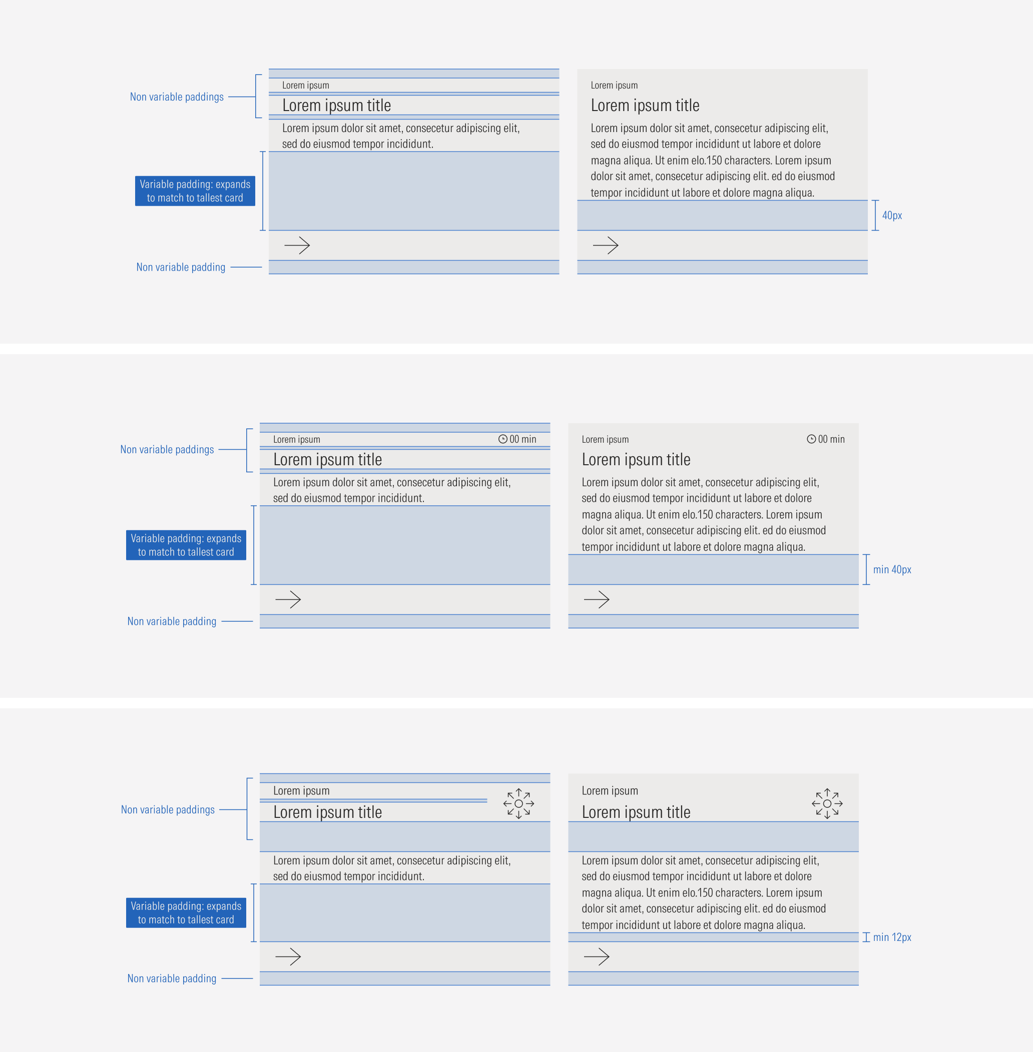
Flexible Height
All card types will match sizes across rows to the tallest card. Keep in mind that the card can become taller, but it should never be less than 200px in height.