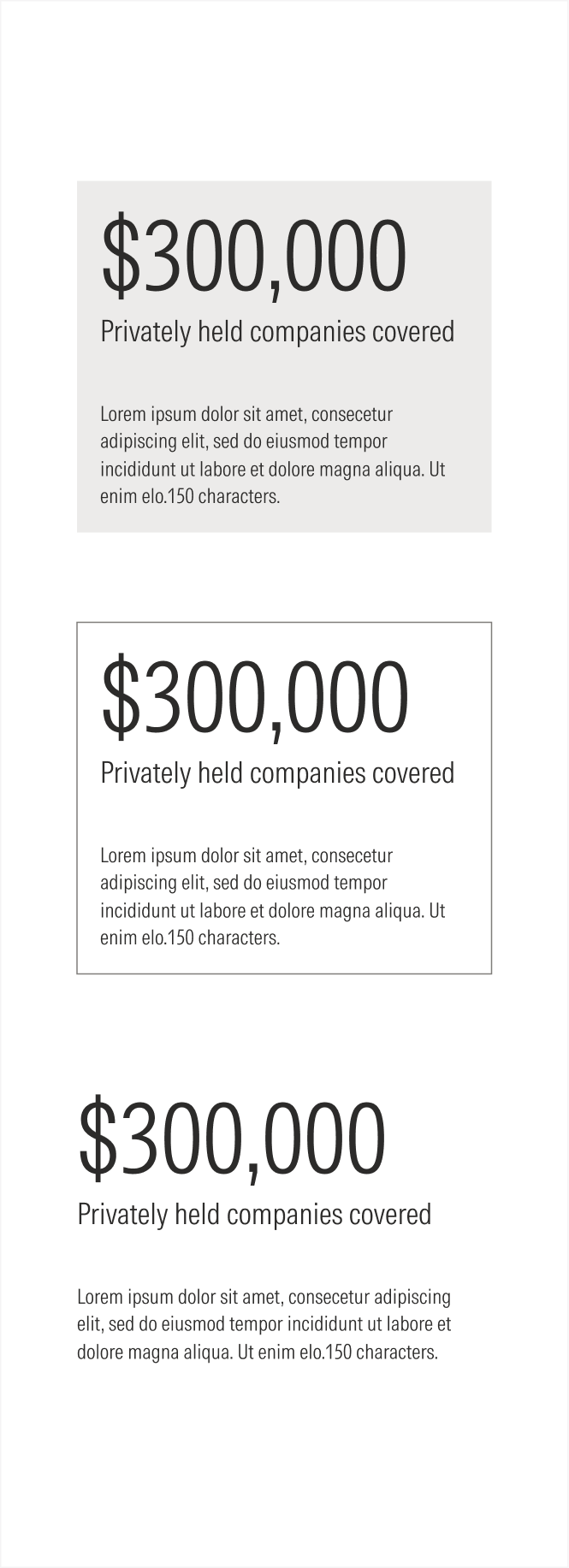
Cards
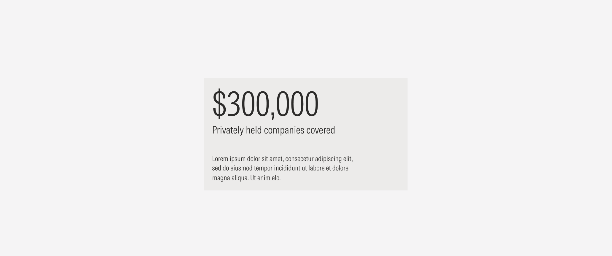
The stat card component groups related information in a flexible-size container. It is widely used across the Morningstar B2B web experience to contain and present specific information, namely, data and statistics.
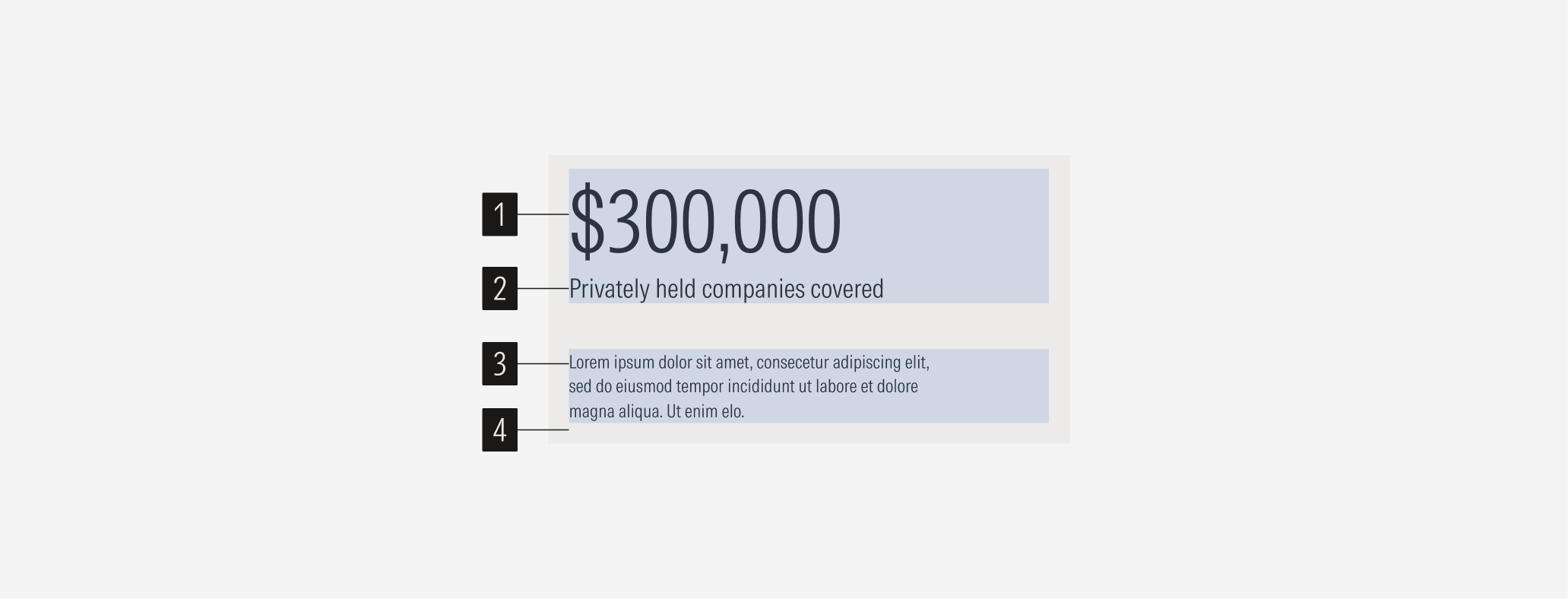
- Number sets the number data for the card. It has a limit of eight characters (numbers and monetary symbols).
- Description gives more context. It has a limit of 150 characters.
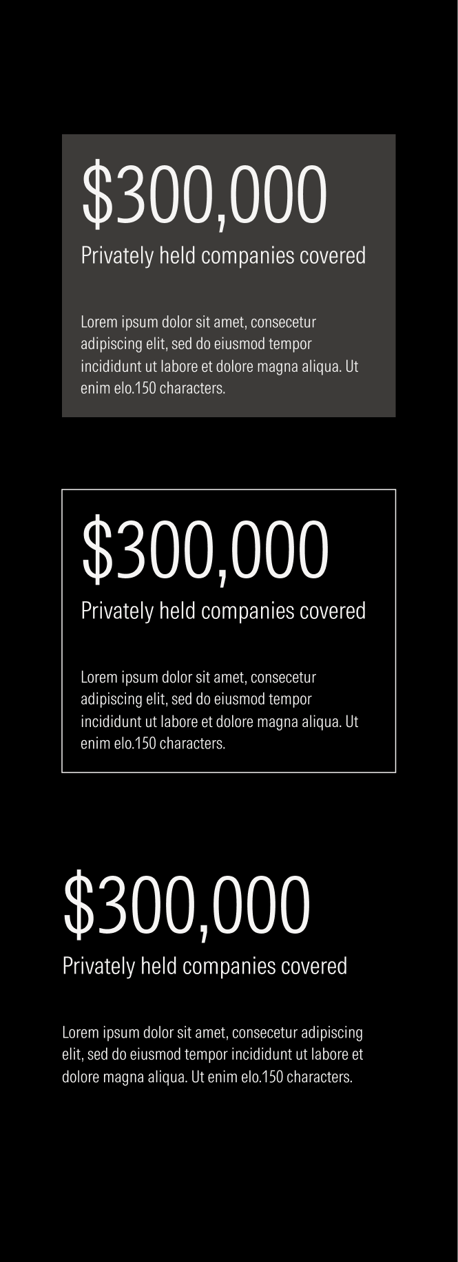
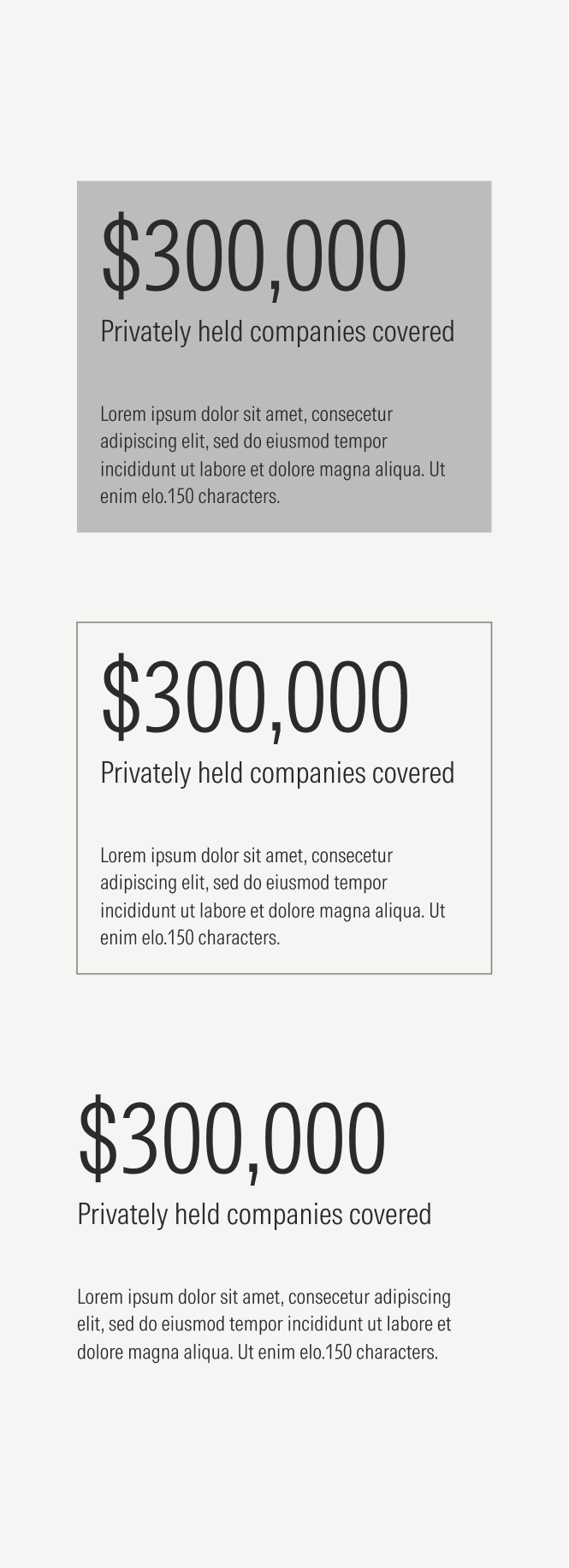
- Background defines the space of the text block. It can be a solid color or transparent with or without an outline.
Variation | Purpose | CTA | Background |
|---|---|---|---|
Stat card | Use to show numbers. | No CTA | Fill, outline, float |
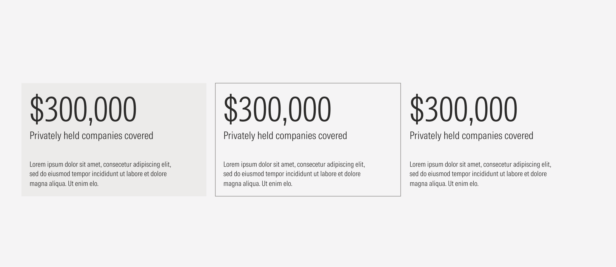
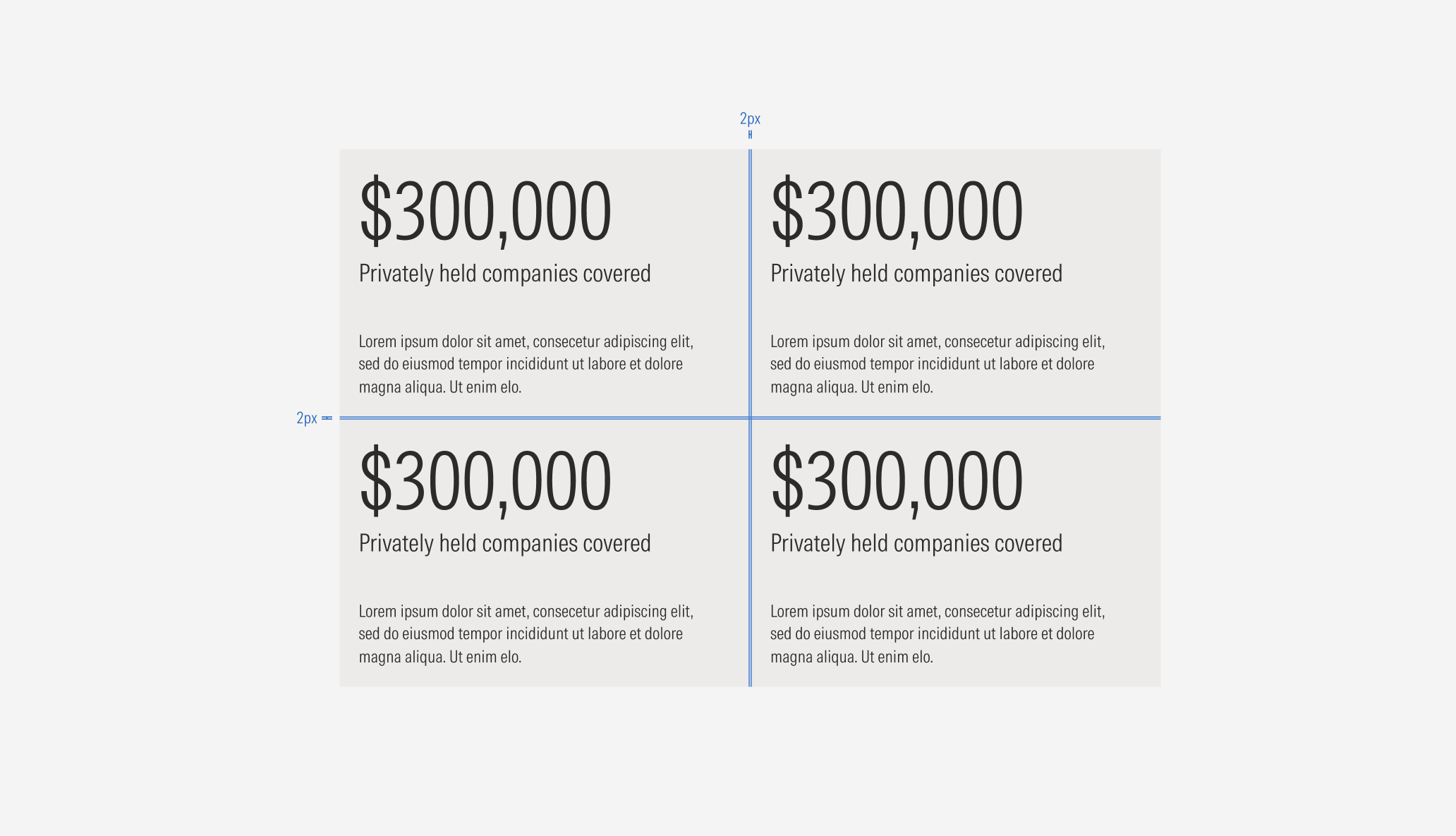
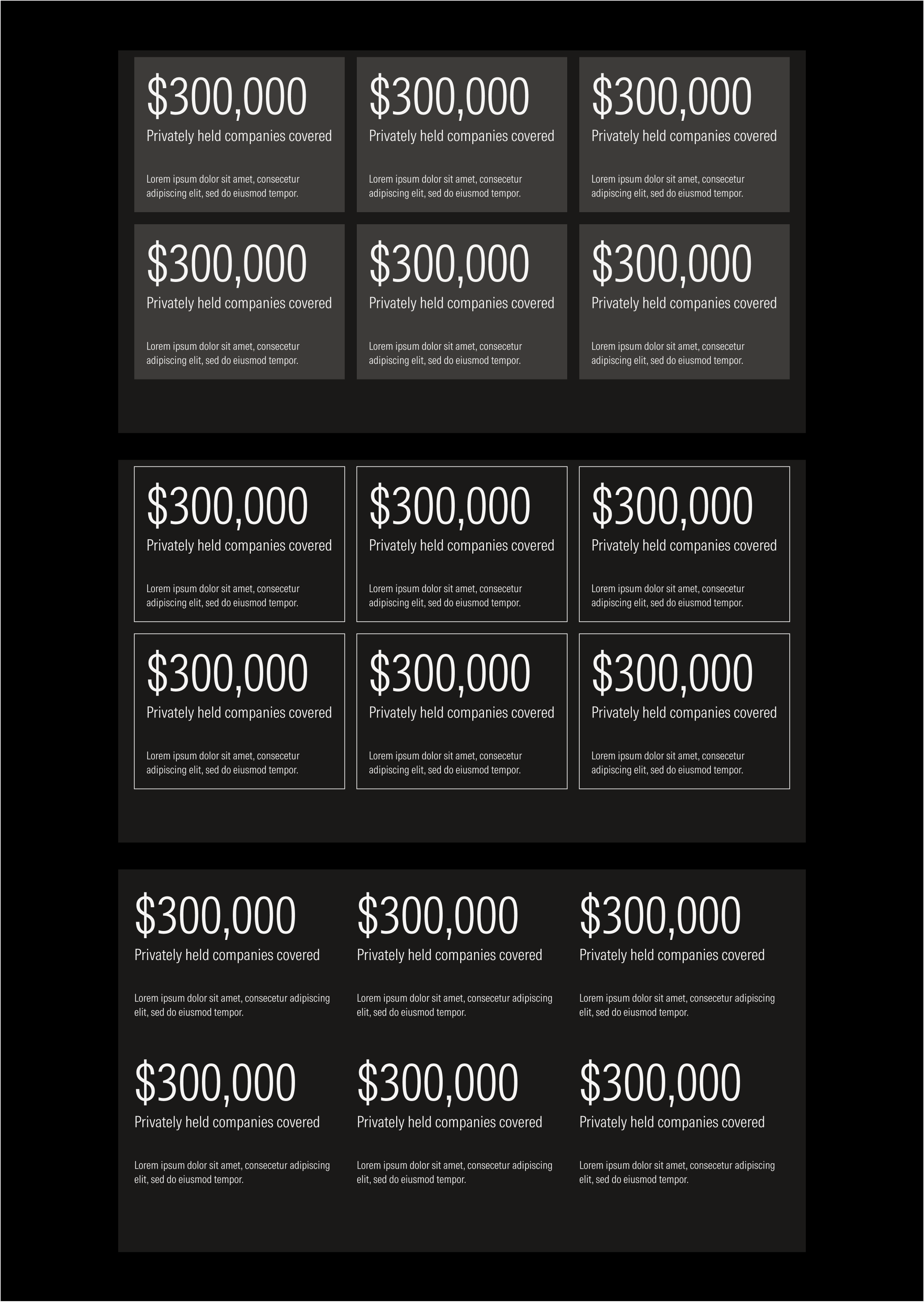
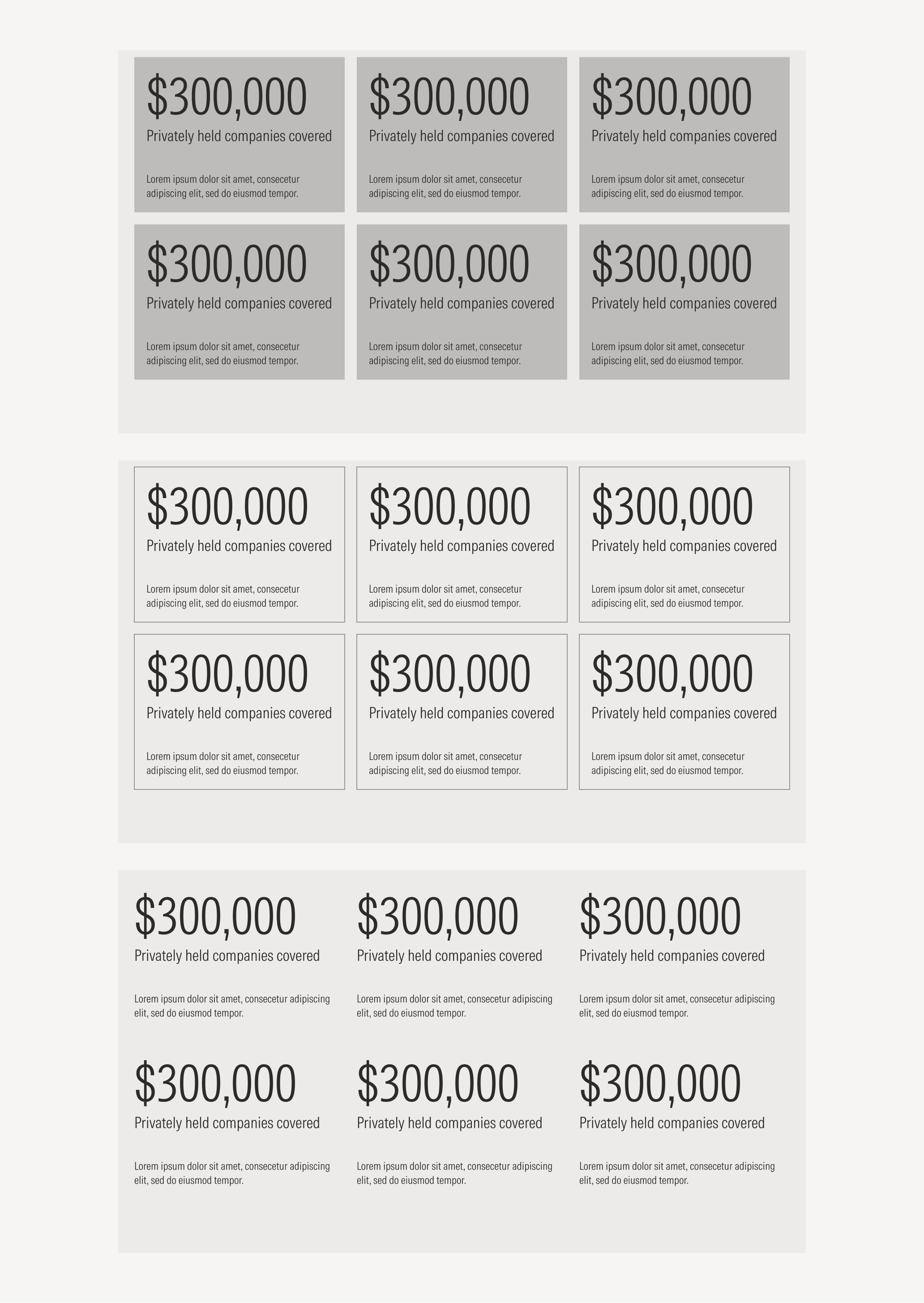
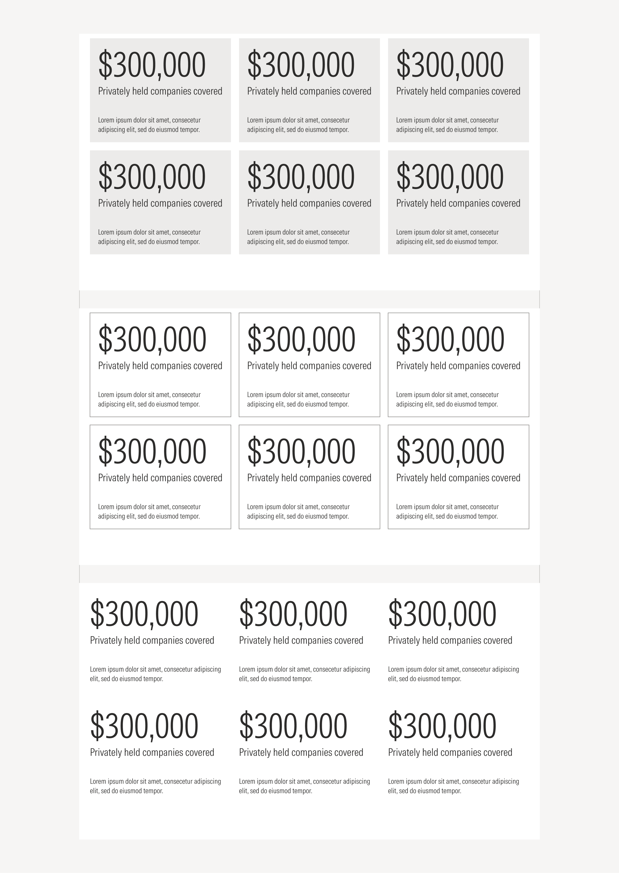
Ensure that proper space is given between each card. Both, the vertical and the horizontal space between cards, should be 2px.
Hierarchy
A proper hierarchy must be ensured for the elements that compose the card. The number has the highest level of importance. The body, which describes the number to give more context, has to be placed near the number (top-aligned).
Alignment
The alignment of the components within the card depends of the type of component. The number and the description are left-aligned.

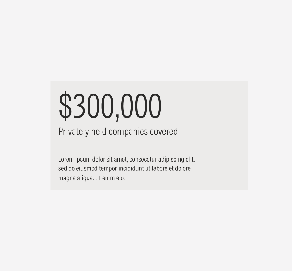
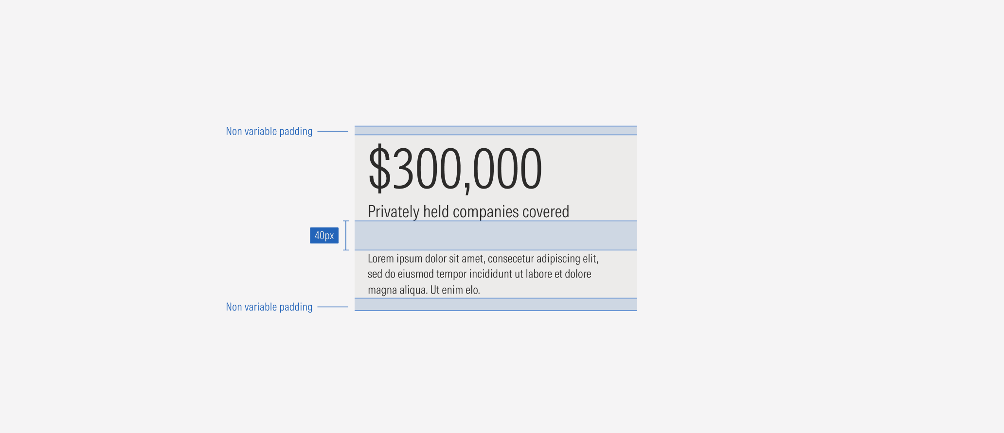
Do keep the non variable padding between the number and the description. The description needs to be top aligned, near the number.
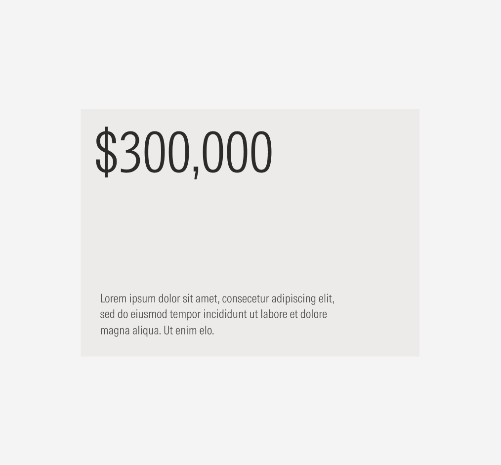
Don’t change the padding between the number and the description or align it to the bottom of the card.

Do use abbreviations for larger numbers to avoid having more than the eight character limit.
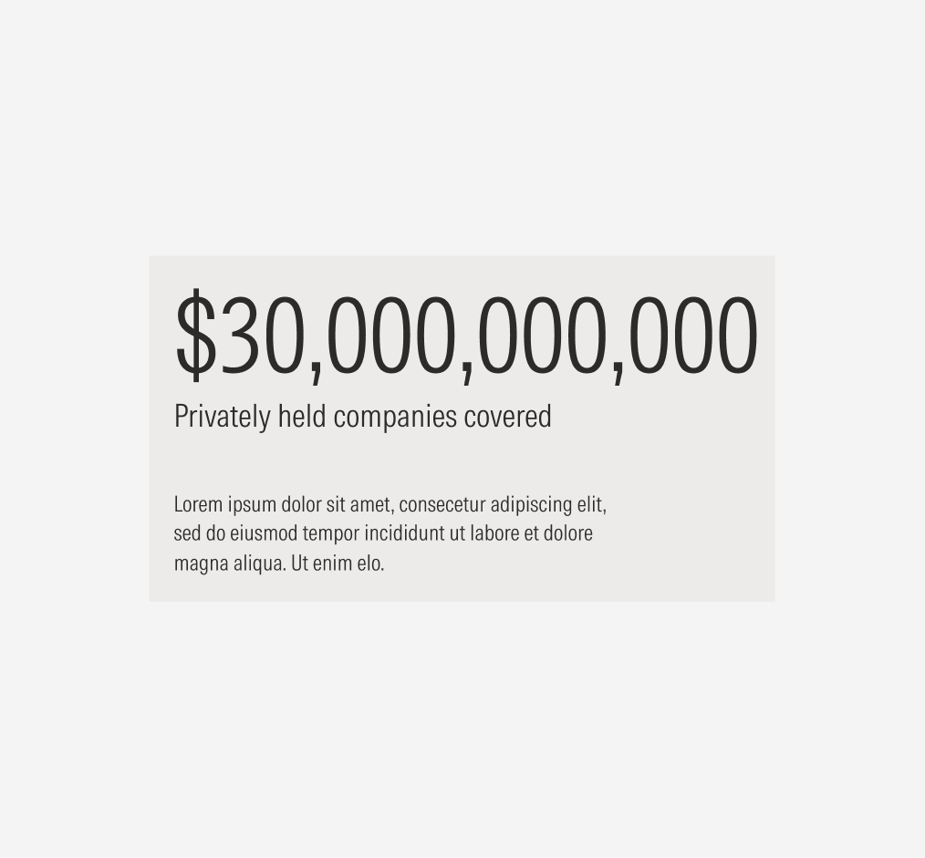
Don’t exceed the character limit for numbers.
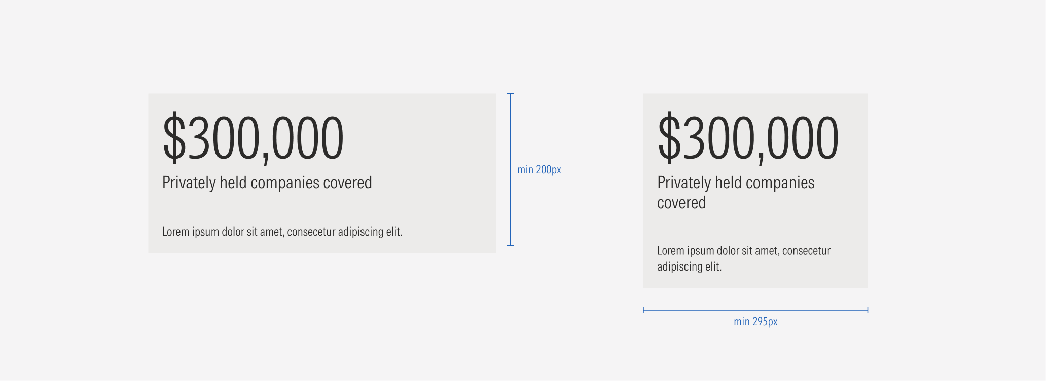
Sizing
Cards don’t manage sizes like other components do. Their width will adapt to the card container and the view-port size, and it won’t be less than 295px. Their height, on the other hand, will adapt to the content length. The card can become taller, but it should never be less than 200px in height.
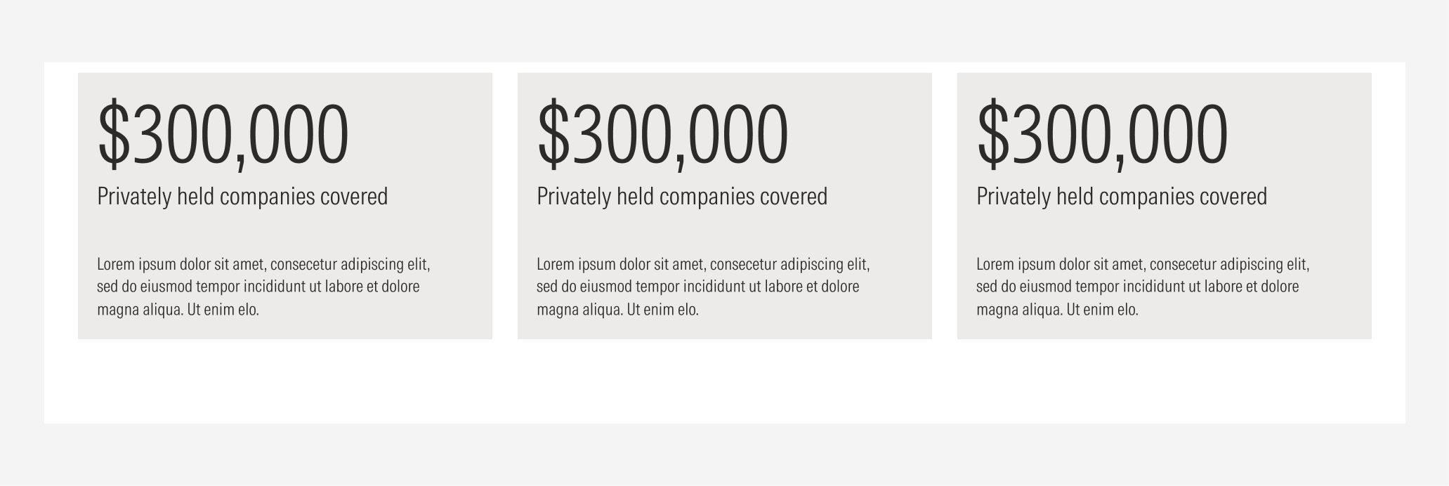
Single Card
Group of cards