Form Elements
Text inputs allow users to enter and interact with data. These are mainly used in forms.
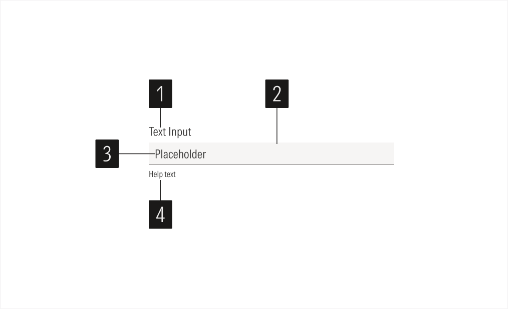
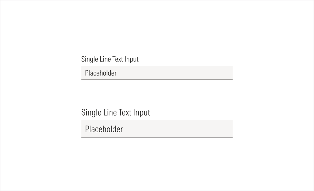
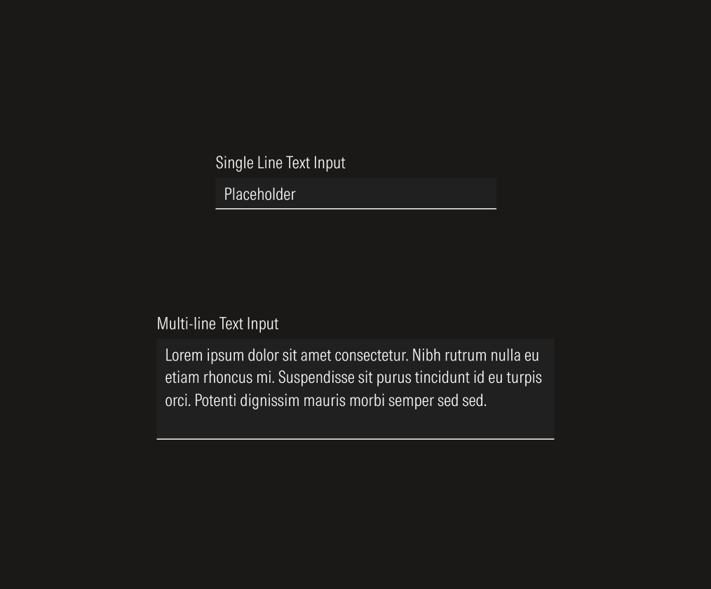
- Label sets the label of the text input.
- Field box (single line) is the interactive element of the text input and contains the entered data on a single line.
- Field text sets the required data.
- Helper text gives extra information when needed, to enforce the required information for the field or to give context when an error happens.
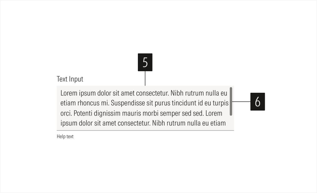
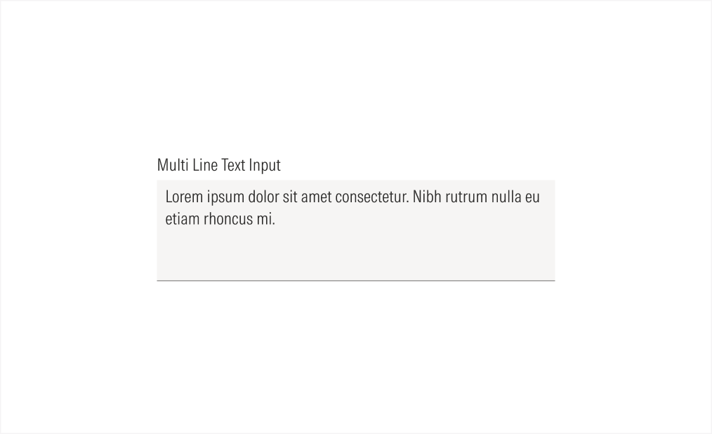
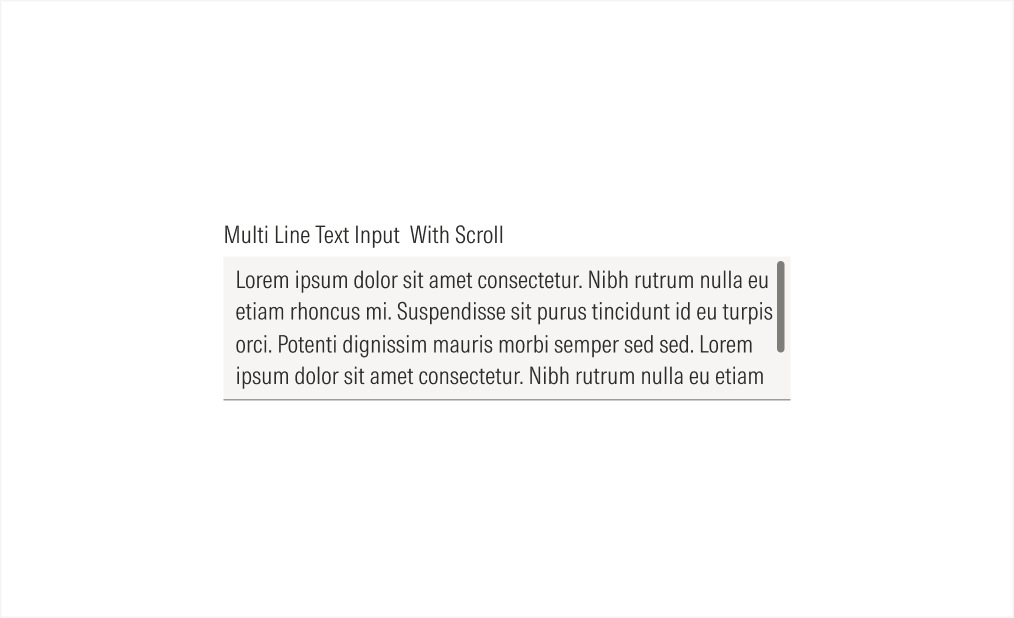
- Field box (multi-line) is the interactive element of the text input. It contains the entered data on a text area for multiple text lines.
- Scroll bar allows users to scroll through the text area space when it reaches the maximum visible lines.
Variation | Purpose | Icon/Scroll Bar | Sizes |
|---|---|---|---|
Single line | Use for short text answers. | With icon, no icon, no scroll bar | LG, MD |
Multi-line | Use for potentially long text answers. | No icon, with scroll bar, no scroll bar | LG, MD |
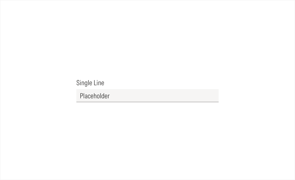
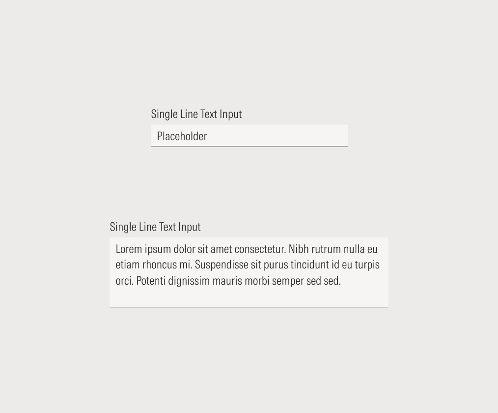
Single Line No Icon
Use when the text input doesn’t need any context or an extra action.
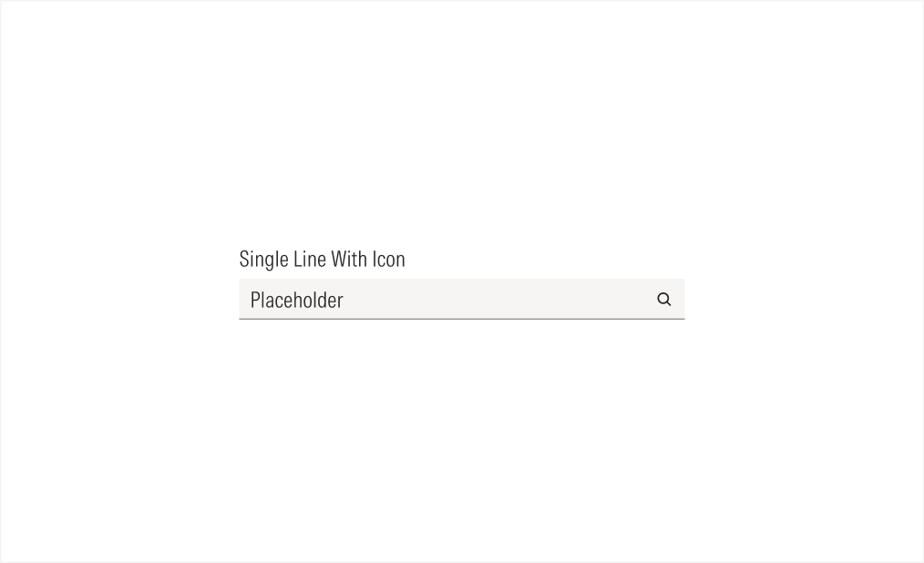
Single Line With Icon
Use when you need a specific type of information and you want to give the user extra context with the icon, or when you want to add an action to the input (such as search, hide, or view the text from the input).
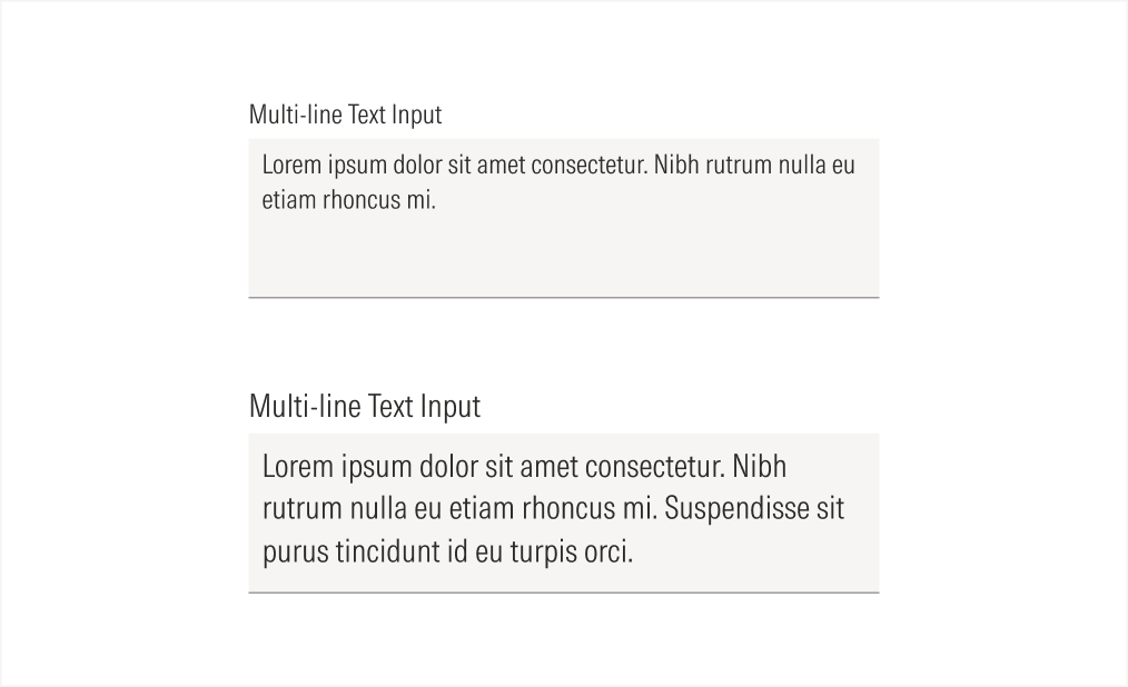
Multi-line No Scroll Bar Active
All entered text is visible in the text area.
Multi Line With Scroll Bar Active
When the text fills the visible text area, the scroll bar becomes visible.
Alignment and Hierarchy
The alignment of text inputs with their container or in relation to content at the same level of the page should follow a left-justified pattern.
Text inputs are mostly used in forms, alongside other form elements, to ensure the proper hierarchy of the available user actions. All the form elements used, should have the same size.
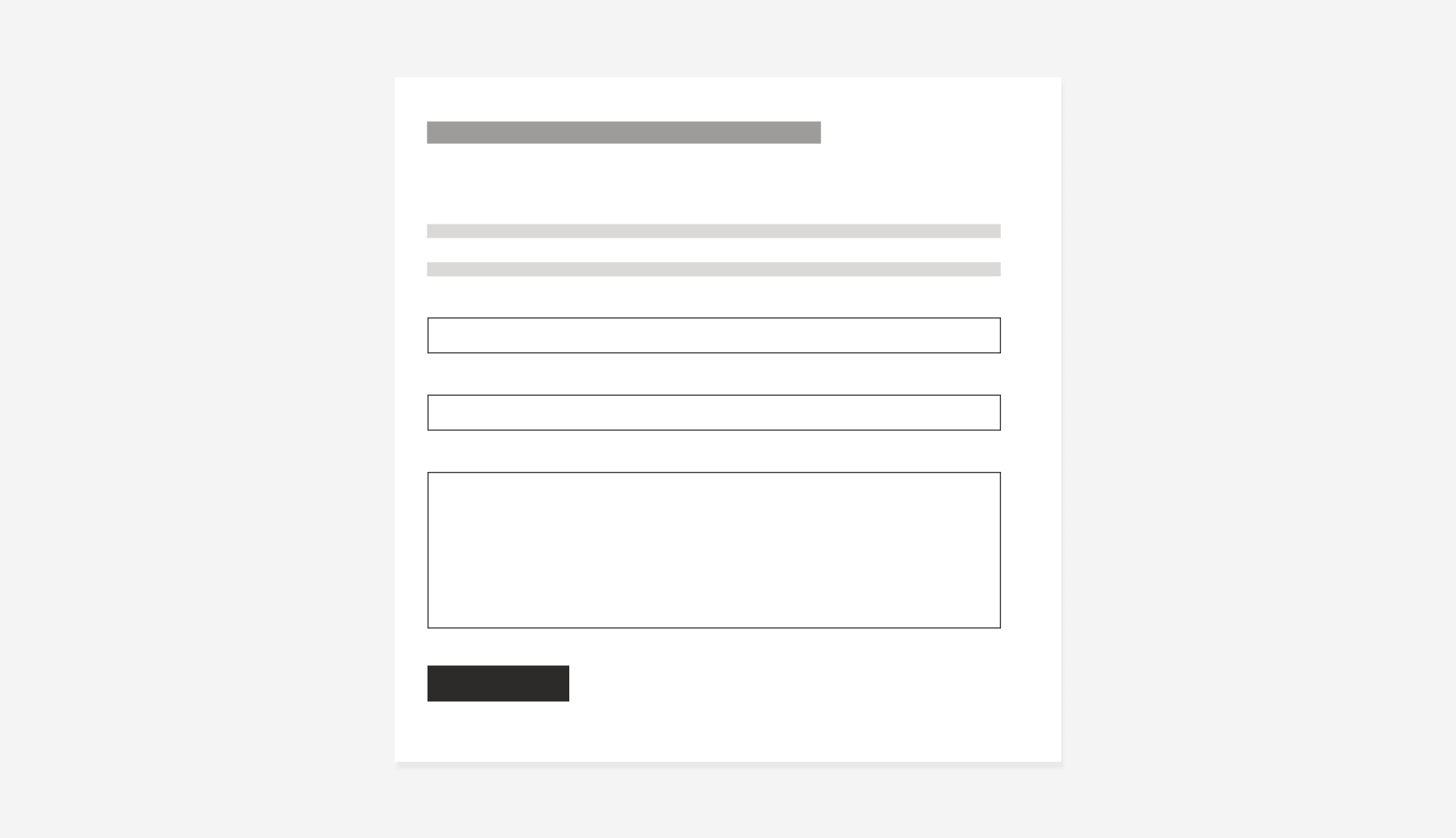
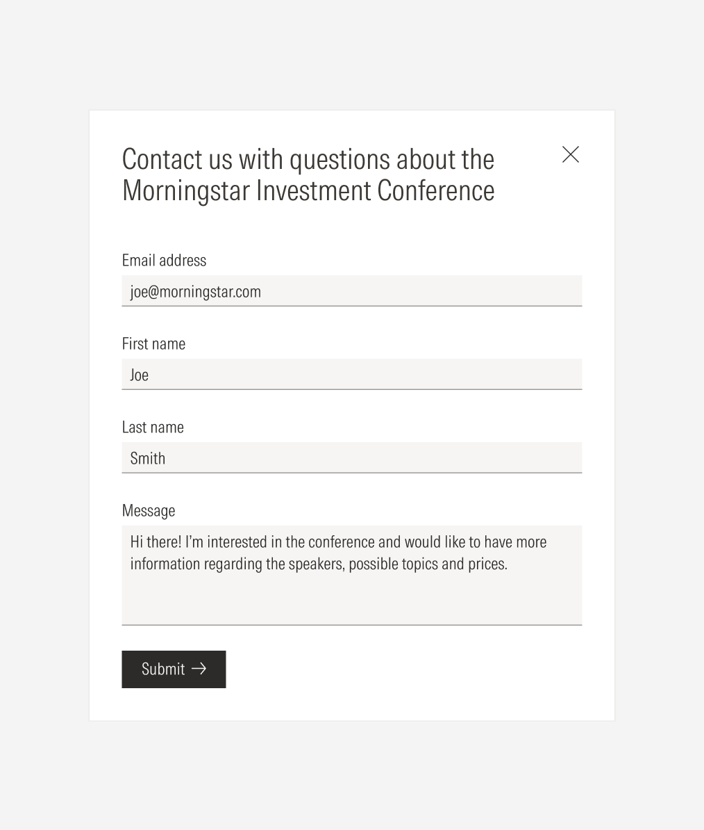
Do place text inputs following the same placement behavior as the other form elements: each on a separate line, taking the whole form width, and keeping the same padding between them.
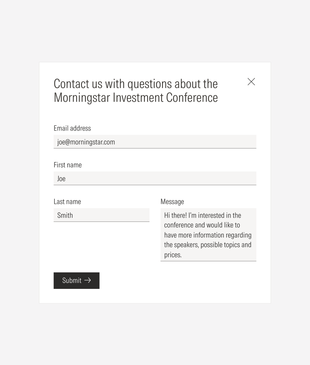
Don’t place a single line text input on one side of a multi-line text input.
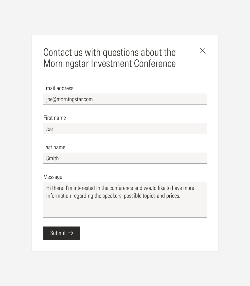
Do use a single-line text input for short text answers, and do use a multi-line text input for long text answers.
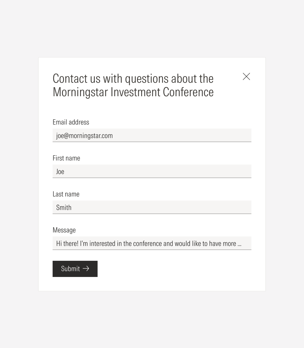
Don’t use a single-line text input for long text answers, and don’t use a multi-line text input for short text answers.