Form Elements
Radios represent a single selection input, allowing the user to select only one option from a group of choices. These are mainly used in forms. Because of its nature, a radio group has a minimum of two options, and one should be selected by default.
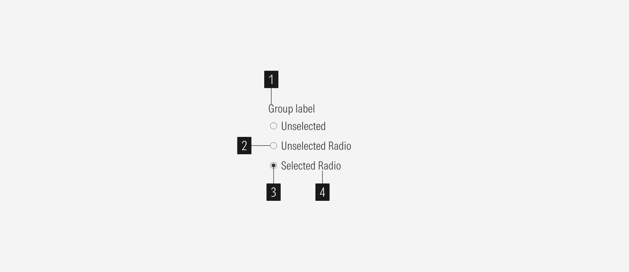
- Group label sets the label of a radio group. Radios could have a label or not, depending on where they are used.
- Circle outline is the interactive element of the radio. When selected, it has a filled circle inside the outline; when empty, there is none.
- Filled circle sets the selected status of the radio.
- Radio label sets the label of the radio option.

Variation | Purpose | Icon | Sizes |
|---|---|---|---|
Radio | Use for single mandatory select options. | With icon (filled circle: selected), no icon (empty: unselected) | LG, MD |
With Icon
A filled circle inside the outline when the option is selected.
No Icon
The circle outline is empty when the option is unselected.

Container
Spacing
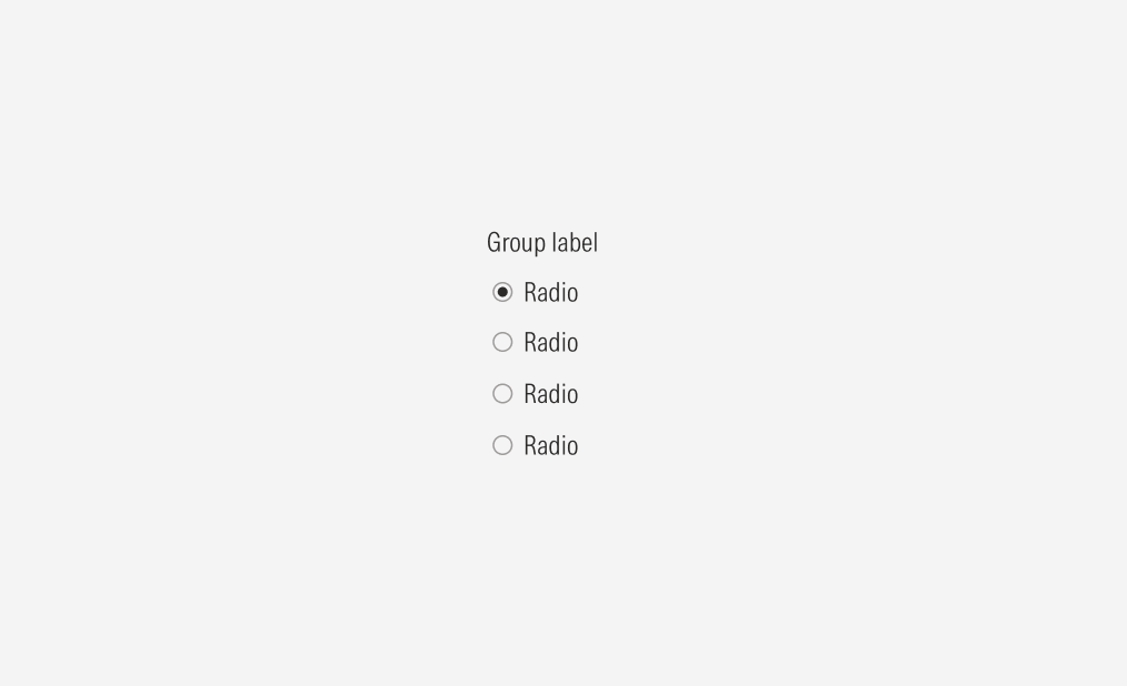
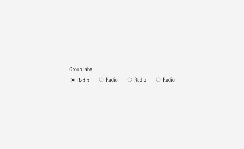
A radio container can add standard spacing between radios. Ensure that proper space is given between each radio when placed next to each other vertically or horizontally. The standard vertical distance between grouped radios is 8px, and the horizontal distance between grouped radios is 24px.
Alignment and Hierarchy
The alignment of the radios with their container or in relation to the content at the same level of the page, should follow a left-justified pattern.
Radios are mostly used in forms, alongside other form elements, to ensure a proper hierarchy between the available user actions, all the form elements used, should have the same size.
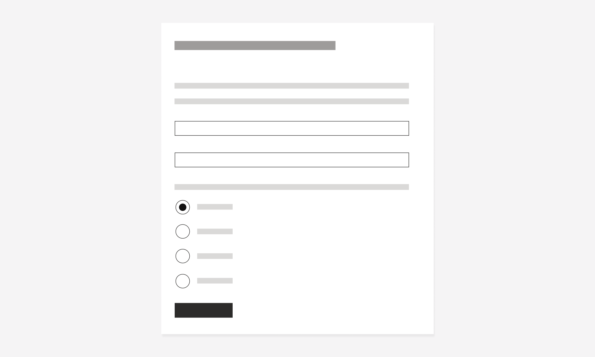

Do place radios following the same placement behavior as the other form elements: each on a separate line, taking the whole form width, and keeping the same padding between them.

Don’t place radios to one side of other form elements.


