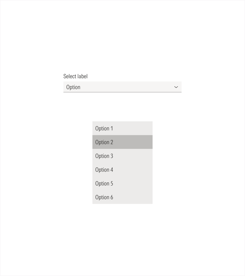
Form Elements
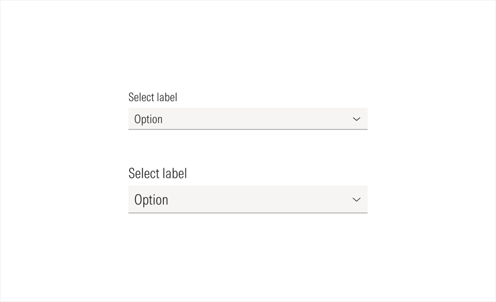
Selects allow the user to choose a single item from a list of options. These are mainly used in forms.
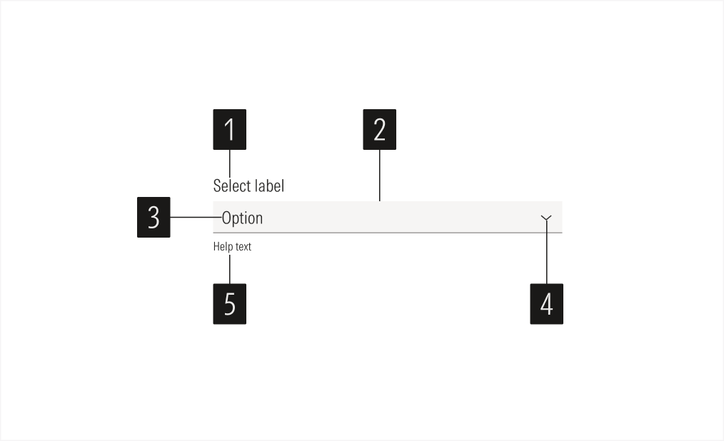
- Label sets the label of the select.
- Field box is the interactive element of the select and contains the selected option.
- Field text sets the chosen option of the select.
- Icon enforces the meaning of the select action.
- Helper text gives extra information when needed, to enforce the required information for the field or to give context when an error happens.
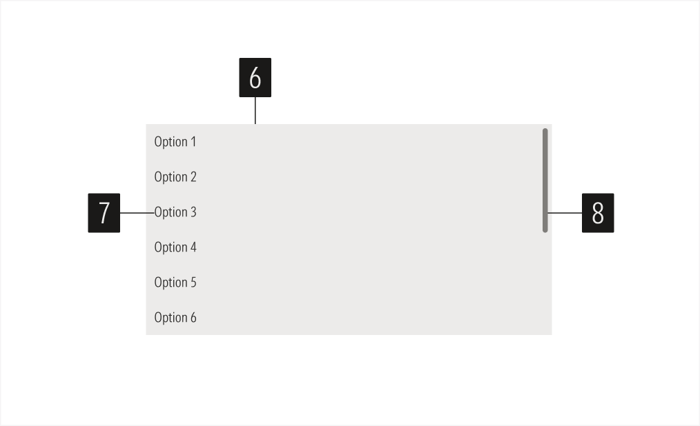
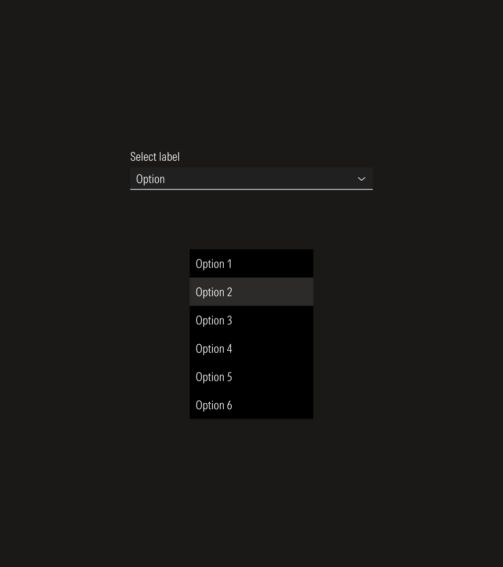
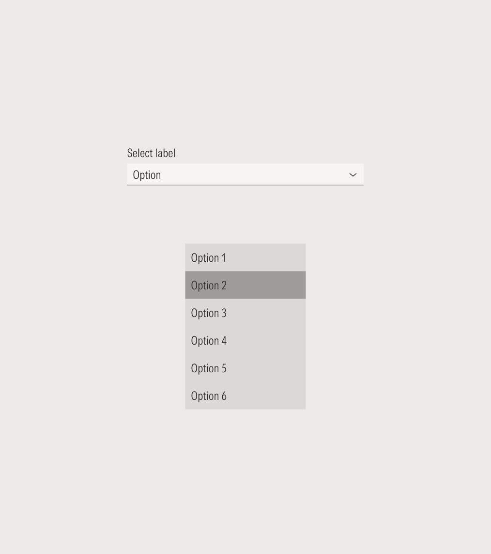
- Menu item box is the interactive element of the select menu item and contains one option.
- Menu item label sets the label of the select option.
- Scroll bar allows the user to scroll through the available options when there are more than six listed items.
Usage
When to Use
Use selects when users can choose from a list of more than five options and only one option can be selected. These are mostly used in forms.
When Not to Use
Don’t use a select when the user needs to multi-select options or there are fewer than five options to select from. Use checkboxes (for multi-select) or radios (for single select) instead.

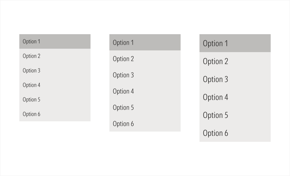
Variation | Purpose | Icon/Scroll Bar | Sizes |
|---|---|---|---|
Select | Use for single-select options when having more than five options to choose from. | With icon (caret-down for default state, caret-up for active state), no scroll bar | LG, MD |
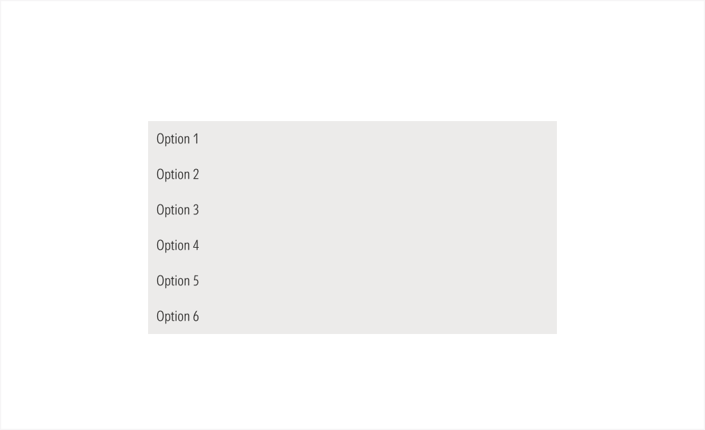
Statitc select menu | Use to display a list of six options maximum for the user to select from. | No icon, no scroll bar | LG, MD |
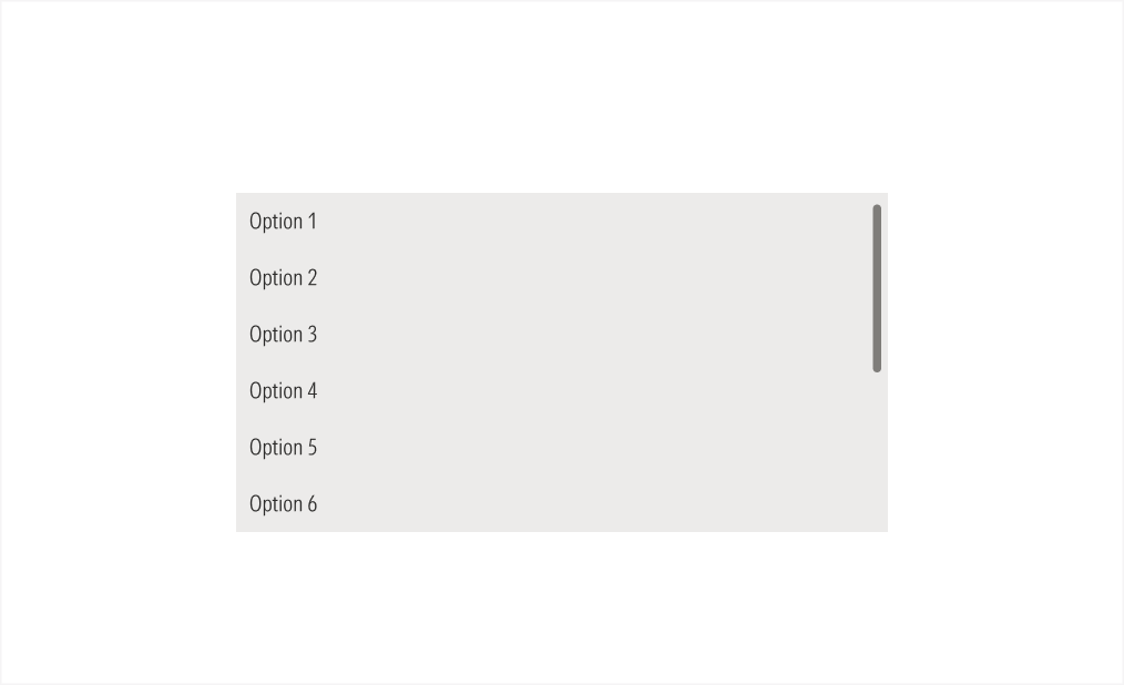
Scroll select menu | Use to display a list of more than seven options for the user to select from. Scroll bar is visible. | No icon, with scroll bar | LG, MD |
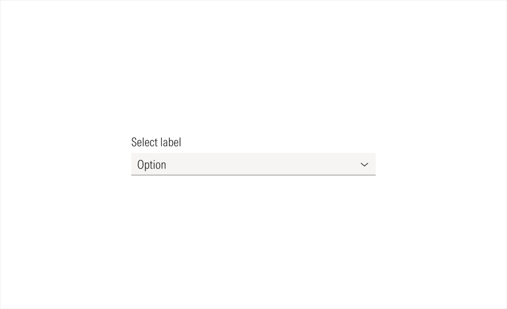
Active and Field Not Selected
When the user hasn’t selected the field, the component stays in its default state.
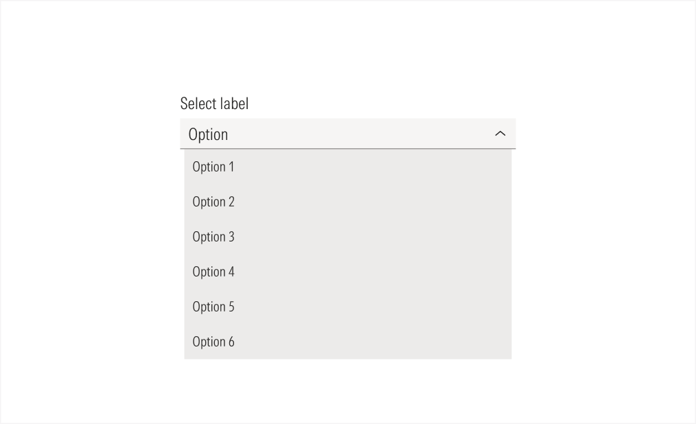
Active and Field Selected
When the user selects the field, a list of options drops down from it.
Alignment and Hierarchy
The alignment of selects with their container or in relation to content at the same level of the page, should follow a left-justified pattern.
Selects are mostly used in forms, alongside other form elements, to ensure the proper hierarchy of available user actions. All the form elements should have the same size.
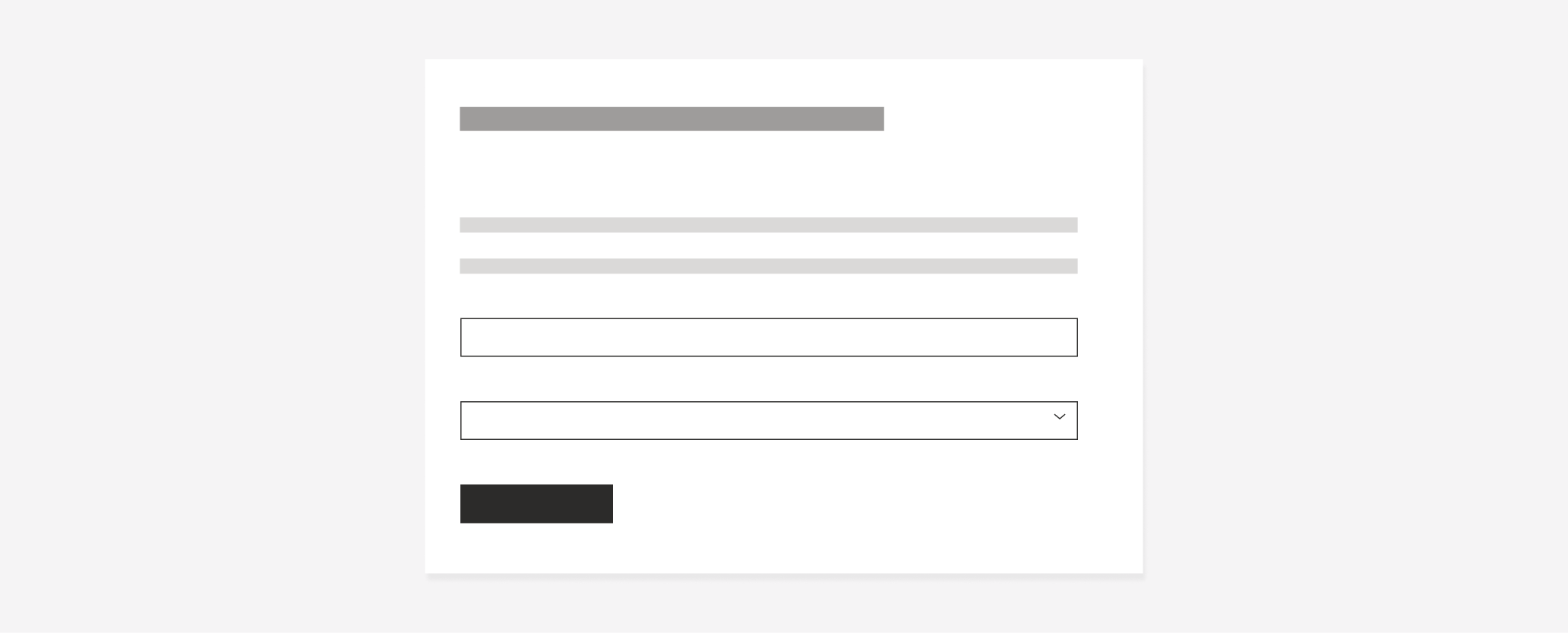
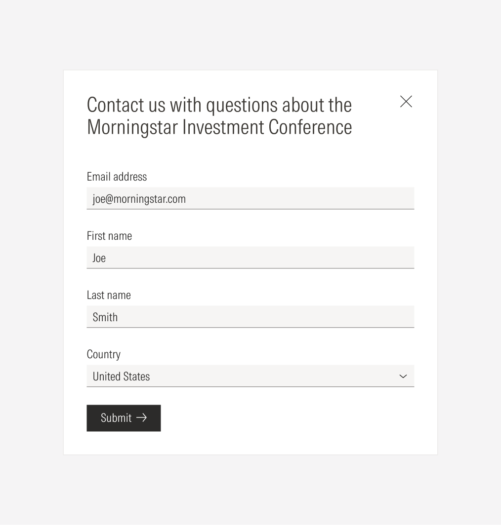
Do place selects following the same placement behavior as the other form elements: each on a separate line, taking the whole form width, and keeping the same padding between them.

Don’t place selects on one side of the main CTA.