Form
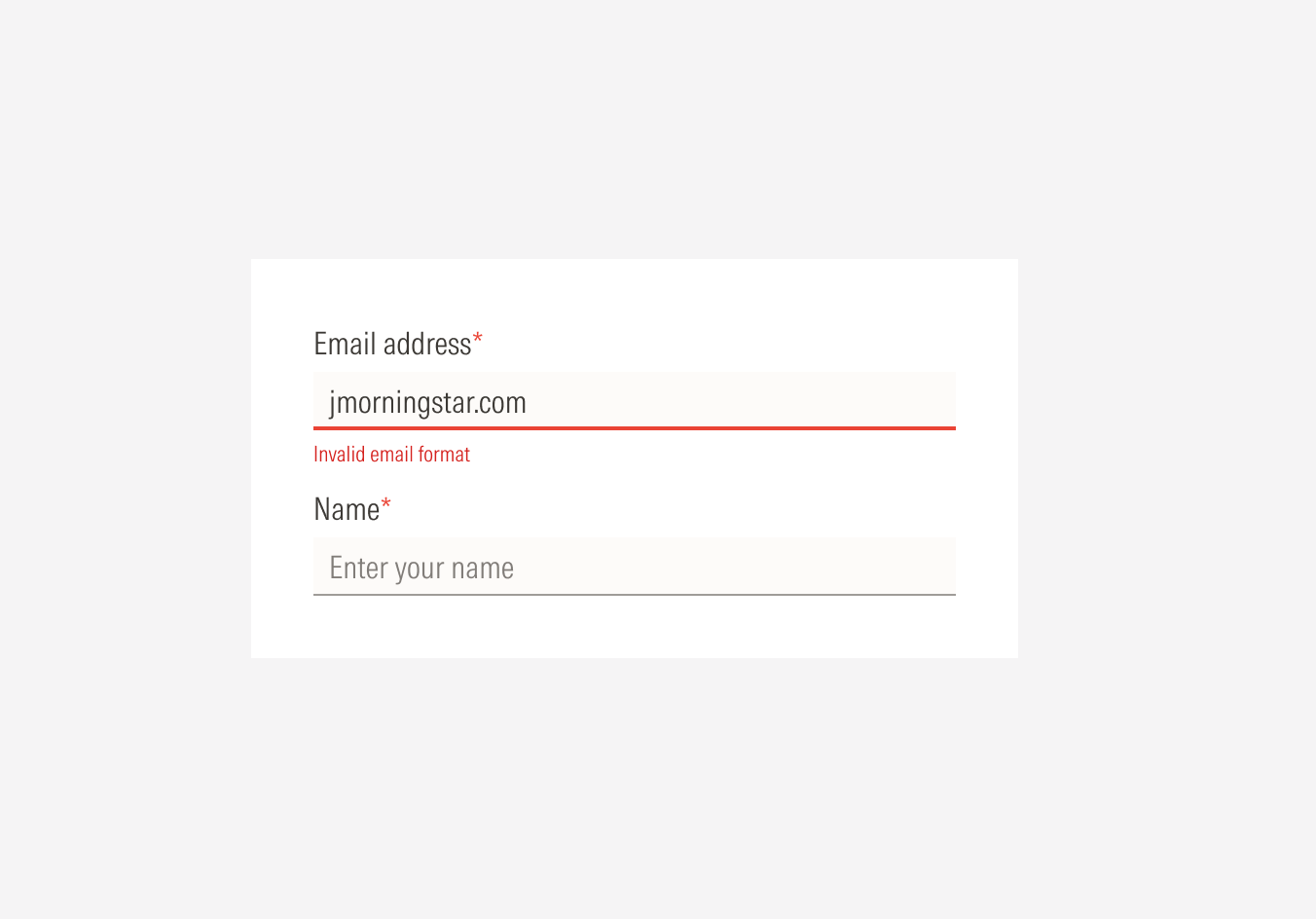
When the system finds invalid information in an input, the UI element must communicate that to the user and give the information they need to correct it. This is where the error status for an input element comes in. The error message and system validation depend on the type of information required and the type of characters allowed for each input.
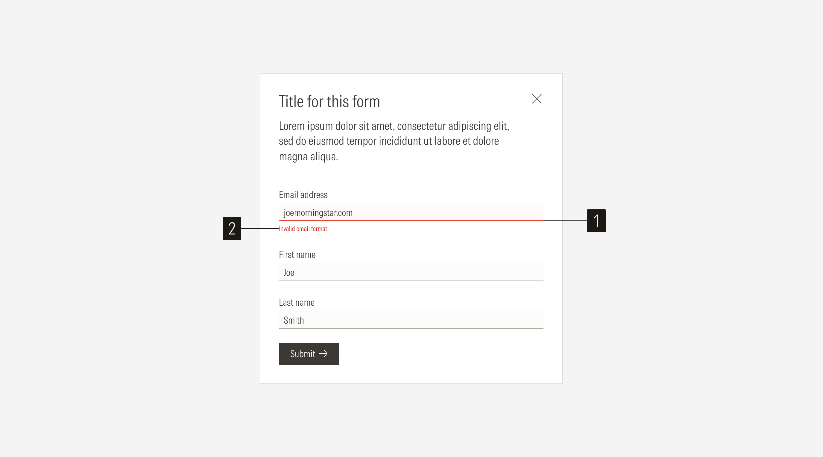
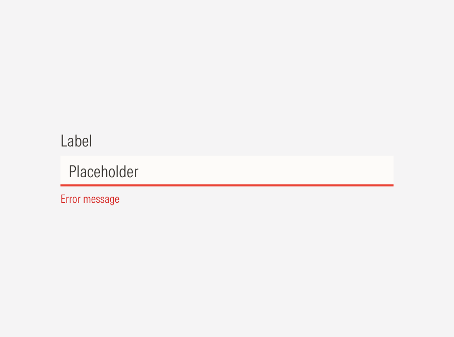
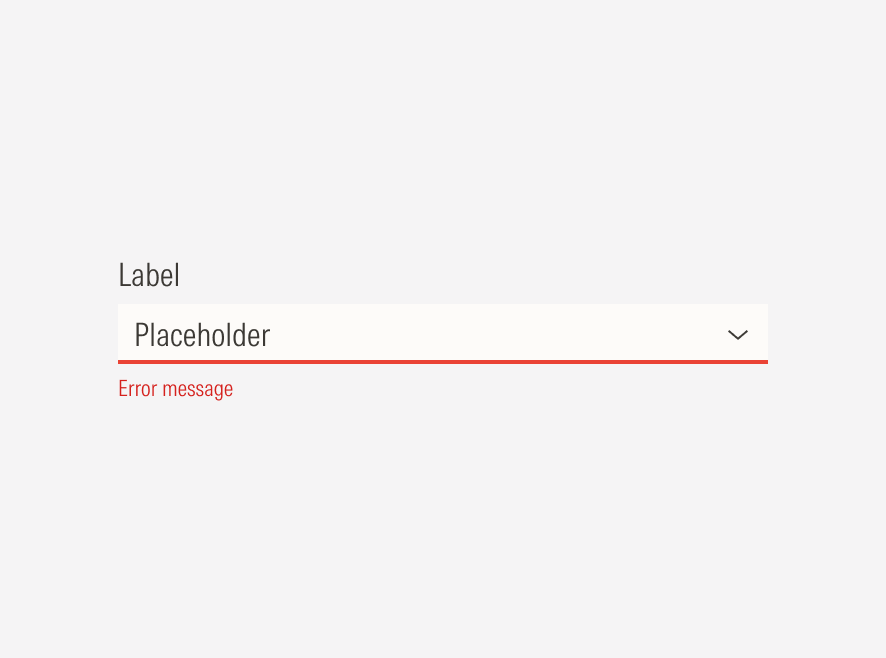
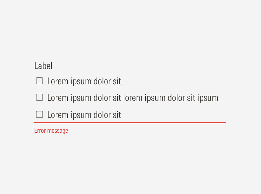
- Input line is an underline field stroke with a 2px thickness and a Red 50 color. It appears when there is an error in an input field.
- Error message shows below the input line when there is an error in an input field. The message must be clear and short.
Single Input Error
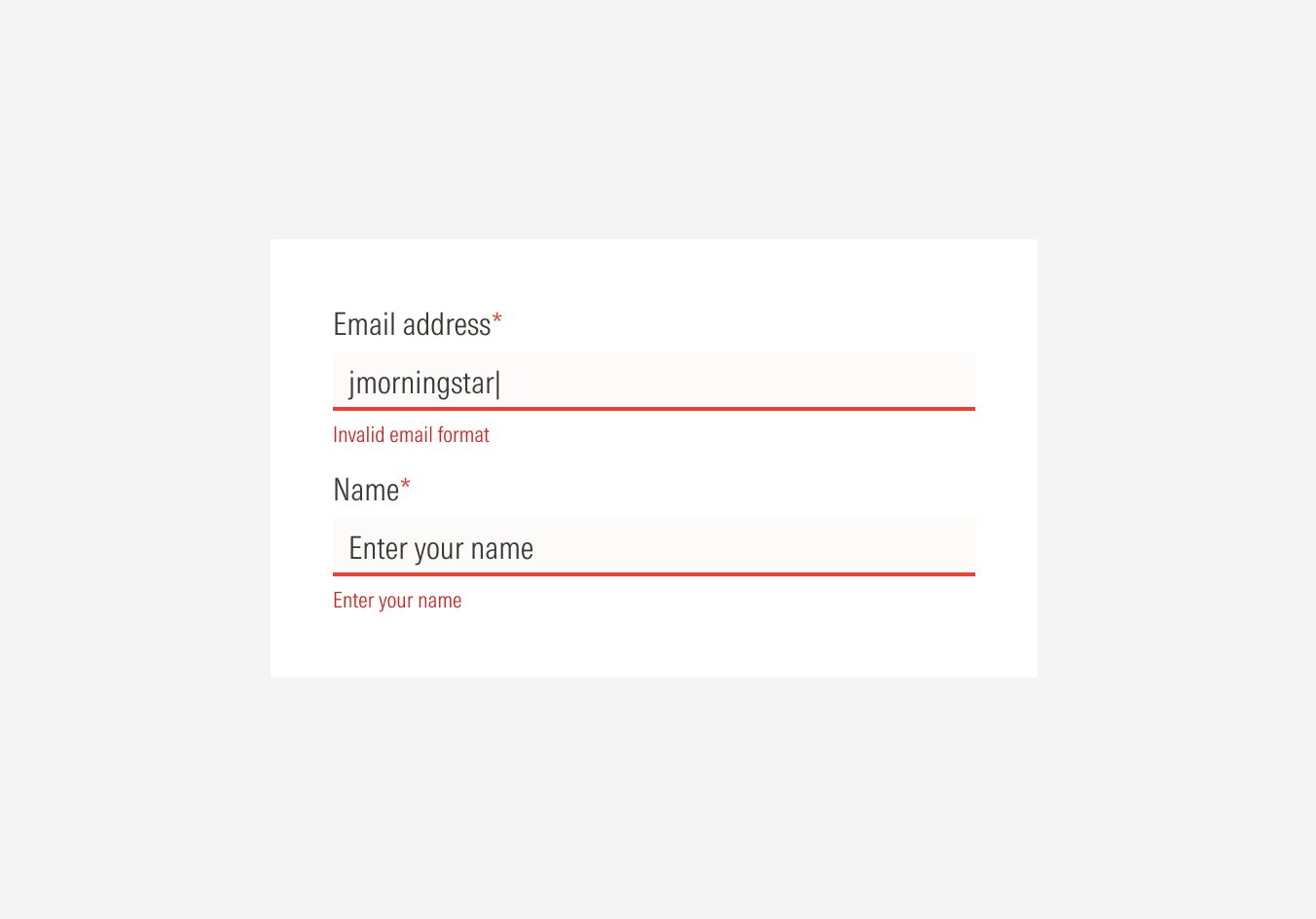
When triggered, the single input error will be displayed close to the component it refers to, affecting only that specific component.
One or more inputs can display an error at at time. Error help text should appear below the input in the color Red 50 with a 2px-thick line over it in Red 60; this creates a good level of contrast and highlights where the error is.
Any input component can trigger an error if the entered information is invalid: text inputs, selects, radios, and checkboxes.
Simple Text Inputs
For cases where the user didn’t enter information in a required field or the format of the information is invalid.
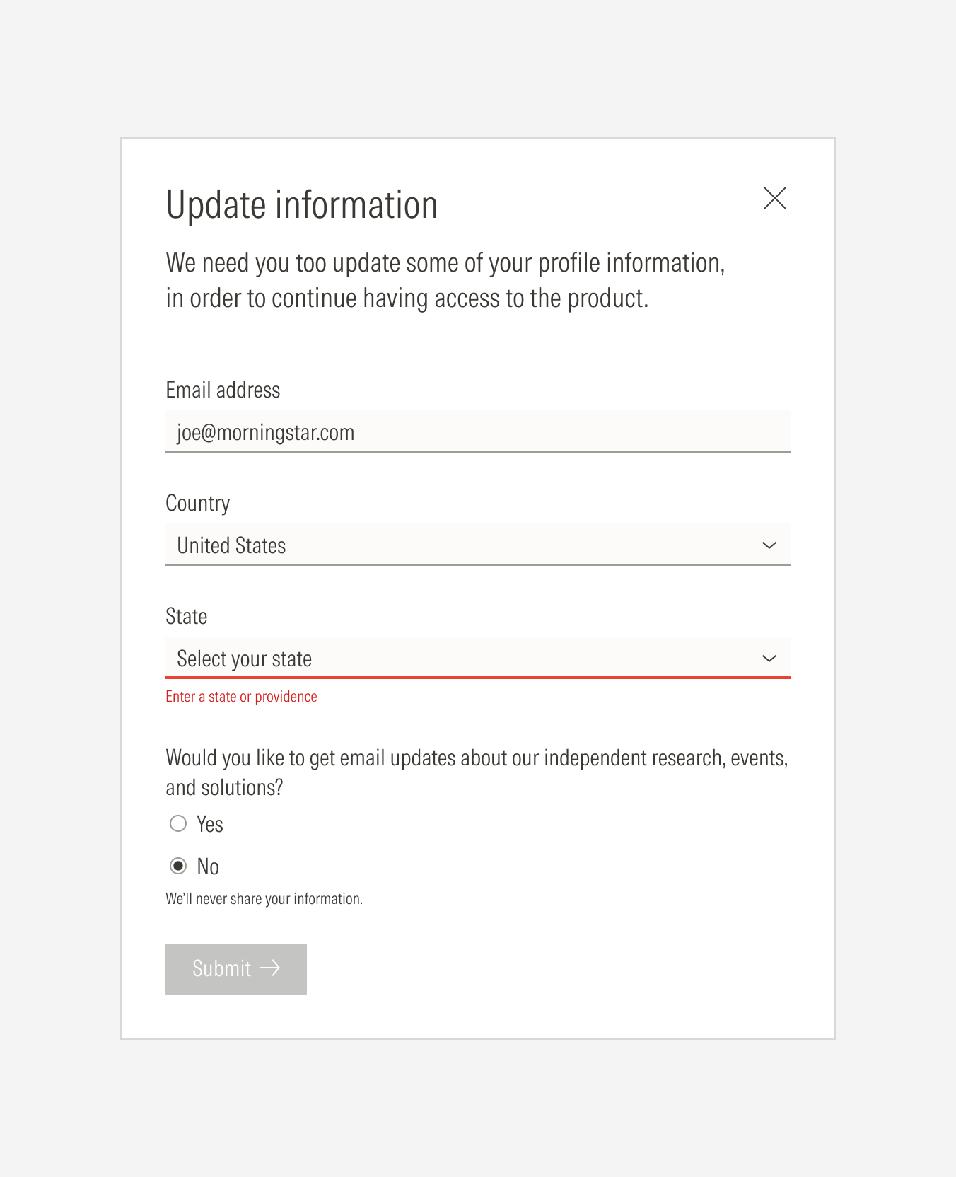
Select Inputs
Use for required fields where the user didn’t enter information.
Radios/Checkboxes
Use when a selection is required or there’s an specific relationship between inputs.
Validate fields after the entry is complete
Aim for inline validation. Show the error indicator once the user has finished entering the information in the field and moved to the next one. If the user is still adding information on a field, it shouldn’t be validated. As Nielsen Norman Group explains, “it’s frustrating to see an error message before being given the opportunity to finish typing”.
Do alidate the field after the user has finished entering the information.
Don’t validate the field before the user has started or finished entering information in that field.
Validate through submission
Once the user submits the form, validate that all the required fields are completed with the right type of information. This will help users know if they missed filling out one or more fields.
Do Do validate when submitting. Once the user selects the submit CTA, the form gets processed and the information is validated through the backend. The system will display an error on any invalid entered fields.
Keep the error message next to the field
This happens when we apply the inline validation. Showing the error message next to the field it refers to (in this case, below its input) makes it clearer and easier for users to understand. Users can see and fix the error right away or come back later after filling out other inputs having to remember it, minimizing their working memory load.
Switch the text descriptor for the error message
If the field has a text descriptor and shows an error after information is entered switch the text descriptor for the error message to avoid movement in the other fields. Any sudden movements or jumps in the form can be annoying and cause frustration, distracting many users.
Do replace the descriptor text for the error text when a field has a descriptor, validation happens, and an error in that field is found.

Don’t keep the descriptor text for the error text when a field has a descriptor, validation happens, and an error in that field is found.
Keep the error messages short, informative, and consistent
Error messages need to be specific and helpful. They should communicate what is wrong and guide the user to a solution. Don’t tell them only what is wrong and let them guess what they need to do.
Error text should have a helpful tone. Give a hint or tip to help the user understand what is missing and needs to be changed.
Do sshow specific, clear error messages so the user can understand what the error might be and how to solve it.
Don’t show unclear, generic error messages that might confuse the user and don’t explain what might be wrong or what they should do.
Use the required or optional indicator to prevent errors
Use a required or optional indicator to communicate which fields a user has to fill out, reducing errors caused by empty required fields.
Validations: Use Cases
Specific fields require validation of the type of information, characters, and necessary data.
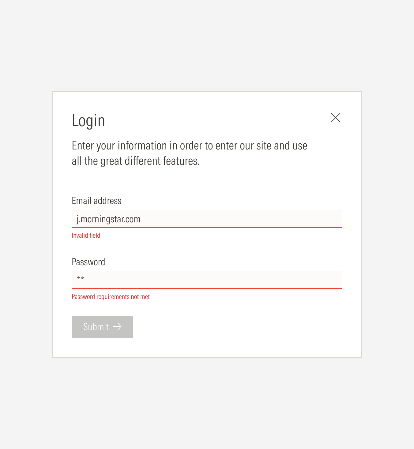
Email Input
- Validate the email format: xxxxxx@morningstar.com
Country + State + City Selection
- Validate that the country is valid. Show only valid countries on the select options to help reduce errors and avoid user confusion.
- Country, state, and city fields depend on each other. When state or country is needed, the user will need to select the country first so the state field becomes active (the options displayed will only be for that selected country). If city is also needed, country and state must be selected first so the city field becomes active (the options displayed will only be for that selected state).
- Validate the selected country to show the respective states.
- Validate the selected state to show the respective cities.
Name/Last Name Input
- Validate that only letter characters are entered—no numbers or special characters.
Phone Number Input
- Validate that the entry uses the accepted phone format, including the country code and the correct number of characters.
- Validate that only numbers are entered. For this option the input field must have a placeholder for the required format.
Password Input
- Validate that the number of characters meets the minimum.
- Validate the type of characters allowed.
- Validate that the password reaches the level of strength needed.