Hero
This hero will start every page in the top-most section of a page. It appears directly under the navigation bars.
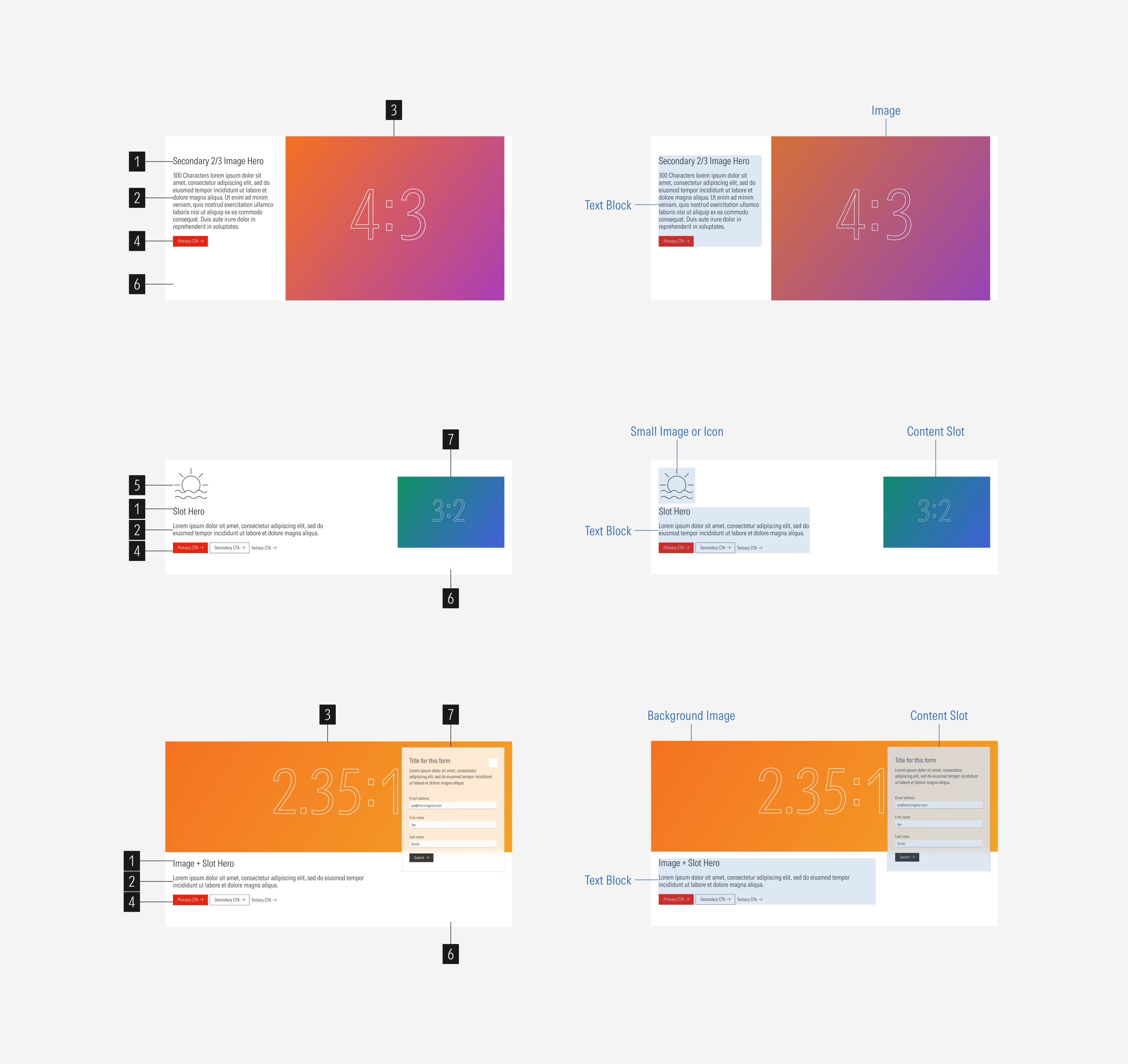
- Title sets the topic for the hero and the content of the page.
- Body text gives context about the main topic of the page.
- Image enforces the content of the hero. Depending on the hero variation, it can be boxed in a slot or a background image for part of the hero content.
- CTAs enforces the desired user action. CTAs are optional. There could be no CTA, only a primary CTA; a primary and a secondary CTA; or a primary, secondary and tertiary CTA.
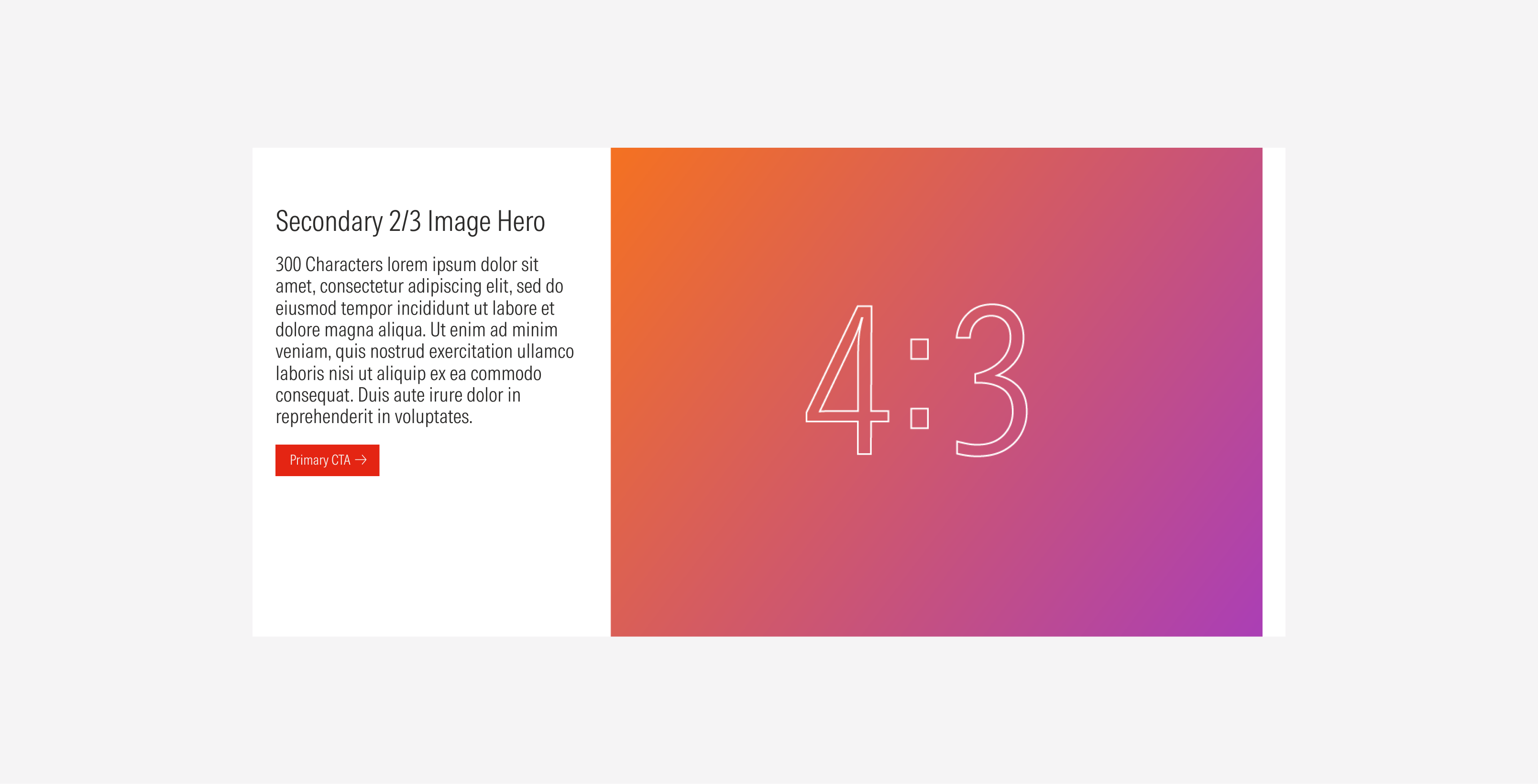
- Icon or logo image gives extra context on the content with the category or event it belongs to. Use brand icons and images with a 3:2 ratio where logos can be placed.
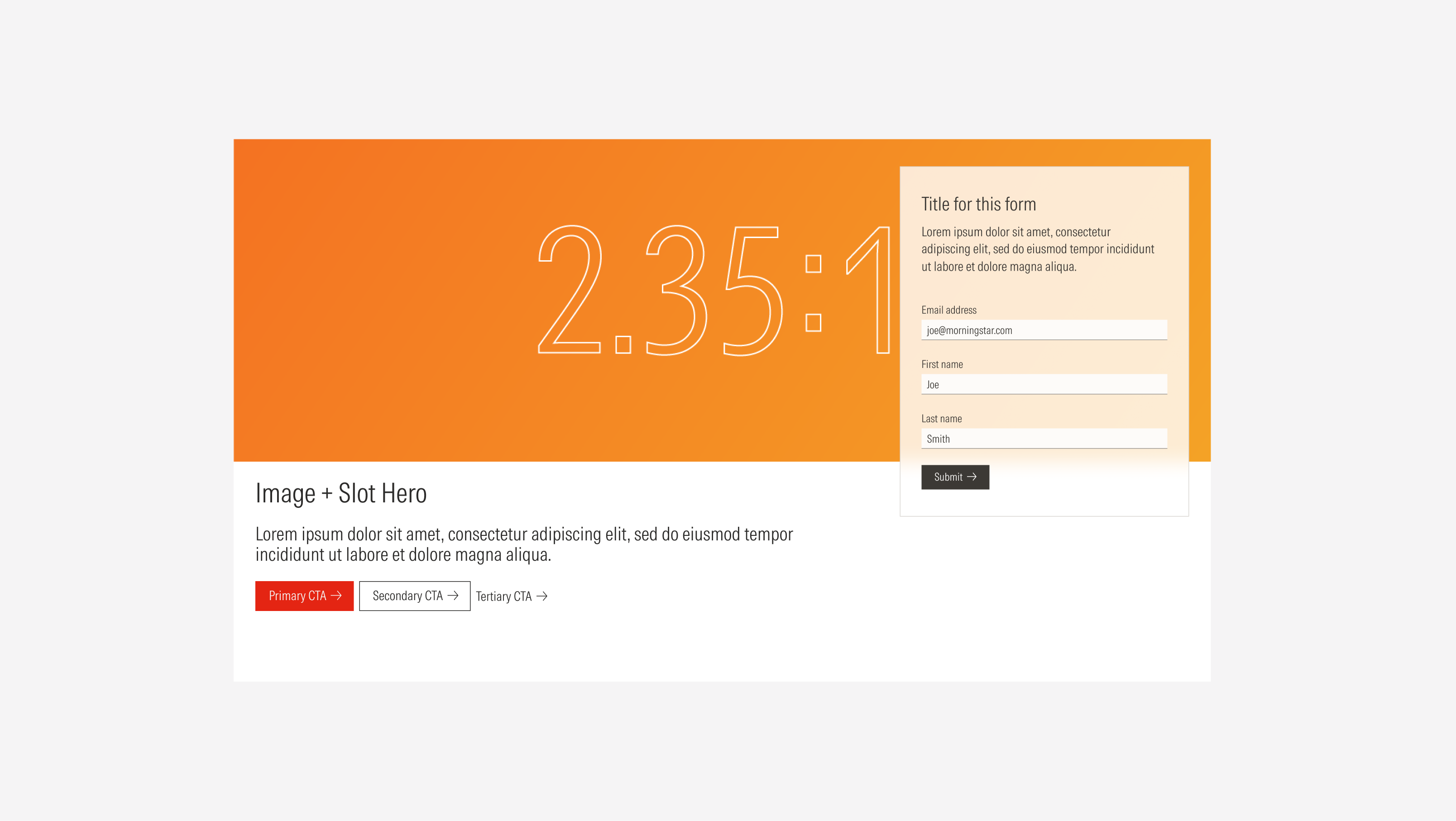
- Background defines the space of the card container.
- Content slot displays different types of elements depending on the content and purpose of the hero. It can contain an image, a list group, a form, or a card.
Usage
When to Use
Use a secondary hero on web-page to hook users and give them a positive first impression of the content of the page, making them scroll to explore more.
When Not to Use
Don’t use a secondary hero on family brand pages or social pages where there is a variety of content for the user to choose from, such as blog posts or research pages. Use a primary hero or a section with a text block instead.
Variation | Purpose | Content | Background | Icon | CTA |
|---|---|---|---|---|---|
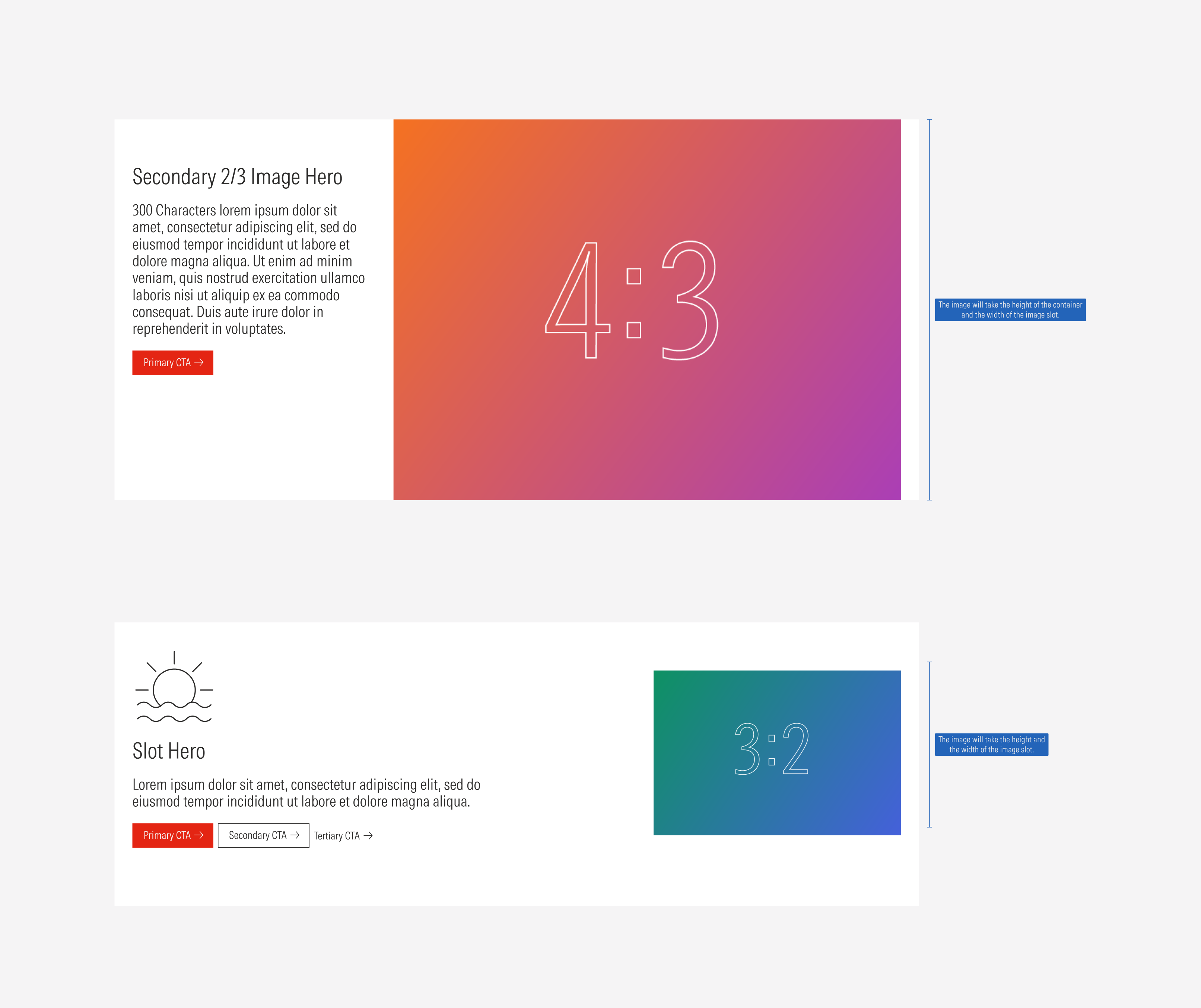
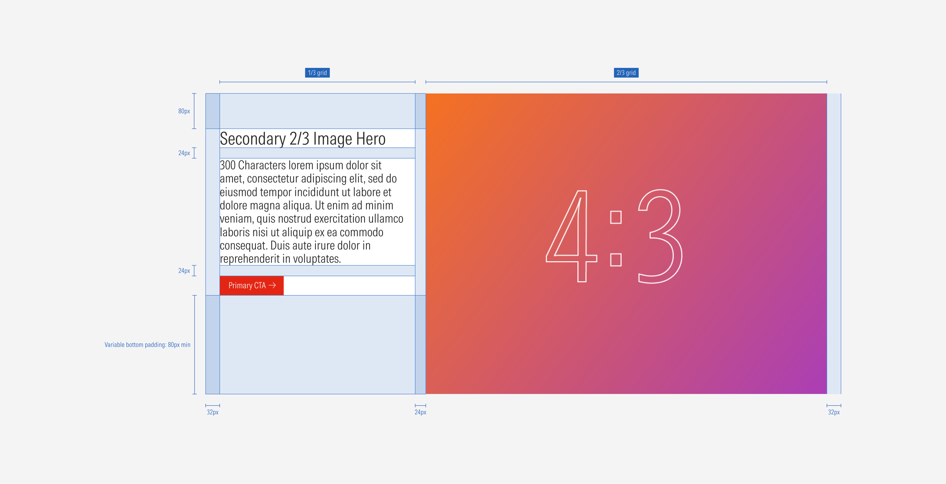
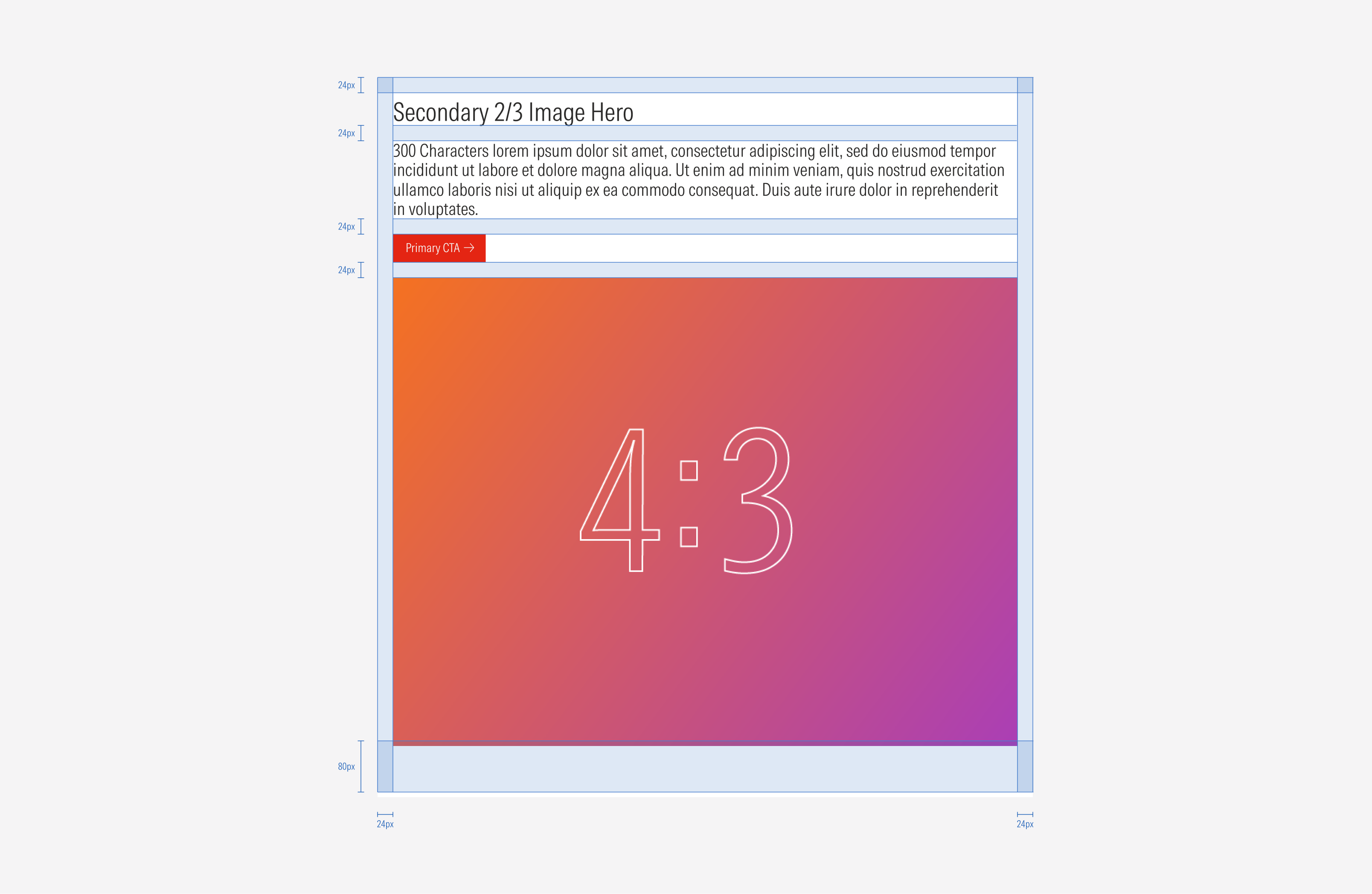
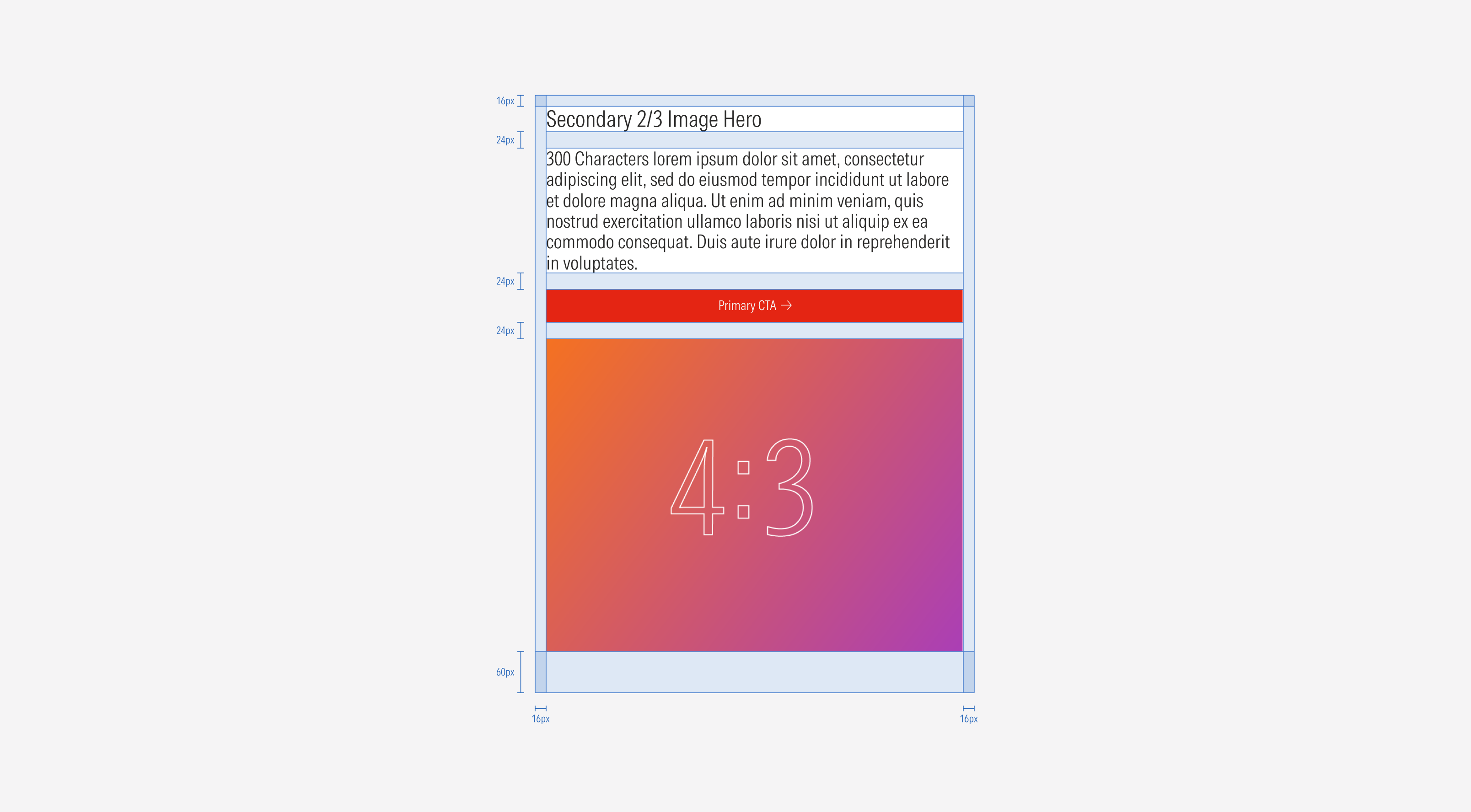
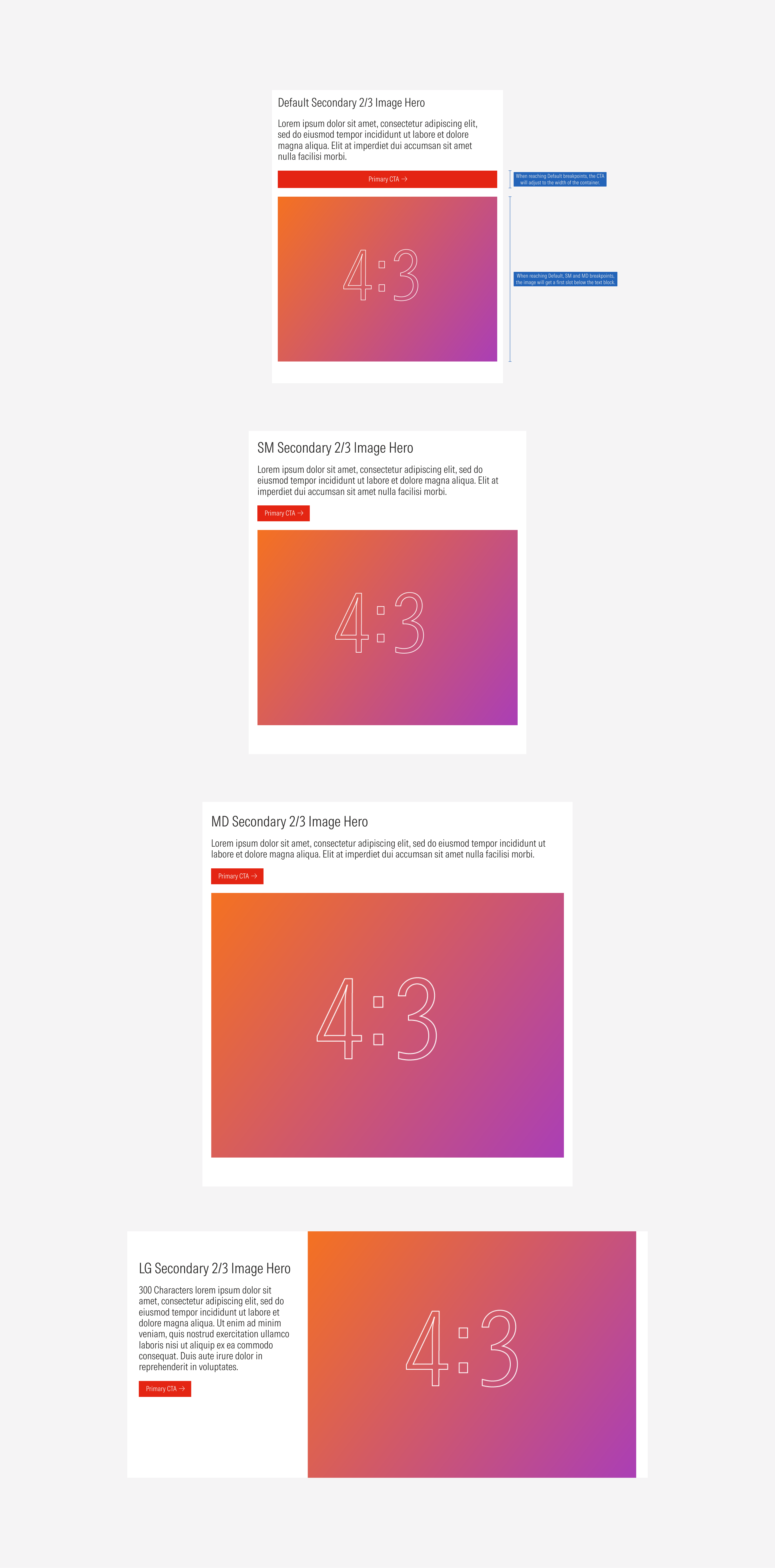
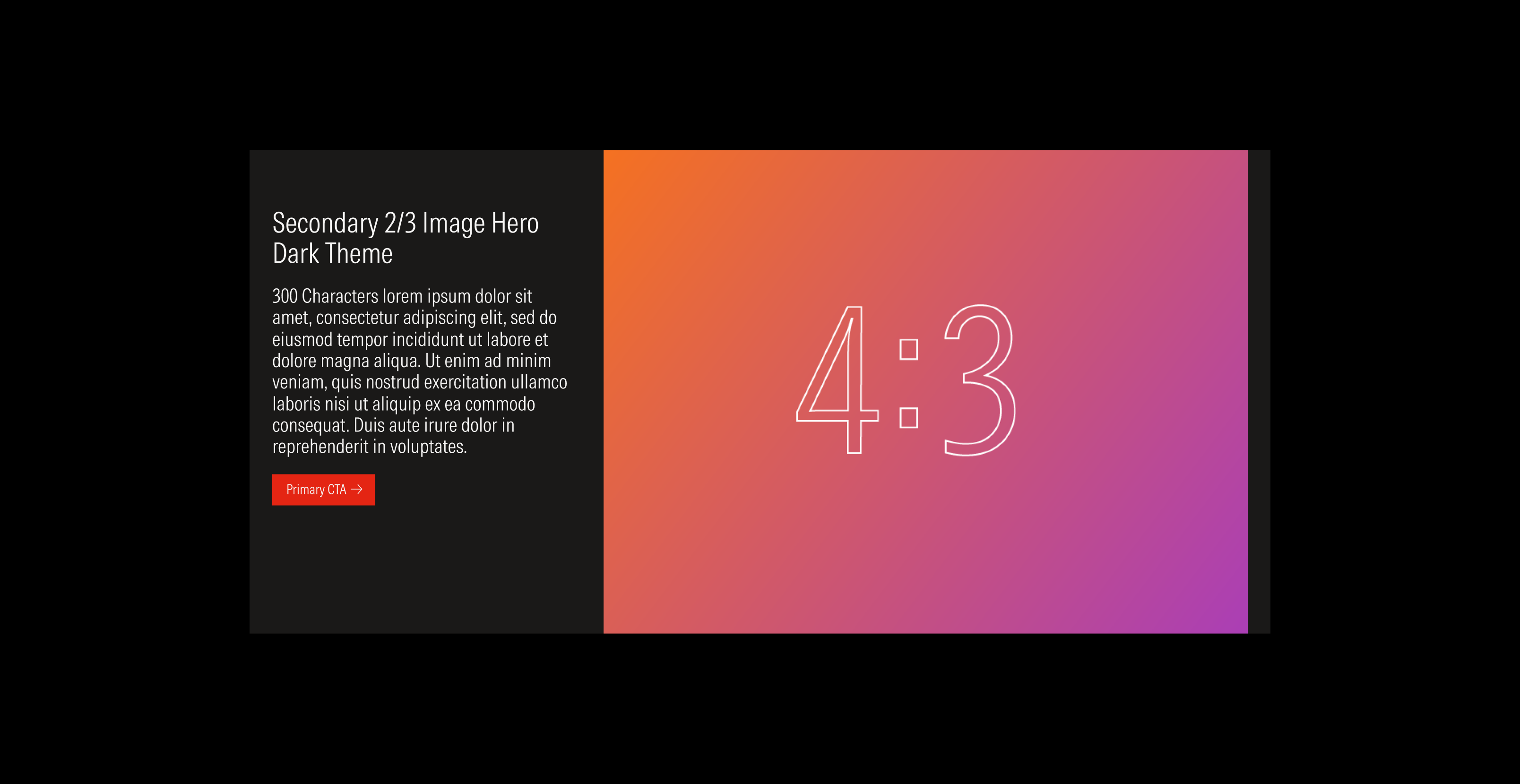
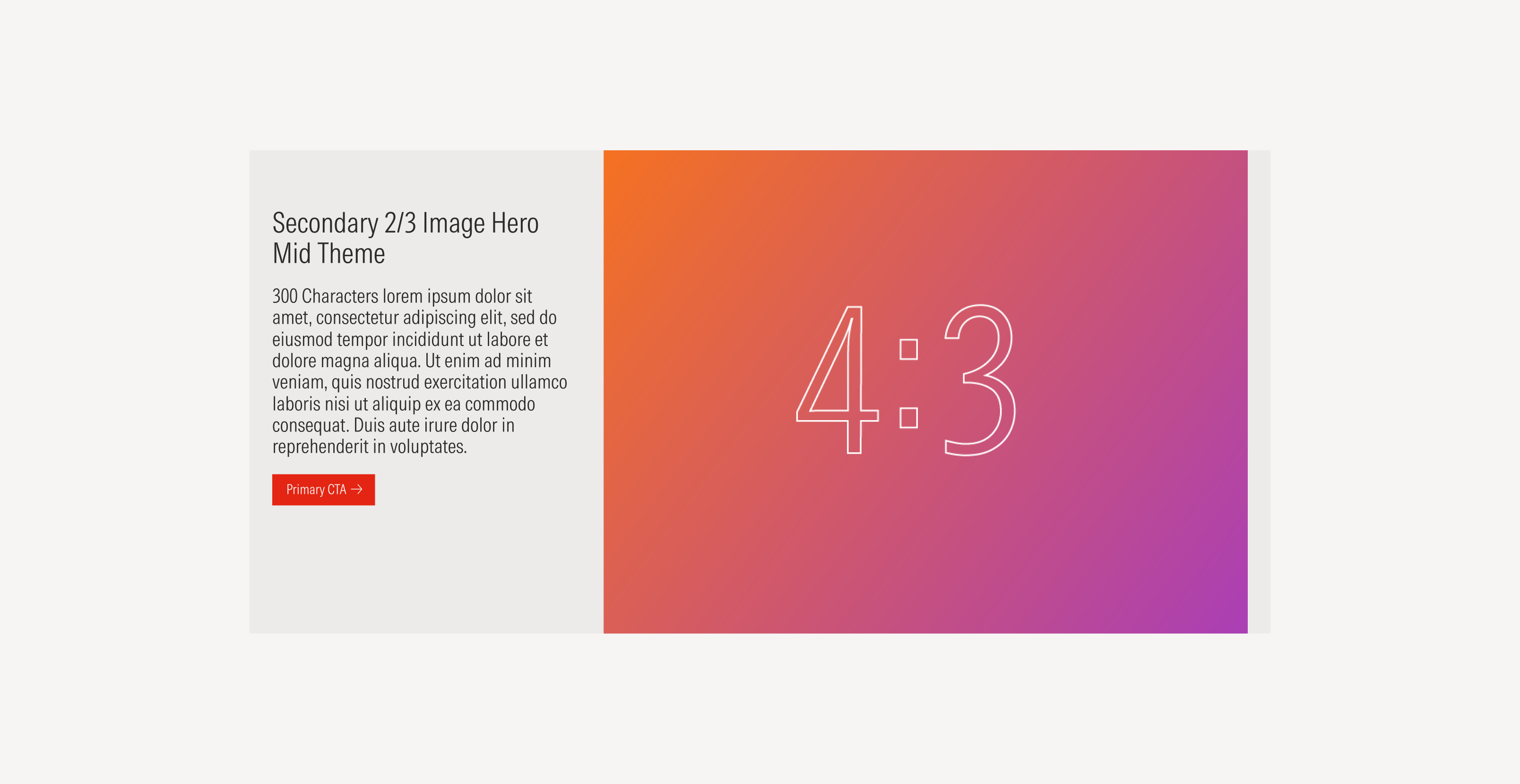
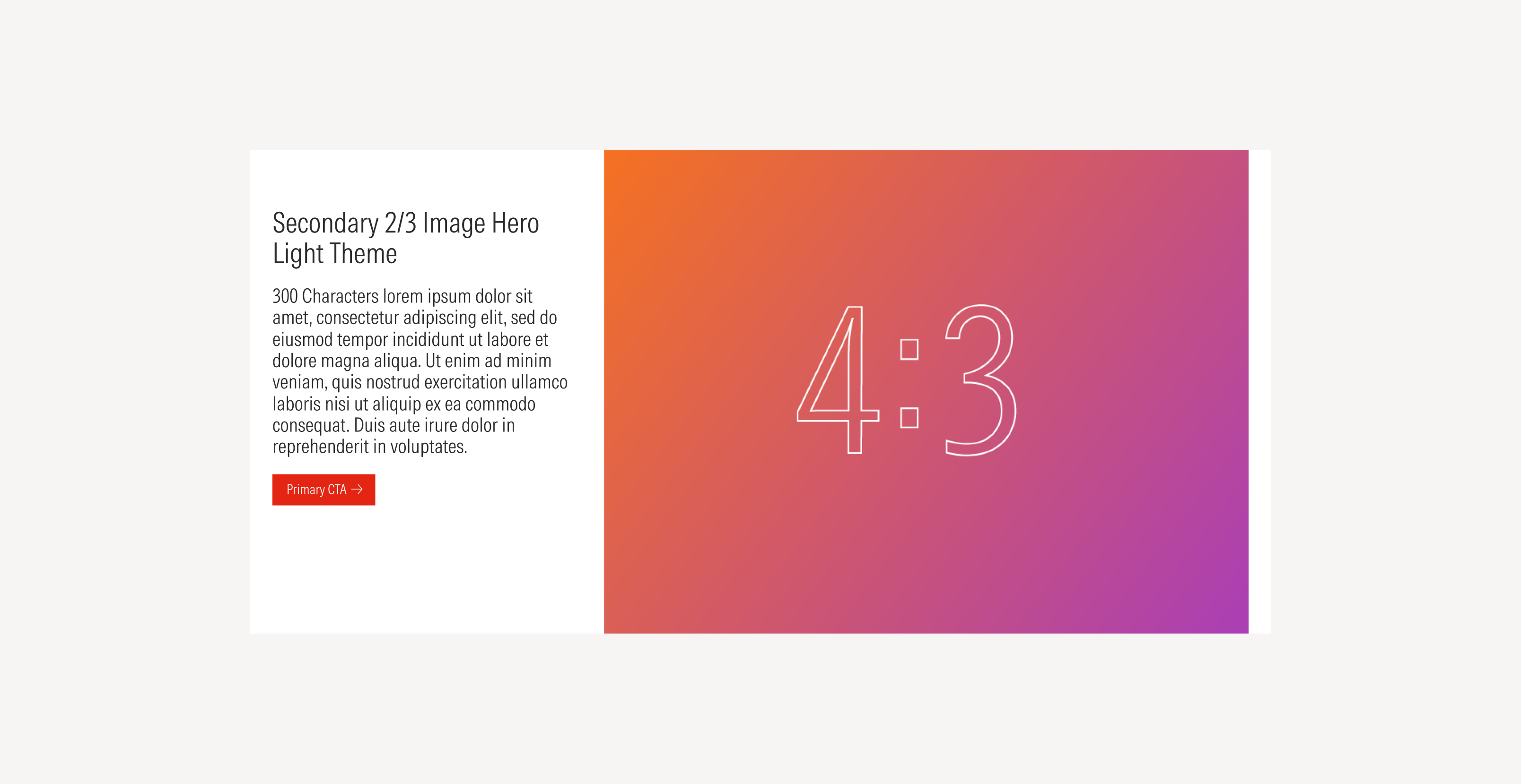
Secondary 2/3 image hero | Use when the hero needs to have an image as the main focal point or when the image has a lot of details. | 4:3 image ratio | Solid color | No icon | No CTAs; a primary; a primary and a secondary; a primary, a secondary and a tertiary |
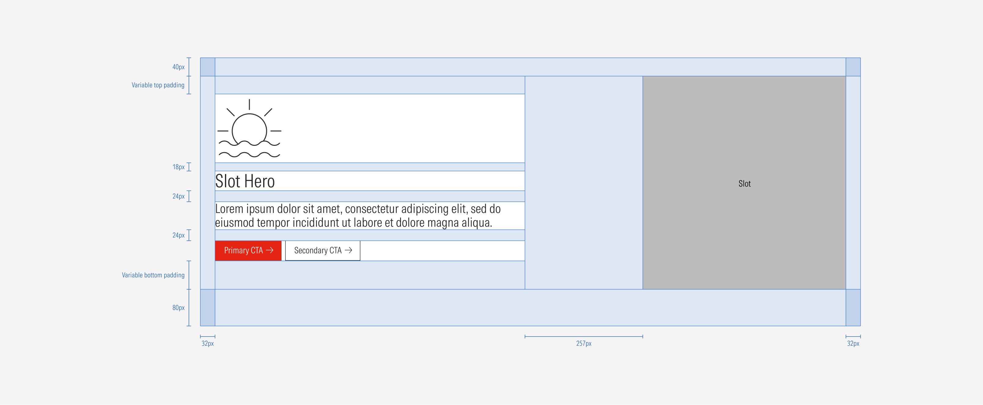
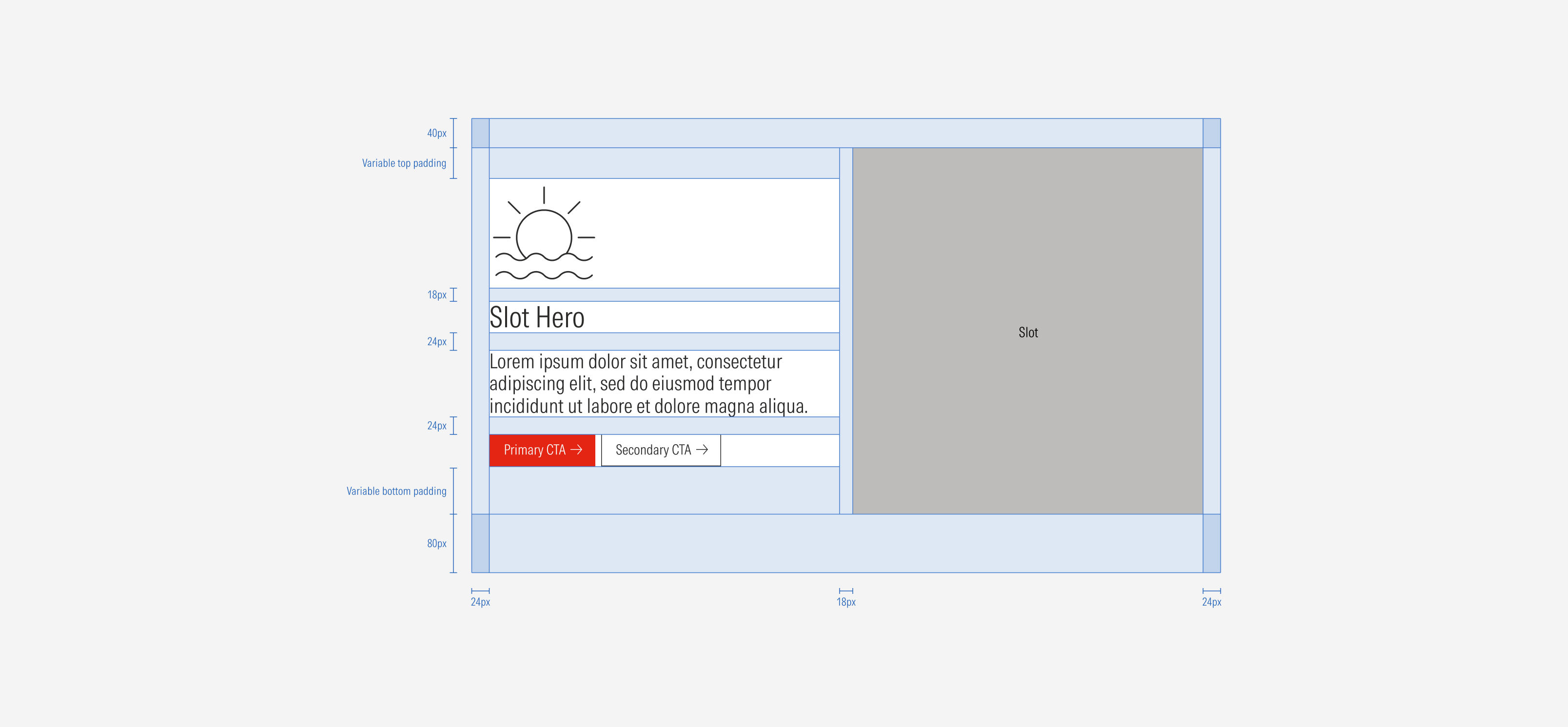
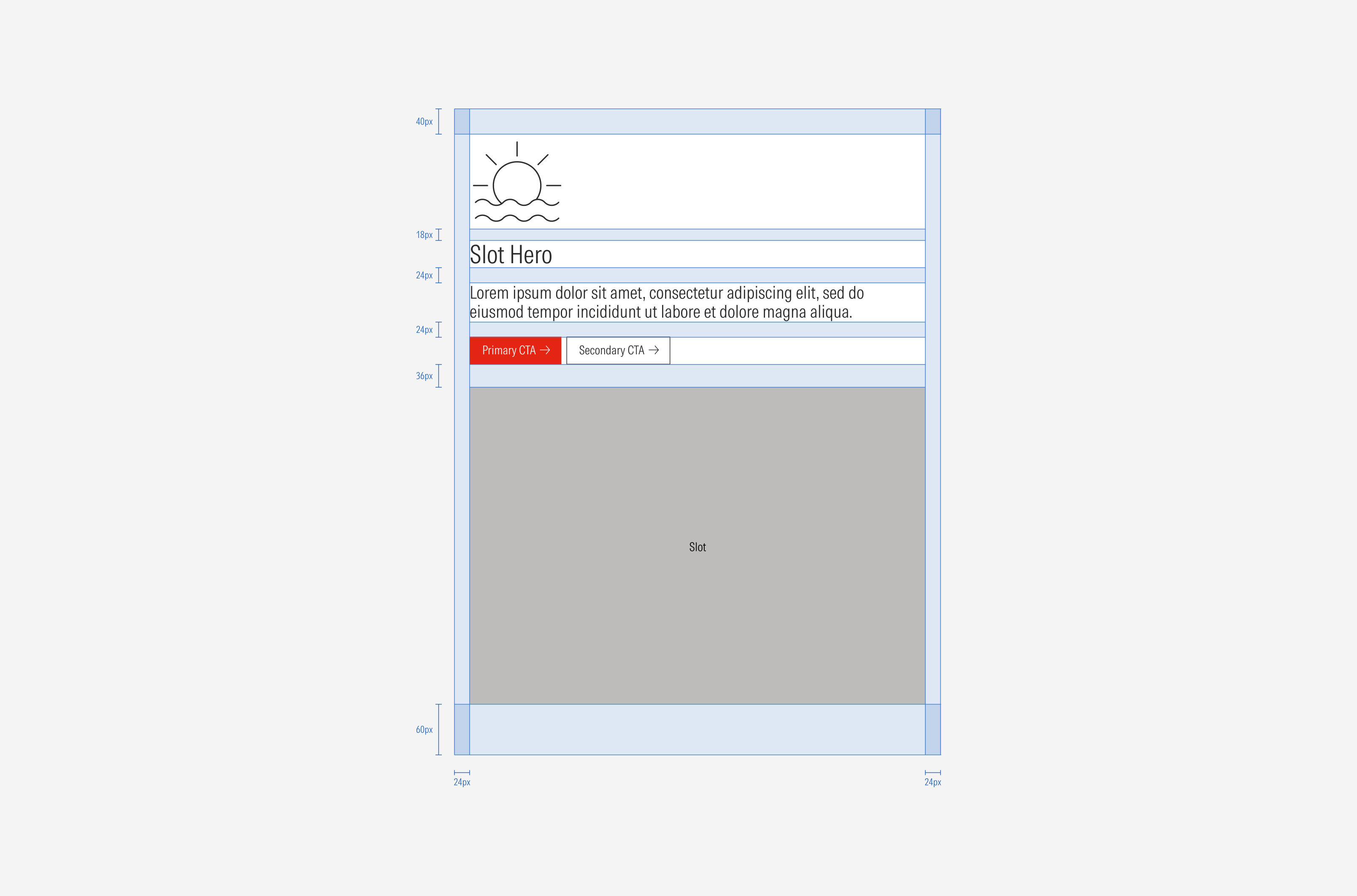
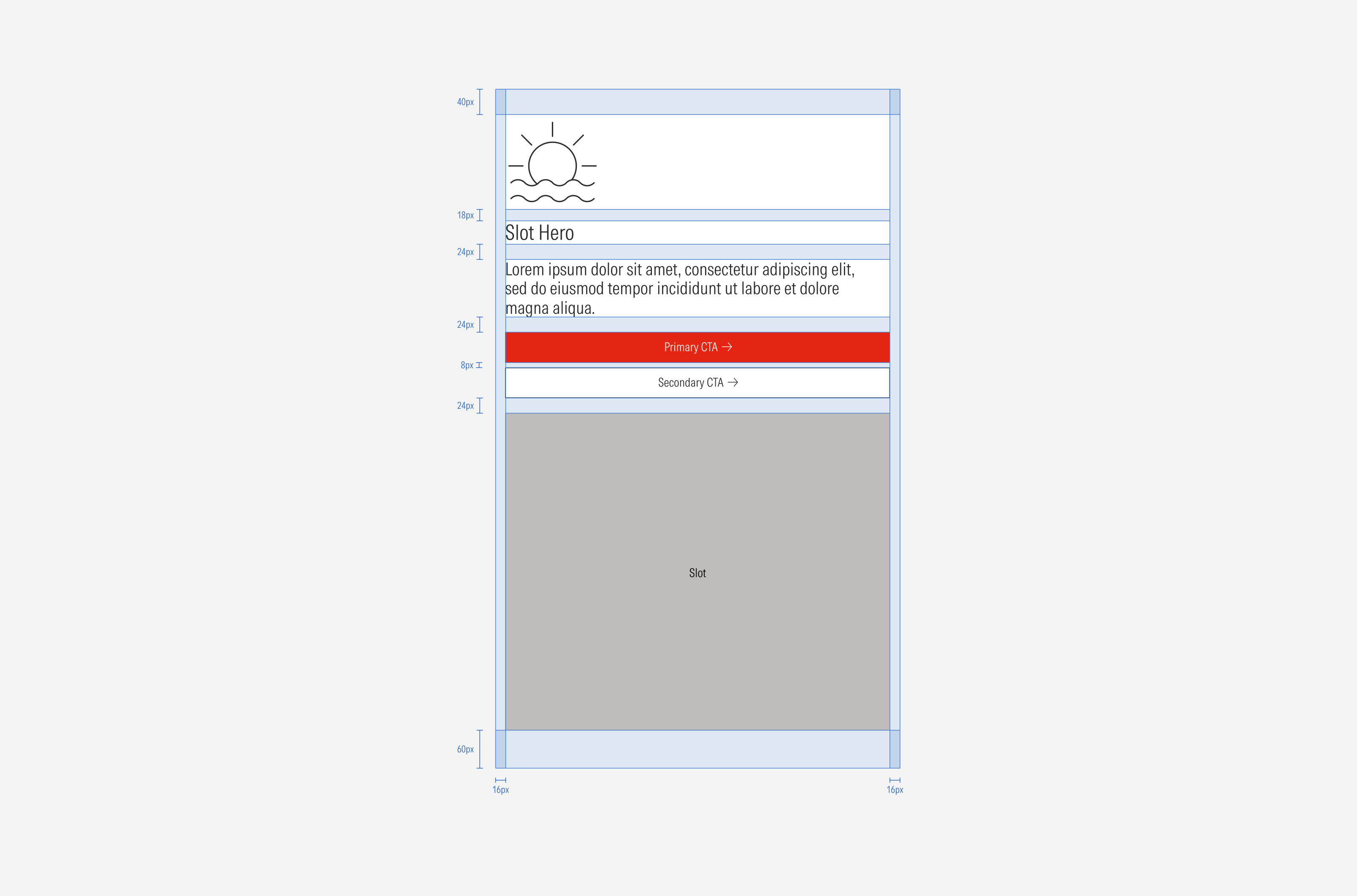
Slot hero | Use when the hero has the text block as the main focal point and there is secondary content to support it or when there is an immediate action needed from the user. | Boxed slot for content (image, general card, list group, form). | Solid color | With icon, no icon, with an image (logo) | No CTAs; a primary; a primary and a secondary; a primary, a secondary and a tertiary |
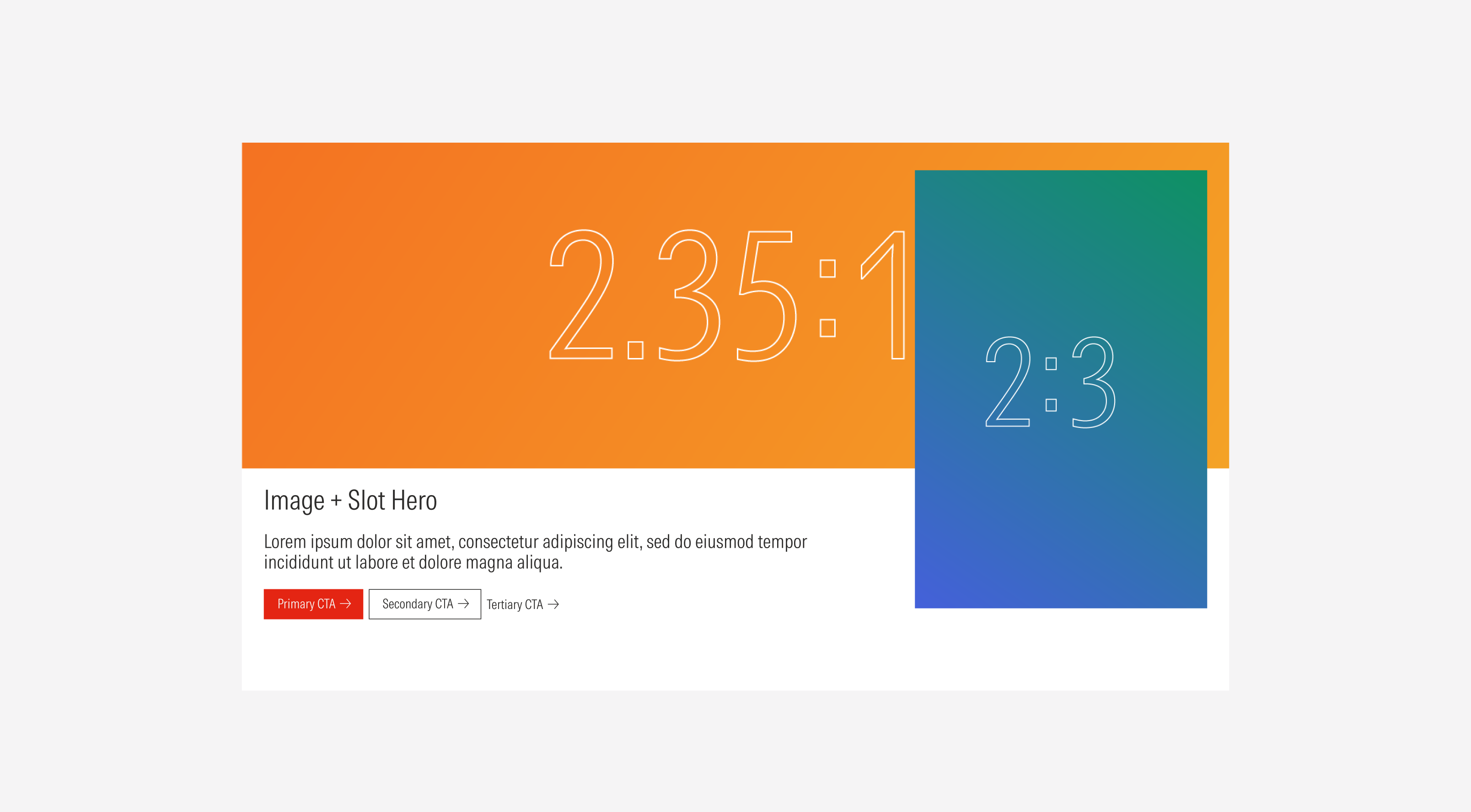
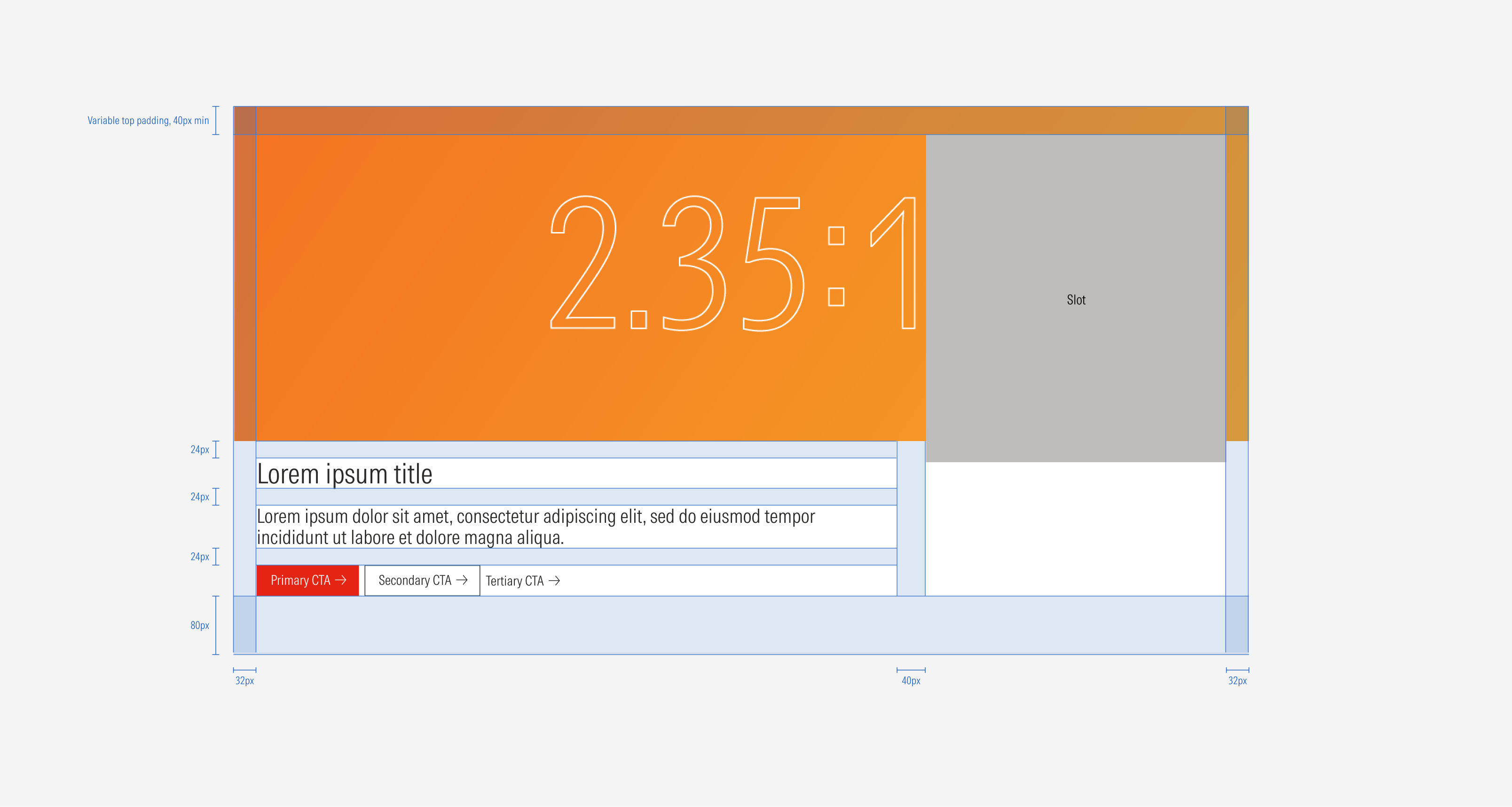
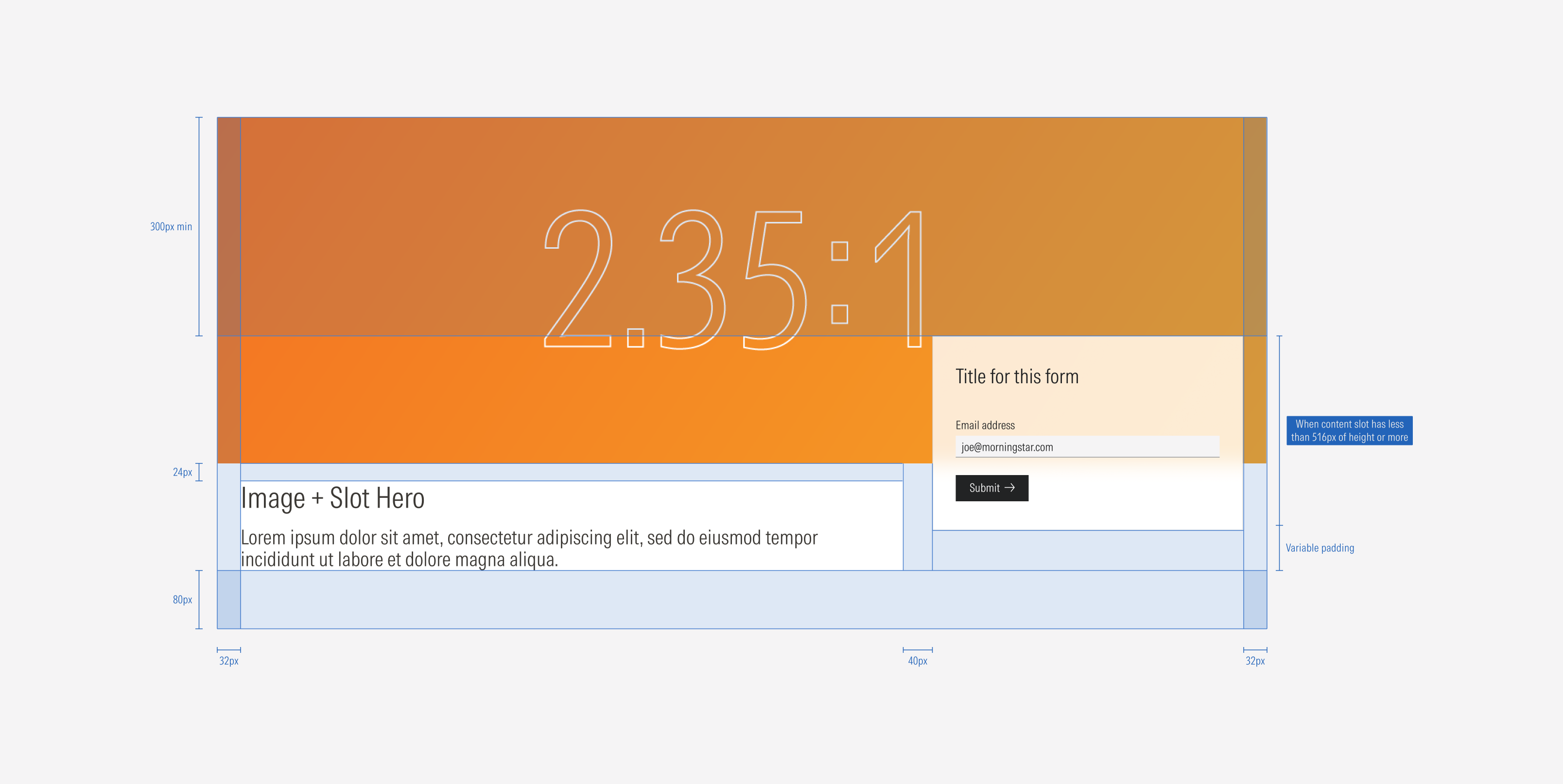
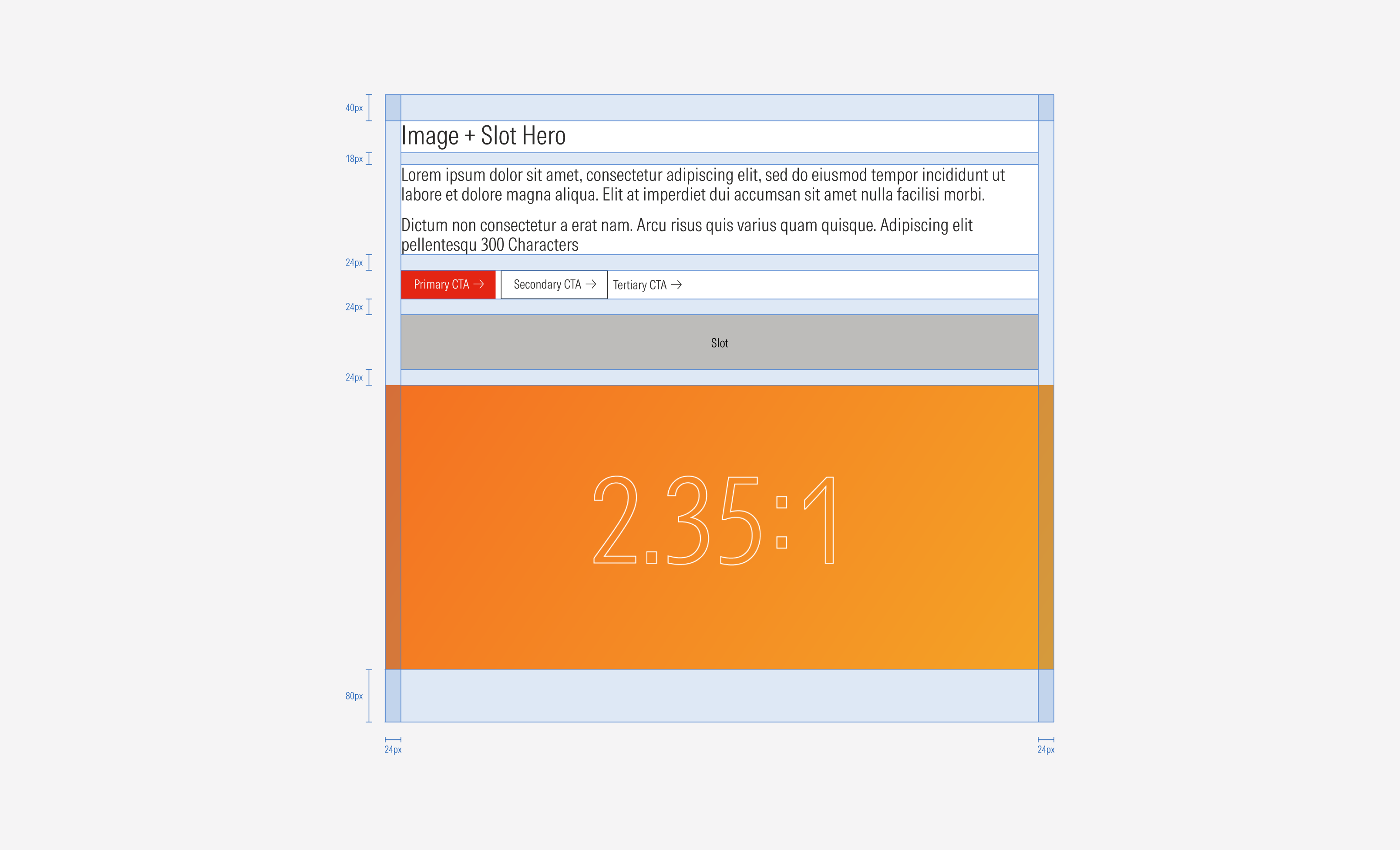
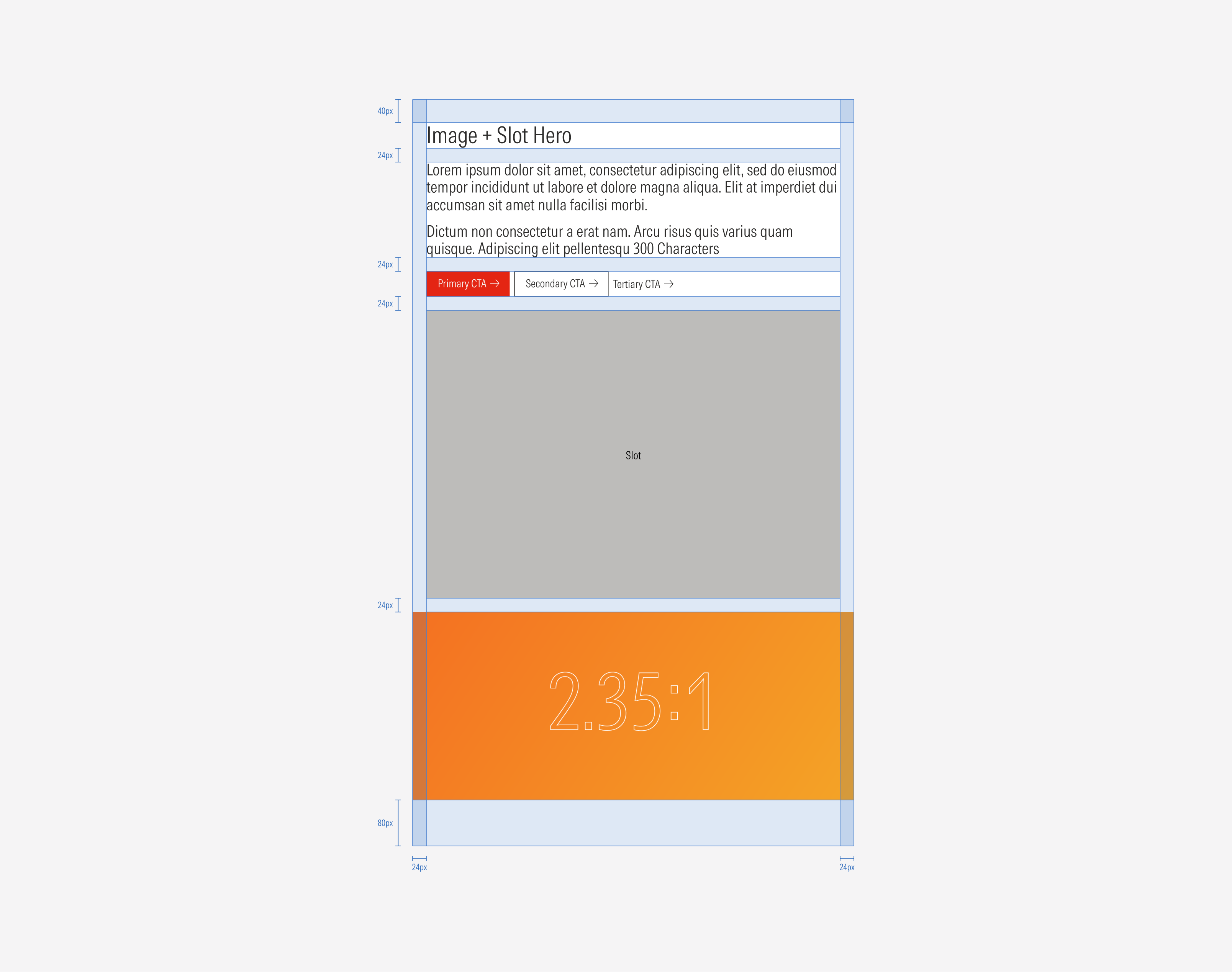
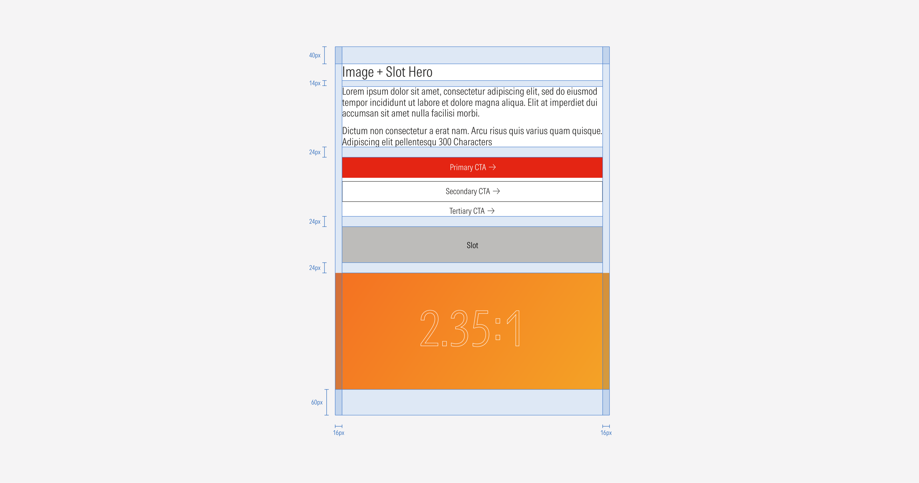
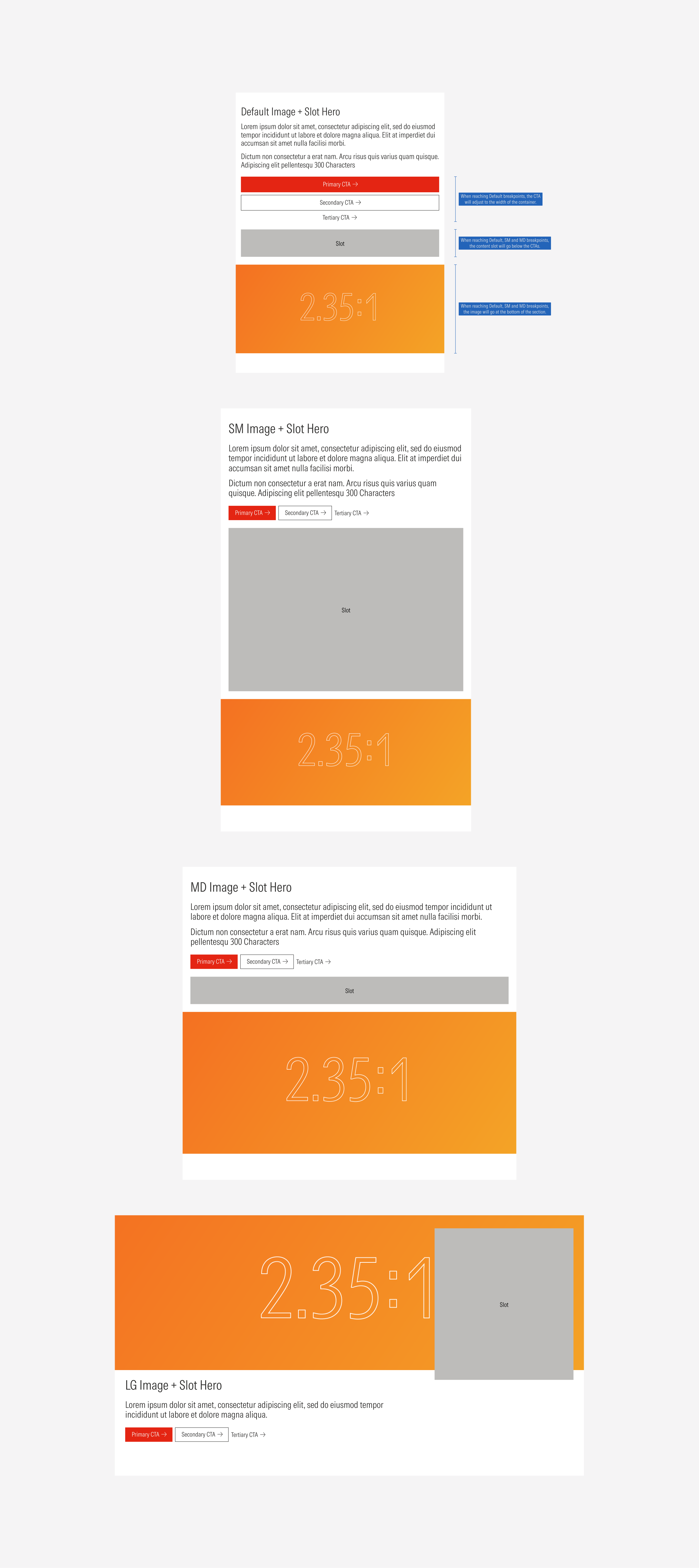
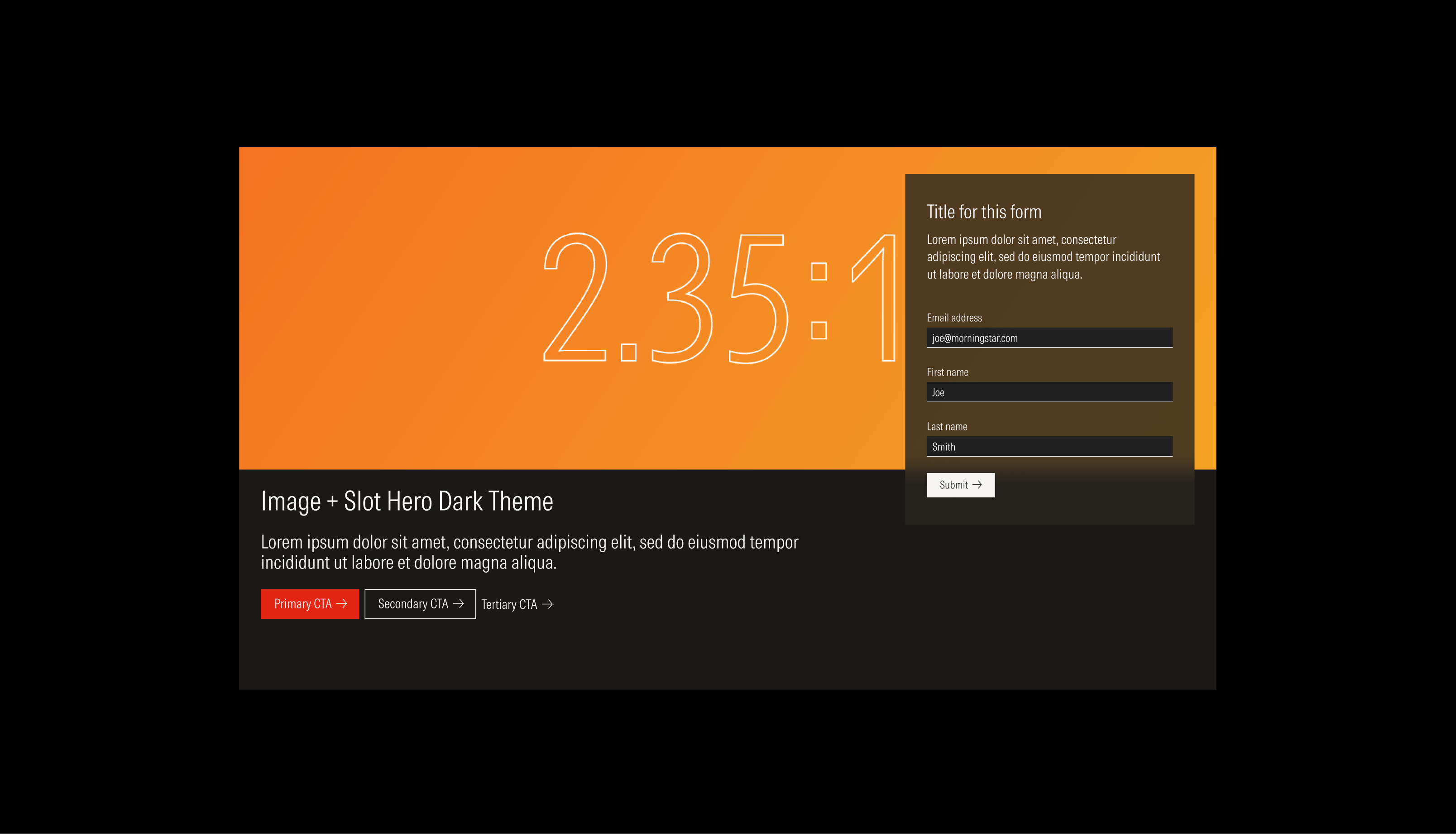
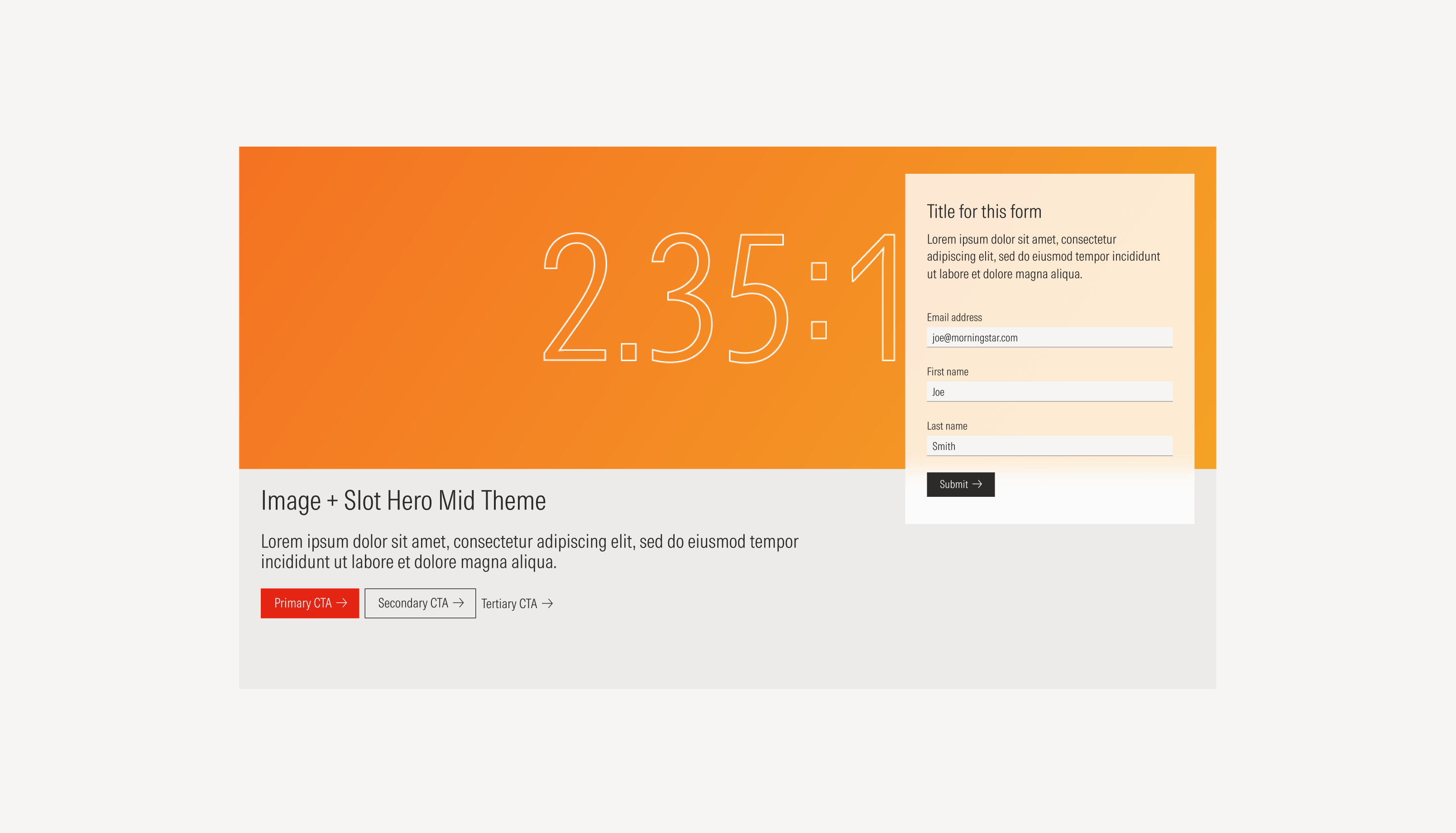
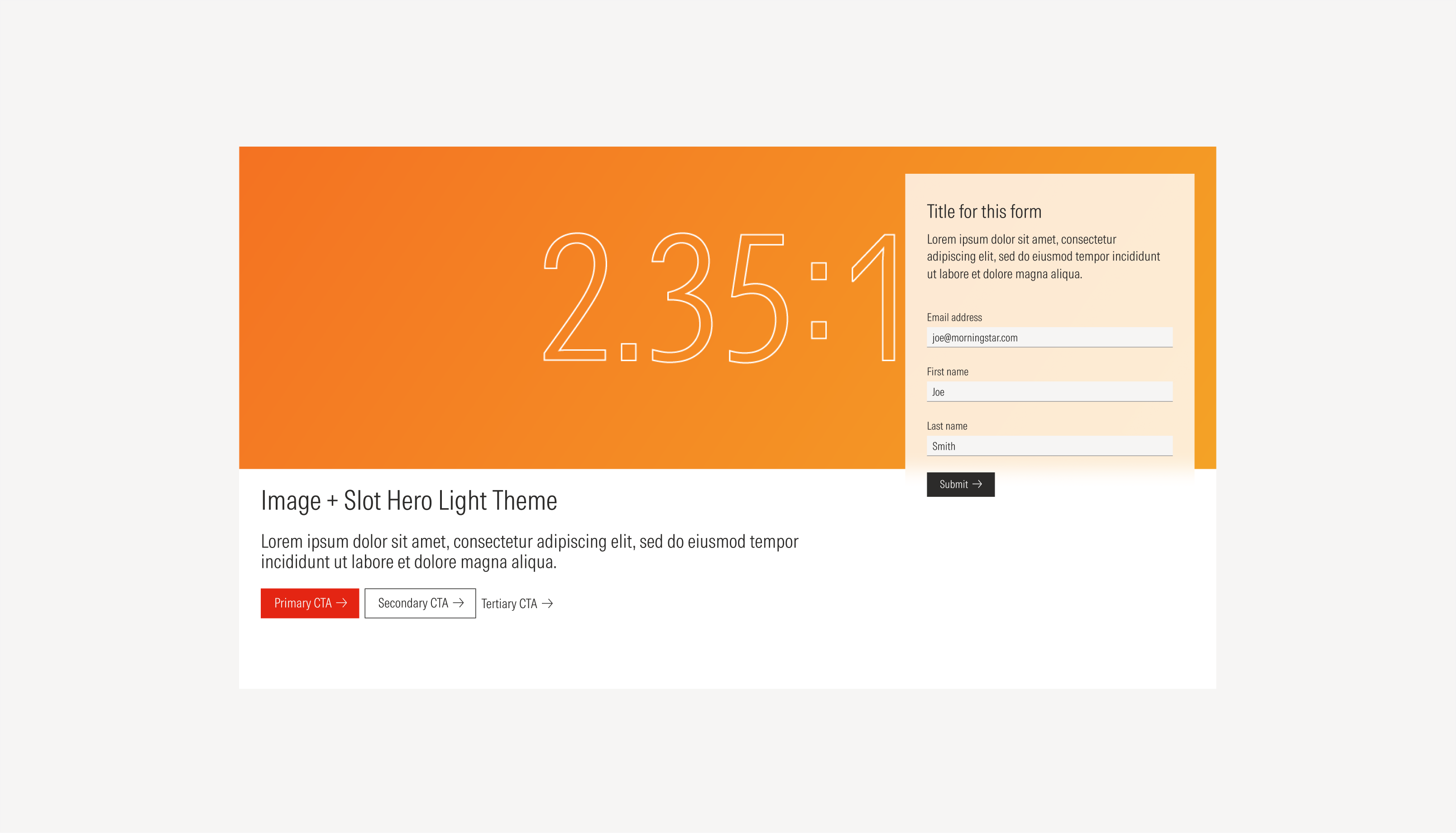
Image and slot hero | Use when the hero needs an image as the main focal point and there is secondary content to support it or when there is an immediate action needed from the user. | Image as part of the background for the content slot and boxed slot for content (form, image, card, list group). | Image and solid color | No icon | No CTAs; a primary; a primary and a secondary; a primary, a secondary and a tertiary |
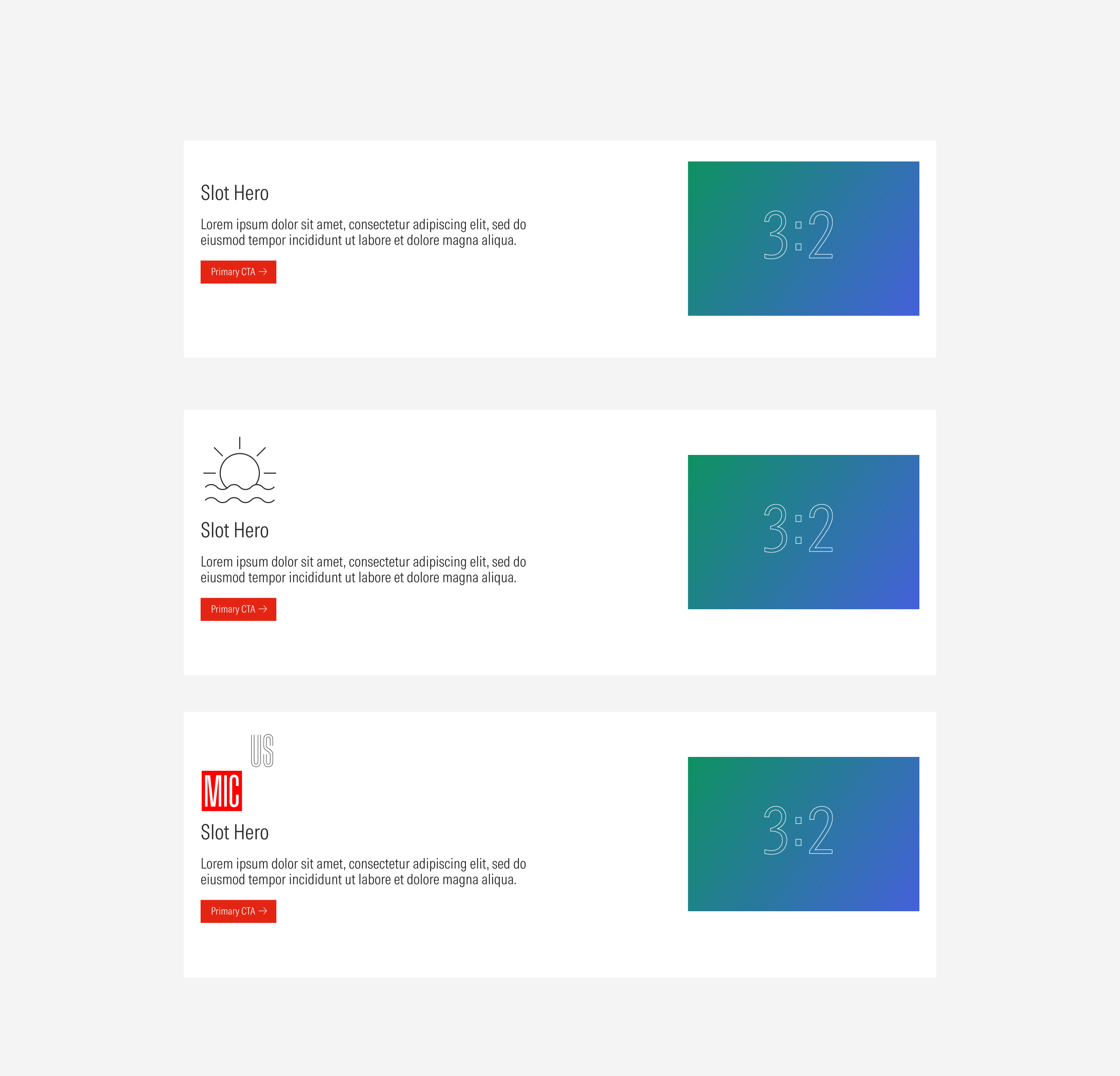
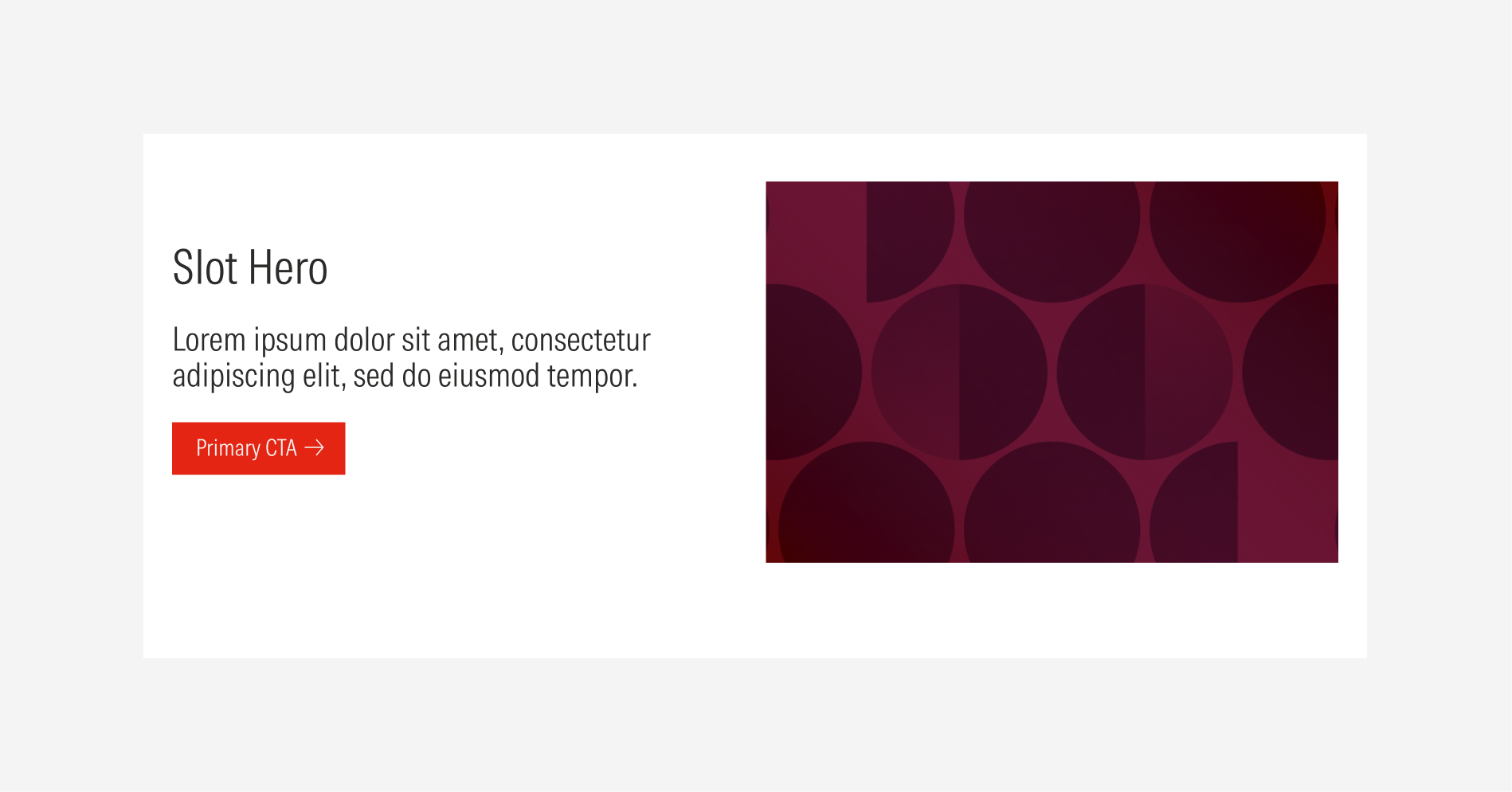
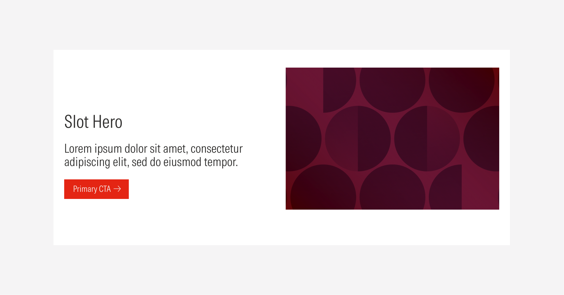
Slot Hero: Image
Use the content slot to contain an image with a 3:2 ratio.
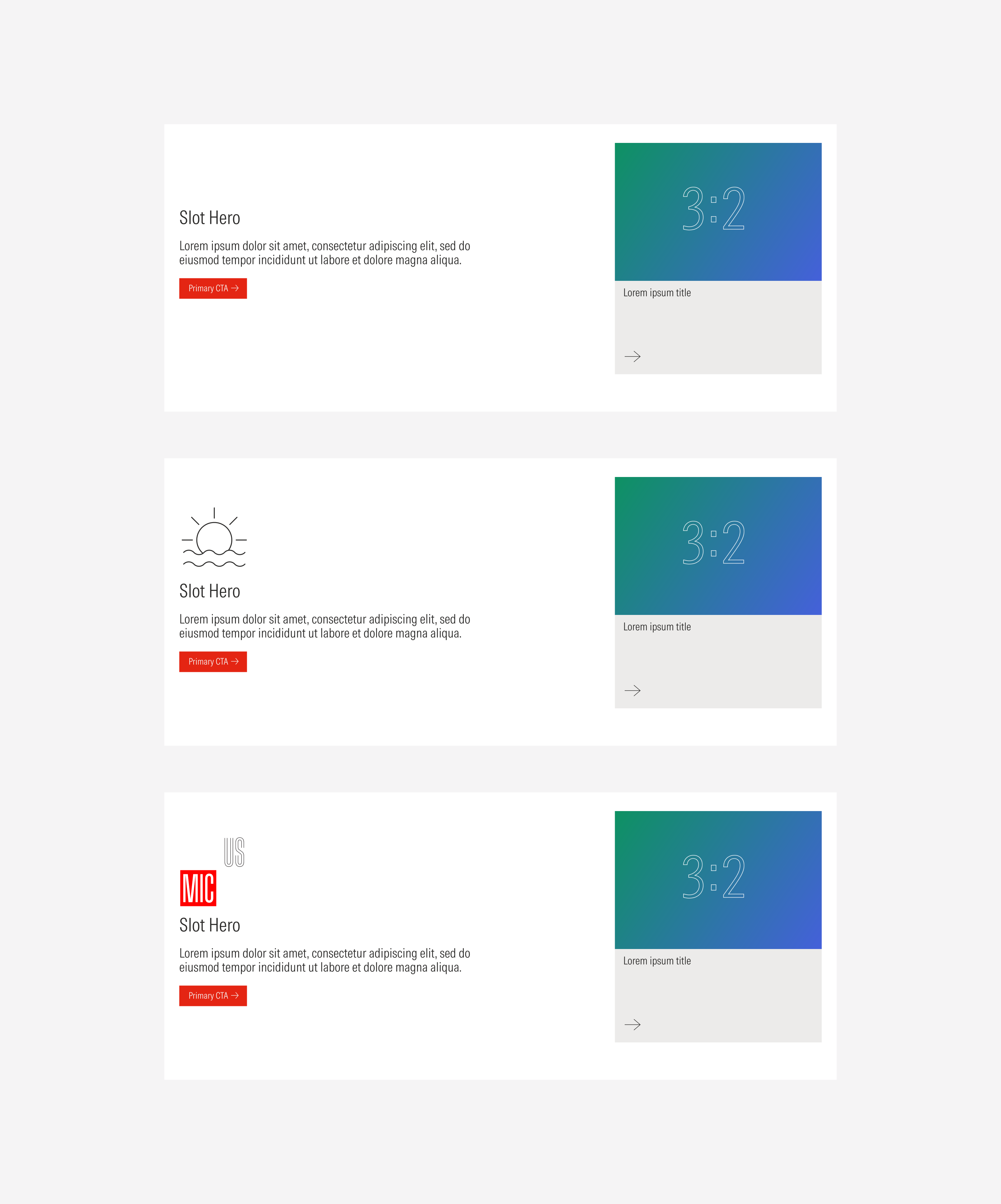
Slot Hero: General Card
Use the content slot to contain a general card.
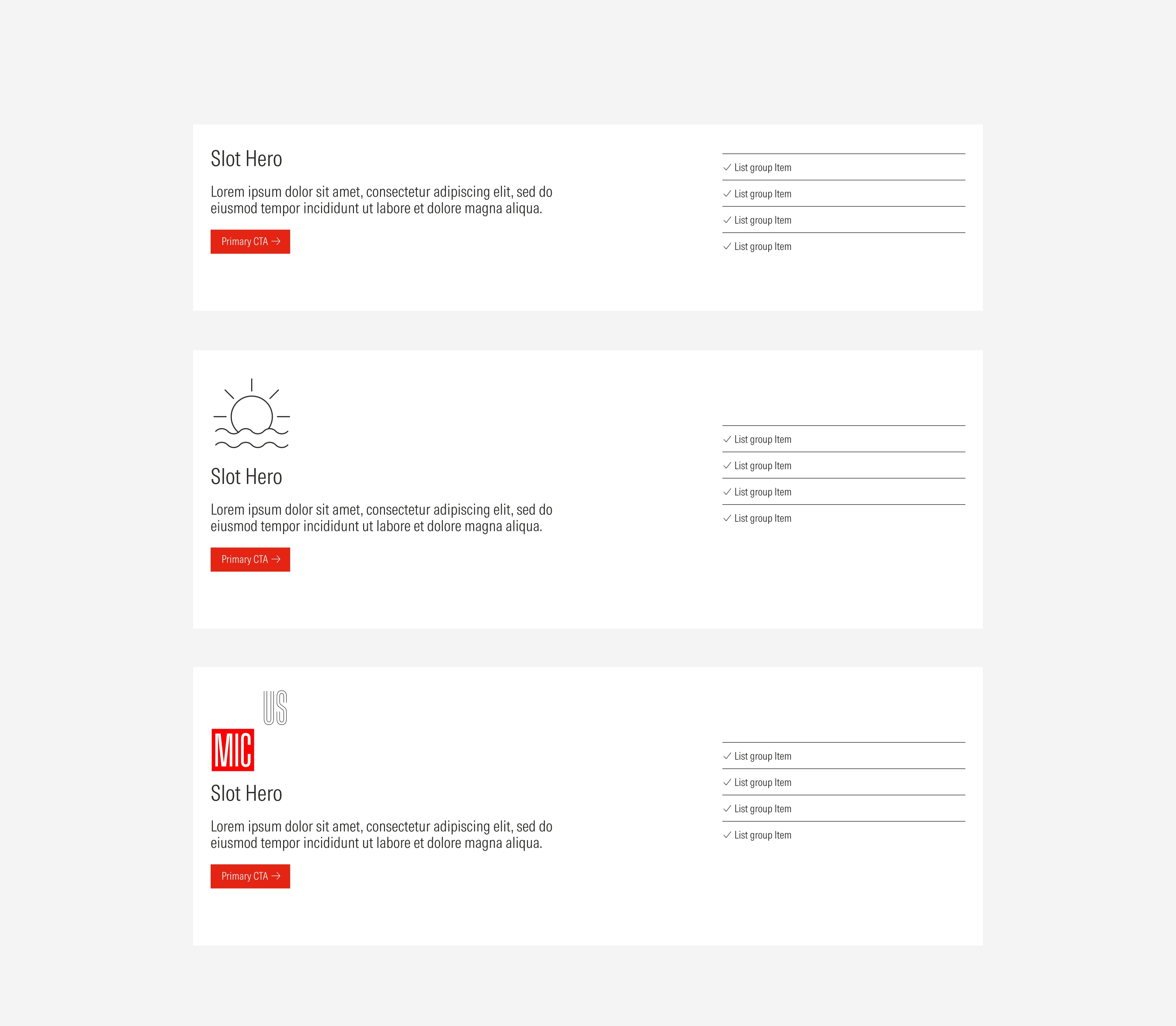
Slot Hero: List Group
Use the content slot to contain a list group.
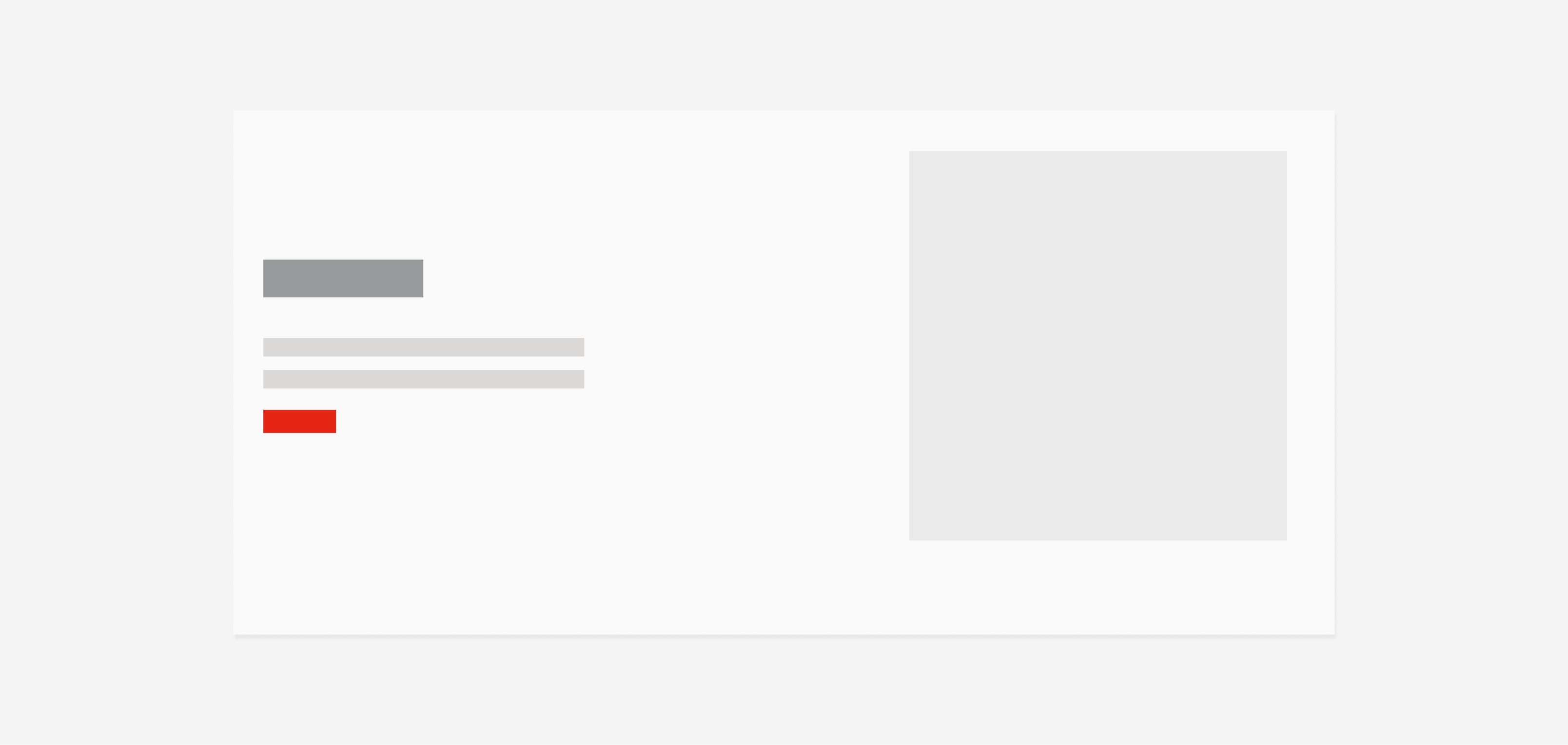
Slot Hero: Form
Use the content slot to contain a form.
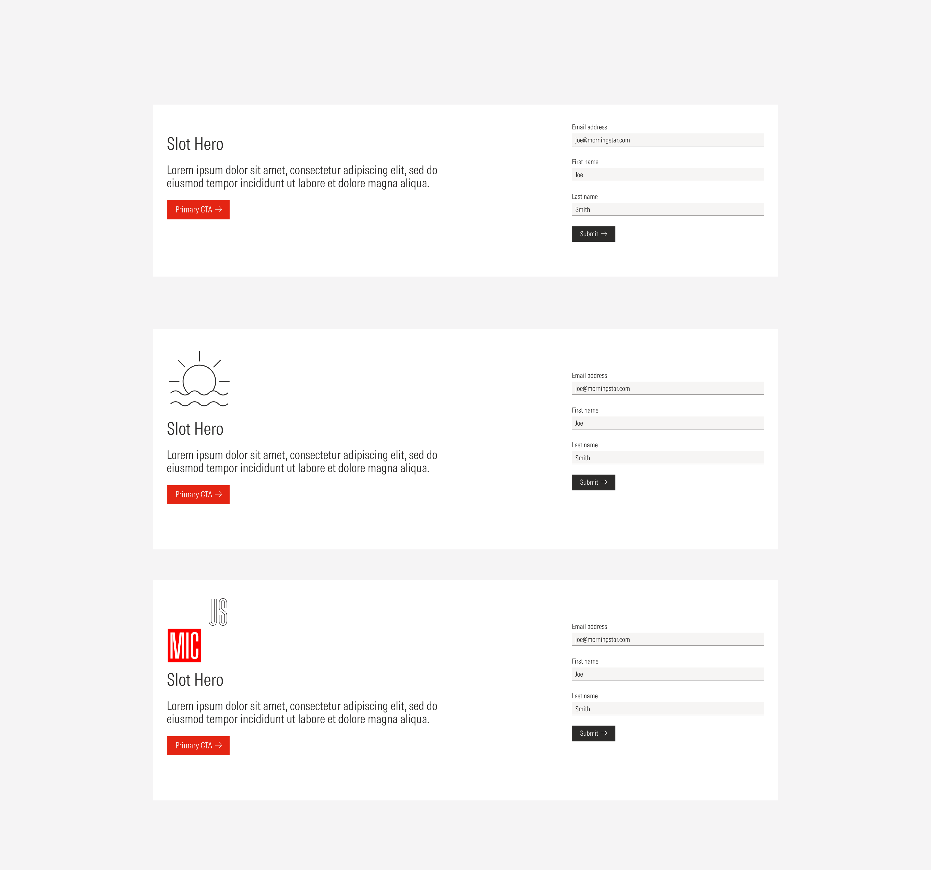
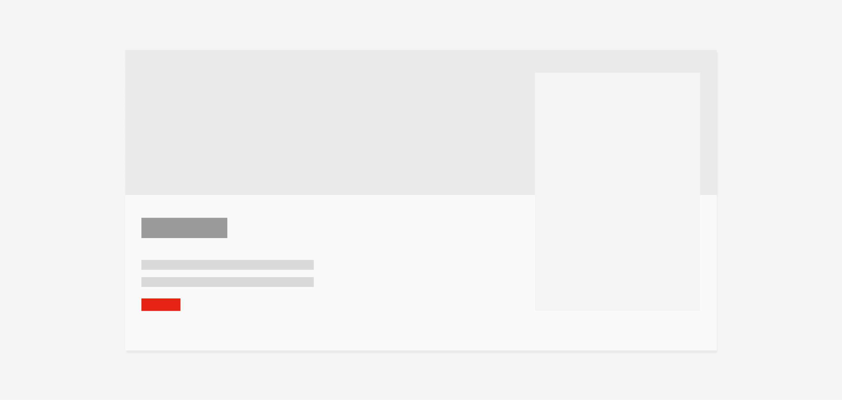
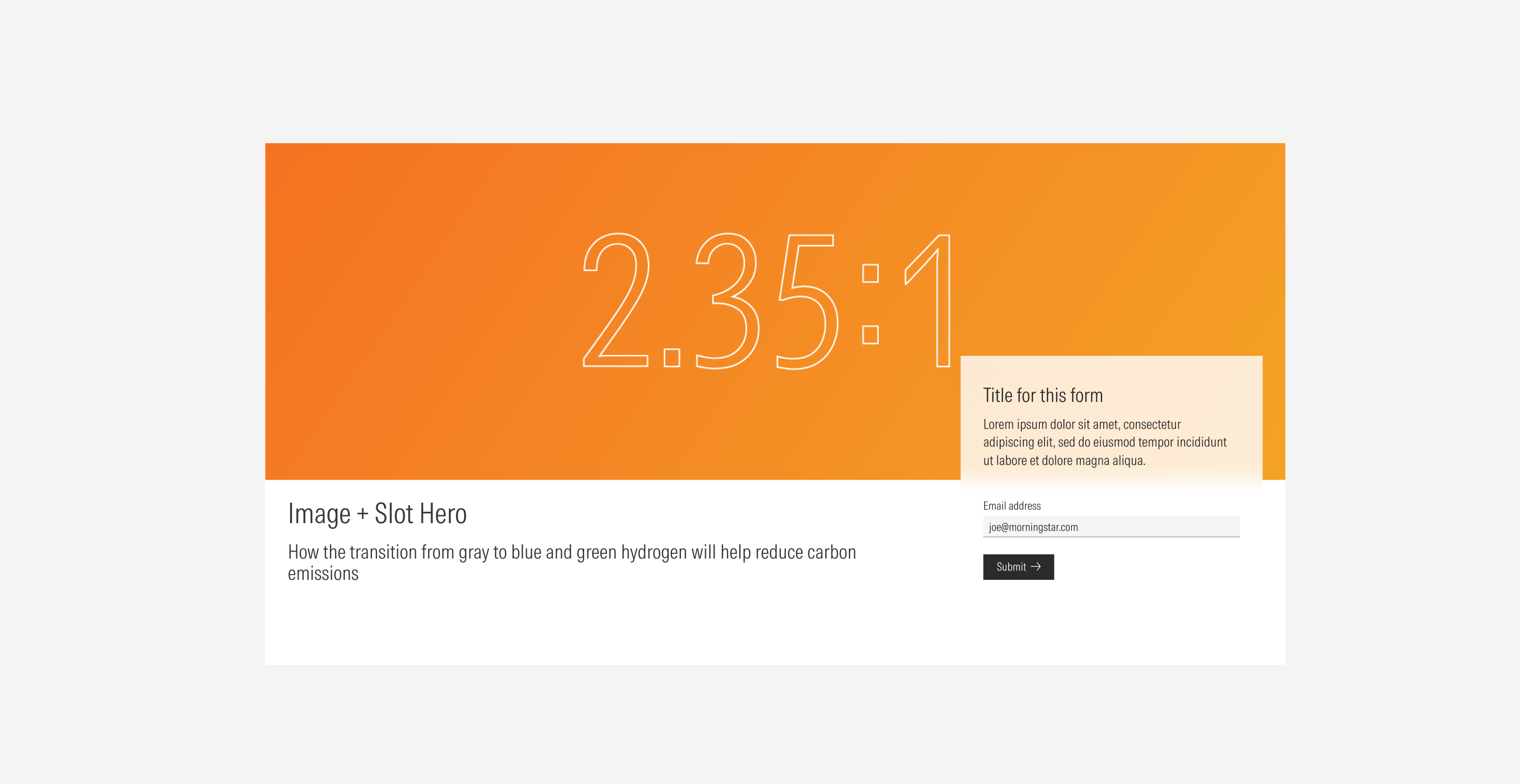
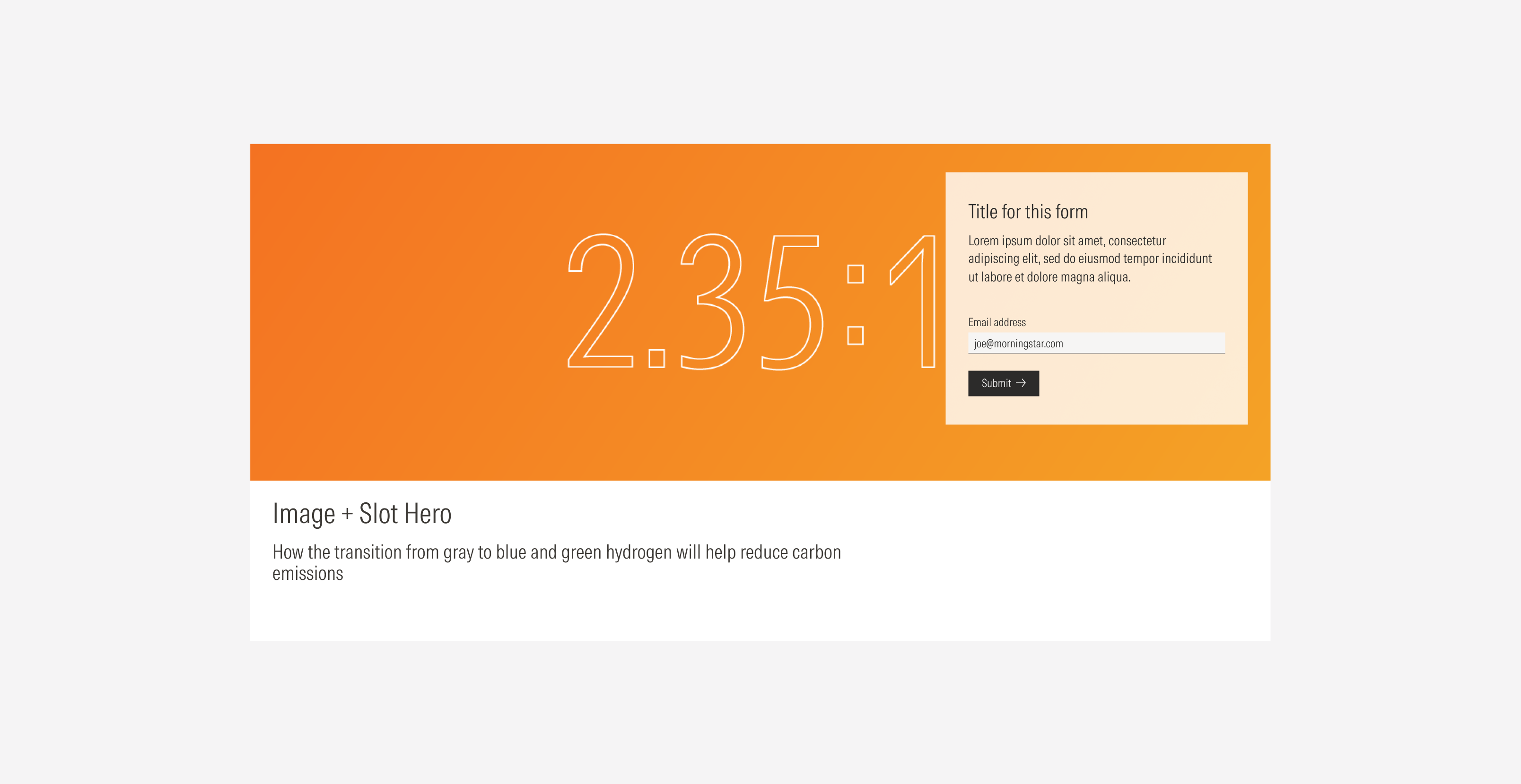
Image and Slot Hero: Form
Use the content slot to contain a form.
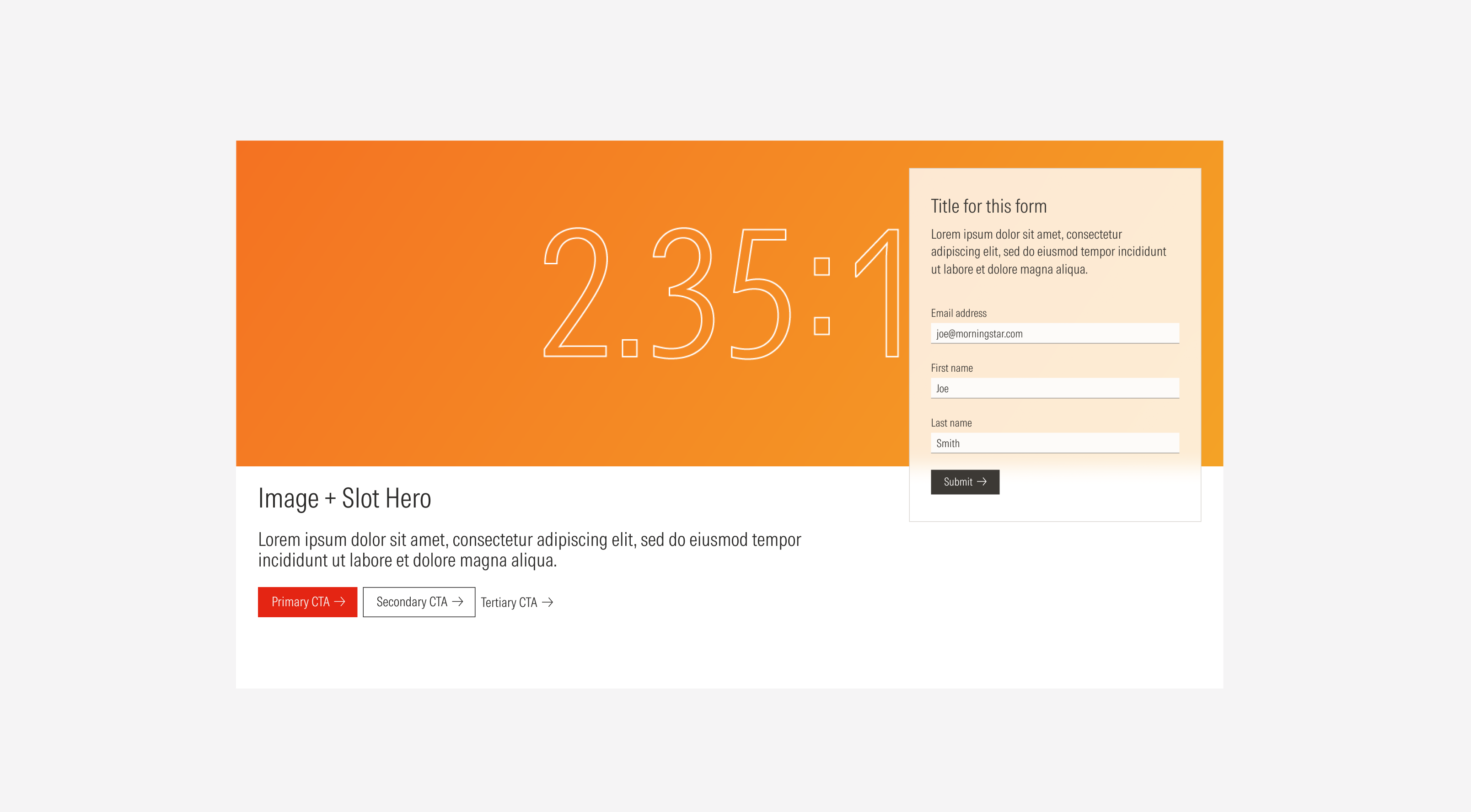
Image and Slot Hero: Image
Use the content slot to contain an image.

In the case of the image and slot hero, the content slot is top aligned with a top padding of 40px. If the content slot is short (less than 516px in height), it will still be top aligned but with a top padding of 300px.
Alignment
The alignment of components with the hero container or content at the same level of the page should follow a left-justified pattern. For both variants, the body will be top aligned to the title. For the Slot hero, the text block will be horizontally center aligned to the content slot. For the Default viewports, the CTAs will take the width of the page, and the image will adjust to the bottom of the hero taking the width of the page as well.
Do horizontally center align the text block with the content slot.
Don’t align the text block to the bottom of the container.
Do adapt the top padding to 300px when you have a short form in the content slot to avoid having it at the top of the hero and disconnecting it from the rest of the content.
Don’t keep the 40px top padding when you have a short form in the content slot, far from the text block content.
Secondary 2/3 Image Hero
Slot Hero
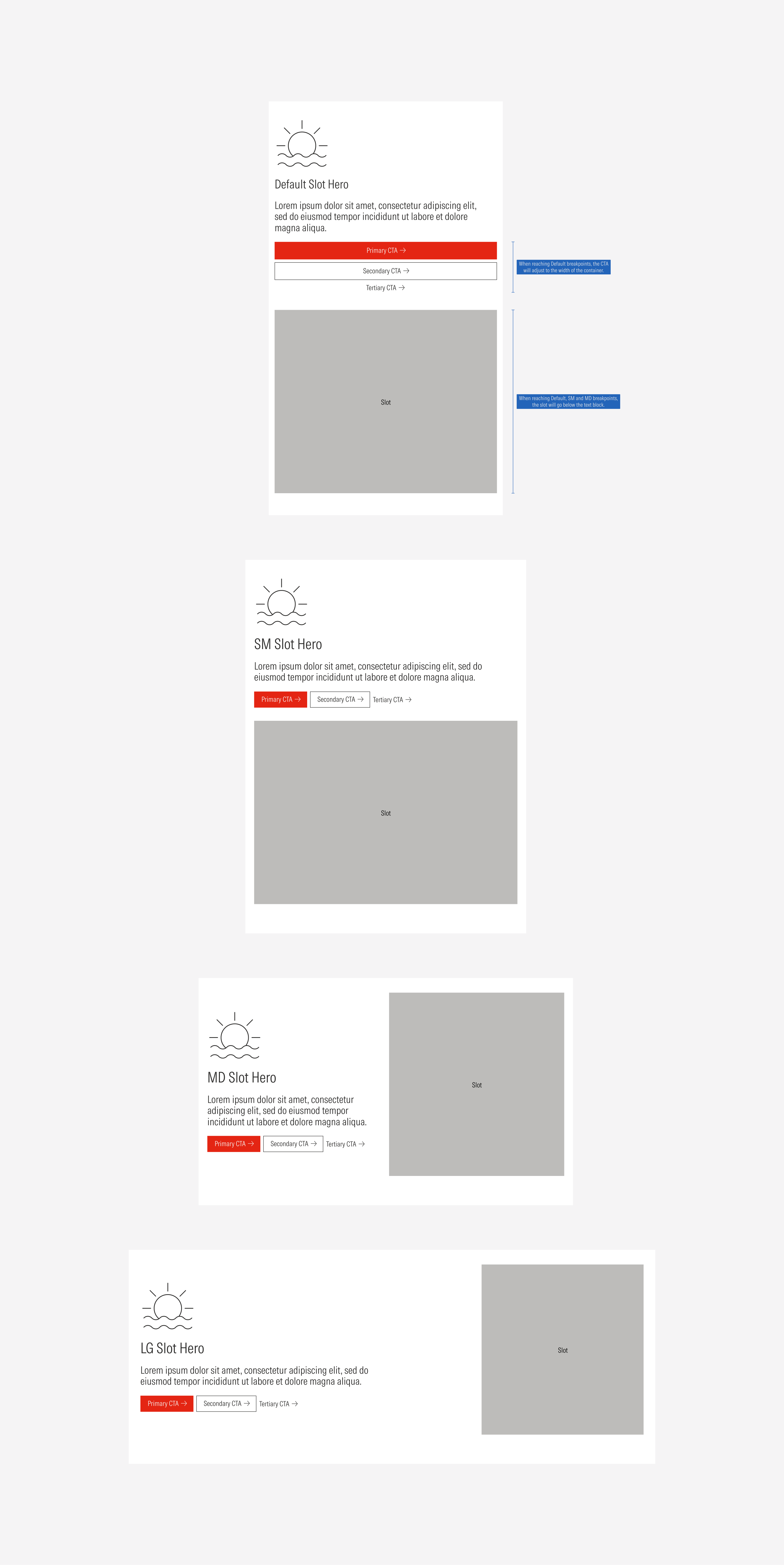
Image and Slot Hero
Slot hero
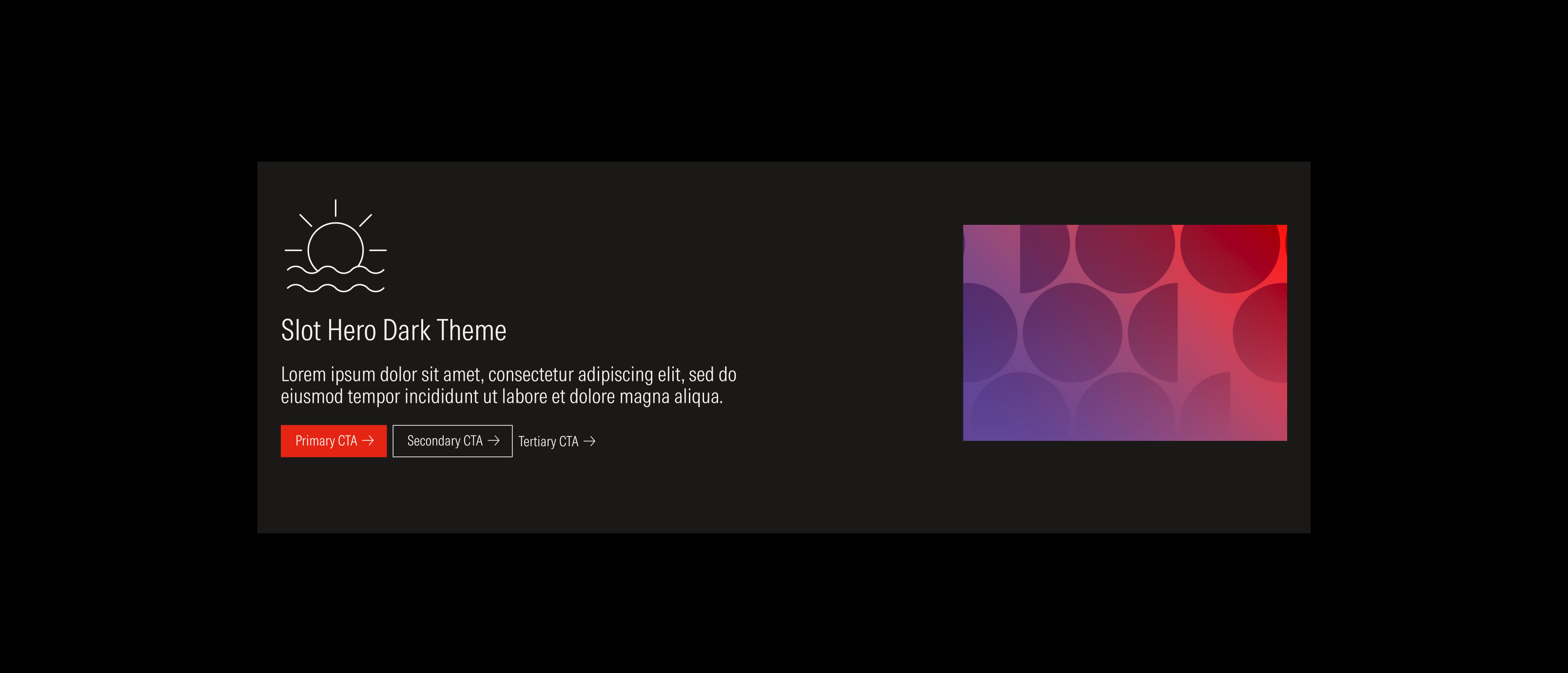
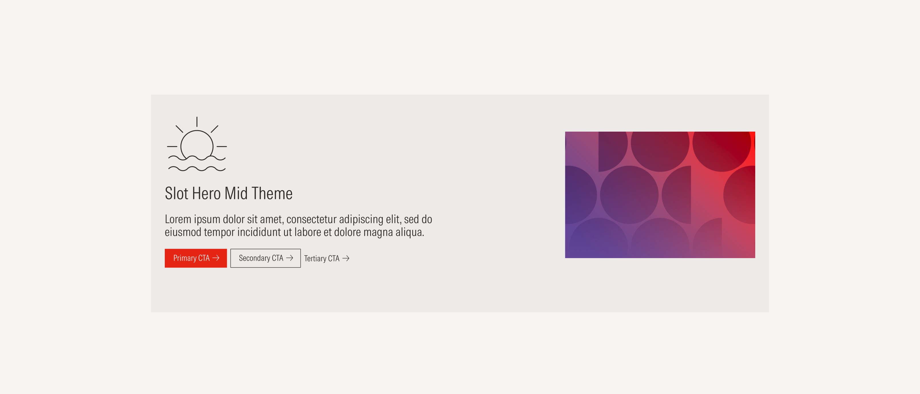
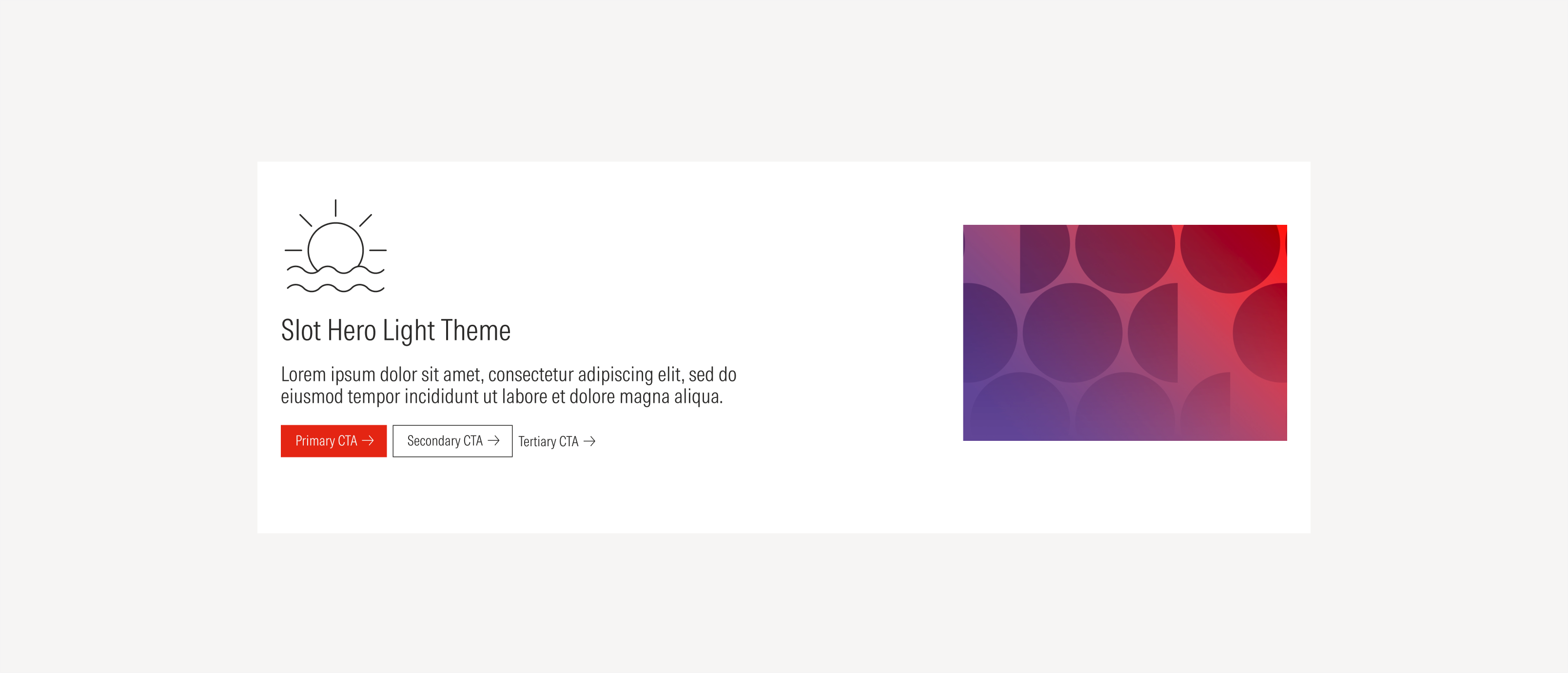
Image and slot hero