Navigation
This section is used at the bottom of the pages that need to show the disclosure text. It will be displayed above the page footer.
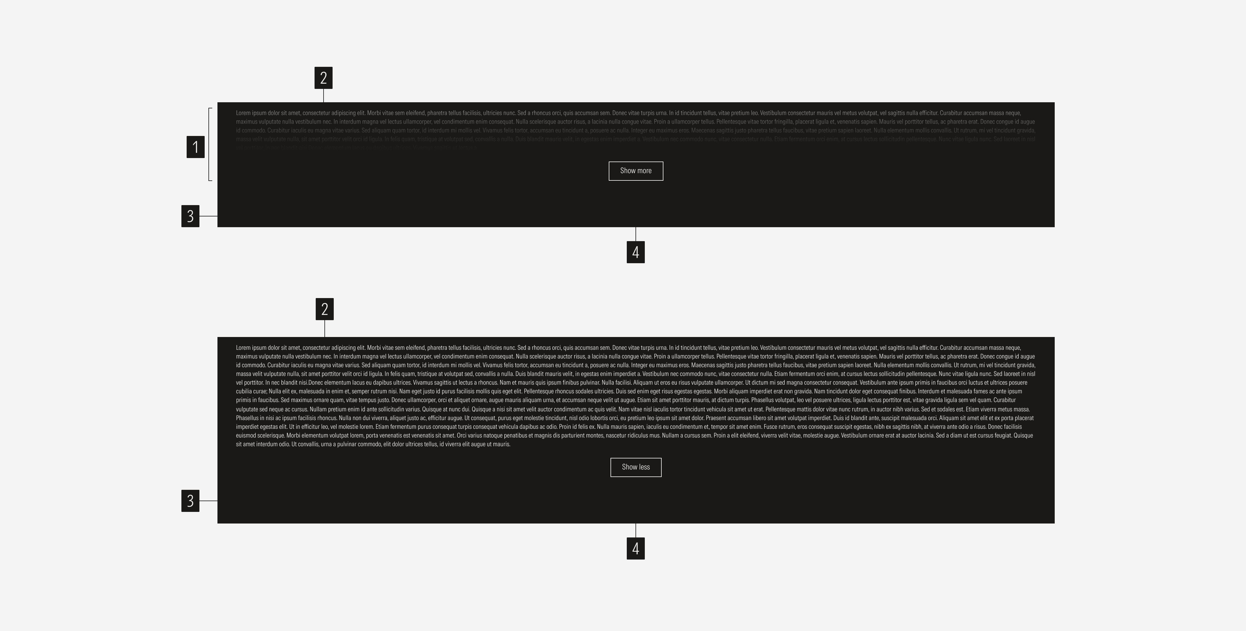
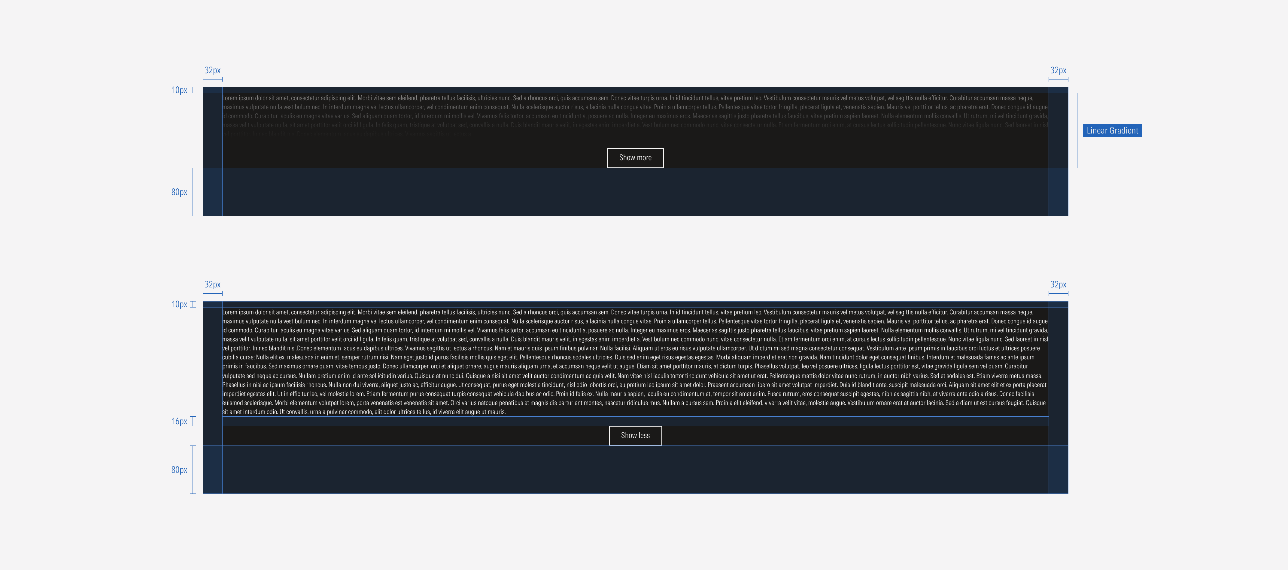
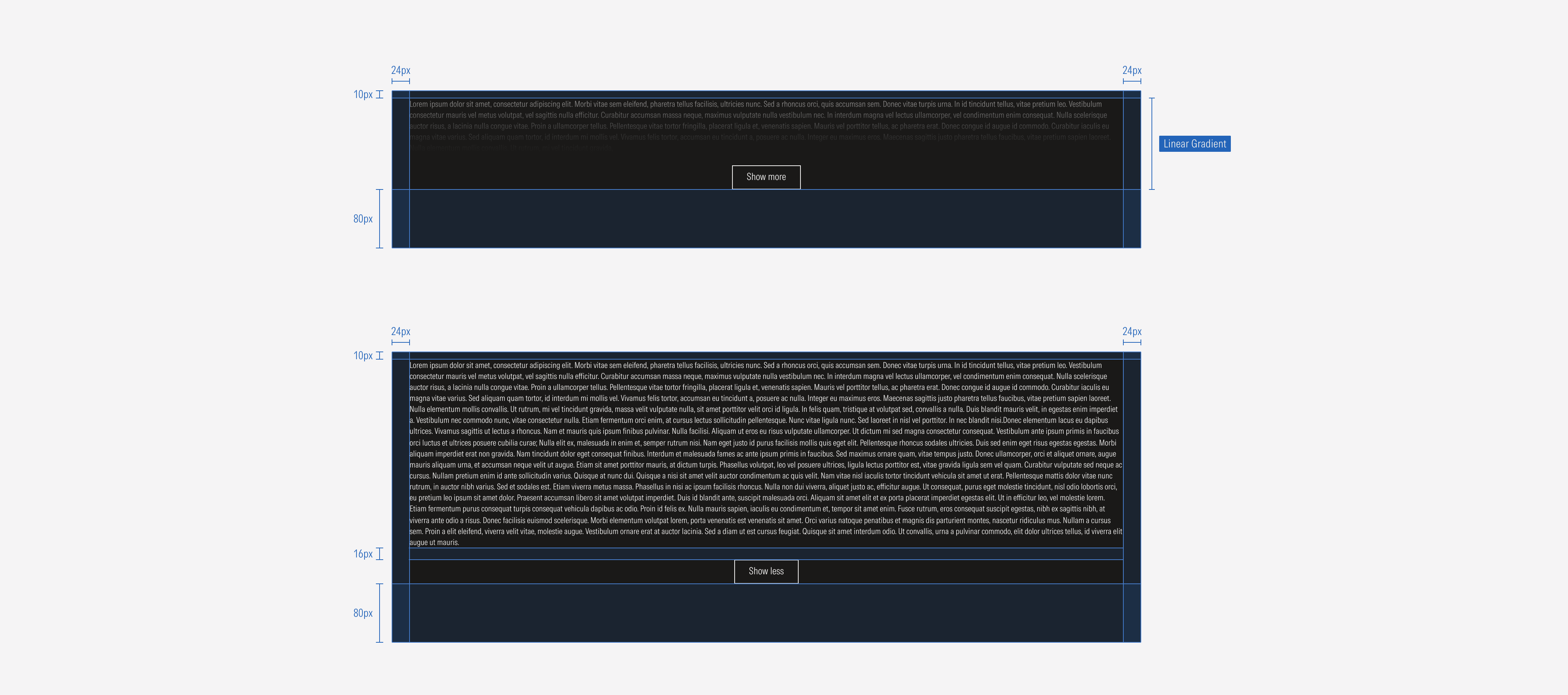
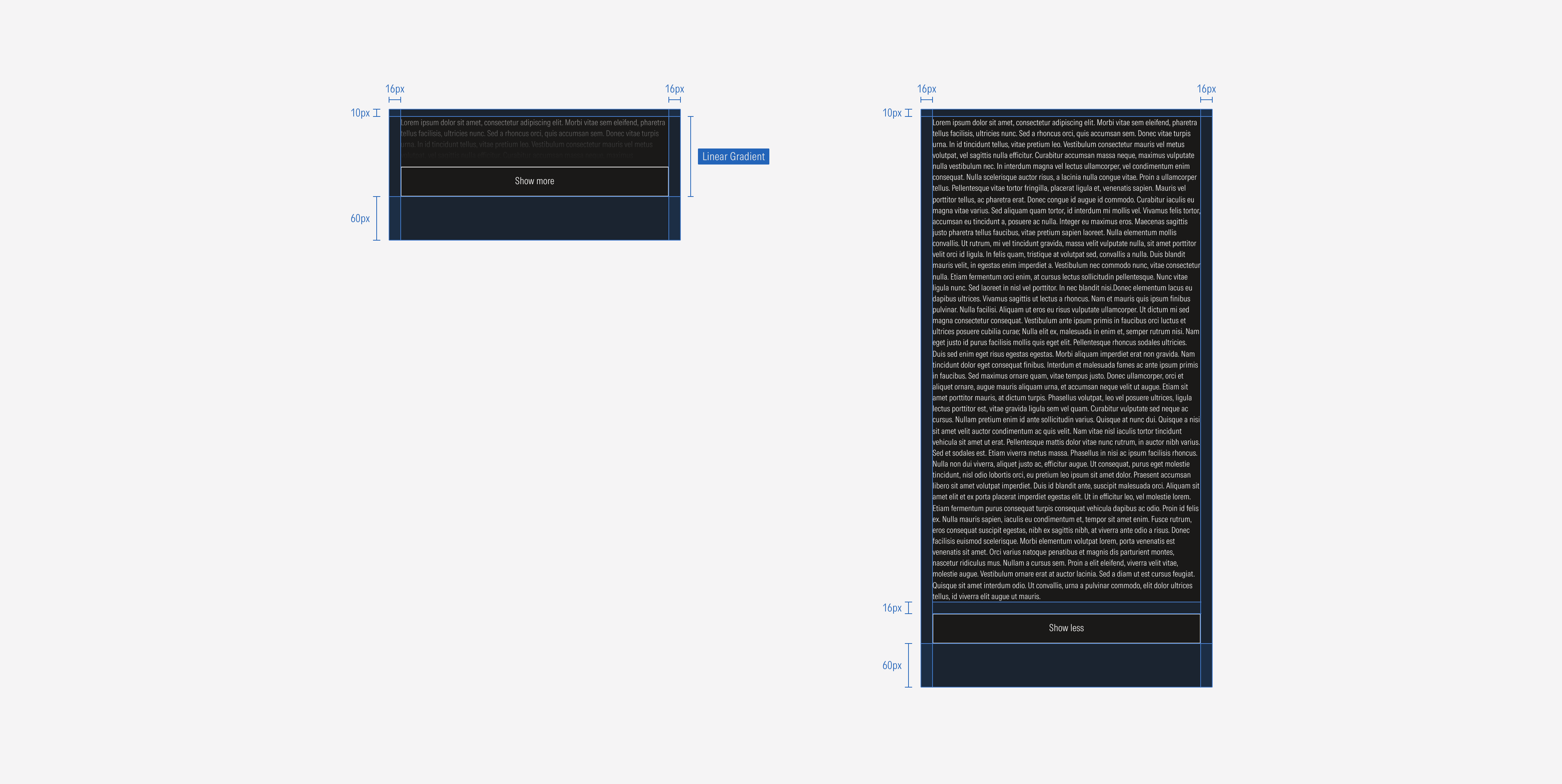
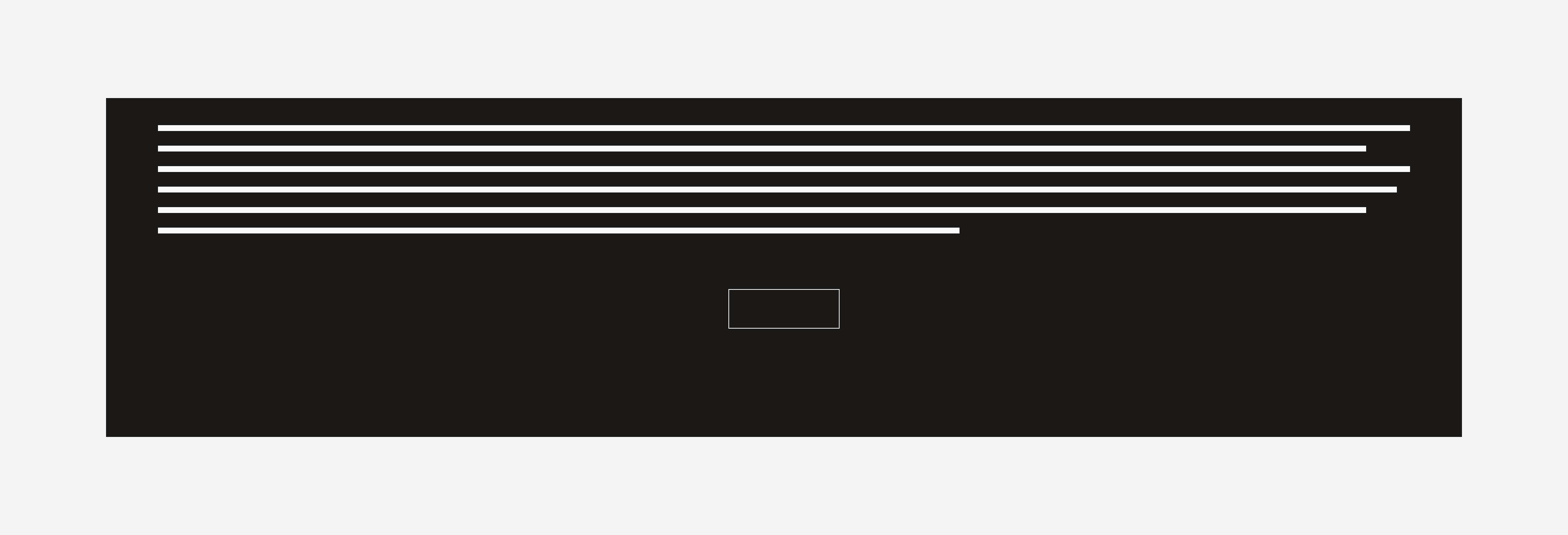
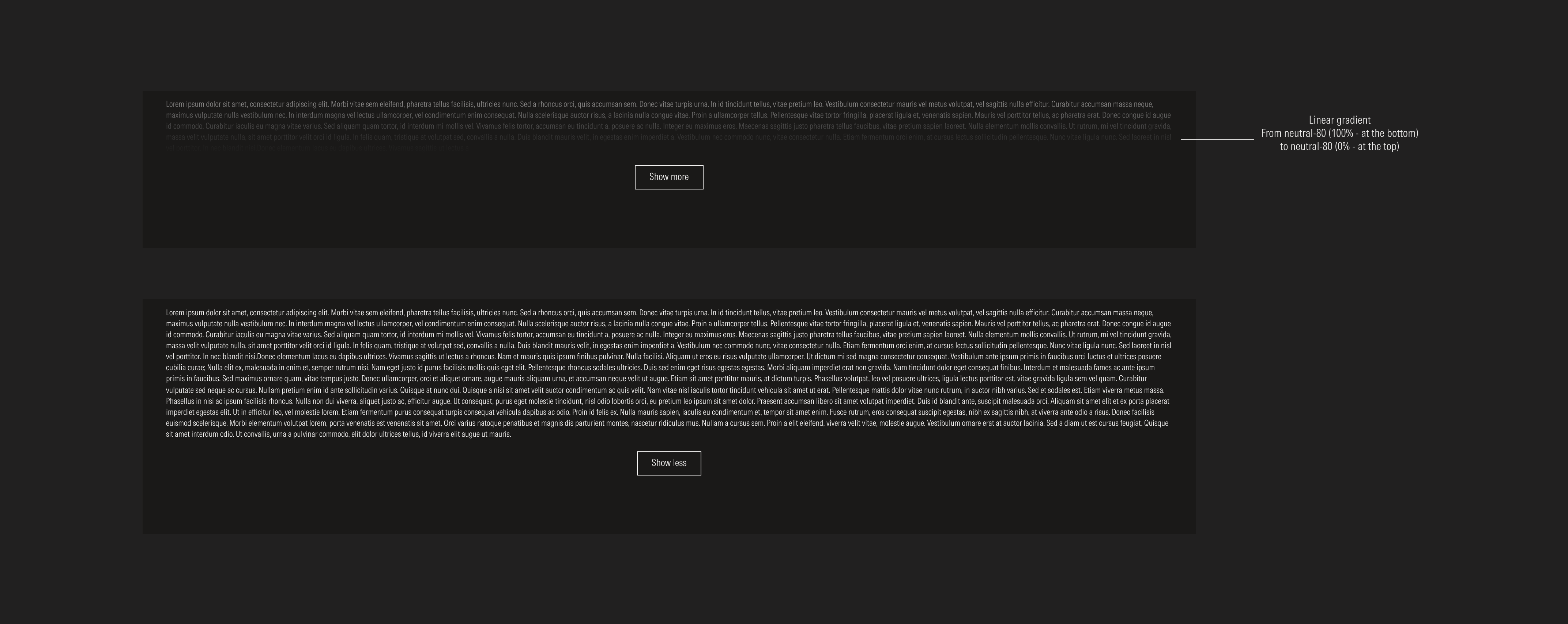
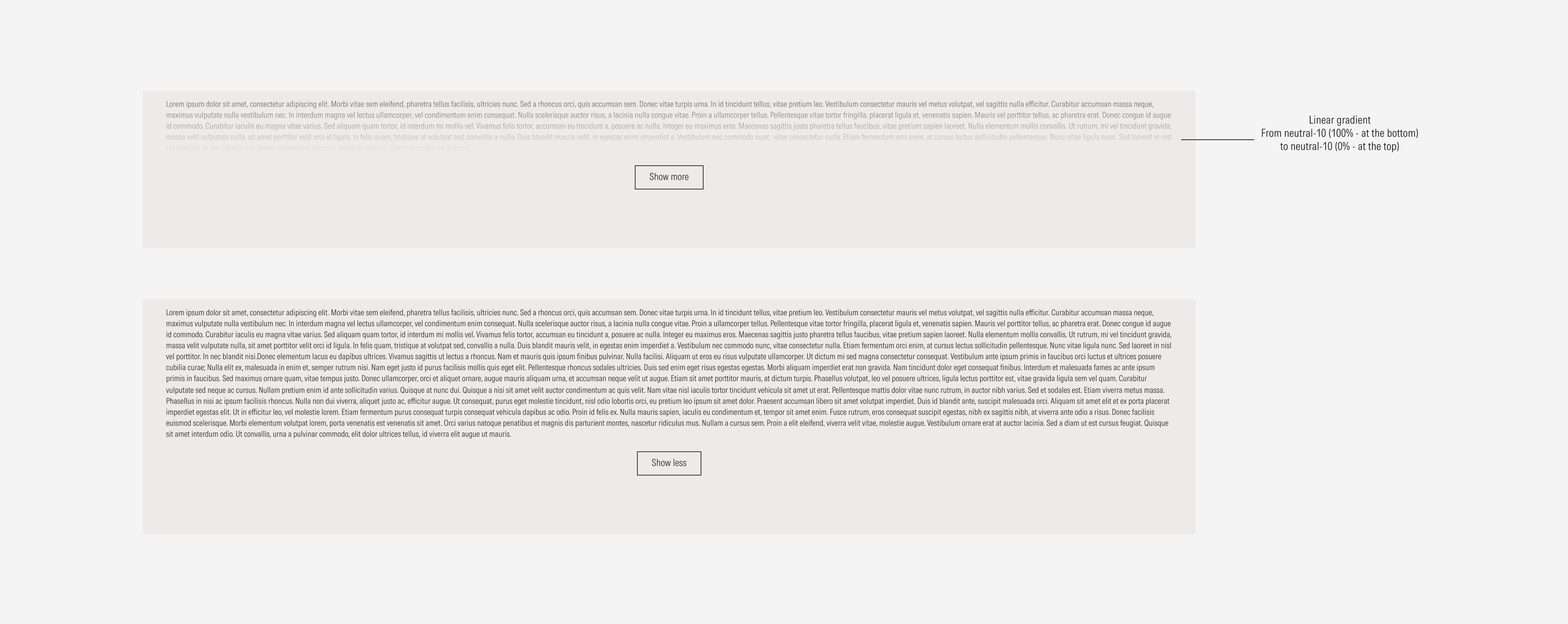
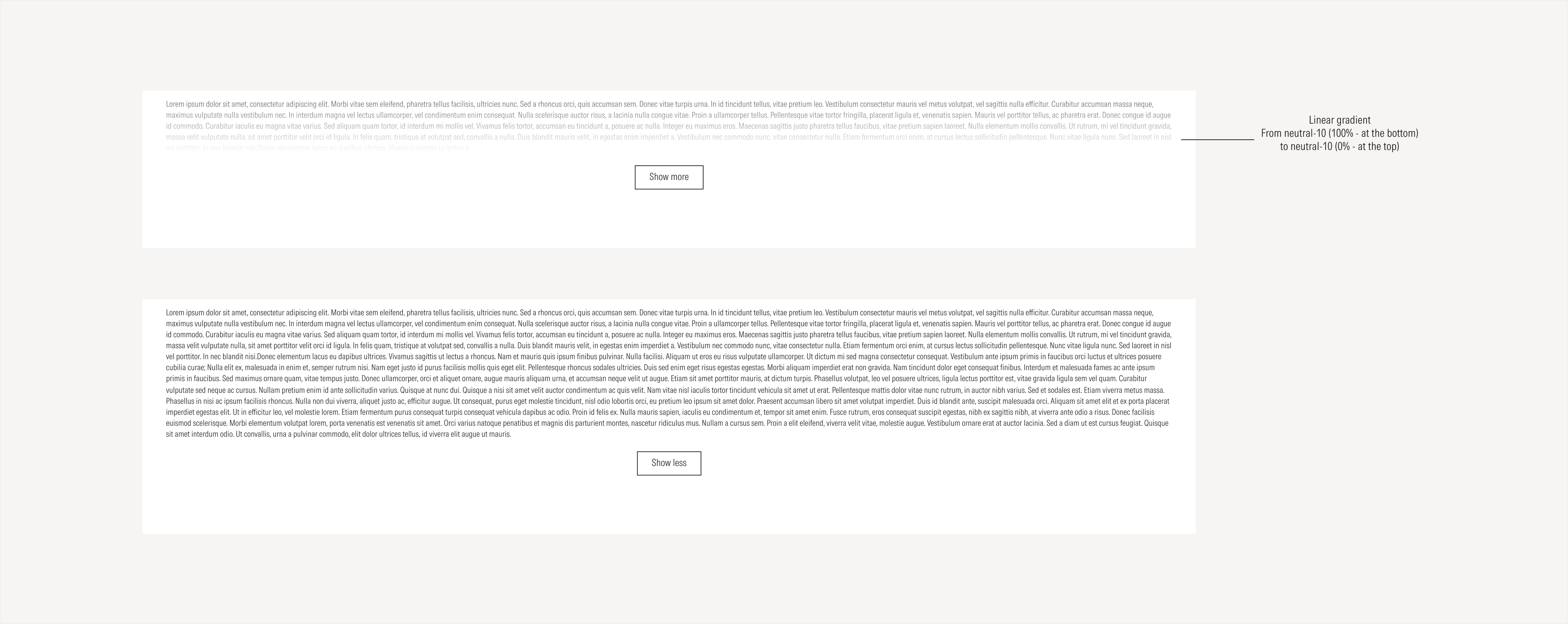
- Linear gradient appears as an overlay with longer text.
- Body text presents the disclosure information. It can be long or short text.
- Background defines the space of the card container.
- Secondary CTA allows the user to show more or show less disclosure text.
Variation | Purpose | Character Limit | Gradient | CTA |
|---|---|---|---|---|
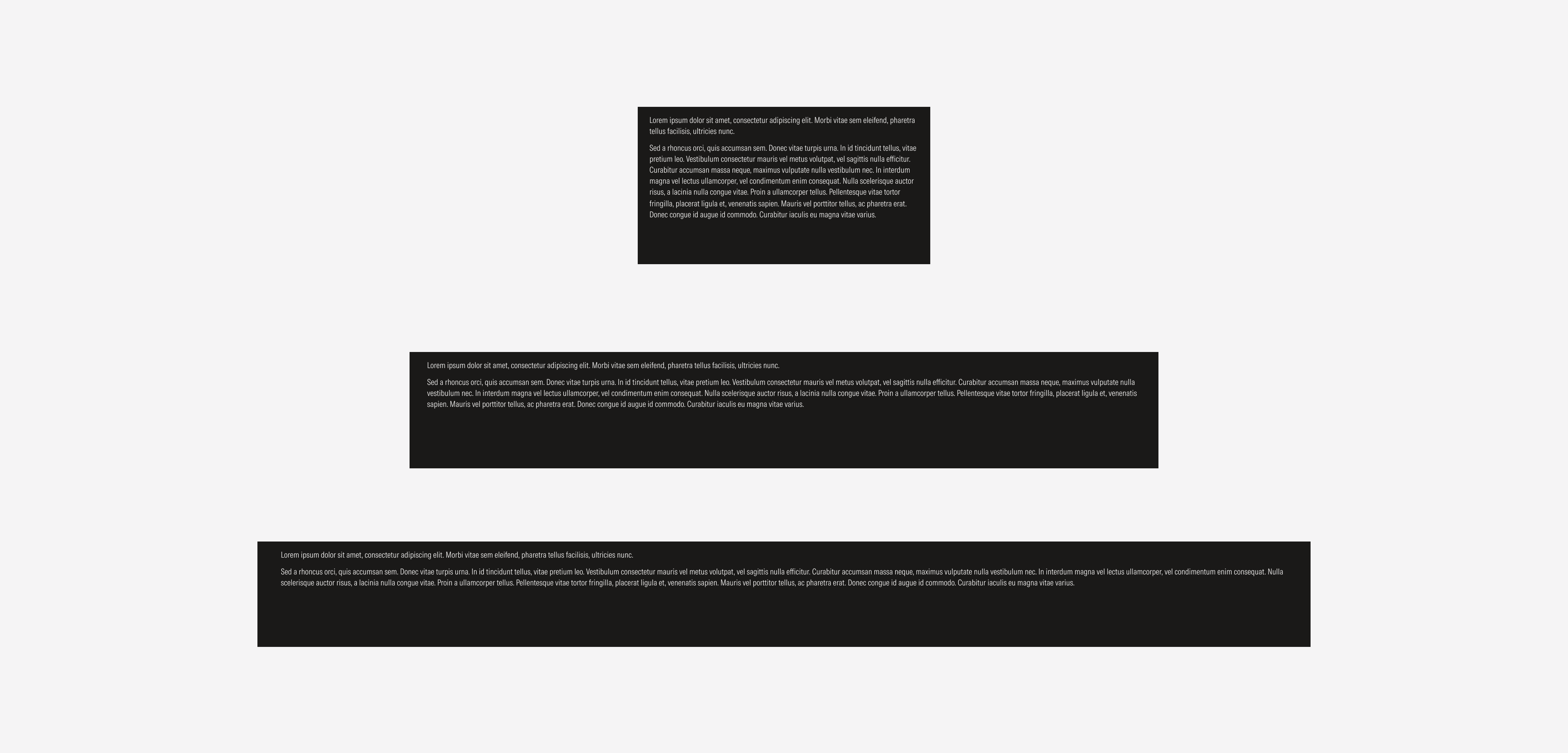
Short content length | Use for short disclosure statements. | A maximum of 1,500 characters | No gradient | No CTA |
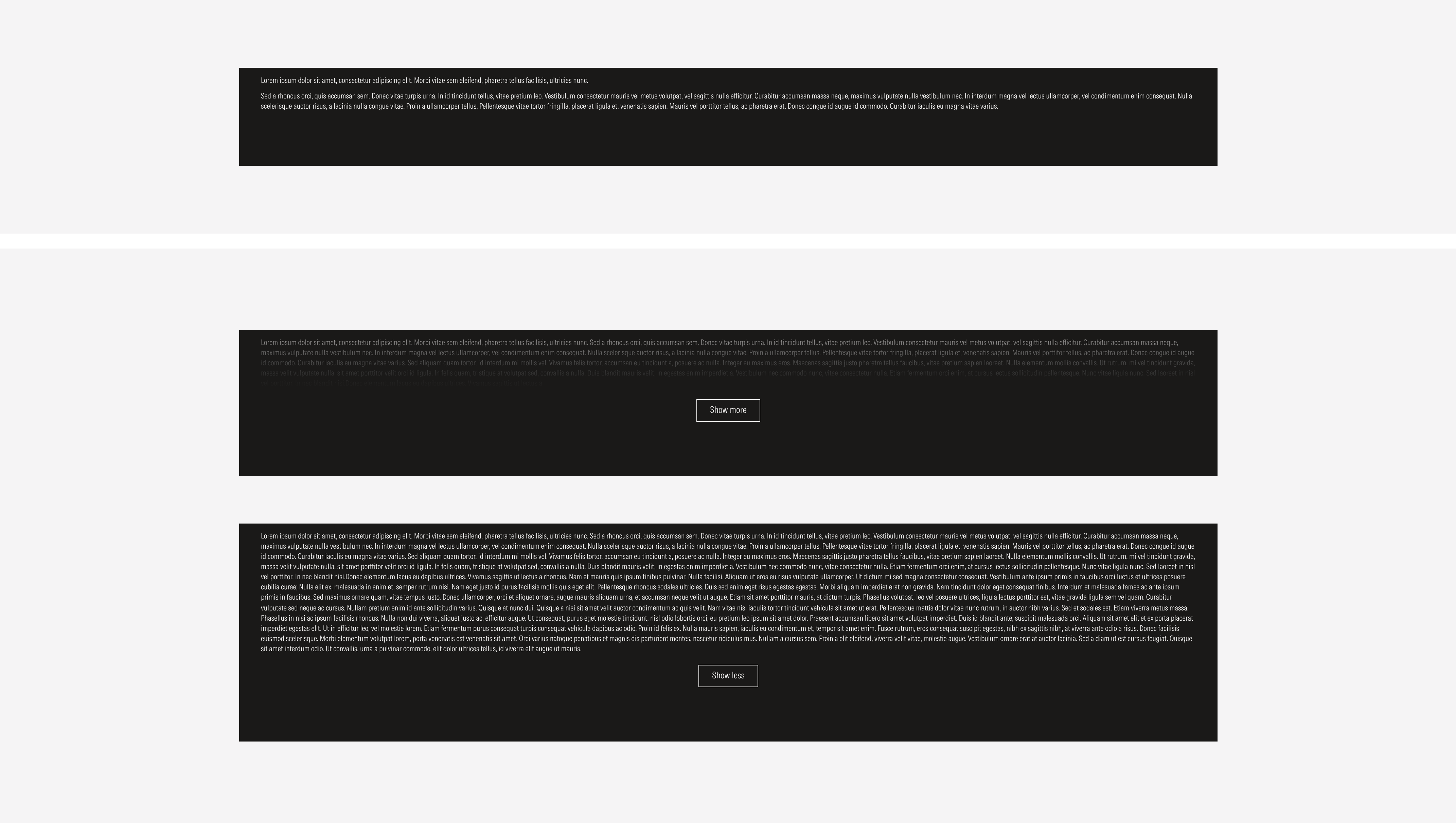
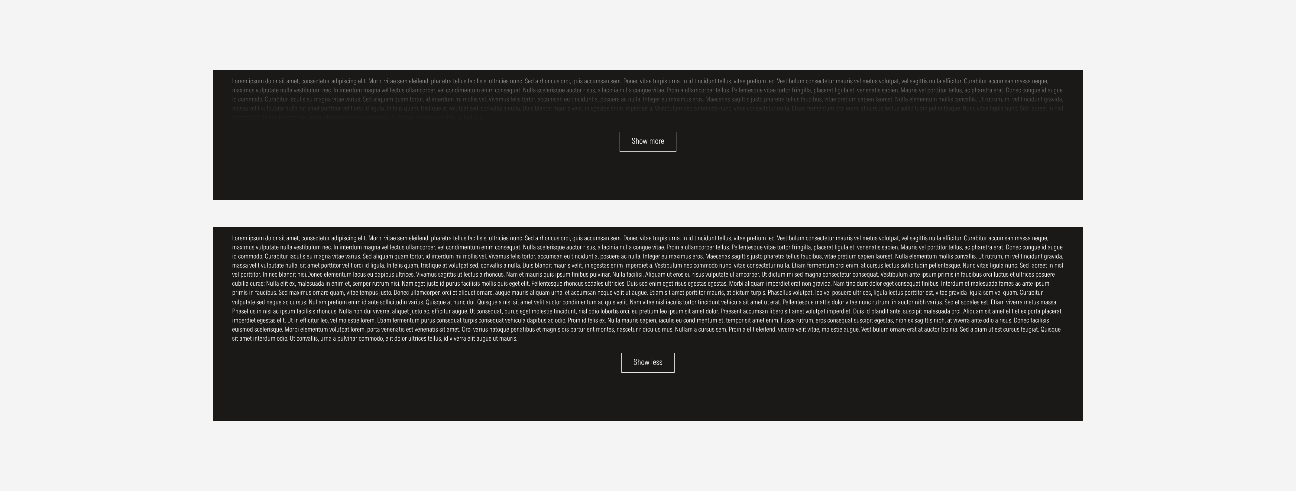
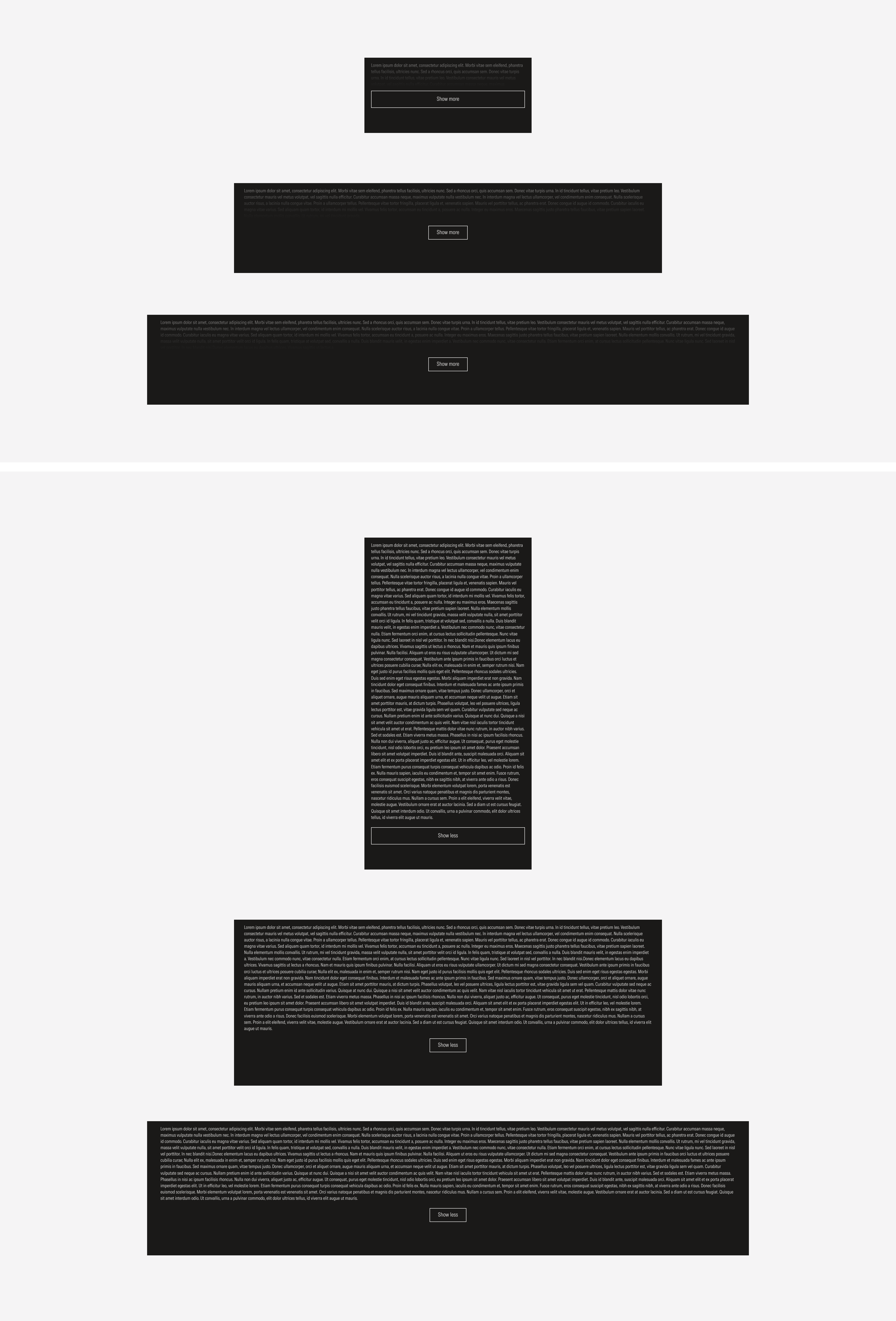
Long content length | Use for long disclosure statements. | Over 1,500 character | With gradient (collapsed), no gradient (expanded) | With CTA (show more, show less) |

Long Content
Over 1,500 characters, the content will be collapsed, a gradient overlay will appear over text, and a secondary button will be displayed at the bottom of the section in order to show less/more of the disclosure statement.

Long Content:
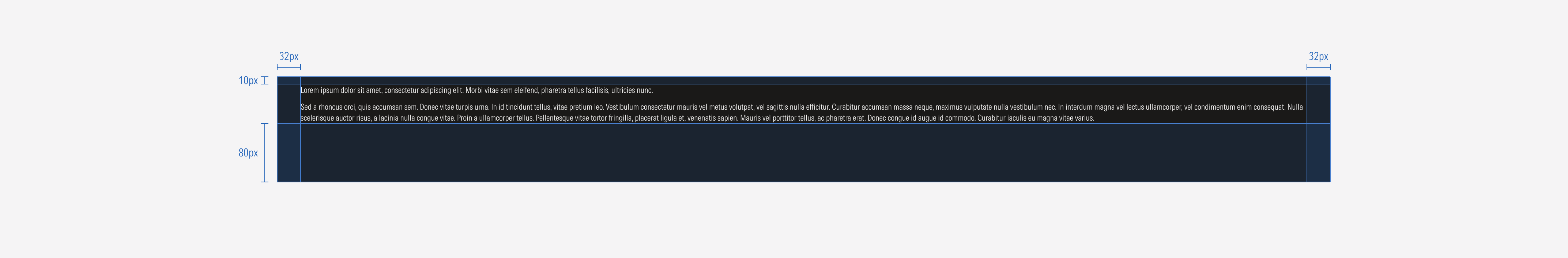
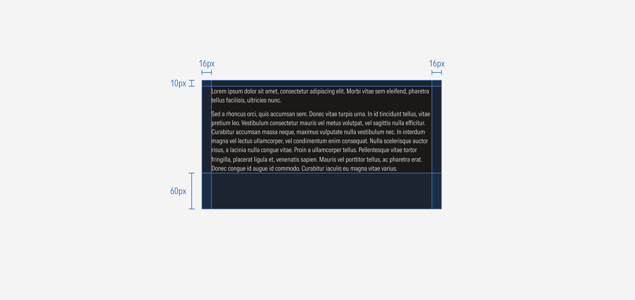
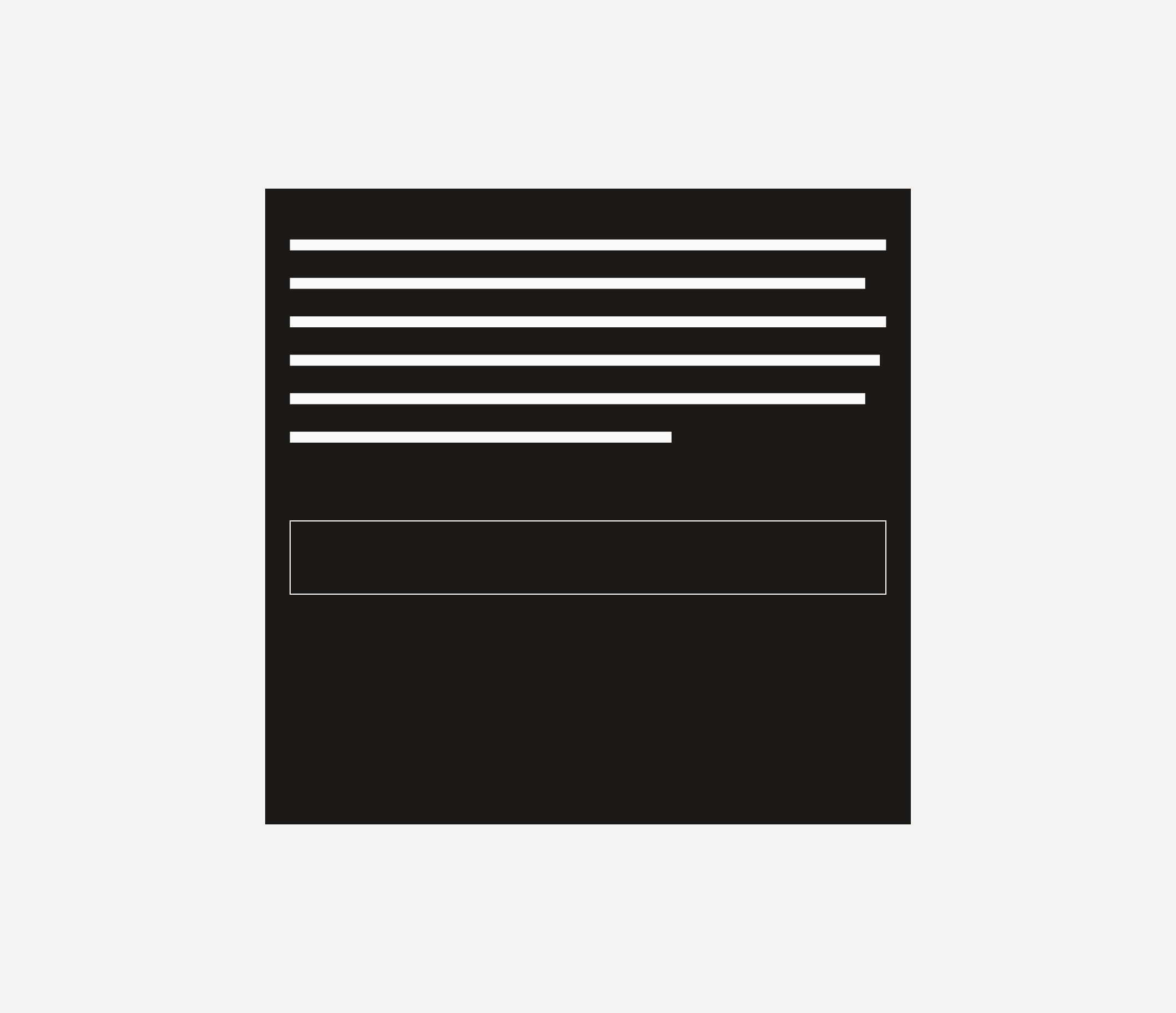
This text block will adapt to every viewport, while the margins and padding remain the same.
Alignment
The alignment of components within the container will be left-aligned, except for the CTA, which should be center-aligned. The “See all” CTA should be a secondary button placed at the bottom of the container.
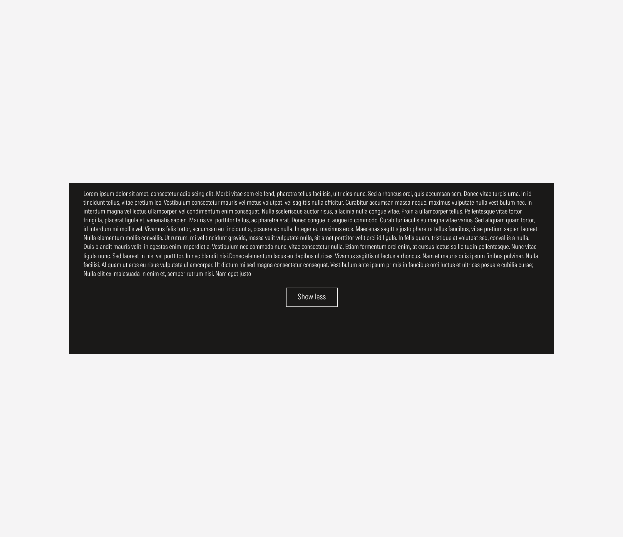
Do use a secondary button as the show more/less CTA.
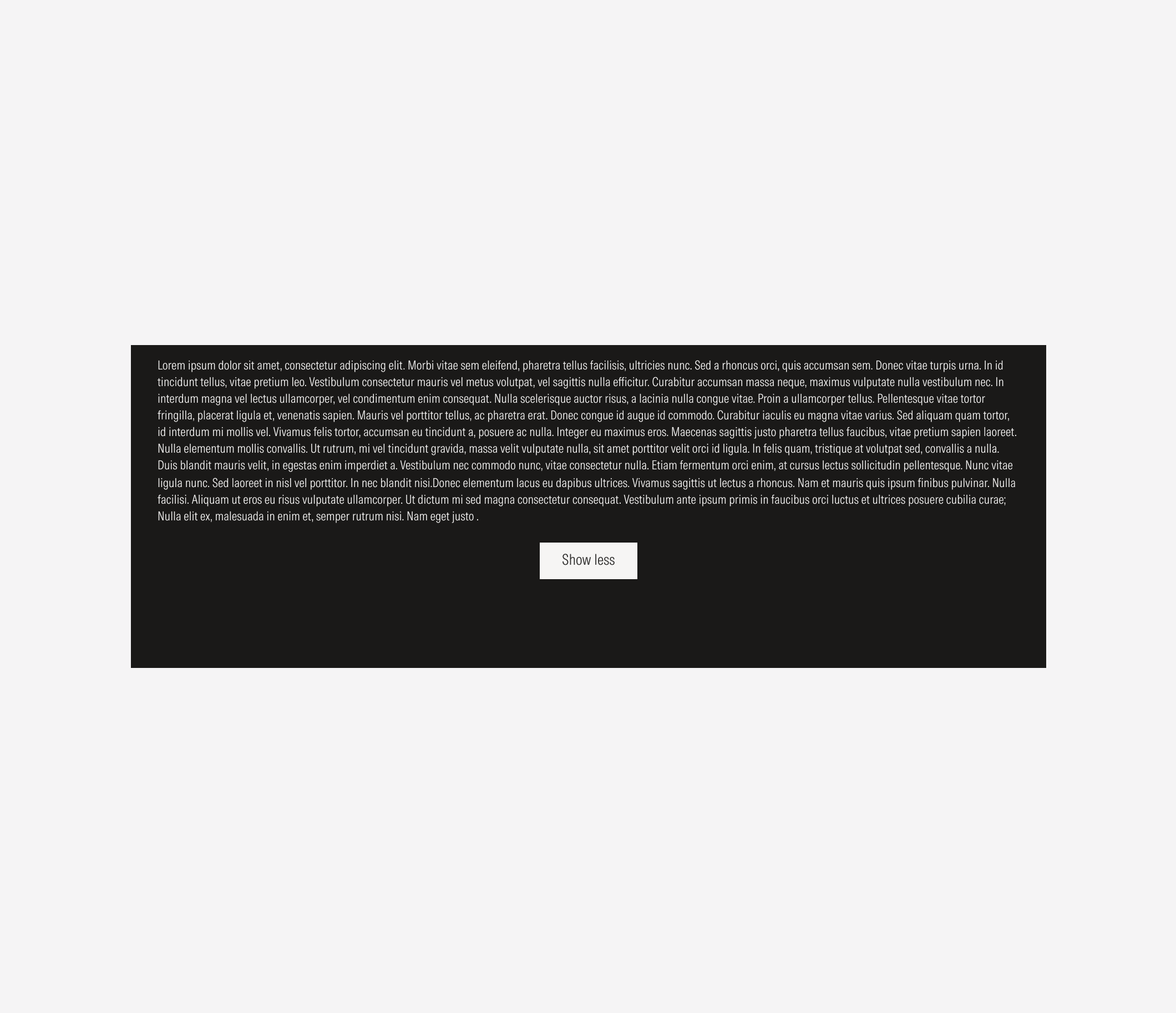
Don’t replace the CTA with another button style.
Long Content


Long Content