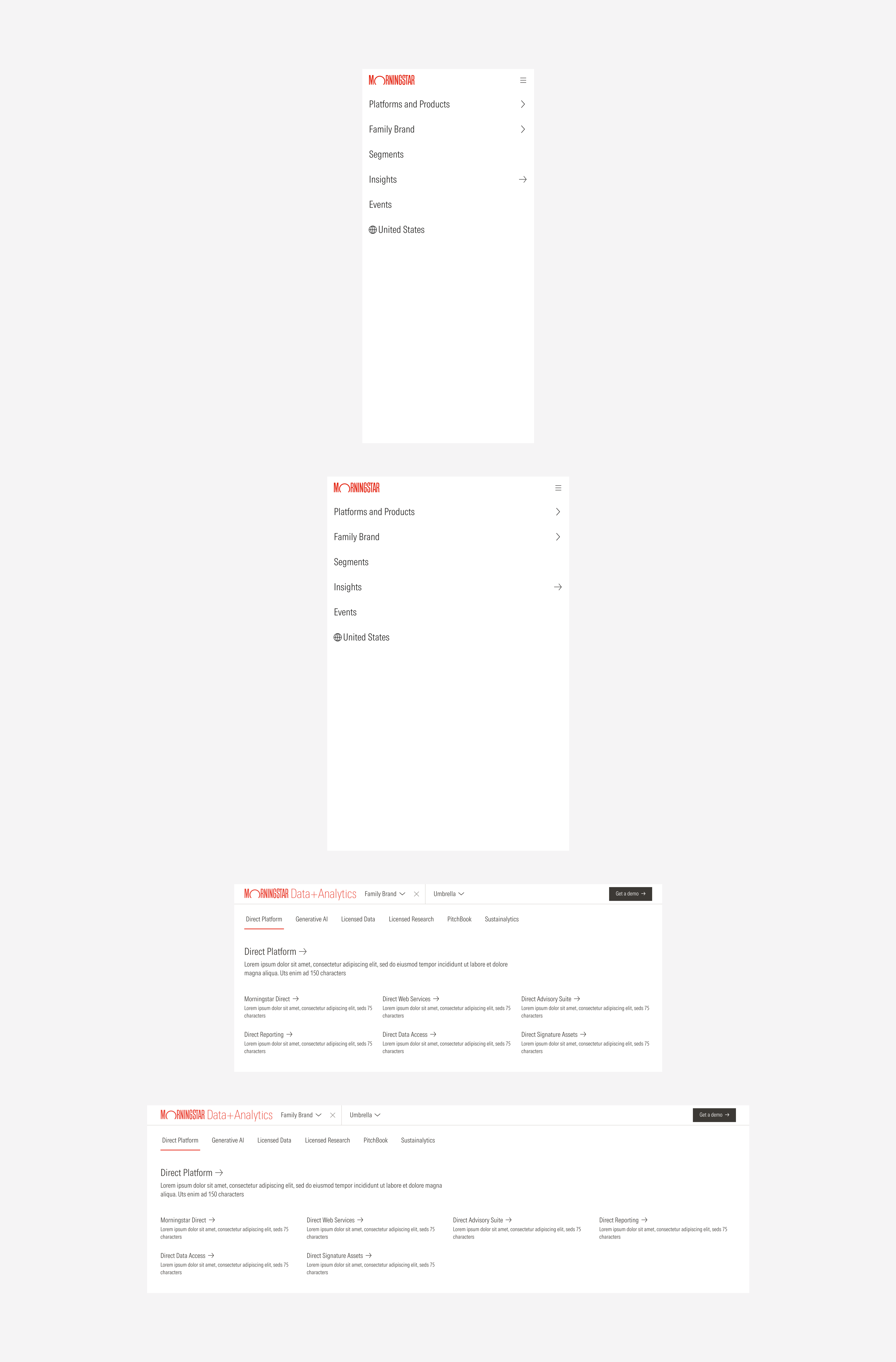
Navigation
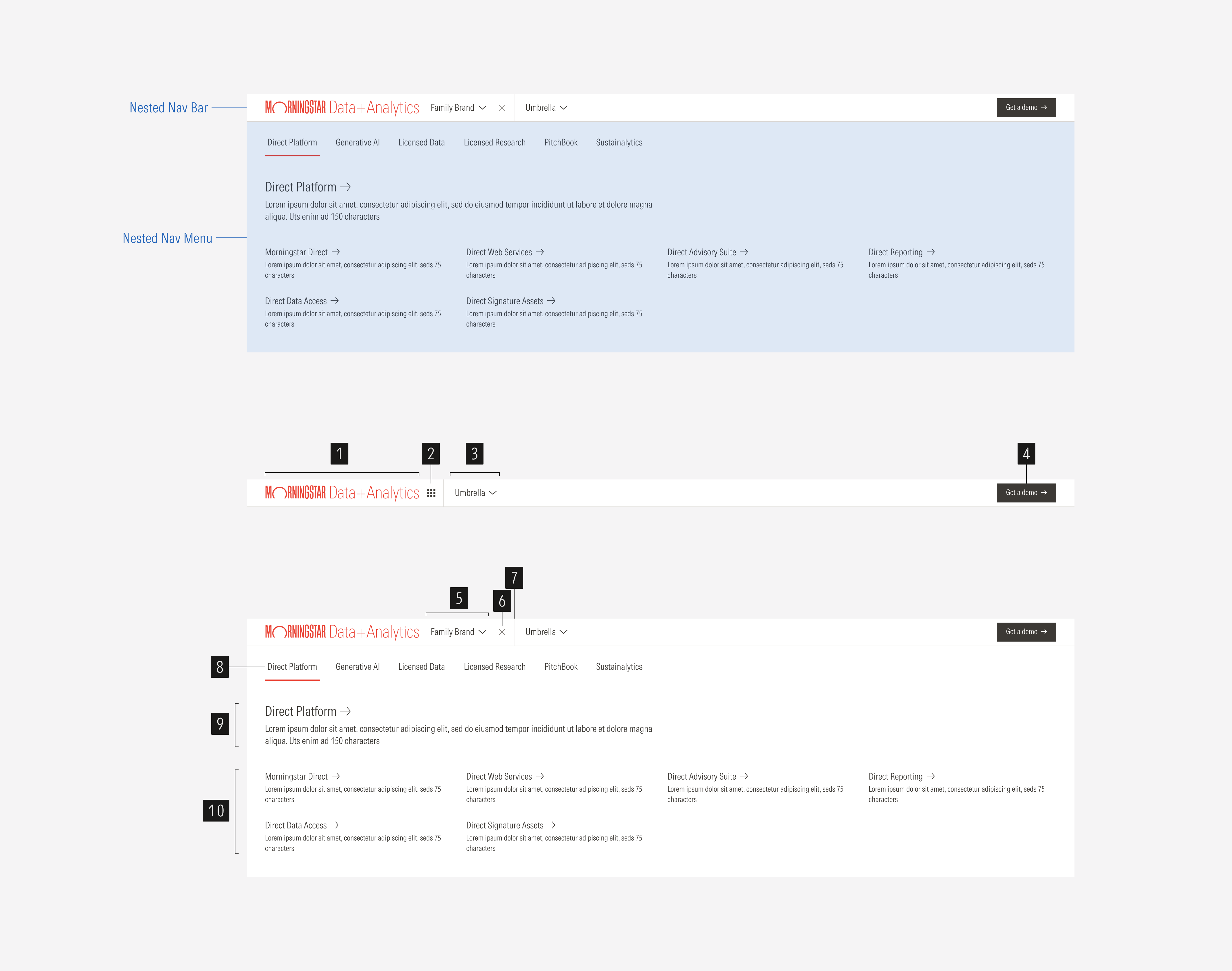
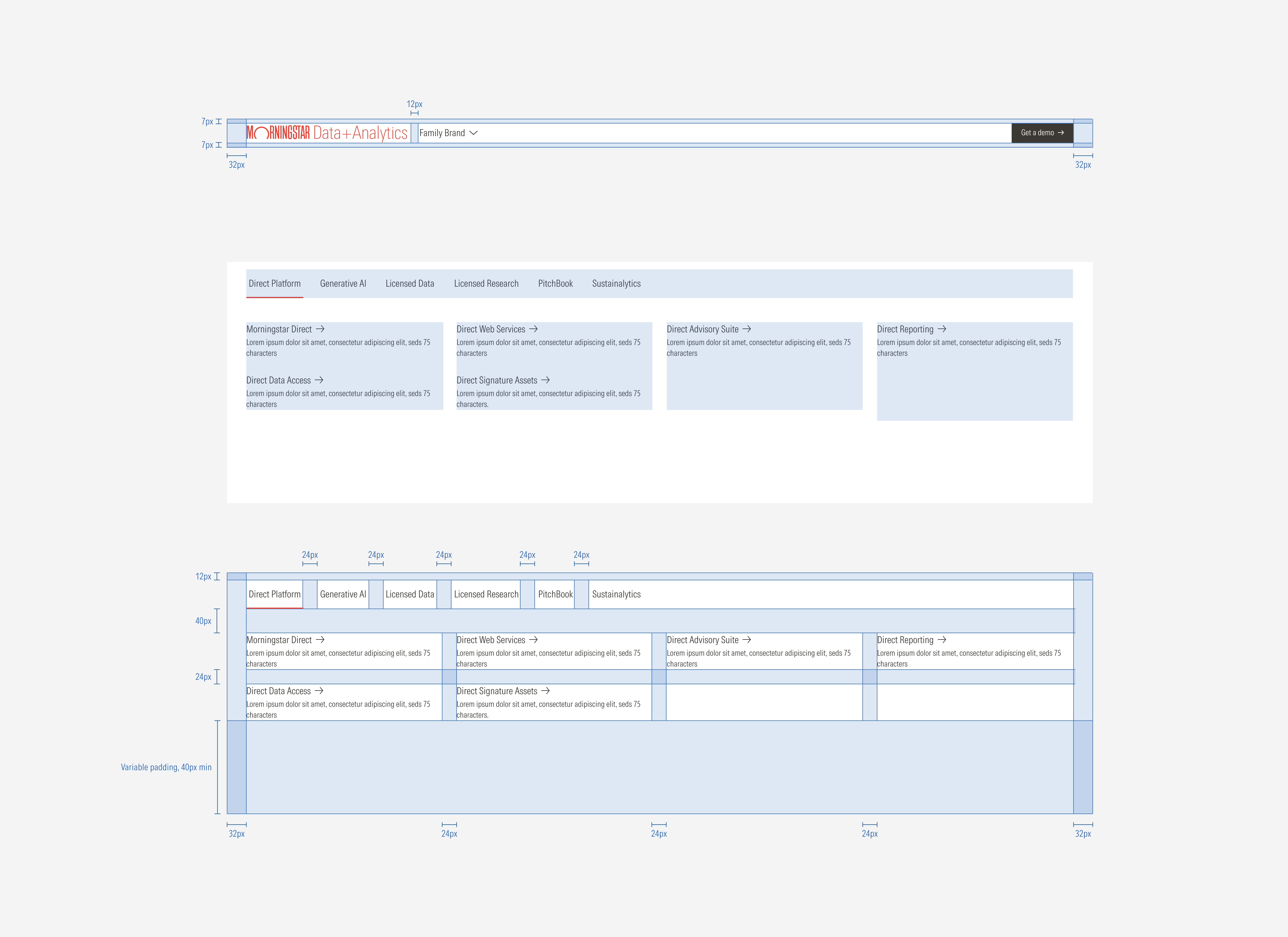
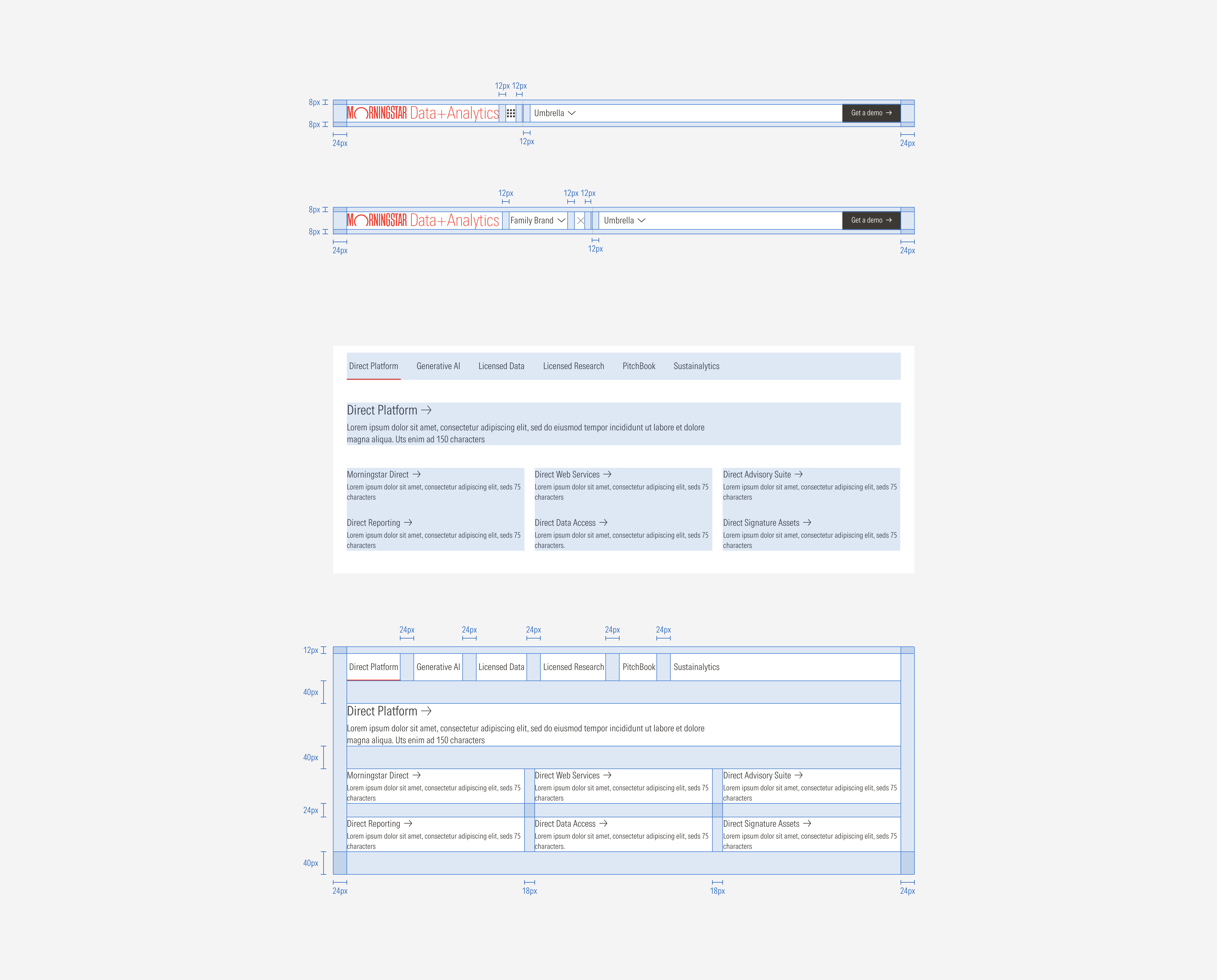
The nested navigation is the second level of navigation and contains products, organized with a parent-children nested categorization. The bar spans the entire width of the page. It sticks to the top of the page if it is the lowest level of navigation that appears.
SM and Default Breakpoints
- Brand logo is a slot where the brand logo will be displayed.
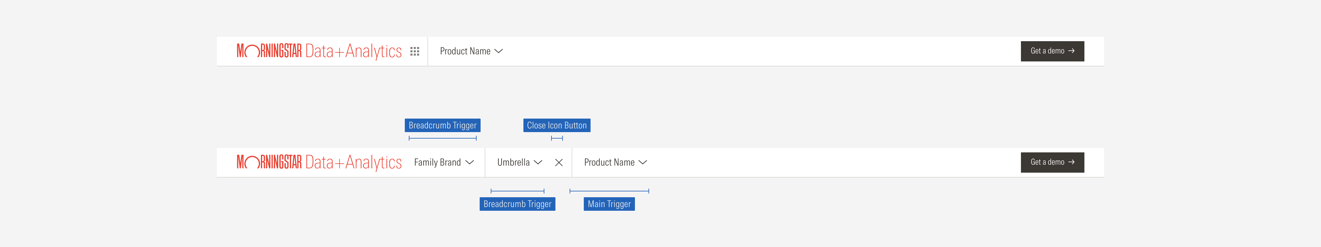
- Breadcrumbs toggle is an icon button that will display the breadcrumbs when it is clicked.
- Main trigger is a navigation button that triggers the main product/page level.
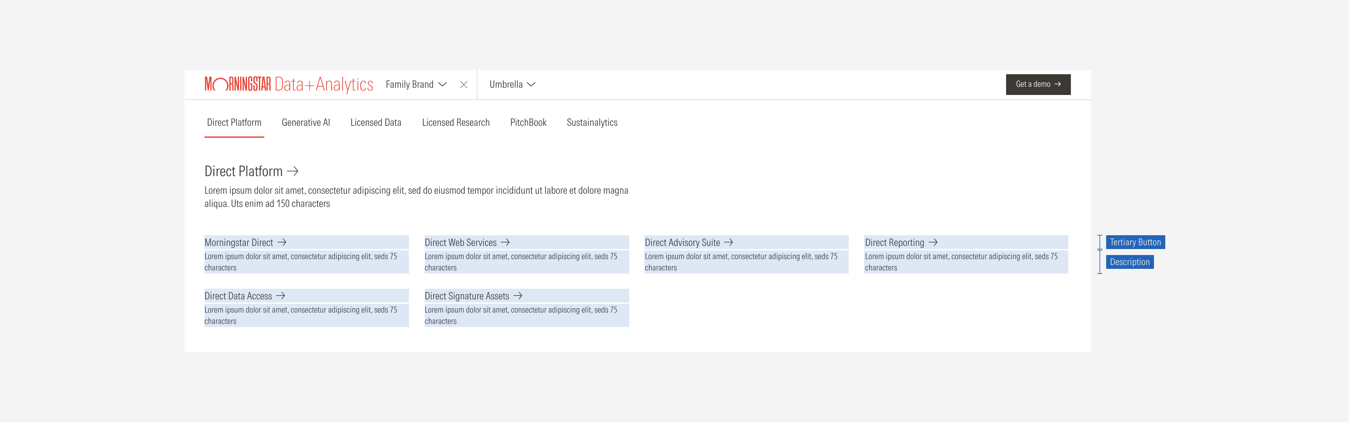
- Primary button is a CTA for actions such as “Get a demo” or “Connect with us”.
- Breadcrumb trigger is a navigation button that triggers the secondary product/page level.
- Close icon button allows to close the breadcrumbs.
- Divider line separates options within a bar.
- Parent tab menu is built with navigation buttons that contain the parent categories.
- Parent page overview is a clickable overview of the parent category that will take the user to its main page. It applies to some categories but not all.
- Child pages are clickable items that take the user to specific pages.
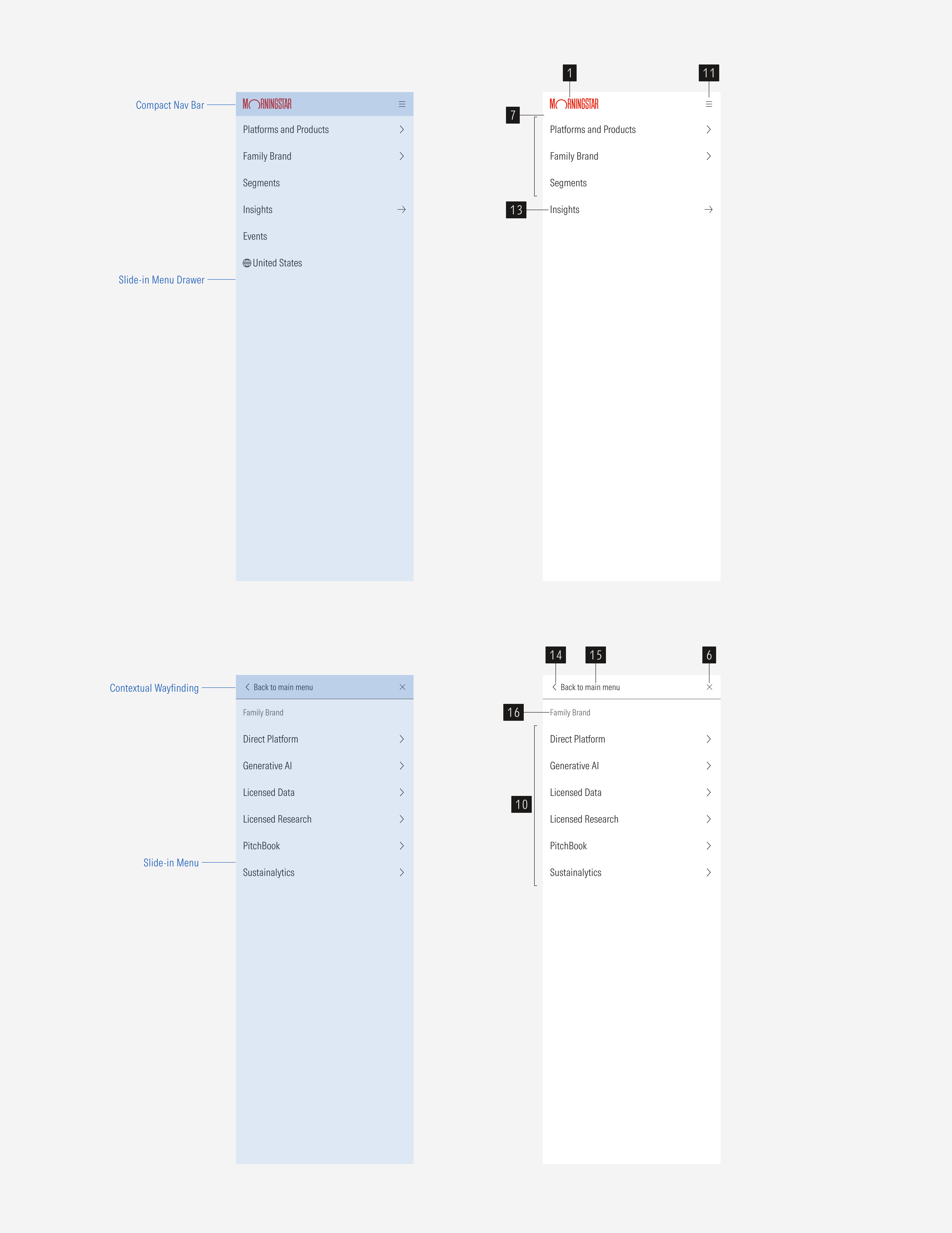
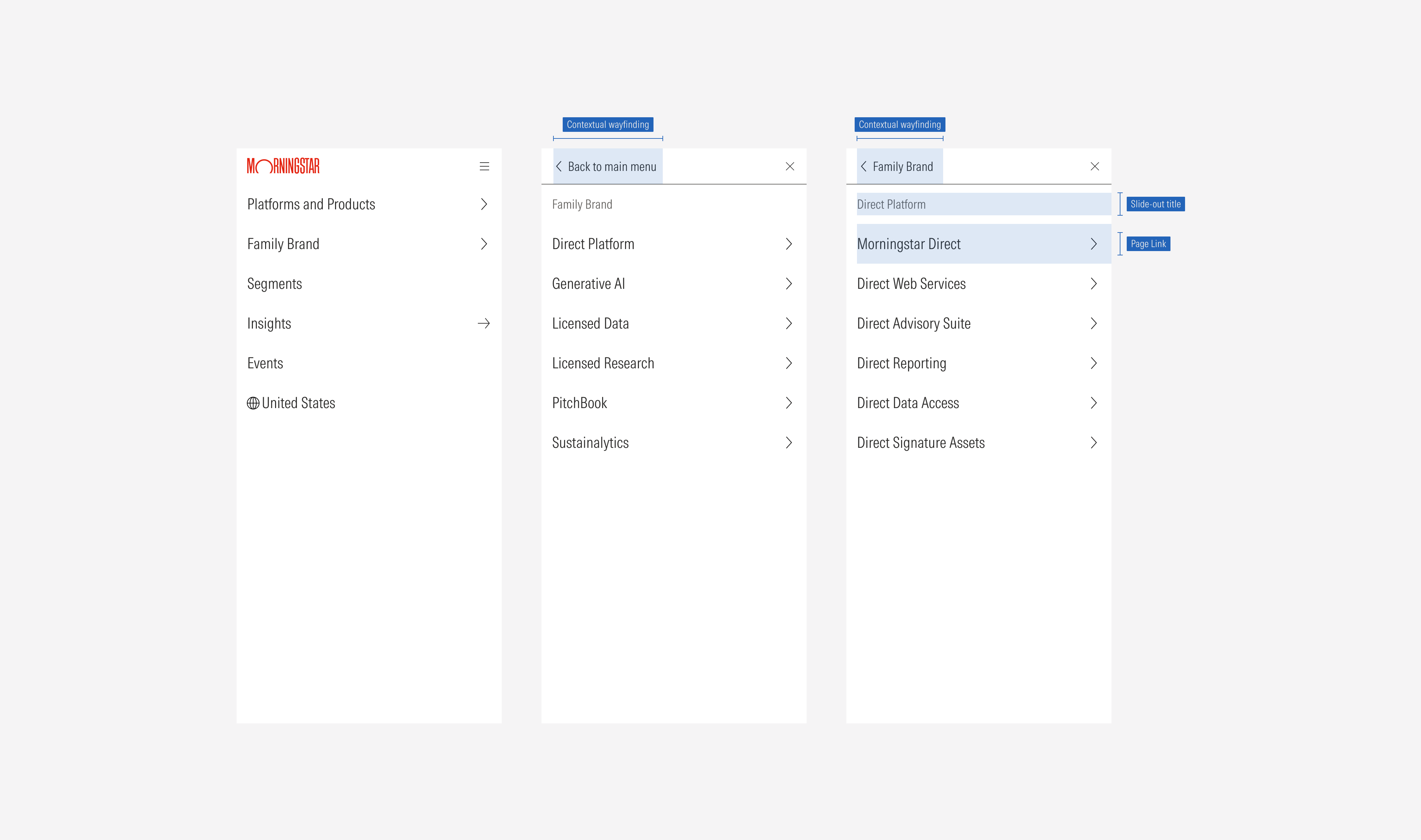
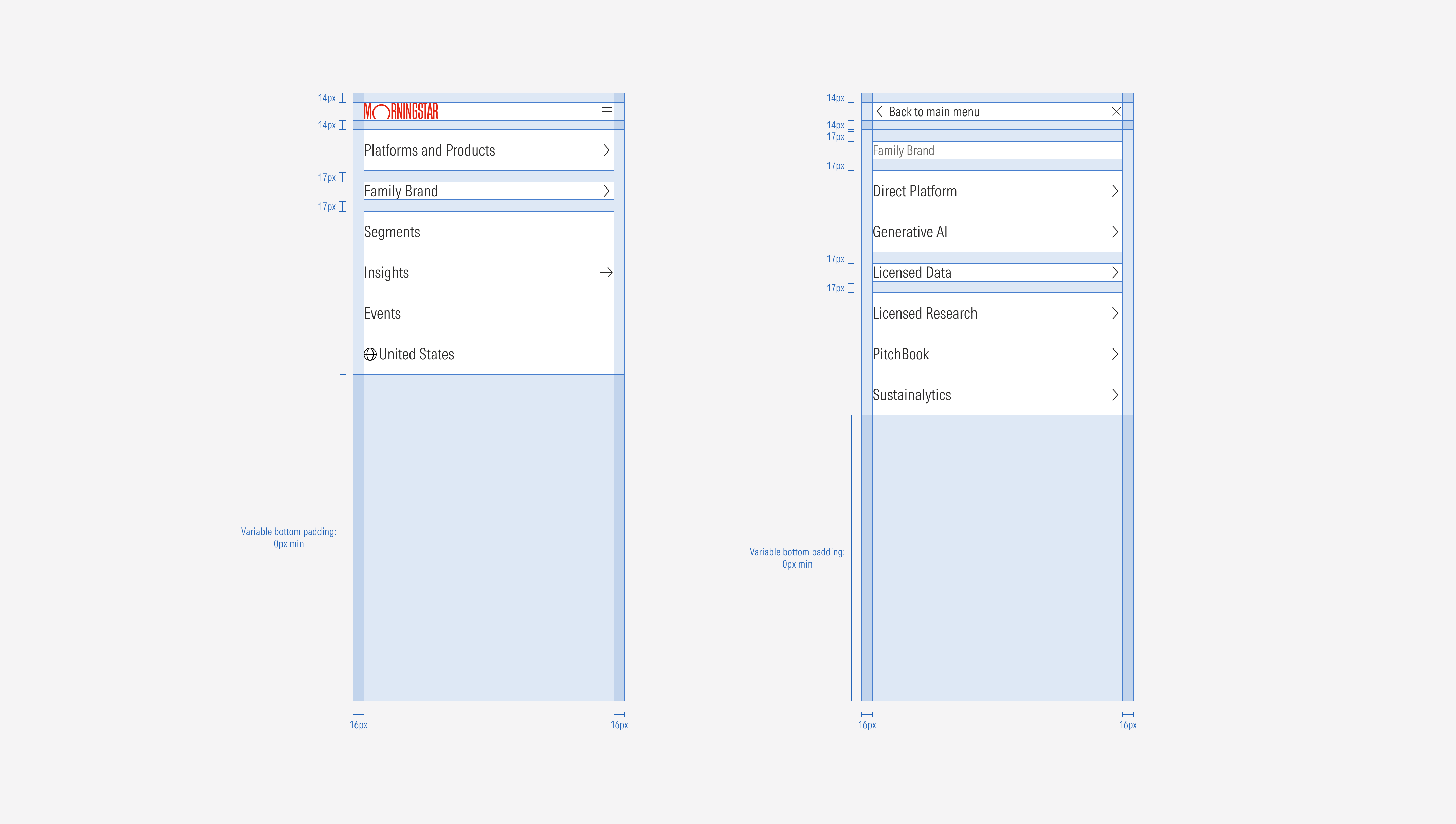
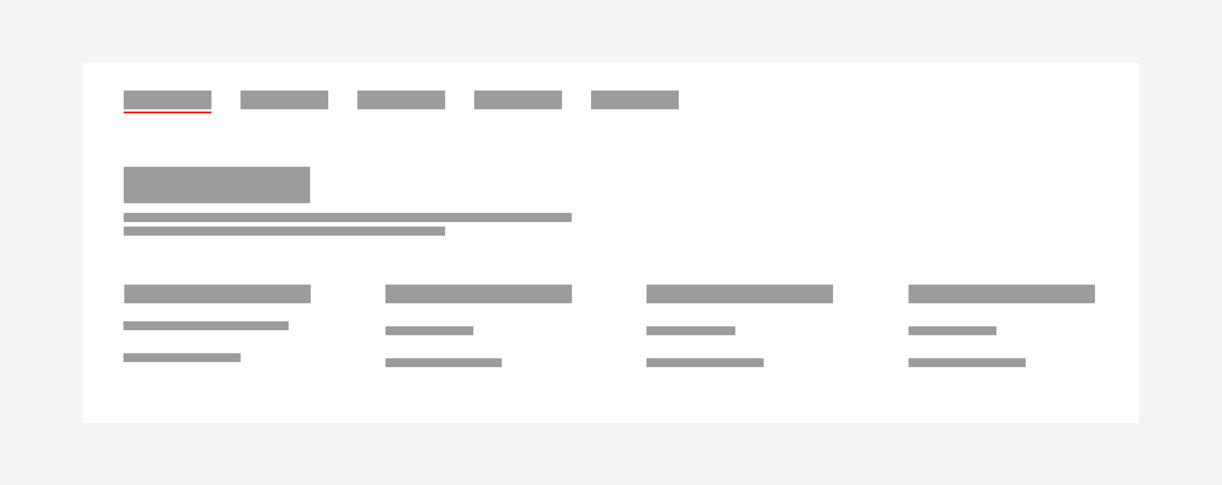
- Compact menu is a hamburger menu that contains the navigation in compact viewports.
- Parent/children list group is a list of tertiary buttons that set the parent label for each child.
- Tertiary CTA appears at compact sizes instead of the primary CTA of the bar at the bottom of the list group.
- Back icon button allows users to go back to the previous menu view.
- Contextual way-finding title gives context to the section options being displayed.
- Category title represents a main section of first-level options.
- Page link is a group of link options that belong to a section or main category.
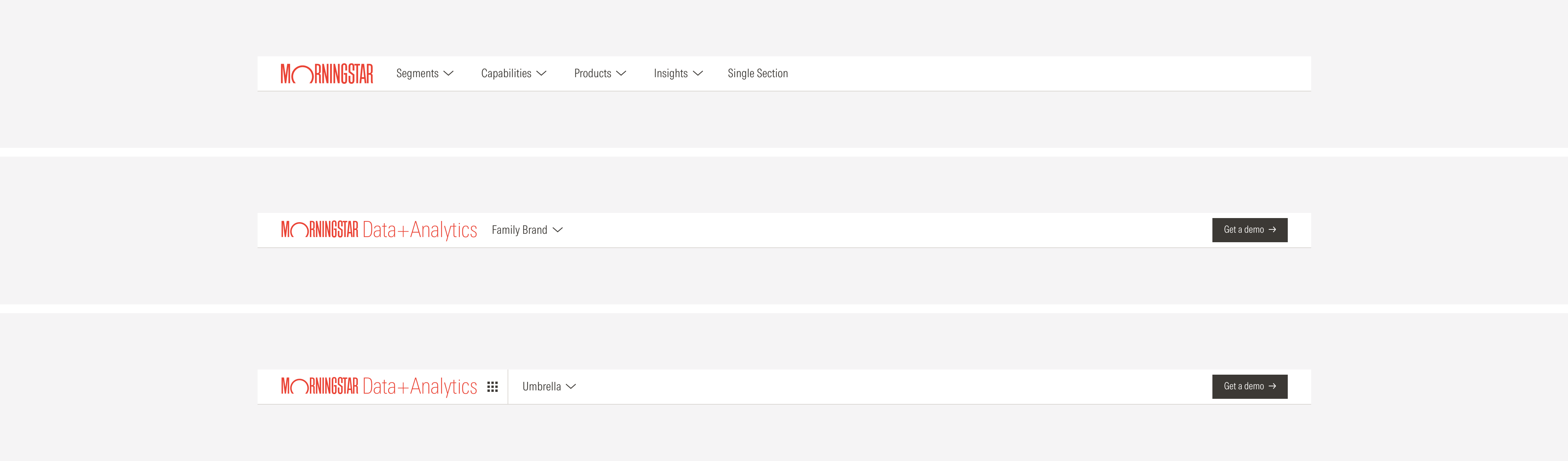
Variation | Purpose | Parts on Display | Components | Size |
|---|---|---|---|---|
Default | Previous site nav, used for simple sites with a single level of navigation. | Nav bar | Navigation button, navigation select | Extended, compact |
Family brand | Use for family brand sites. | Nested nav bar, nested nav menu drawer | Icon button, navigation button, navigation select | Extended, compact |
Platform and products | Use for platform and product sites. | Nested nav bar, nested nav menu drawer | Icon button, navigation button, navigation select | Extended, compact |

Nested Navigation Drawer
The caret-down for products and platforms will trigger a full-bleed dropdown. The background page will have an opacity-40 Neutral 80 overlay. The menu animates down from the top. When collapsed, use the caret-down icon. When the menu dropdown is visible, use the caret-up icon.
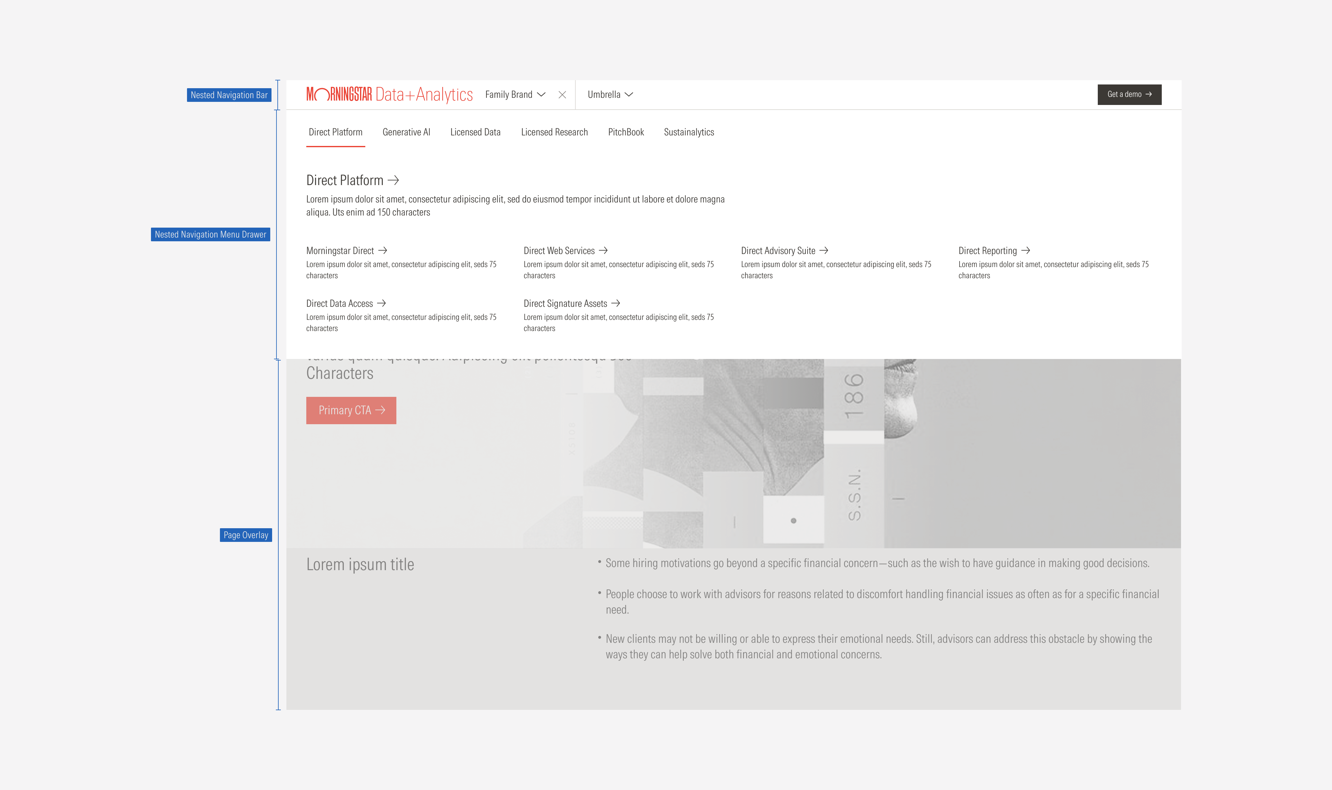
Each column of content can have a tertiary button with a brief description.
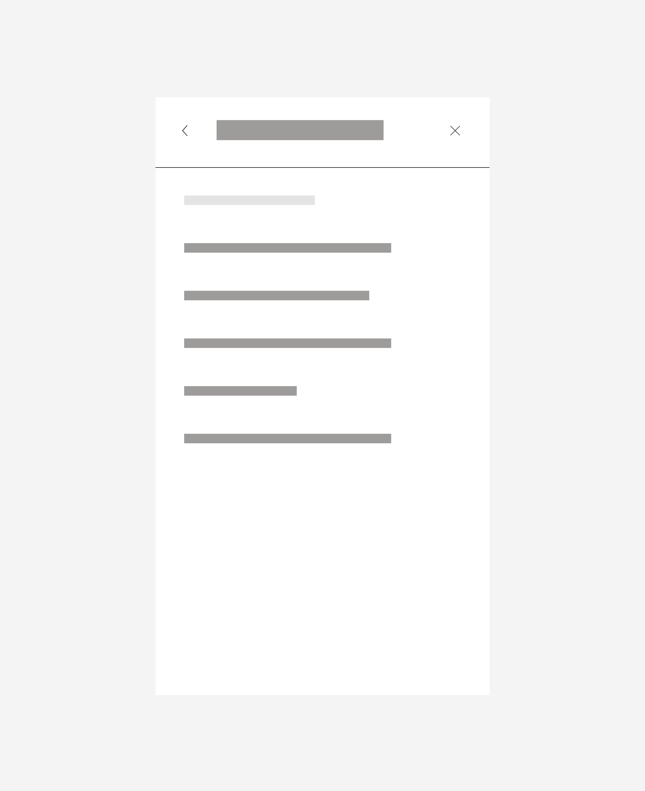
Default and SM Slide-In Menu
The menu becomes a slide-in menu that drills down into lower levels. When open, the menu will go edge to edge. This menu condenses all items under the hamburger menu. The first menu will be a list of the first-level items.
Intentional icon usage shows the user the expected action. Carets show a new slide-in and the direction they will appear from. An X icon is clicked or tapped to close a window.
MD Breakpoint:
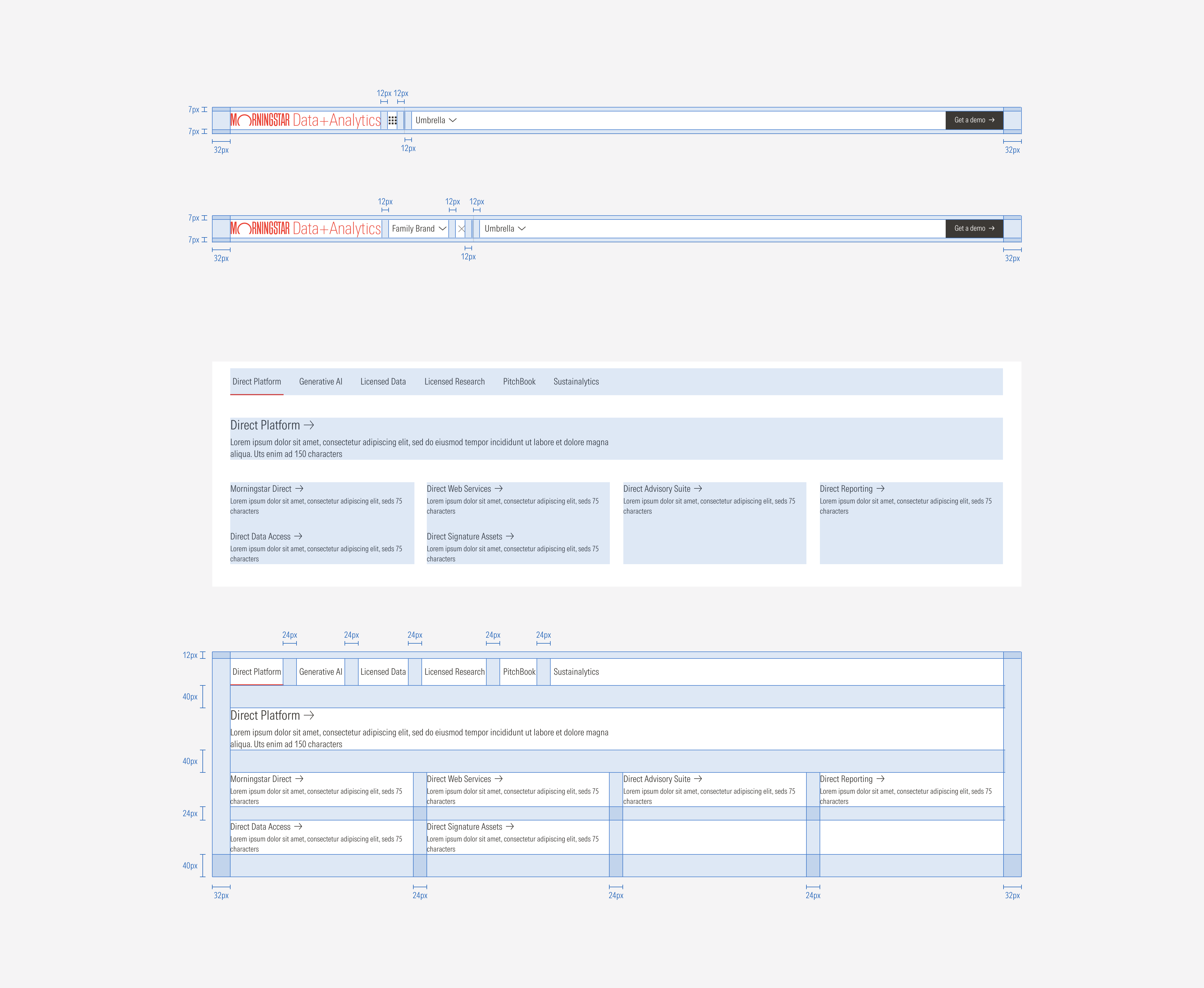
The menu is split into three even columns. Sections of content will flow underneath with a 24px gap between rows.

SM and Default Breakpoints
Hierarchy
A proper hierarchy must be ensured for the elements that compose the nested navigation bar and menu drawer. The nested nav bar should contain the first-level options, the parent tab menu the second level, and the child pages the third level of the navigation. The labels need to give a clear and short idea of what they represent.
Alignment
The alignment of components within the container will be left-aligned, except for the primary CTA and icon buttons in the compact viewports that are right-aligned.

For the scenarios where the labels are long or the triggers need more space to be fully displayed when the breadcrumb toggle is selected; the primary CTA and the main trigger get hidden to give more space to the second level items while the user has the breadcrumbs visible.
